My Response
In response to their work and my trip to the Design Museum, I decided to create a small booklet/pamphlet which breaks down certain aspects which make the road signs so engaging and effective. I chose to have an emphasis on typography, colours, shapes and icons.
Inspiration
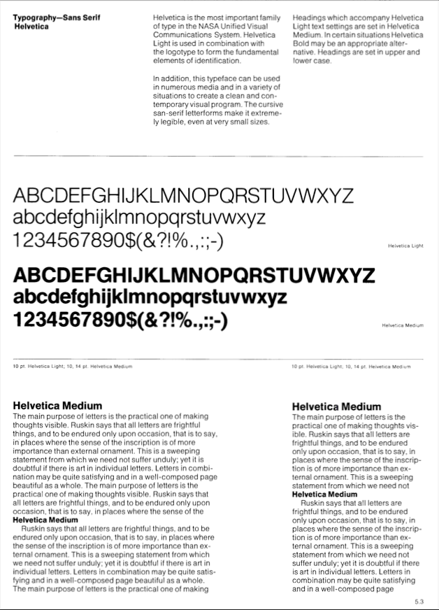
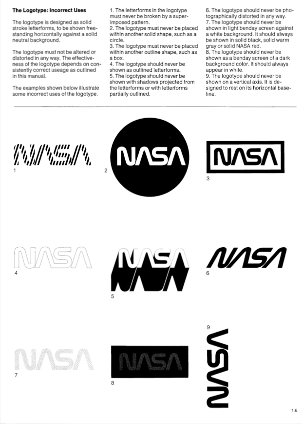
The overall layout of this document was inspired by the NASA Graphics Standard (1976). You can see some photos of it below. I really like the simplicity of the layout, and its 3 column layout works well to present information without it seeming like a block of text.
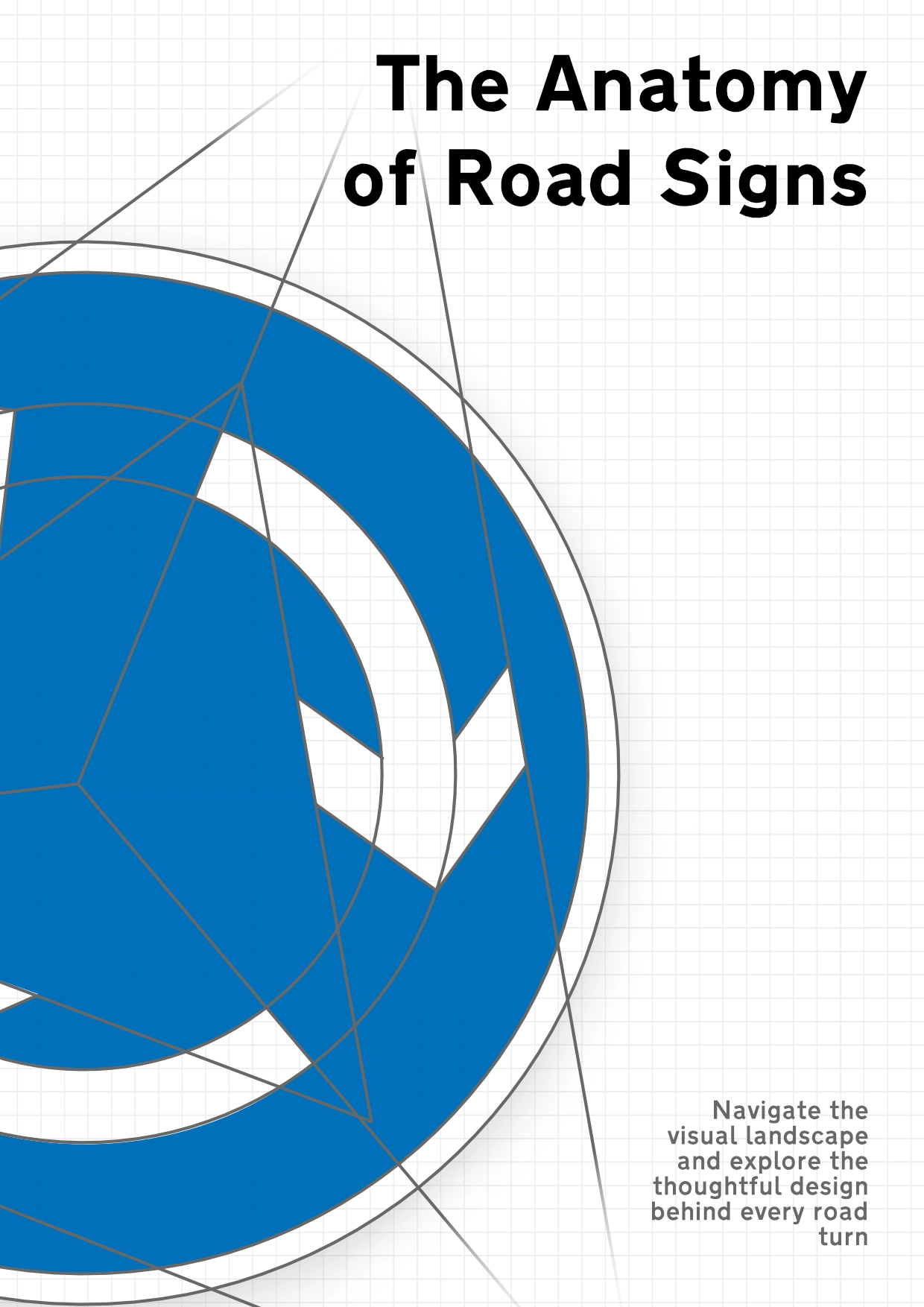
Title Page
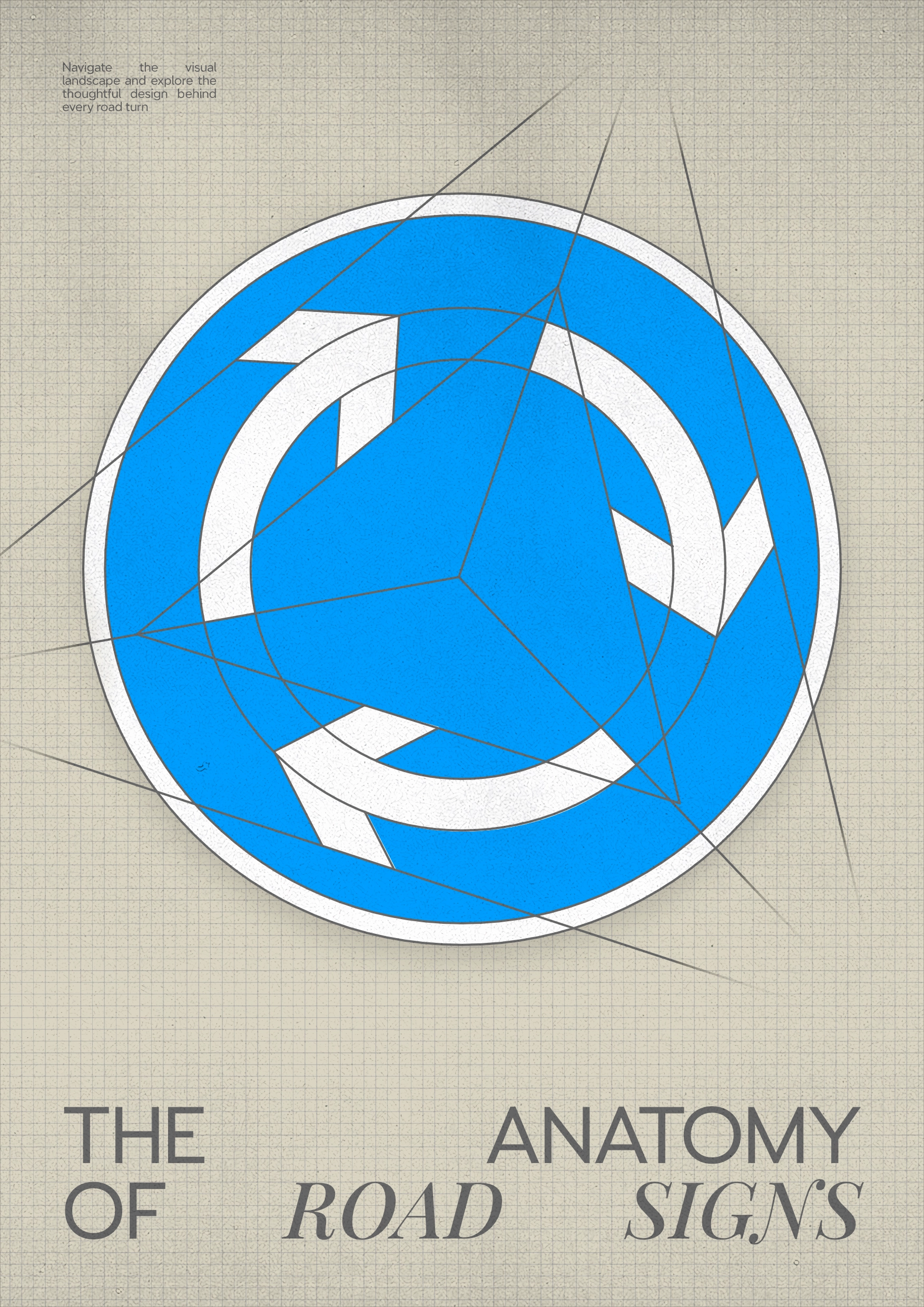
I had the idea to create a wireframe of a common road sign, illustrating the visual composition of the design and highlighting the hidden shapes, similar to these I found online:
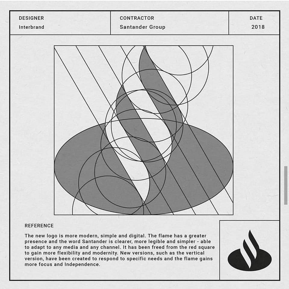
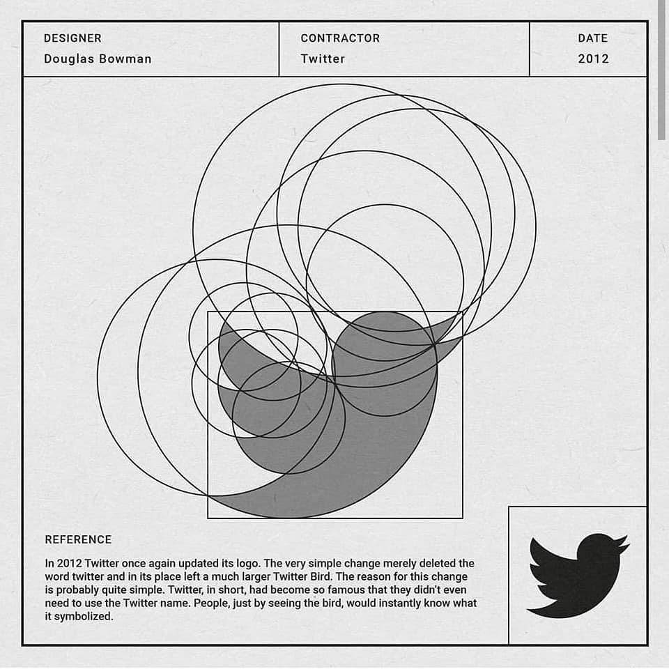
I chose the mini roundabout sign as it was complex enough to have these hidden shapes, but not as complicated as a sign such as a school crossing where the wireframe could become too dominating.


I then experimented with adding a neutral background, and a grid to help emphasise the design document/wireframe idea. I really liked the grid, but felt my original background and font choices didn’t echo the professionalism I wanted it to.

I also printed out the poster and annotated some more changes on it.
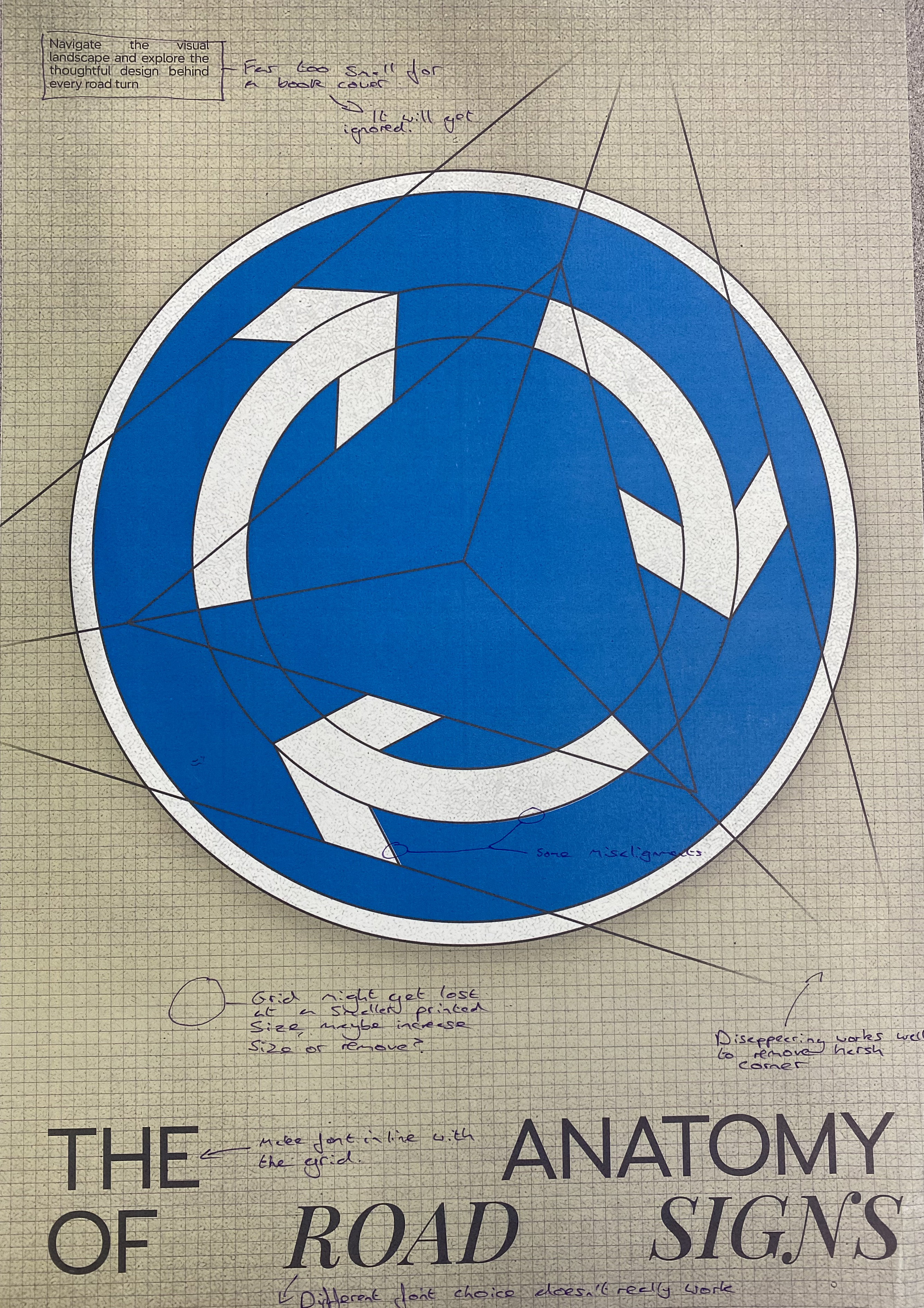
To help with this, I removed the background in favour for a white one, and I moved to a more standard sans serif font.
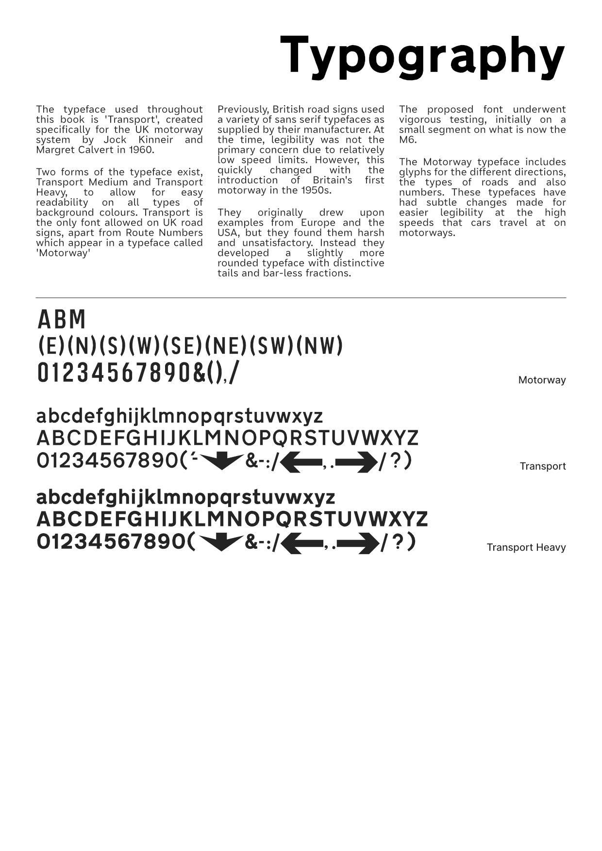
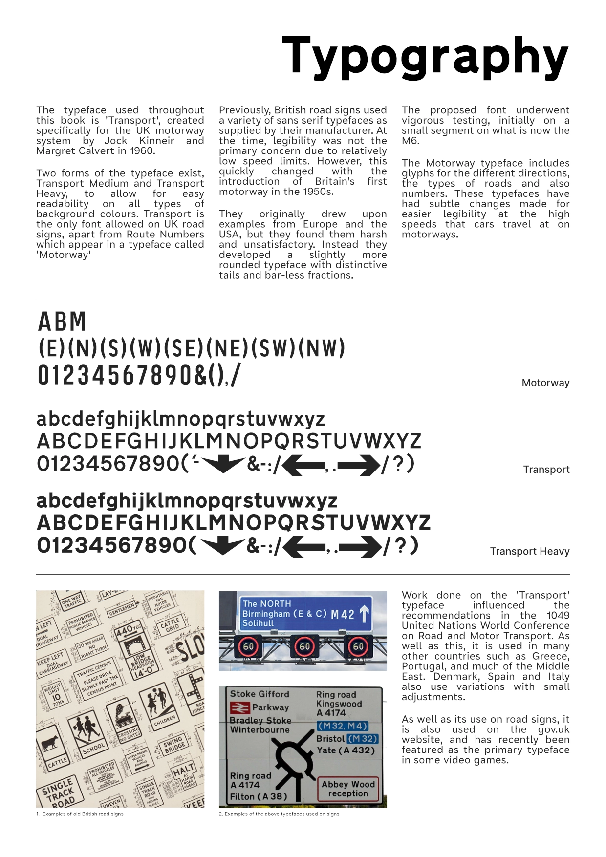
Typography Page
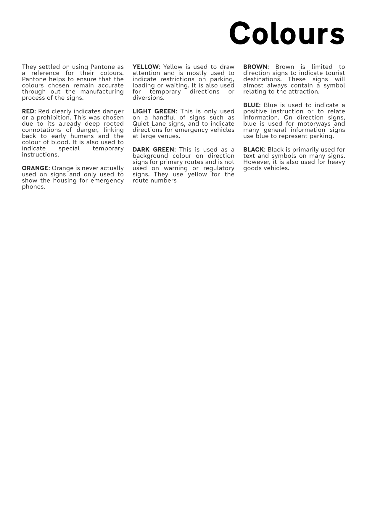
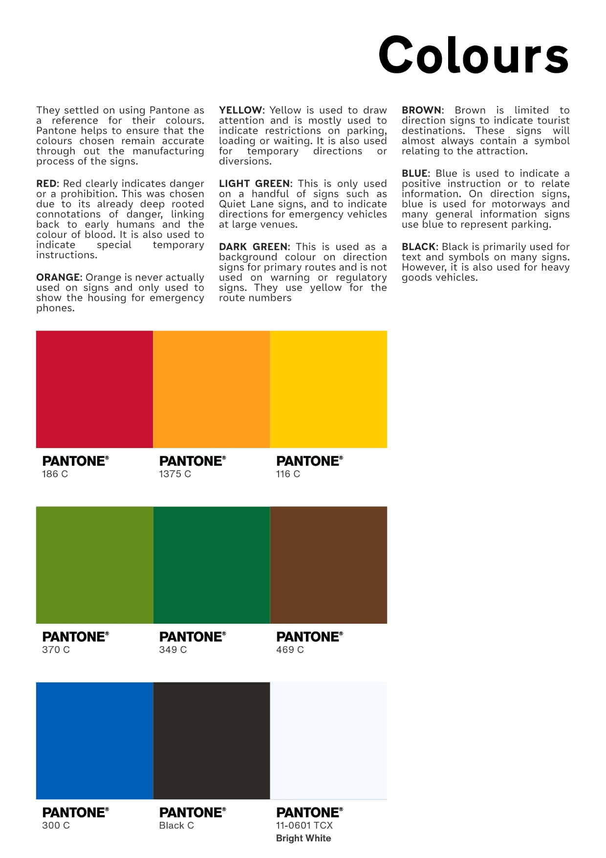
Colour Page

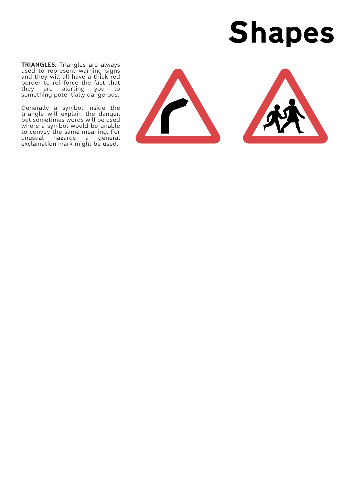
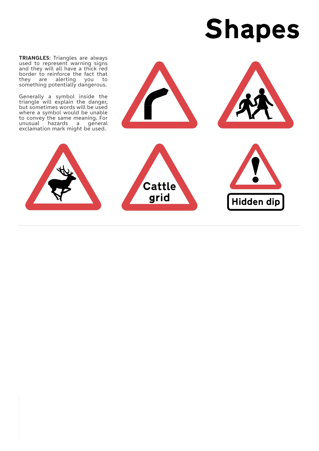
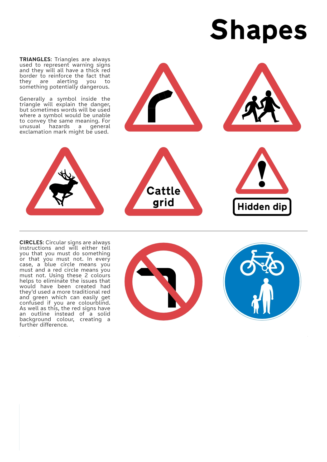
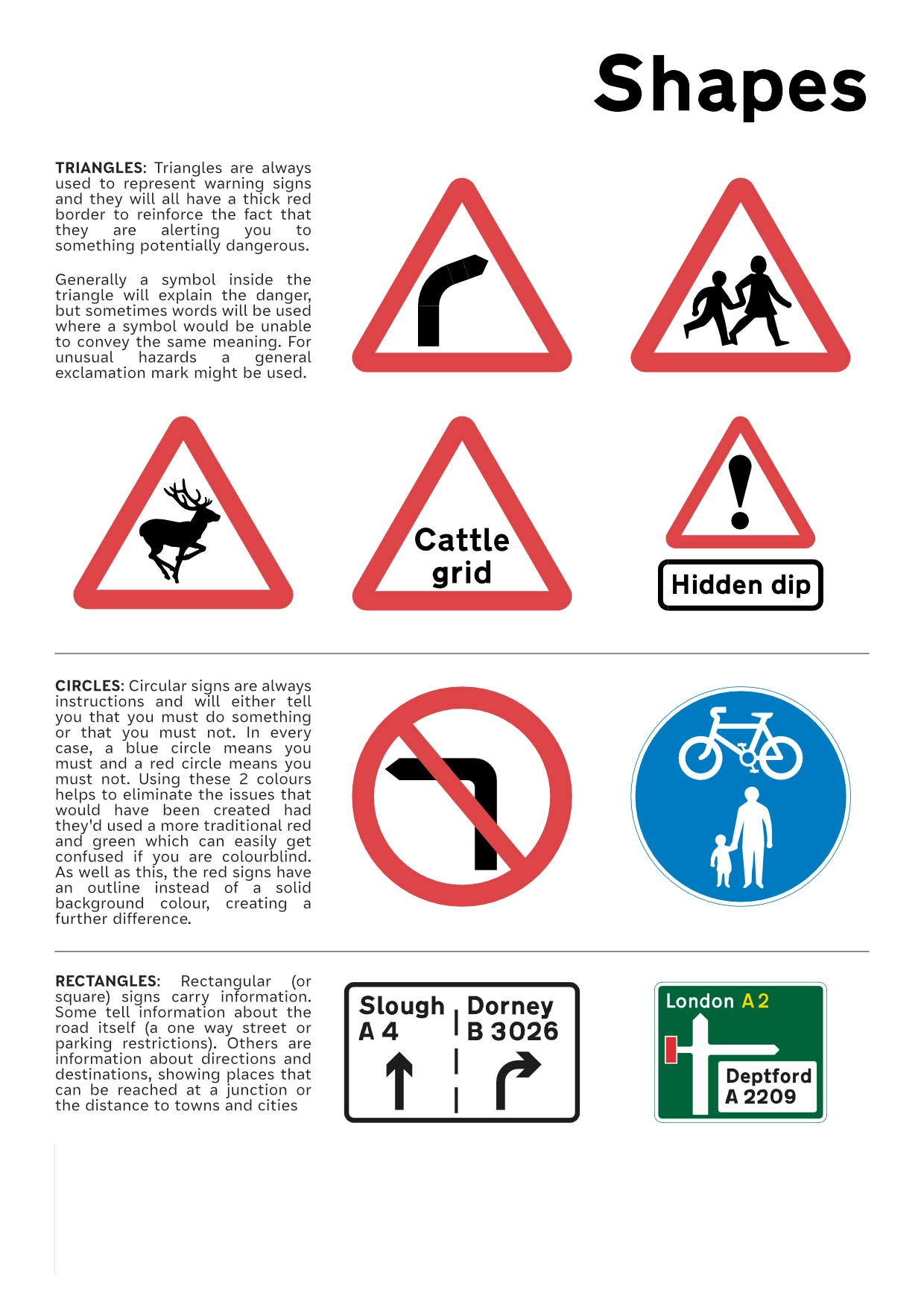
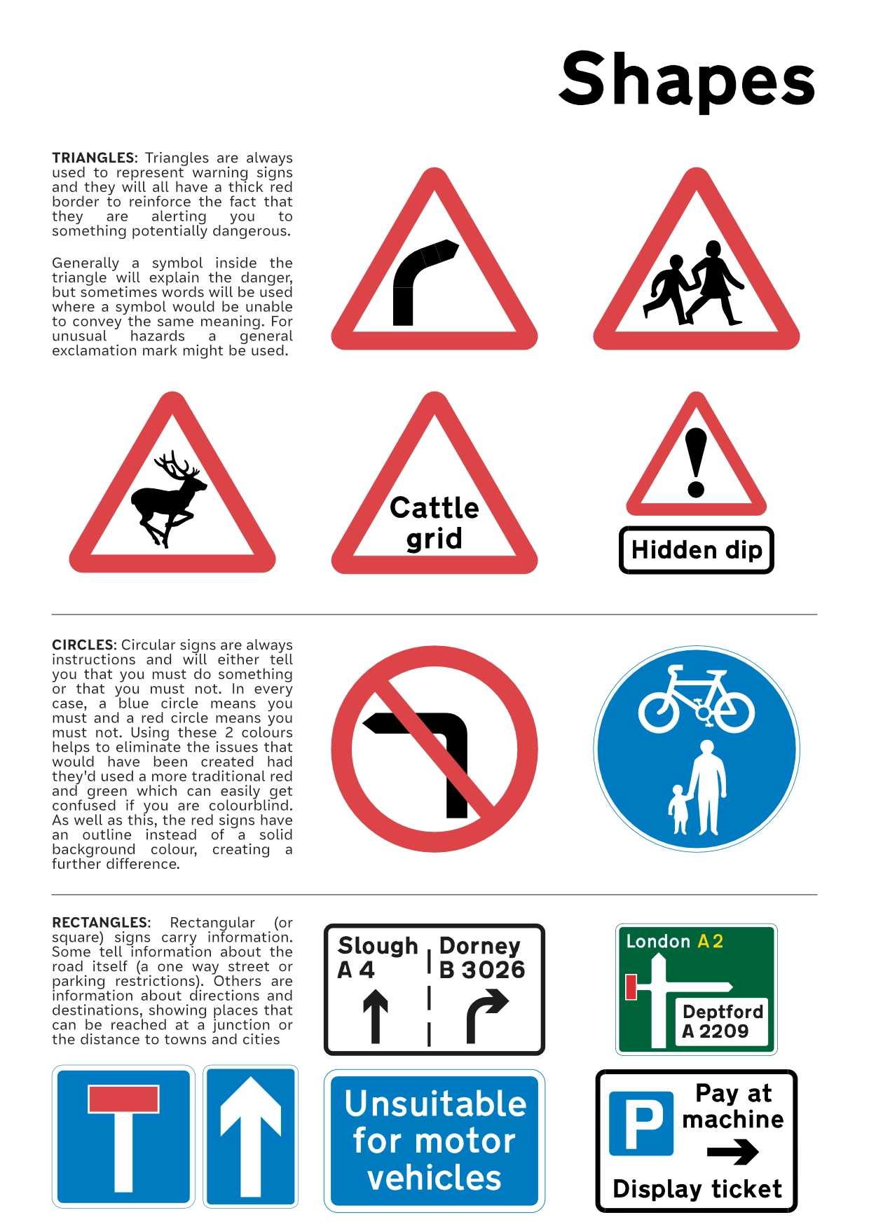
Shape Page
Final outcome
The research I conducted to produce the written content for the pages has helped me immensely in understanding the various techniques used by Kinneir and Calvert when they first produced their specification.
Below you can see the final outcome in the form of a virtual flipbook