Survey
To help inform my work I created a survey to gather information on factors that make designs more accessible to those with colour blindness. I did this by testing a variety factors including colours, spacing, size and shape.
You can find the form here
Results
I first asked them if they had a form of colour blindness and when they were last tested. 78.6% said that the did not suffer from colour blindness and the remaining had deuteronomy (red/green blindness). However, 65% of people had never been tested in the first place, and so the number of colour blind people could be much higher. Only 35% of people had been tested in the last 2 years, suggesting that awareness for colour blindness isn’t as good as it could be.
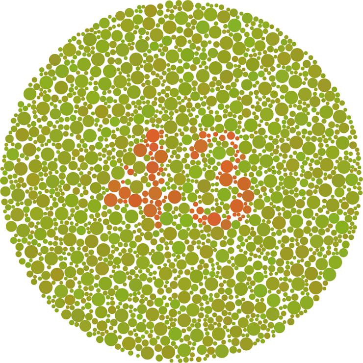
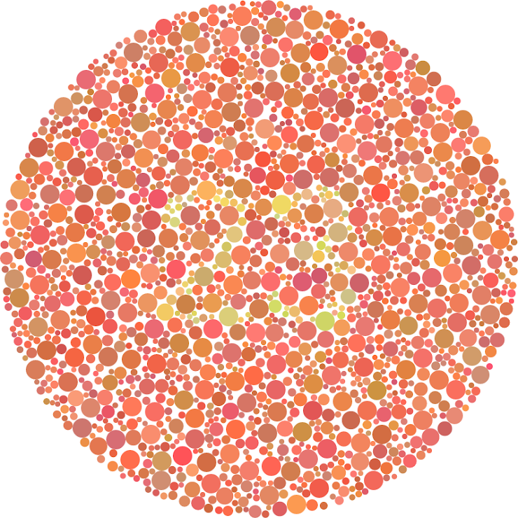
The first plate was used to diagnose severe red green colour blindness and 92.3% said that they saw 43 and 7.7% said they saw 63 but were unsure. I can fairly clearly see the 3, however, I struggle to fully recognise the 4.
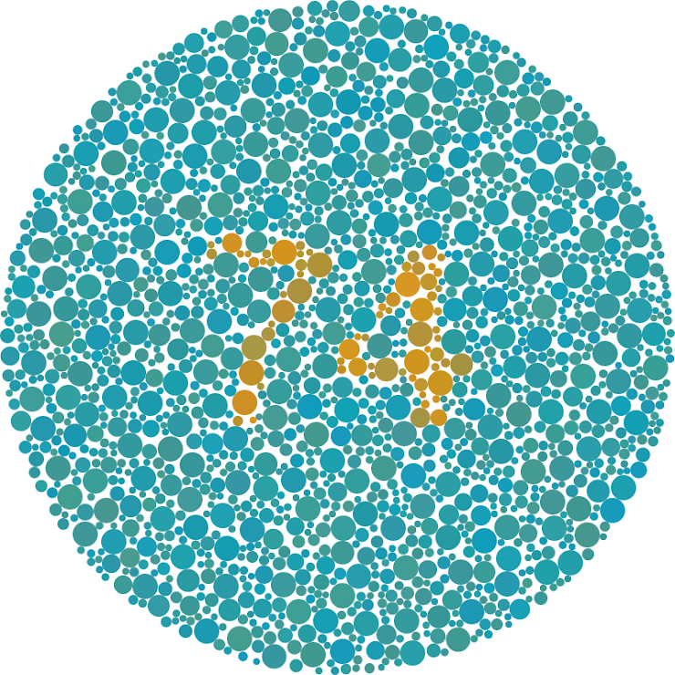
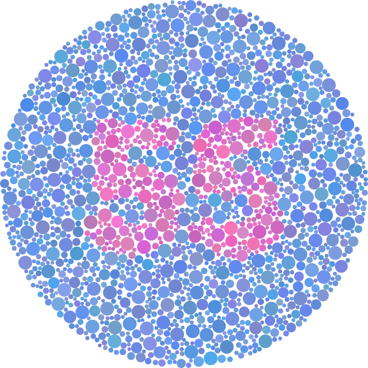
The second plate is used as a control plate to ensure no one was answering incorrectly, and everyone answered correctly with 74.
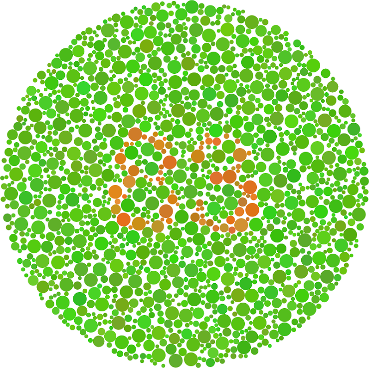
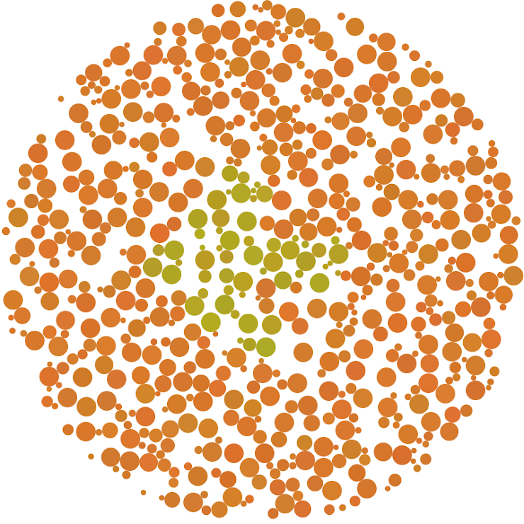
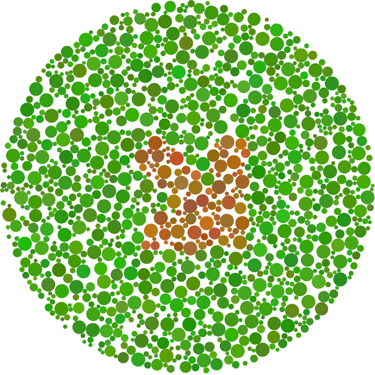
This plate was also used to diagnose red/green colour blindness, but I wanted to see how the brightness of the colours affected the results. The correct answer was 83, but around 15% of people saw 88, suggesting that the brighter the colour, the harder it is to see.
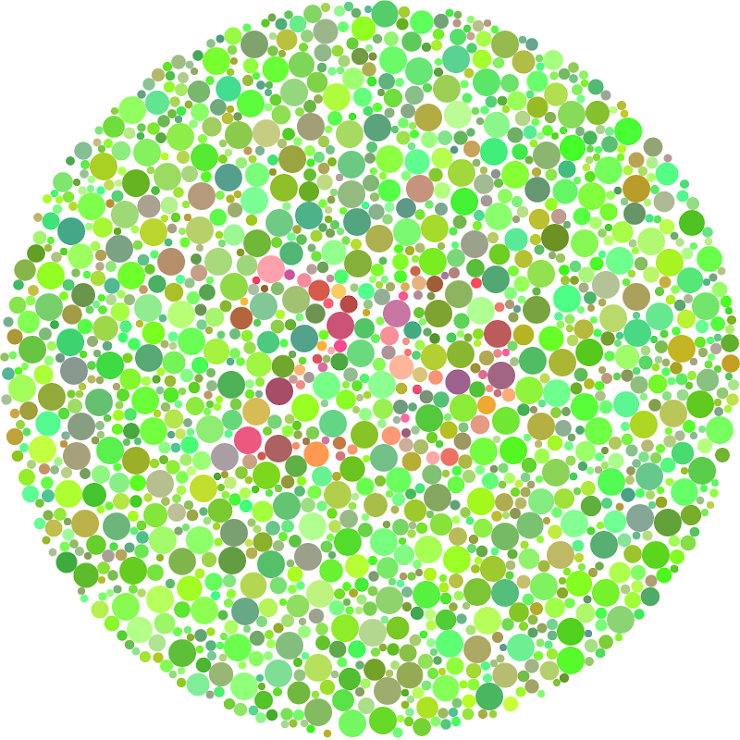
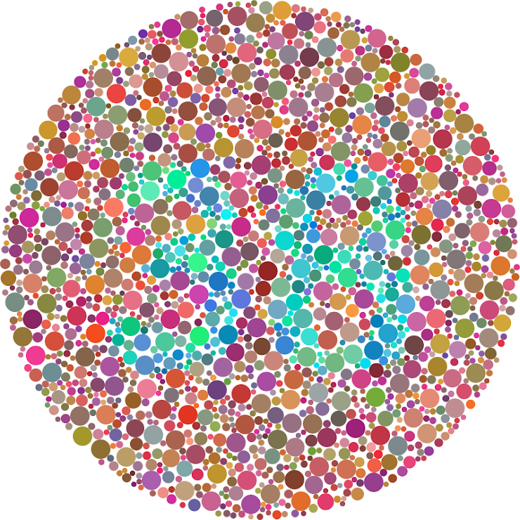
For this plate I wanted to see if a larger range of colours would help with visibility. Personally, I found it made the plate far busier and more difficult to read, and the results prove this. 15% couldn’t read it, and 30% could read the number but with some difficulty.
For this plate, I wanted to see if it would help if I inverted the red/orange with the green. I found that whilst it helped it was still a struggle to see. Only 7.7% couldn’t see the correct number.
This plate was used to diagnose tritanopia, a form of blue colour blindness which makes it difficult to differentiate between blue and purple. This form is quite rare and everyone saw the correct number (55). However, I did find it difficult to see as the shades are very similar.
This plate was to see if a larger range of colours used for the dots would help visibility. 85% saw the correct number easily and 15% struggled to see the number. I also used a thicker and larger font, which was also a factor in the increased visibility.
For the last 2 plates I wanted to see if it would help if an arrow was used instead of a number. I also experimented with using less dots to see if that helped with perception. Around 68% said the correct direction, with the remaining answering incorrectly. This clearly suggests that a lower density of dots decreased visibility.
This plate was meant to be used to diagnose red/green colour blindness, however because the arrow was solid, it made it very easy to see, and around 90% answered with the correct direction.