Survey Response
I then wanted to create an outcome based on the information I had gained from the survey. I settled on creating a series of outcomes promoting the message that shapes are easier to interpret than text.
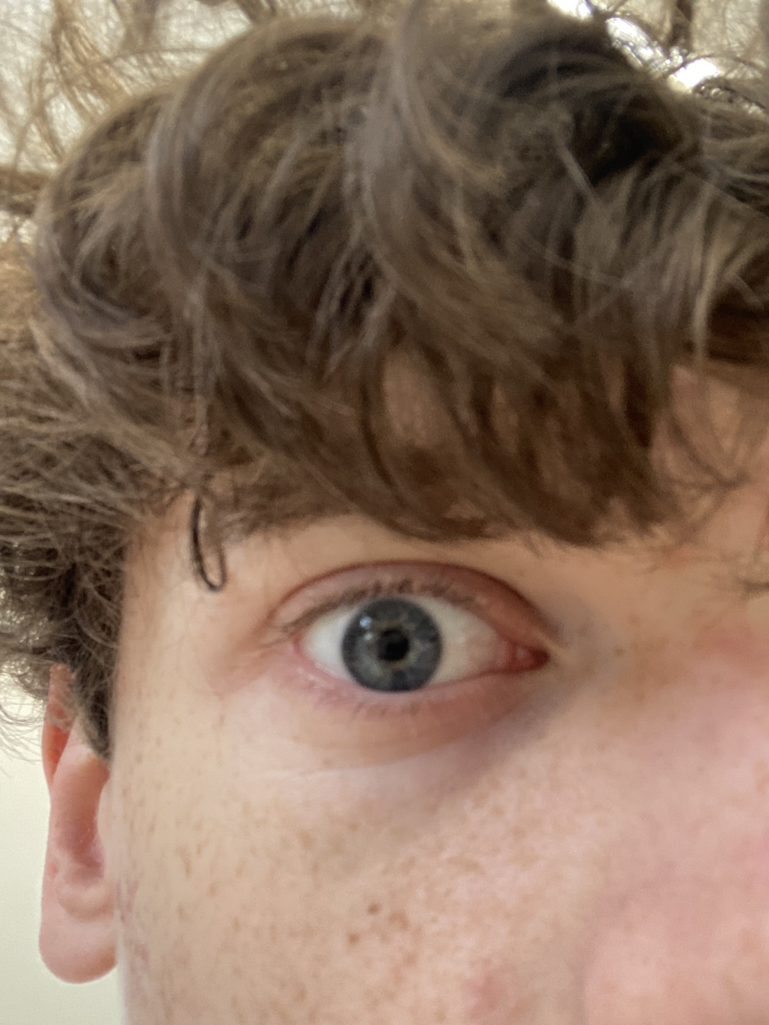
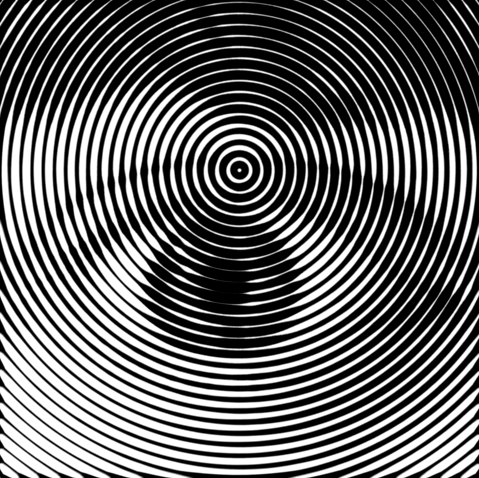
I wanted to use the following picture of my eye in the design:
Infographic
Focal Point
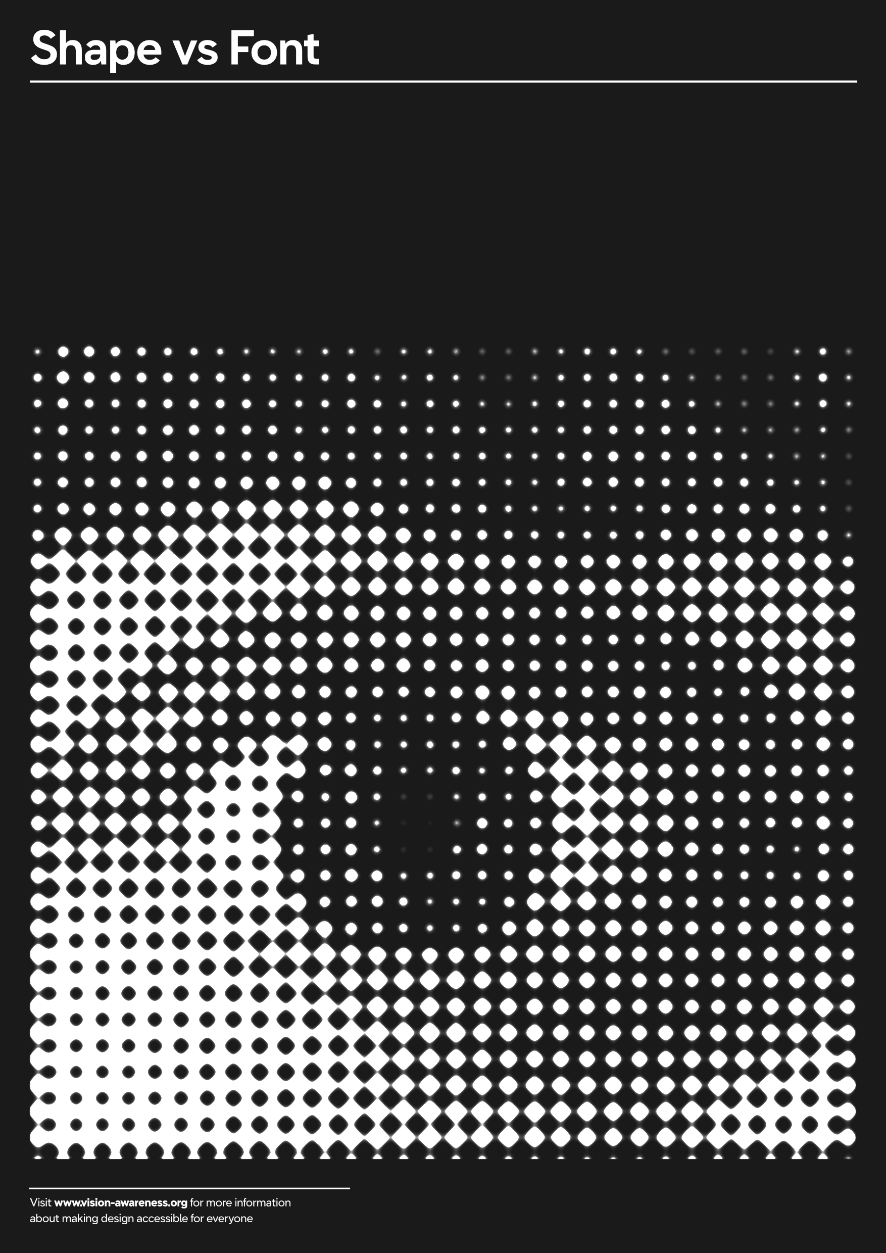
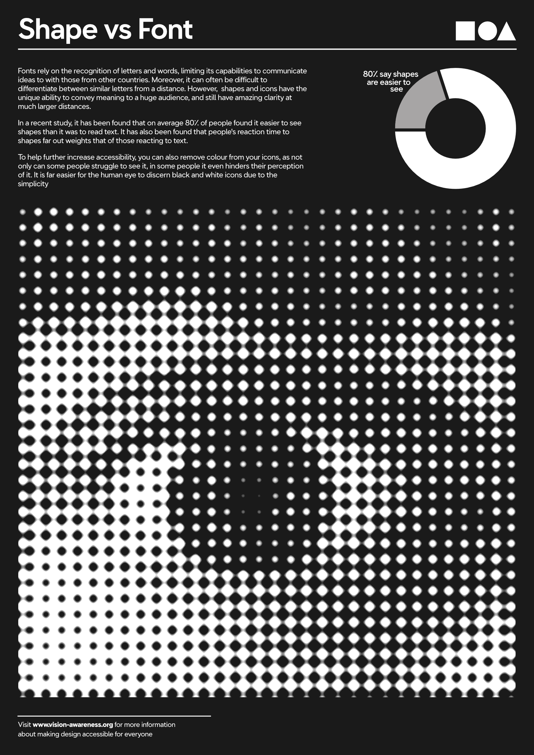
I really wanted an eye catching focal point for the infographic, and experimented with applying a halftone filter to a picture of my eye:
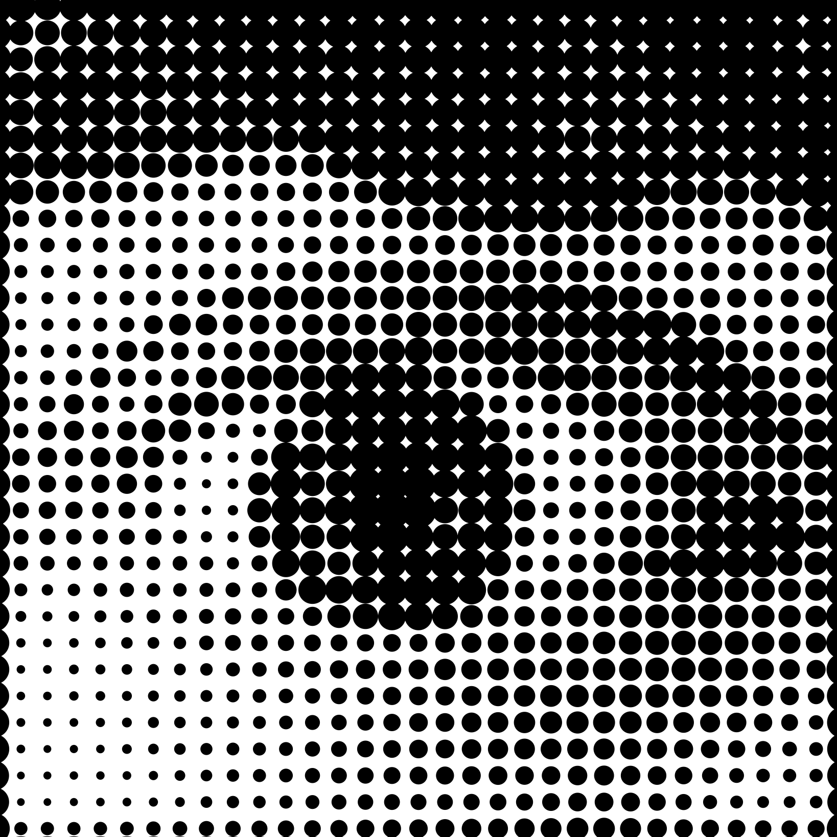
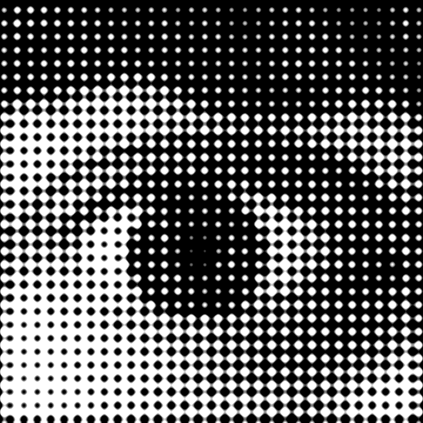
I chose to use the last one as seems far less harsh than the first option and still links with the polka dots from my previous work with Kusama. It’s also much easier to make out the detail in the eye with this version.
Layout
I had a rough idea of a layout in my head, and so I wanted the focal point towards the bottom of the poster, and the information towards the top. However, I later decided to move it up slightly to allow room for a small section about where you can find more information on the topic. I then added a small divider line as it helped to distinguish the section and make it more obvious to the reader.
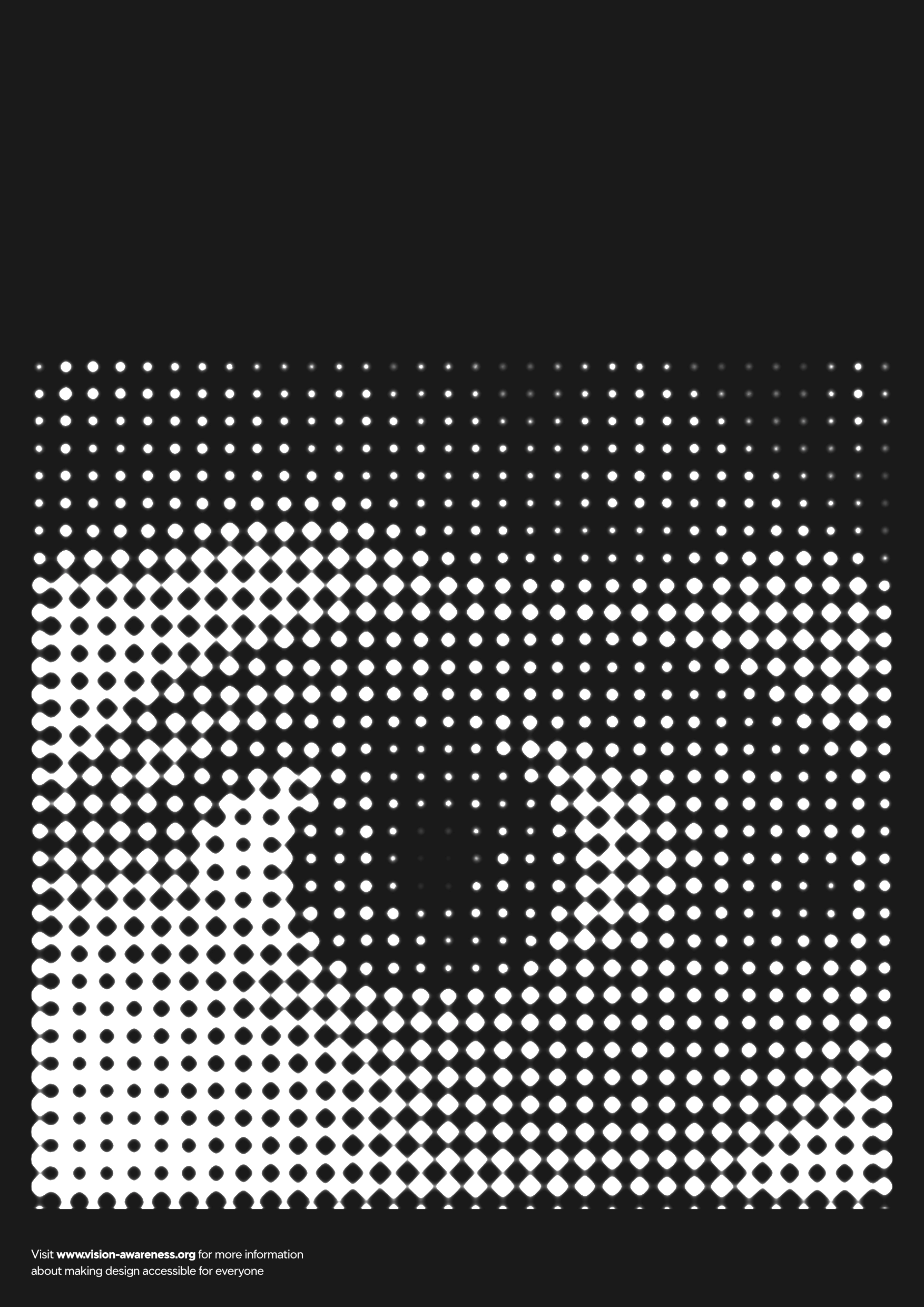
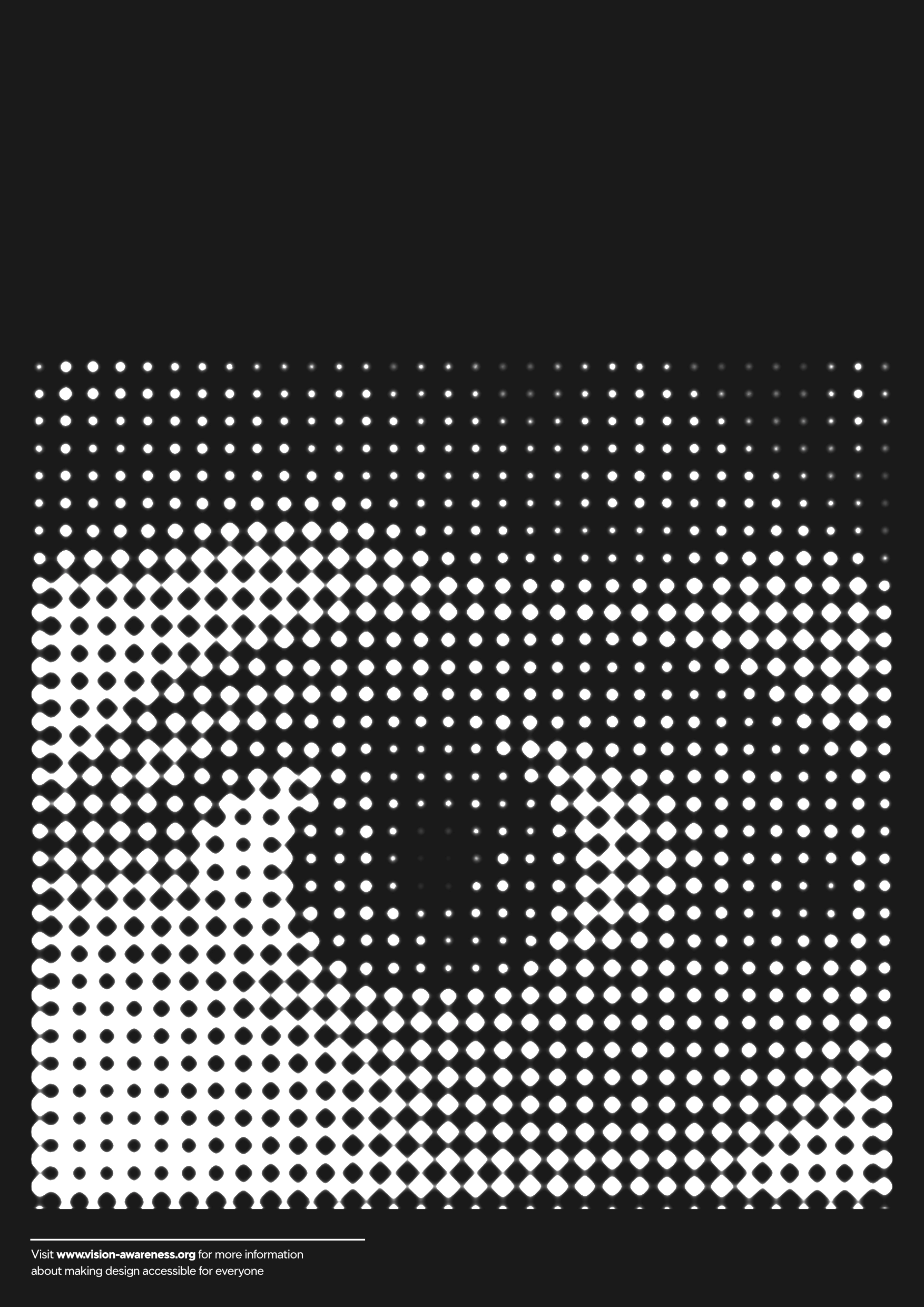
I wanted to keep the title minimalist and I decided to use a very simple sans-serif font, similar to Helvetica Neue. I also decided to continue the theme and add the divider line beneath it. However, the title still felt off, and I then decided to add a trio of shapes on the right to help balance it.

I then added a small blurb explaining my findings, and added a small pie chart to help display this information at a glance.

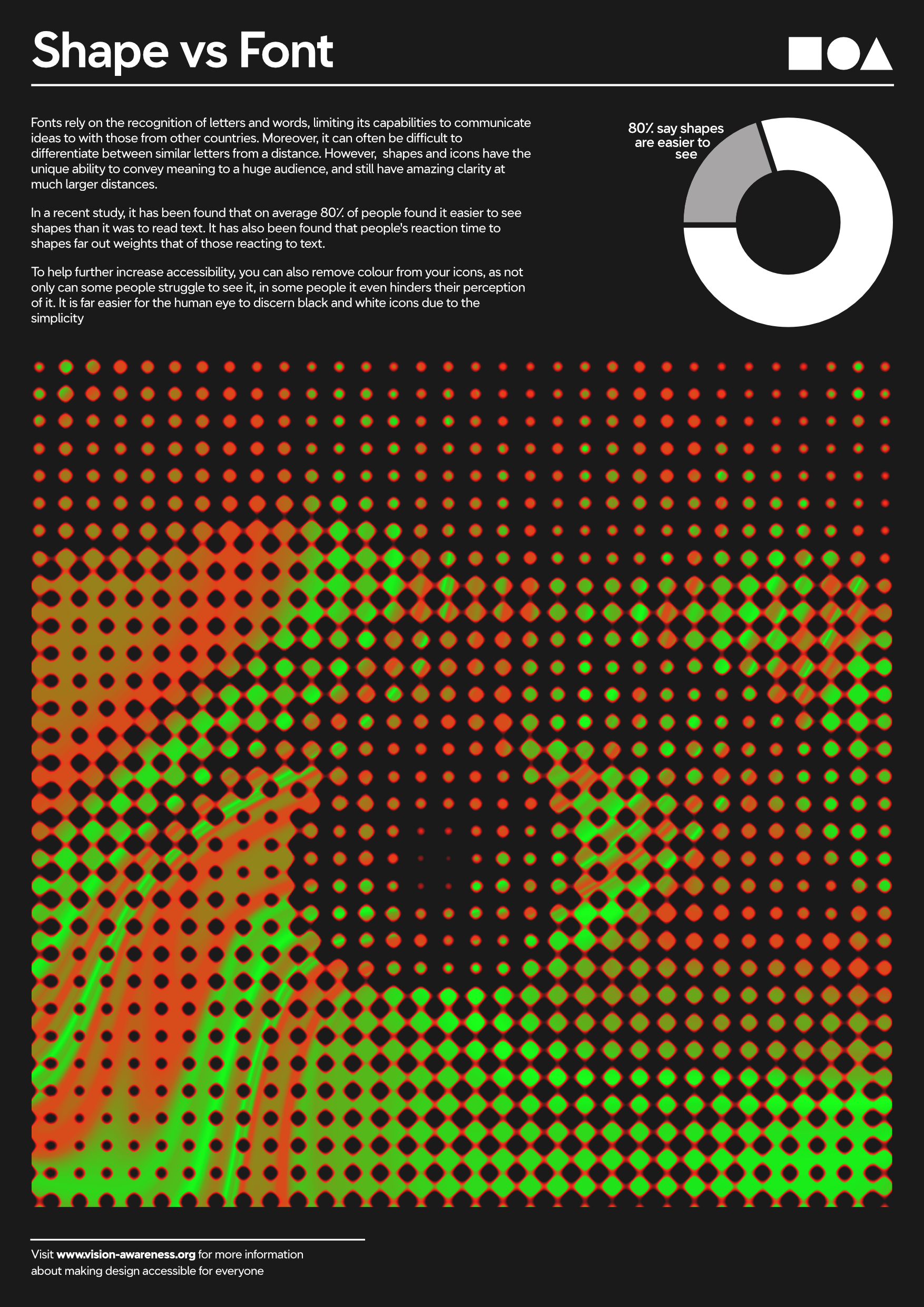
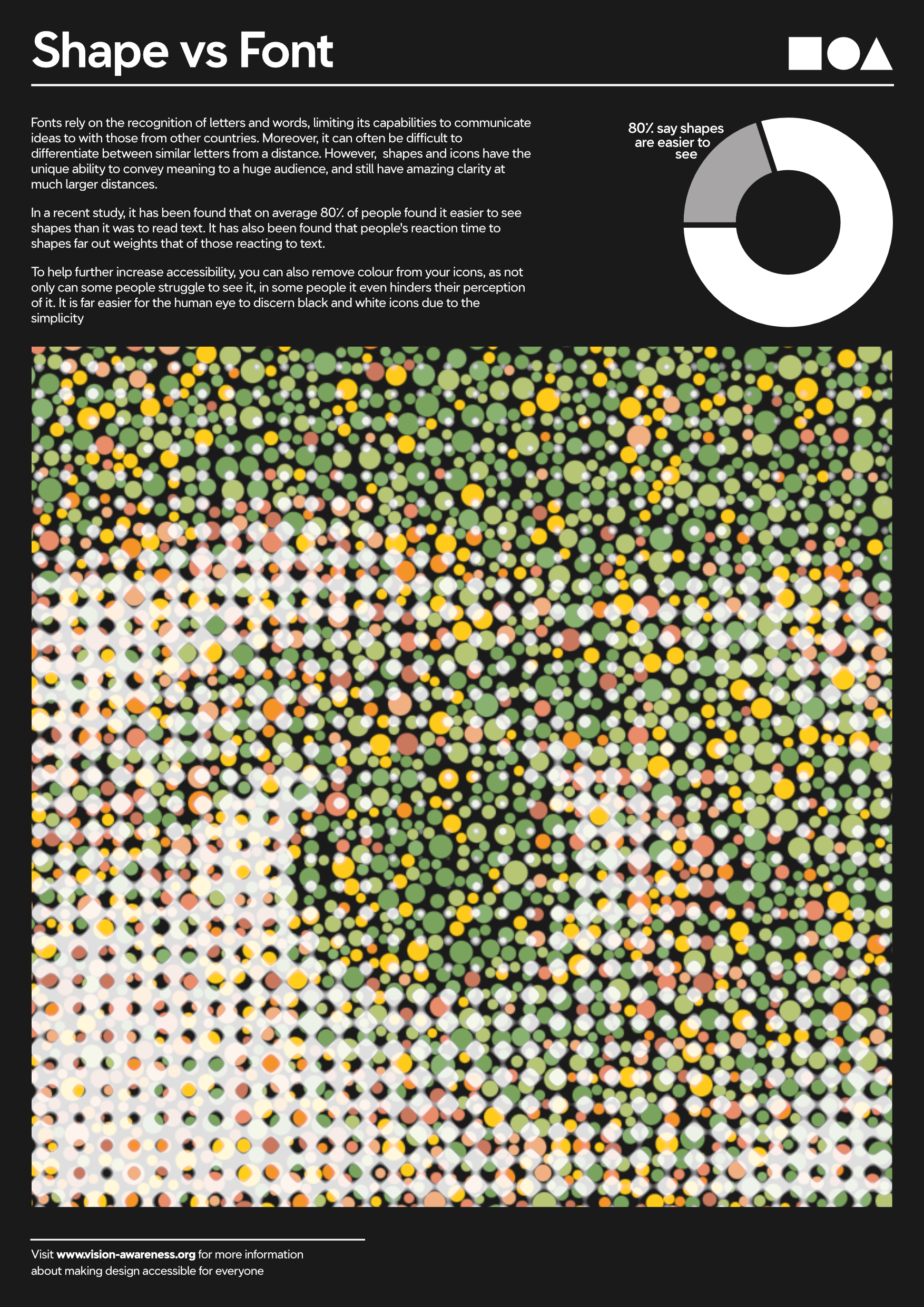
Colour Experiments
To help make the poster more engaging I decided to make the main focal point coloured. To help fit in with the theme of Ishiara tests, I chose a red/green colourscheme similar to those used in the tests.
The first uses a red green gradient that I manipulated with the liquify tool. The second has an ishihara test behind it.