Informing Others
As someone who not only fits into the younger demographic and one who remembers the lack of informative and engaging images growing up, I looked at creating 2 different outcomes for both young adults and children. To help inform my work I created a moodboard of designs I thought represented the goal of the RNIB’s brief.
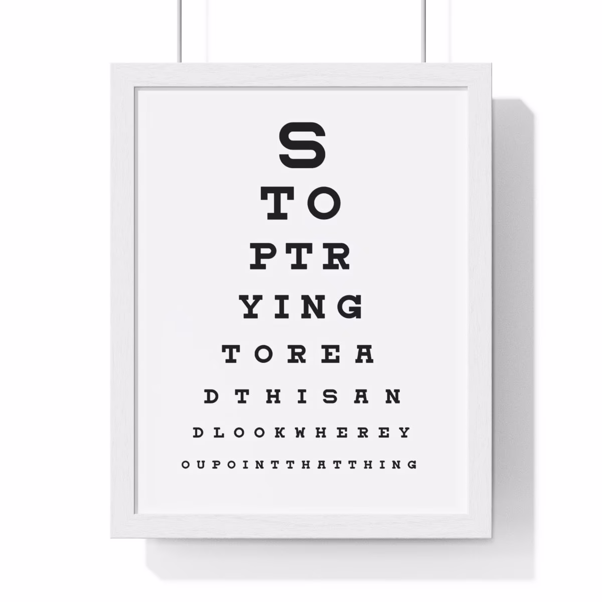
I was really inspired by the font they’ve used here. Even just a glance at the wide font suggests that it has something to do with eyesight or the opticians. I really want my work to emulate this instant recognisability as it helps to grab attention and spread awareness.
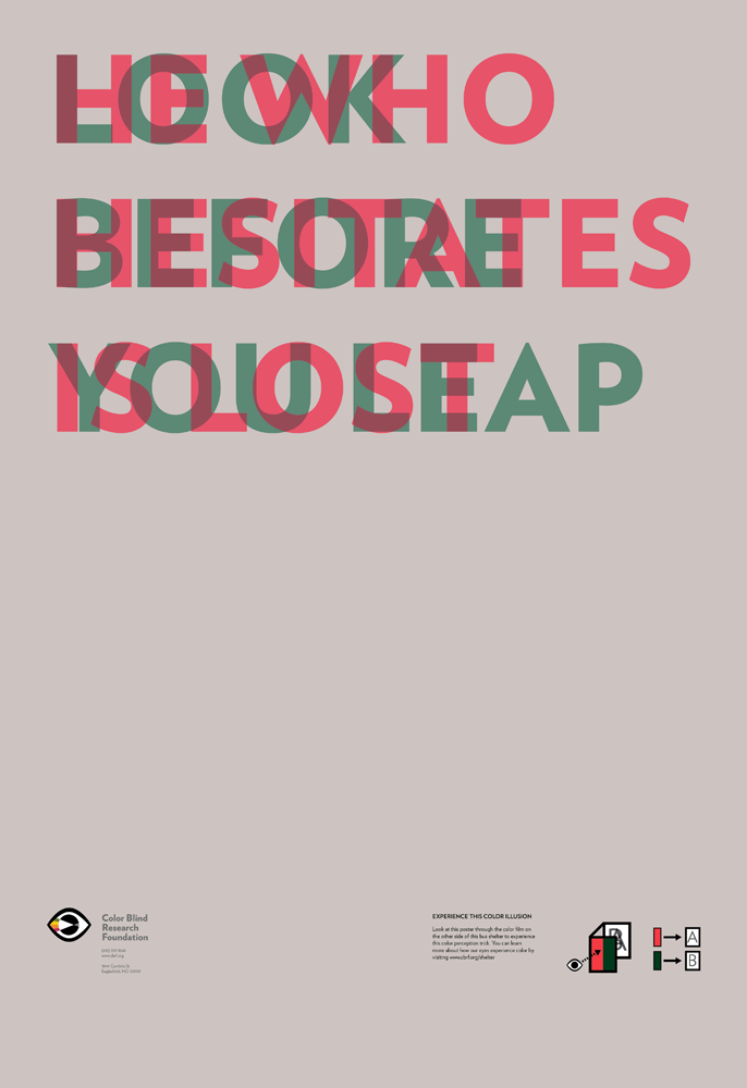
The simplicity of this poster emanates professionalism due to the sans serif font and large amounts of whitespace. They also use a stereoscopic 3D effect that creates a very visually interesting image. As well as this, it uses far more muted colours than what you would usually see in stereoscopic effects which further promotes this professionalism.
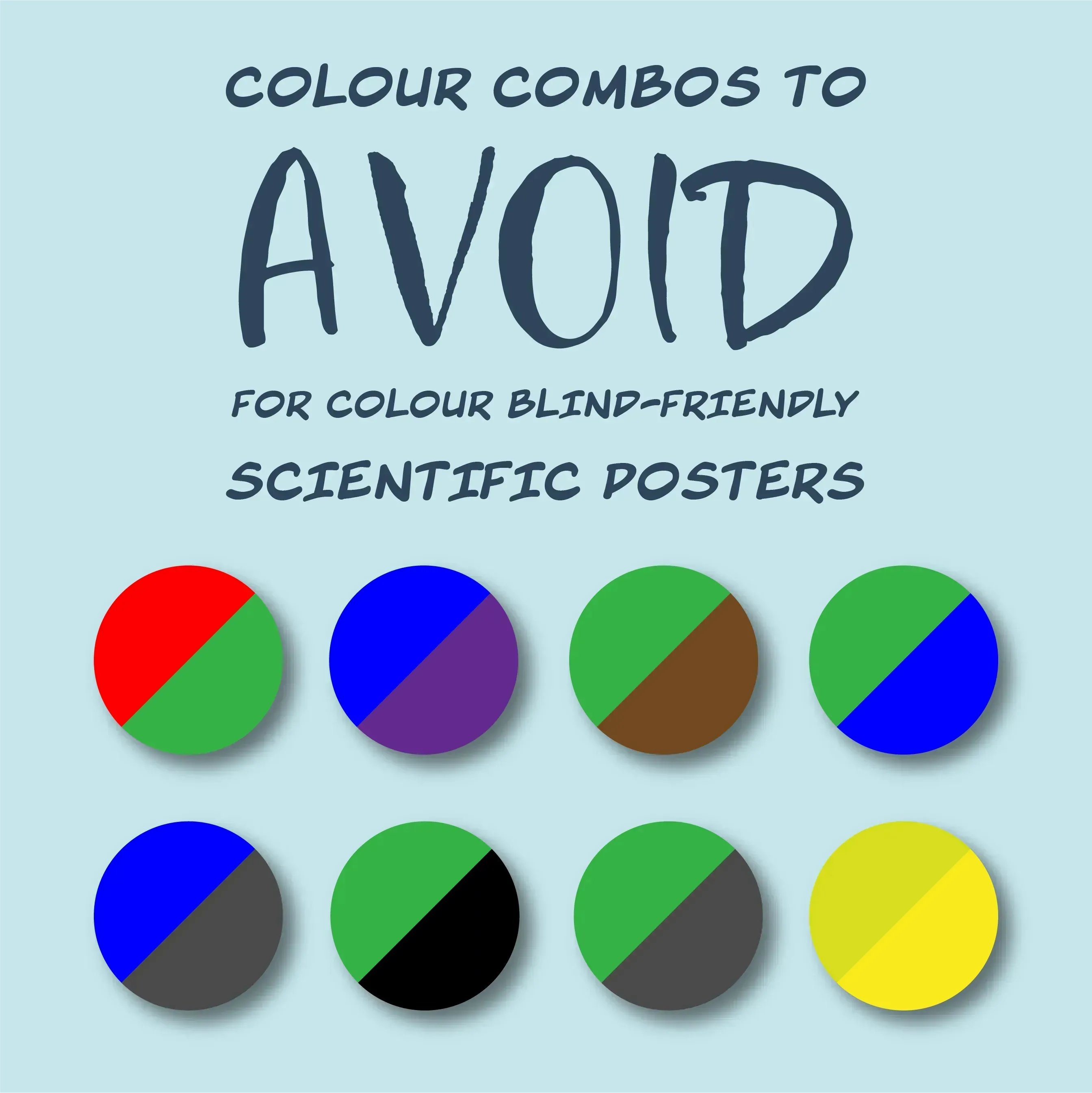
This poster is very informative and raises a very unknown issue regarding colours used to present diagrams, as red/green, the most commonly used, are often very difficult to see for people suffering from Deuteranopia. It presents this information in the form of colour swatches, however, the typography does make it seem rather unprofessional
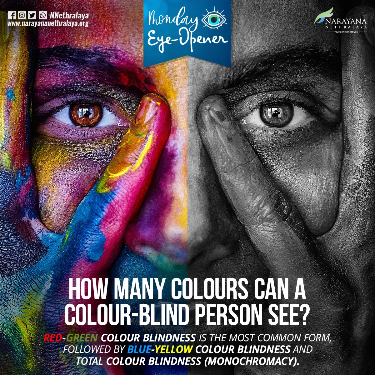
The juxtaposition between the two half’s creates a very visually powerful image. On one side you have the vibrant colours that most people see, and on the other side you have the severe form of colour blindness called monochromacy.
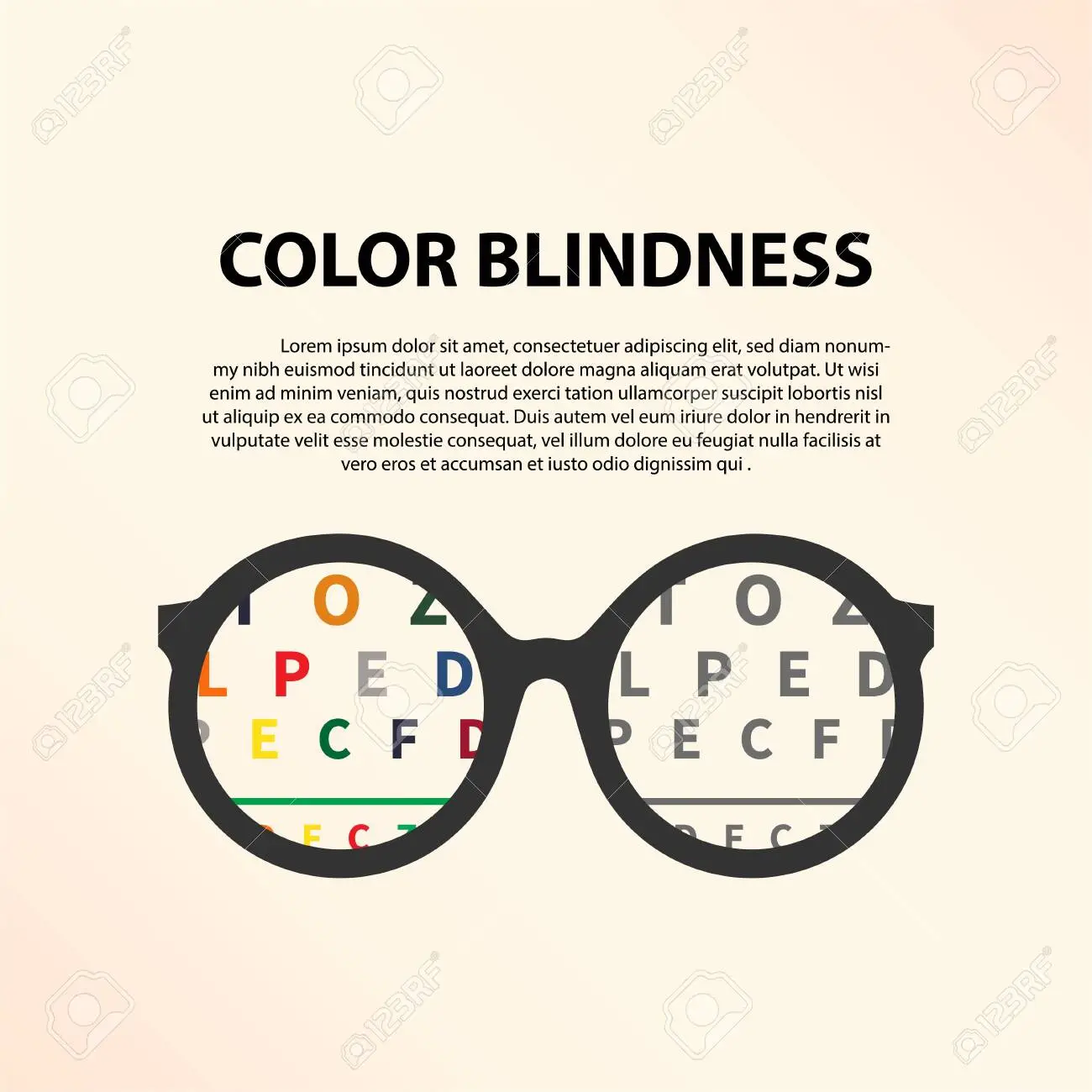
Whilst this is more of a concept rather than an actual poster, the idea of having some information that gets revealed through the glasses is very striking, and it creates a simple but effective focal point for the audience.
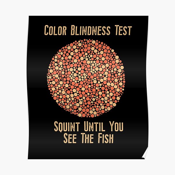
This poster uses an Ishihara Test to help to engage the audience, making it far more likely to cause an impression on them and they are therefore more likely to remember it. It also sparks conversation amongst friends as they are likely to want to find out how much others needed to squint to see it.