Response 1
This response is primarily inspired by David Carson and his grunge work
Layout
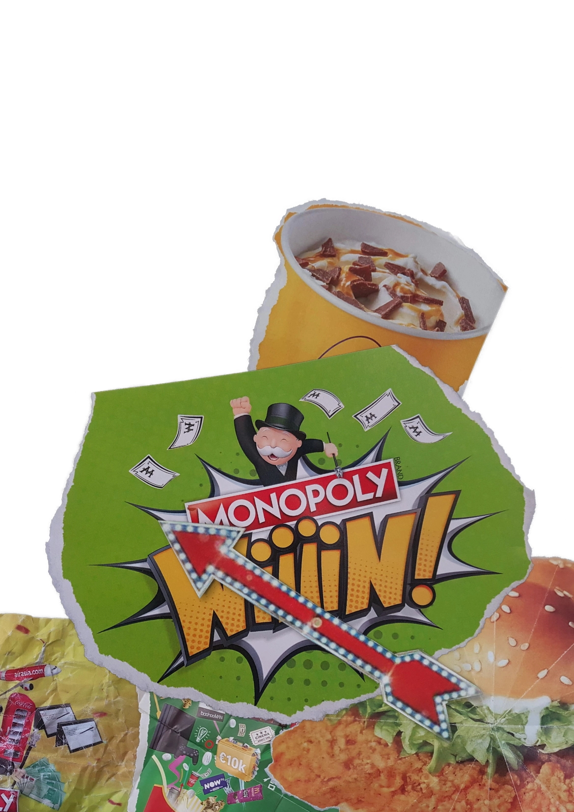
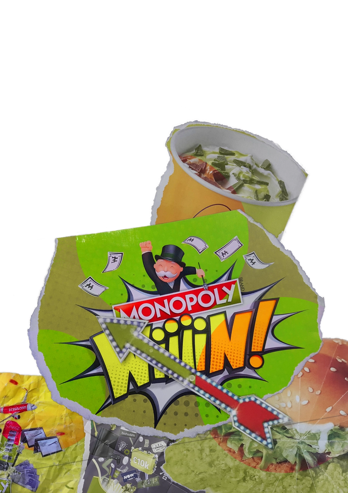
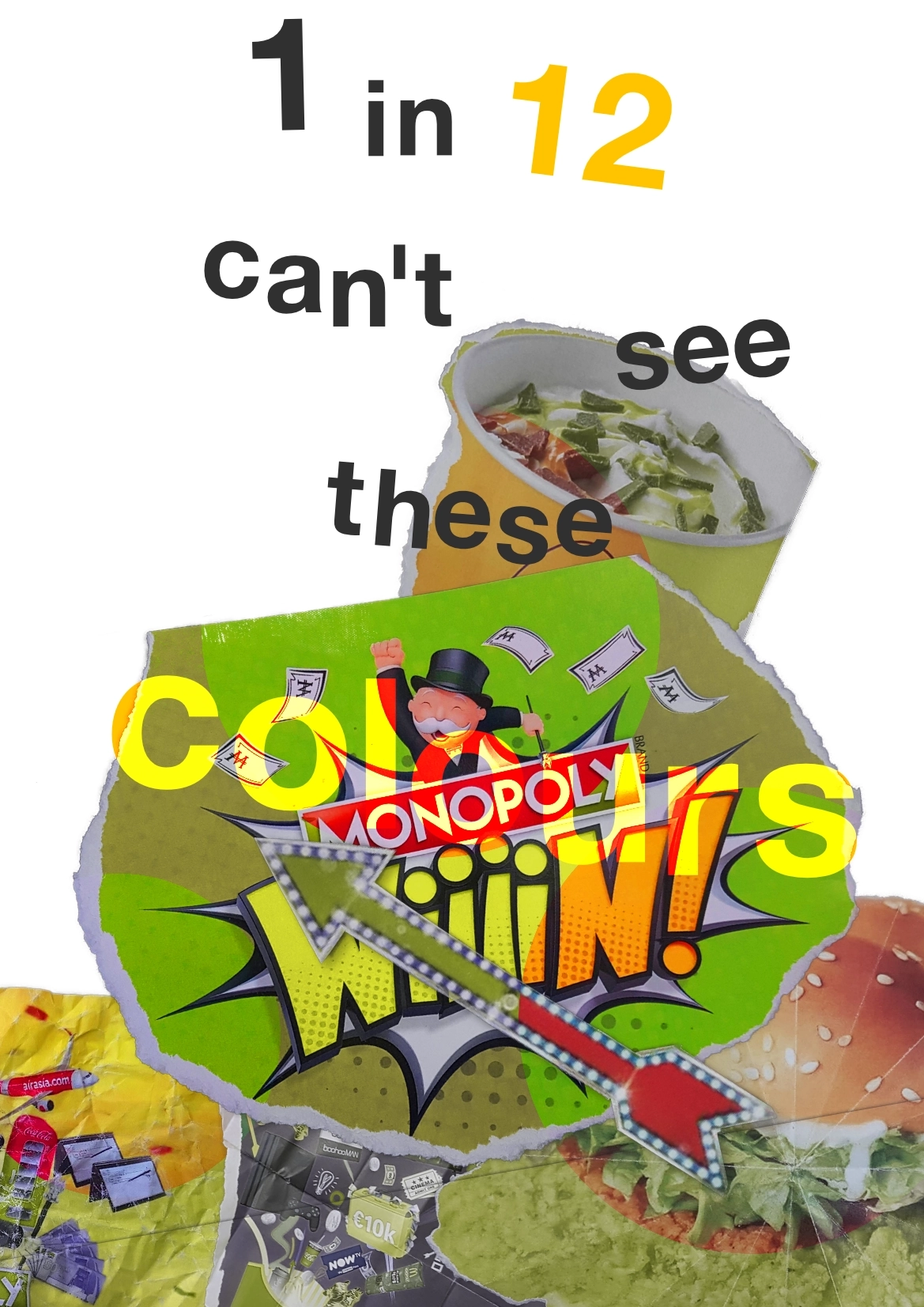
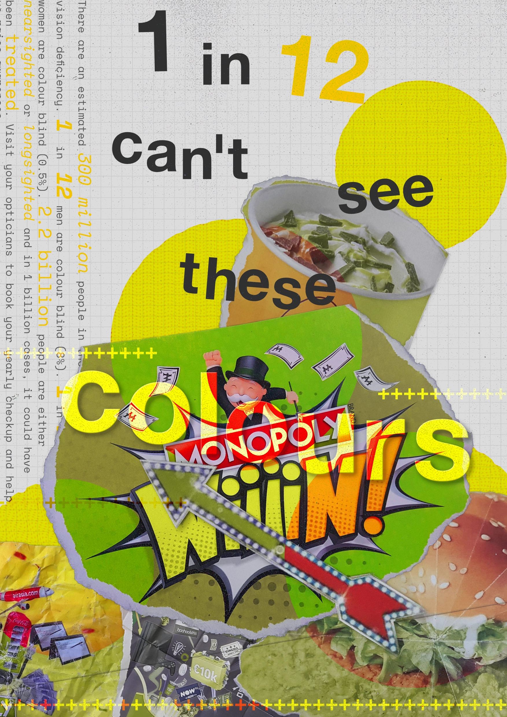
I first started off by importing photos of various elements that I had printed and then torn and scrunched up. I really like this composition as it creates almost a mountain of content that many people aren’t able to fully interpret. I really want to continue this trend throughout the rest of the design, mimicking it with the typography.
I then added these peepholes through the colourblind versions into the original designs. This is to help give others a taste of what living with colourblindness is like. It also helps to link it back to the polka dots used by Kusama. I then added the text that I wanted to display. The font is Helvetica Neue, the same font that Carson used in his own work. Whilst it does look quite plain, it does clearly display the information
Additions
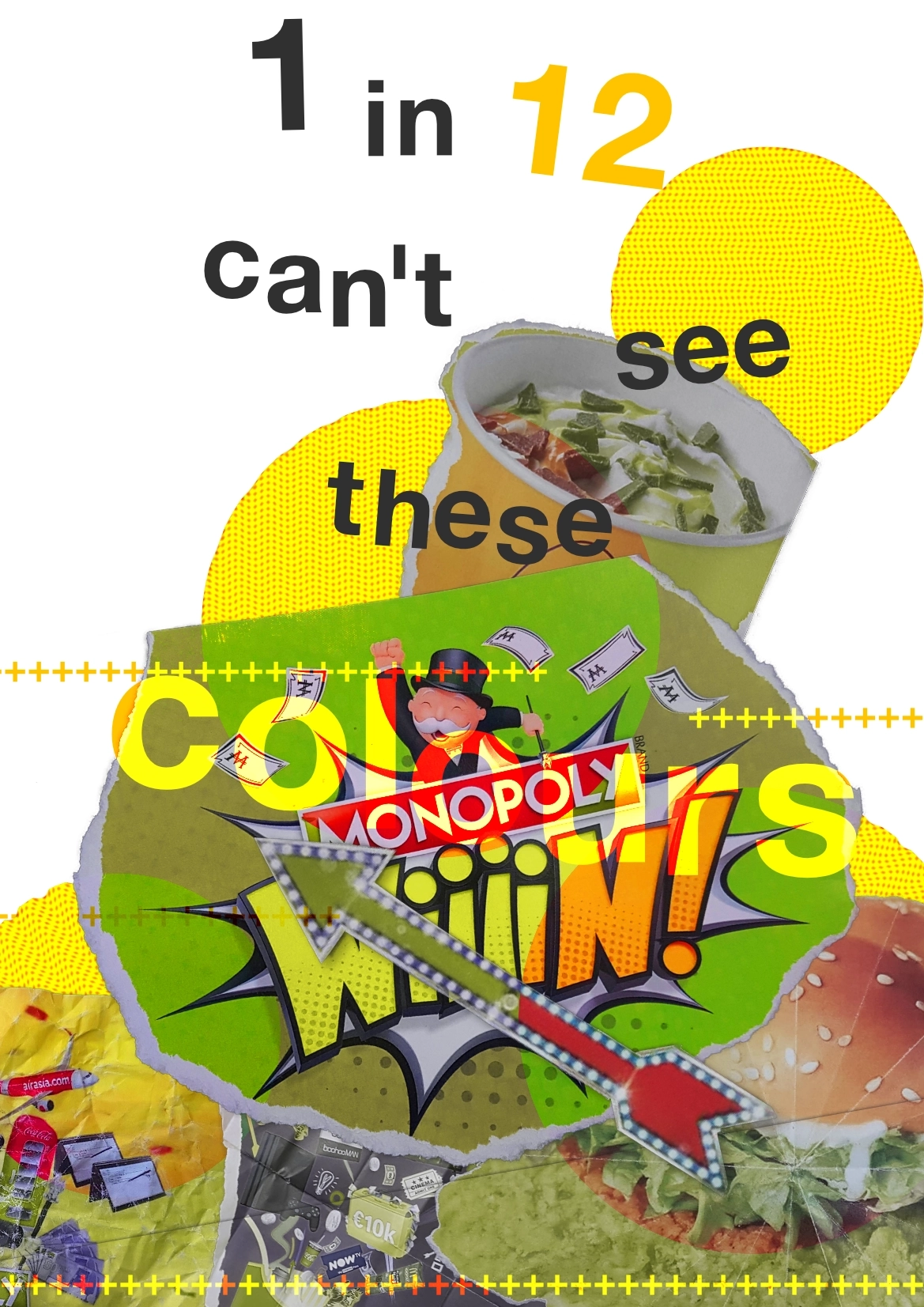
I then added the plus signs that are also often seen in some of Carson’s work. They help to add some texture to the designs and break up the otherwise very complex designs beneath. I also added a background to the peepholes to help define them a bit better, as they were getting quite lost as the design got busier. This small change really helps to highlight them as it guides the eye and fills in the whitespace caused by the peepholes.

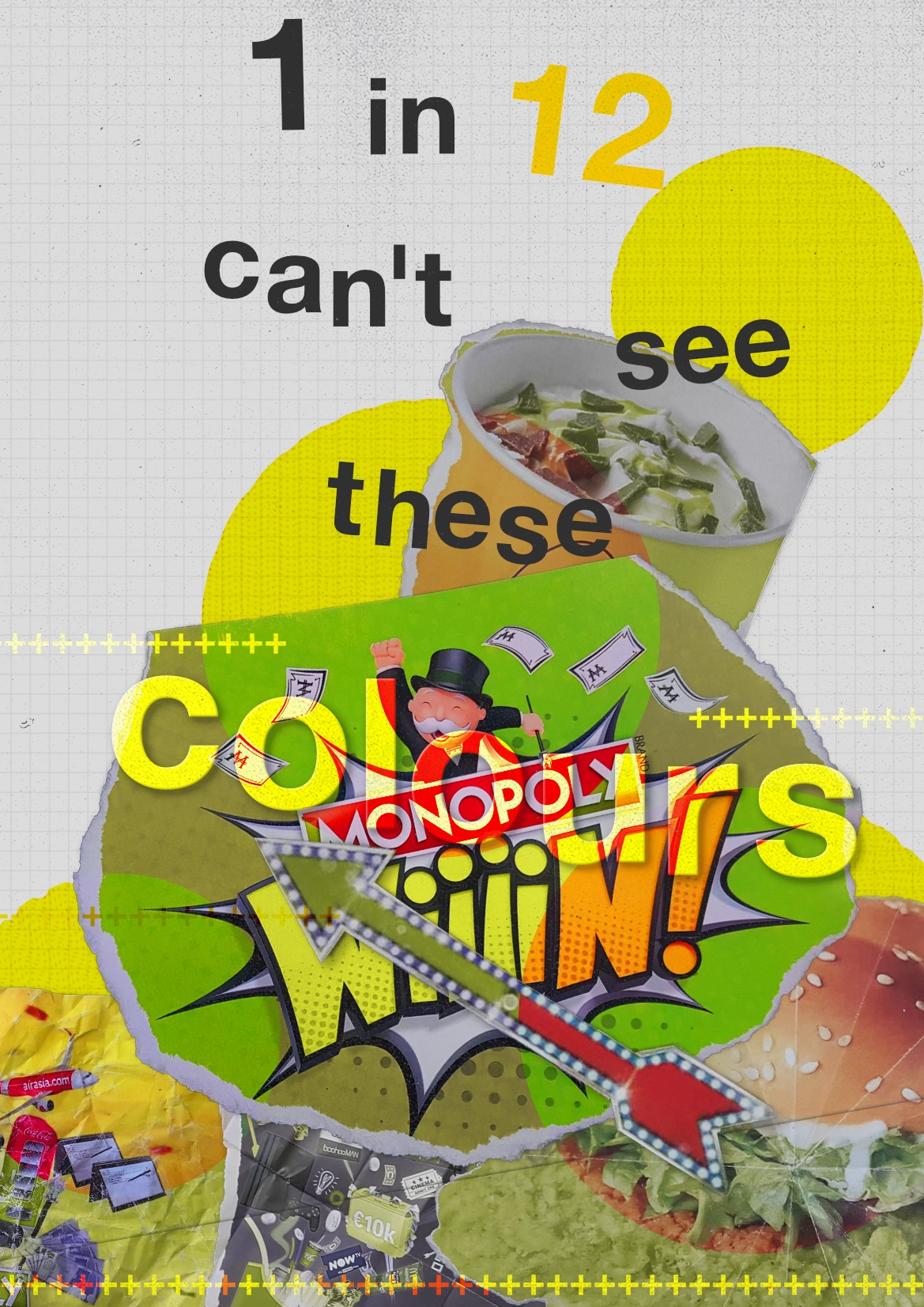
I then added a grid in the background to help break up the empty space. I also added a slight bevel and shadow to the “colours” text as it was getting lost among all the other elements and starting to get quite difficult to read. I also added the perpendicular text that Carson used to further fill in some of the whitespace. This helped to balance the design much more as there was a lot more whitespace on that side.
Adjustments
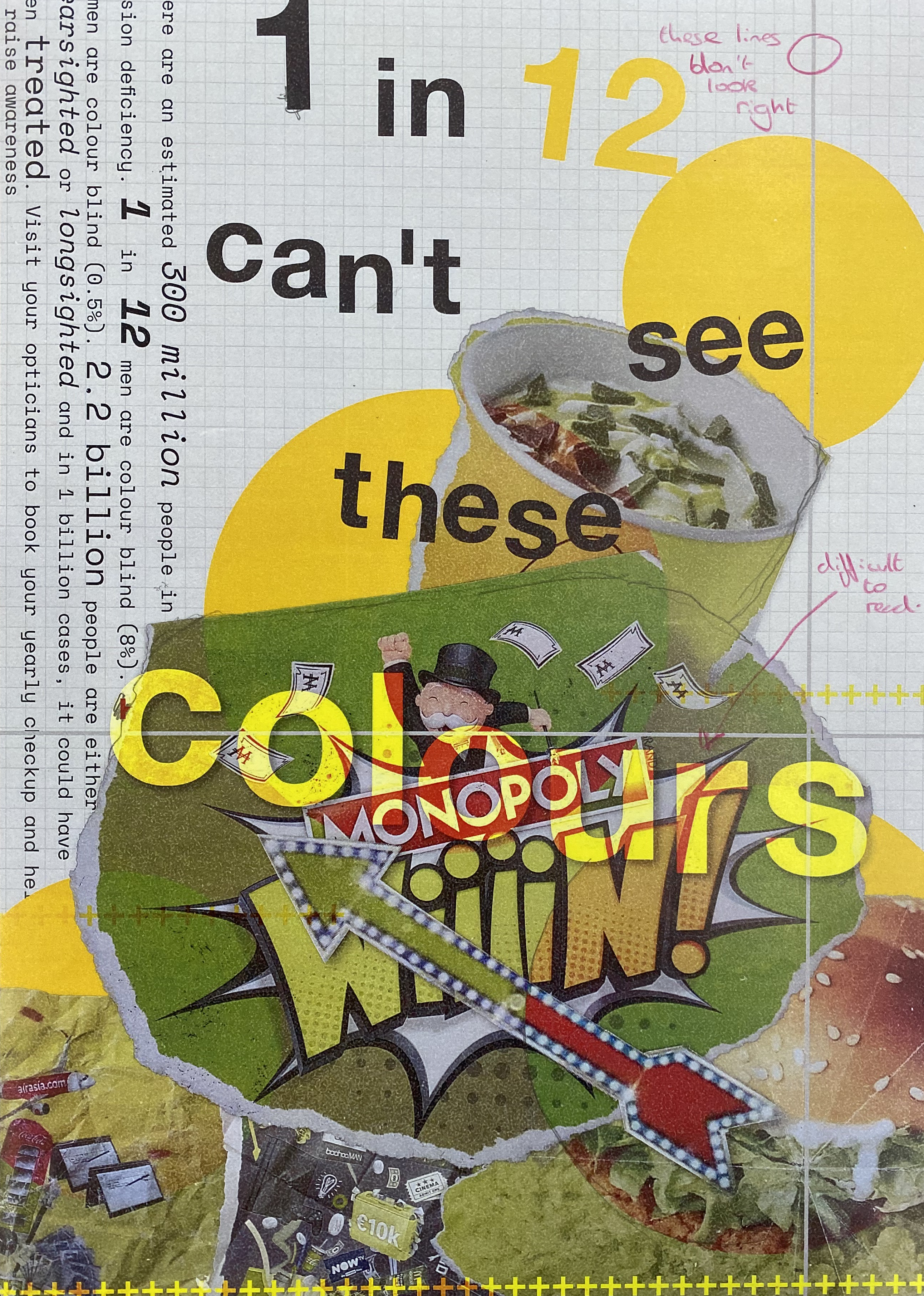
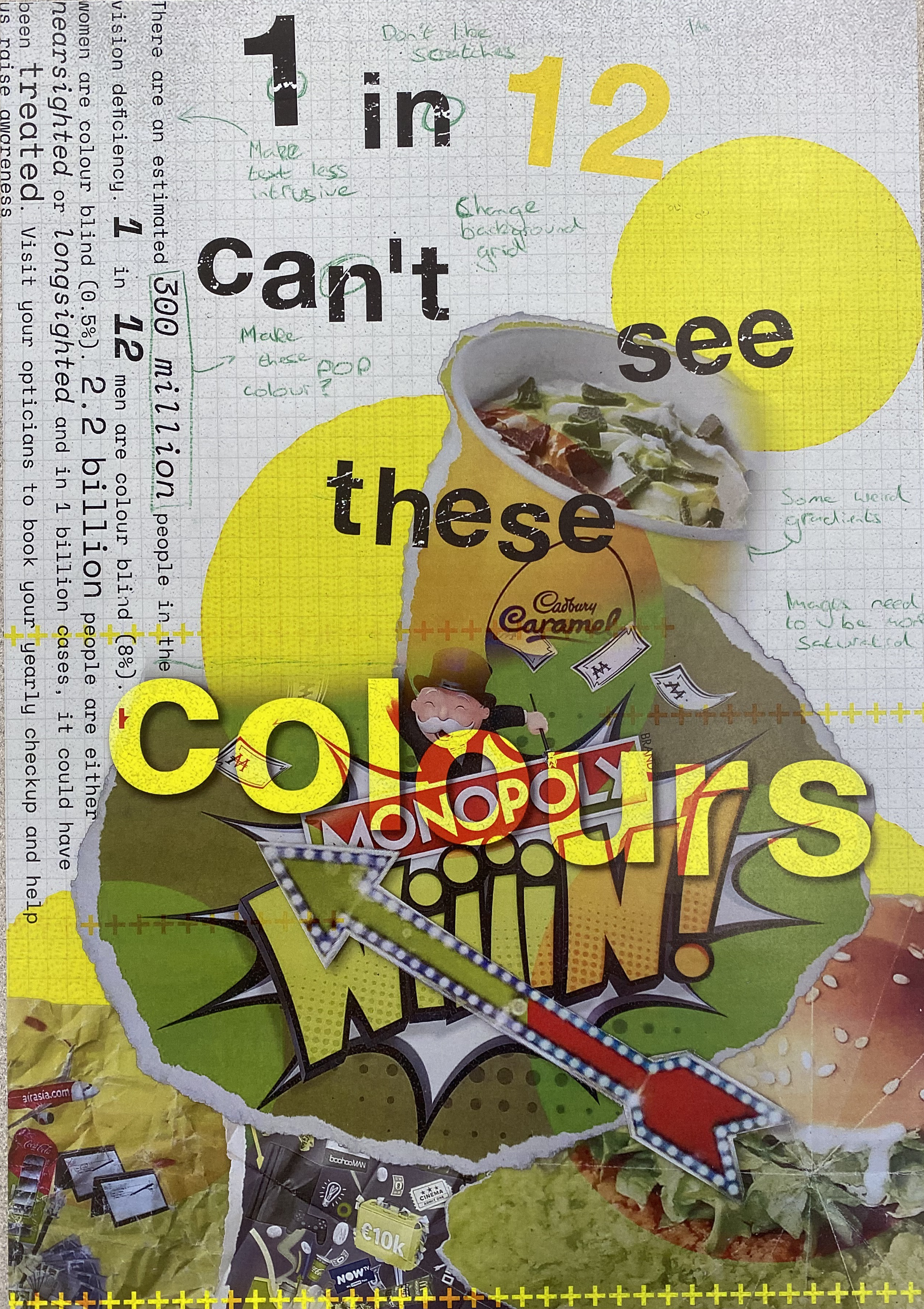
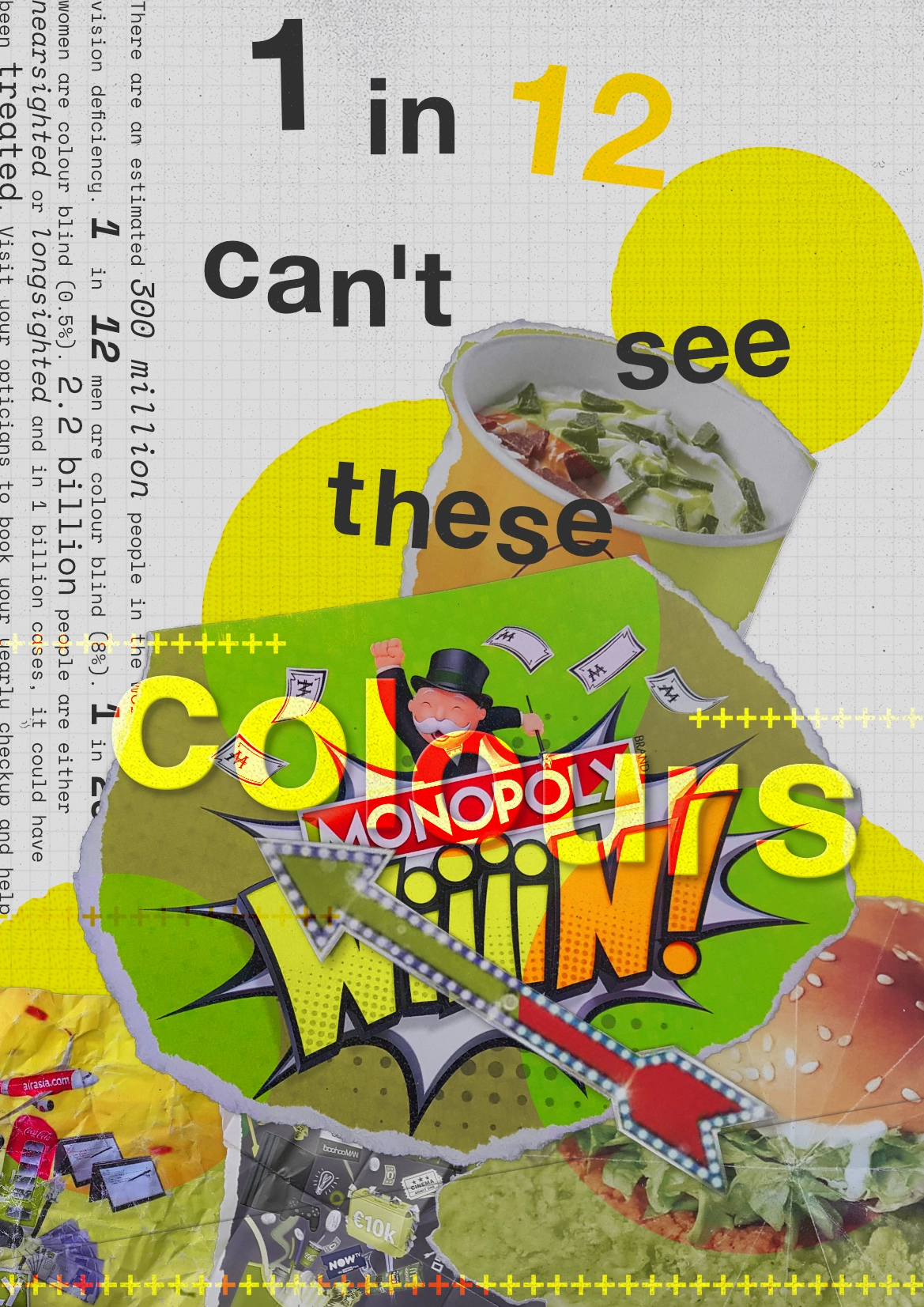
Throughout the development of the outcome, I would print out my work and annotate any issues or adjustments I wanted to make: