My Response
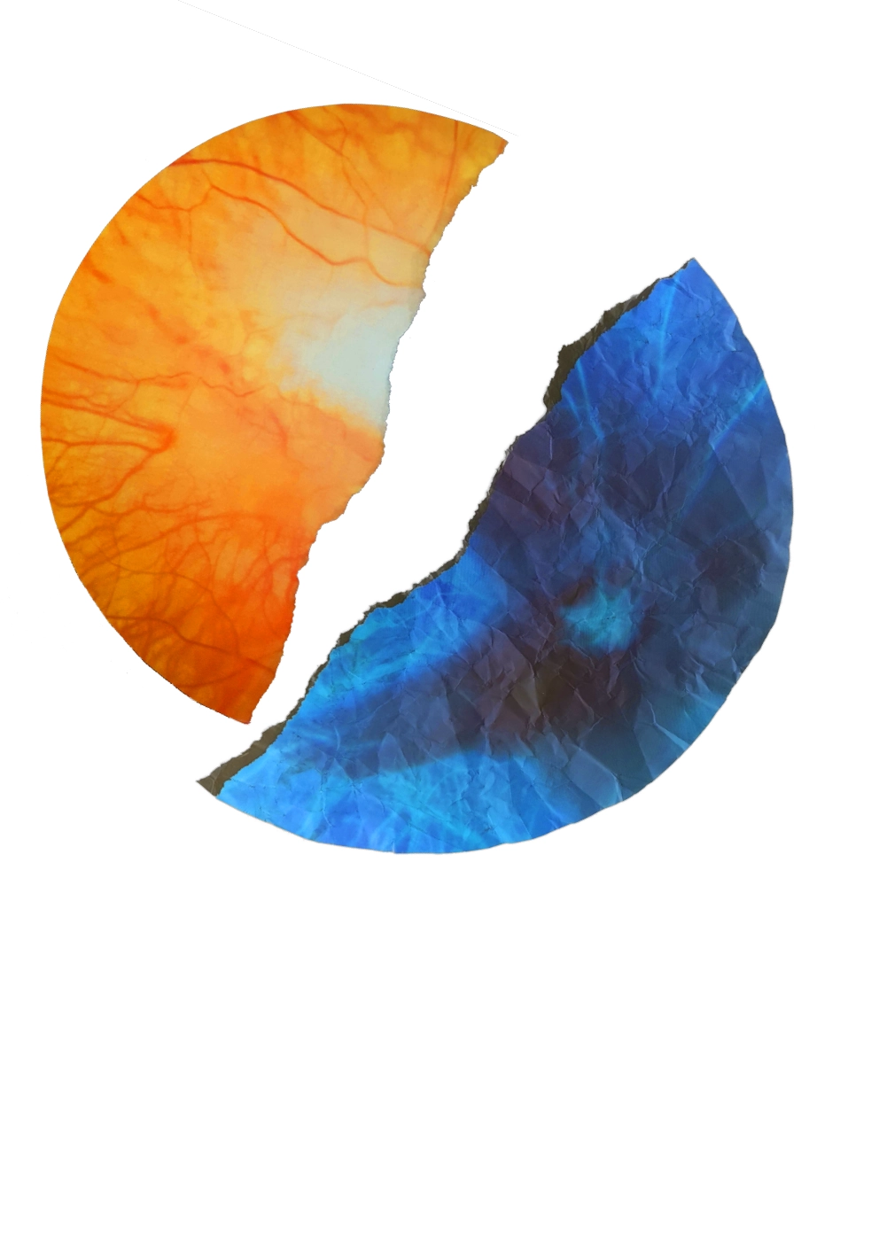
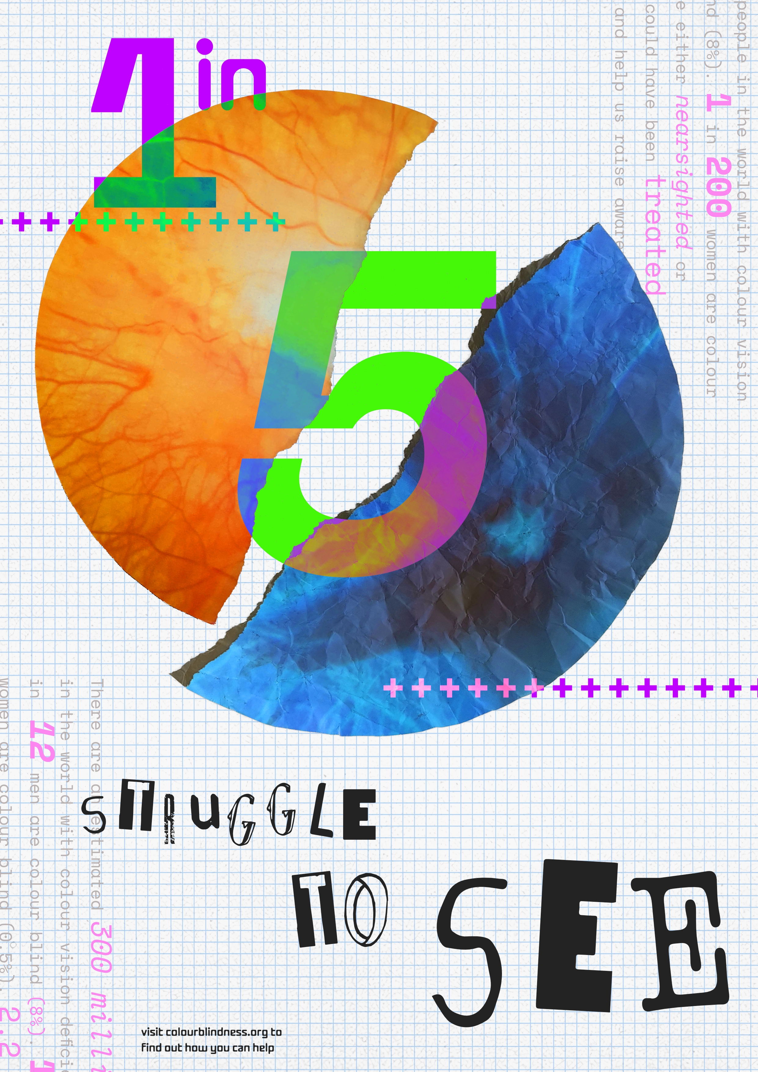
For my response to his work I really wanted to use a picture I obtained of my eye from a recent visit to the opticians. On the left is my right eye, which has myelinated nerve fibres, severely decreasing my vision in it. The white patches is where my vision is effected, so my peripheral vision is unaffected. On the right is an image of what is considered a normal eye.
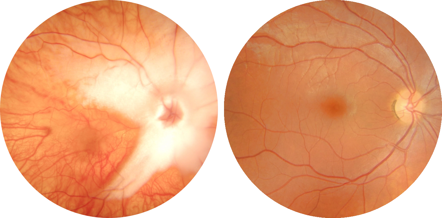
I want this poster to visually demonstrate what a “Broken” eye looks like, and to still represent useful statistics regarding colourblindness.
Font Experiments
A major part of Carson’s work is his distinctive font choices. He often uses a variety of fonts, combining them to create something similar to that of a ransom note. Other times he uses fonts often used in printmaking, where he’ll emmulate the artefacts and discrepancies often seen in those styles.
Rough Layout
I first started by trying to get a good composition of elements. I knew that I wanted my eye to be the focal point, and I eventually came to the idea of fracturing it into a good side and a bad side. I originally made the fracture digitally, but didn’t like how it looked, so I printed a picture of it off and physically ripped it. I also scrunched the bad side up to further cement the idea of it being broken.
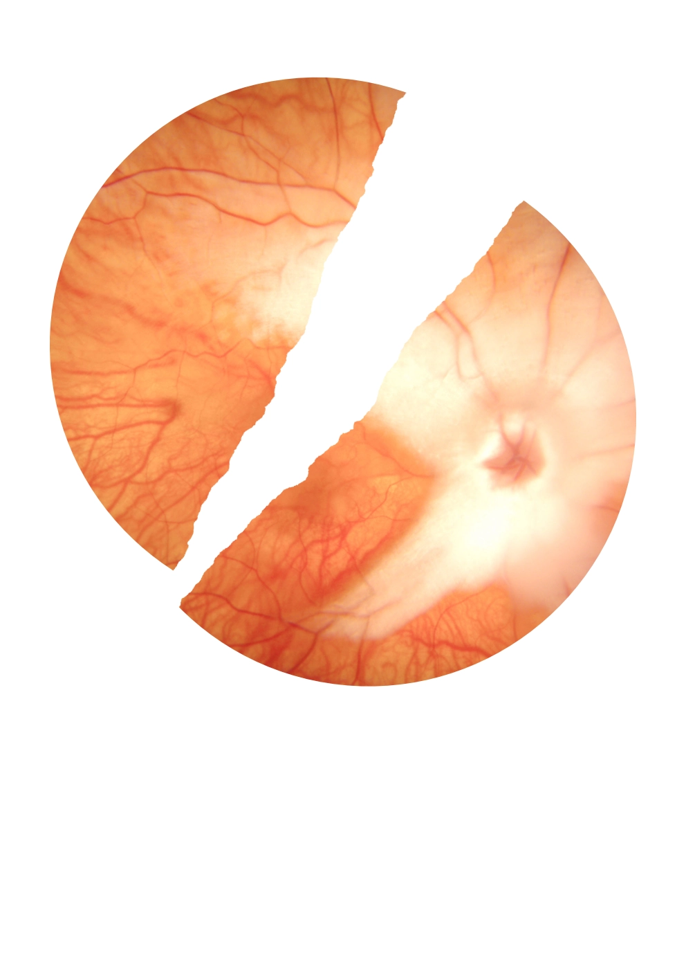
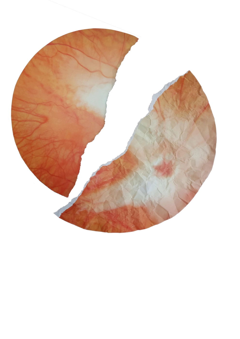
I then also applied some processing effects such as adjusting thee hue and saturation and inverting the bad side to make it look more exciting.
I then started to add the information that I wanted to display. I really like the statistic that 1 in 5 people have issues with vision and I wanted to make it front and centre. Similar to Carson’s work I used a mismatch of fonts at varying sizes and rotations. I also decided to add perpendicular text containing more statistics and figures, similar to Carson.

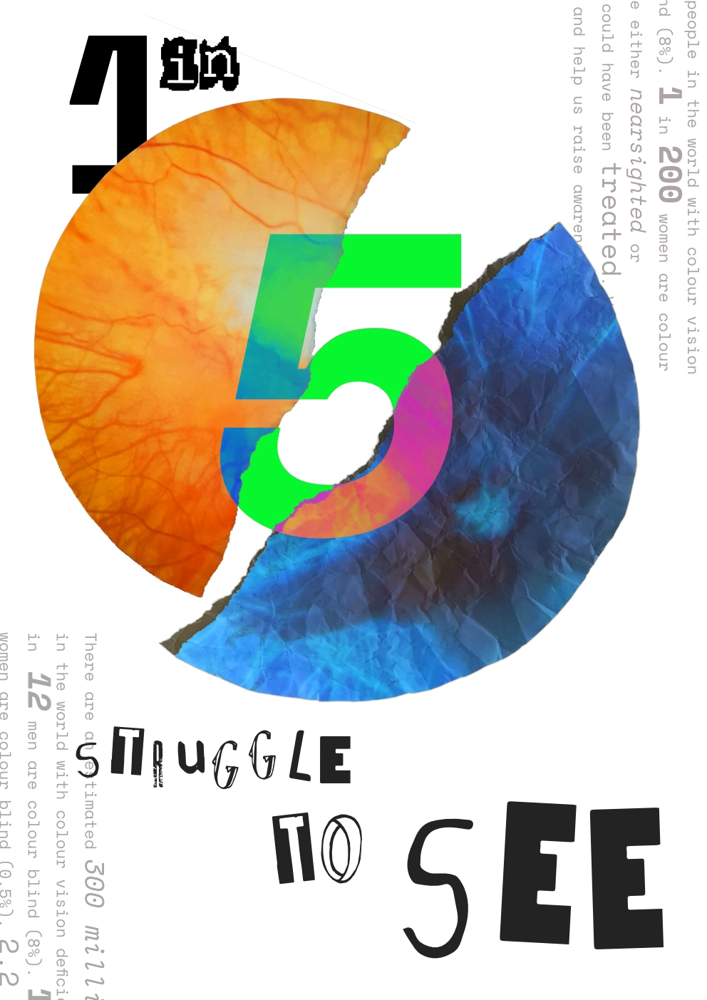
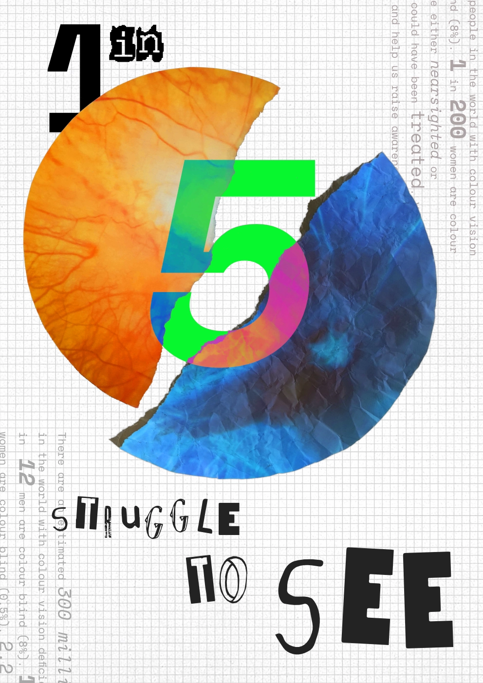
Finally, I added a grid in the background to help fill in the empty space.
Iterations
To help me visualise how the design will look as an actual poster, I printed it out and annotated different parts that I liked/didn’t like. This is very useful as often the design can look completely different printed to how it does on screen.
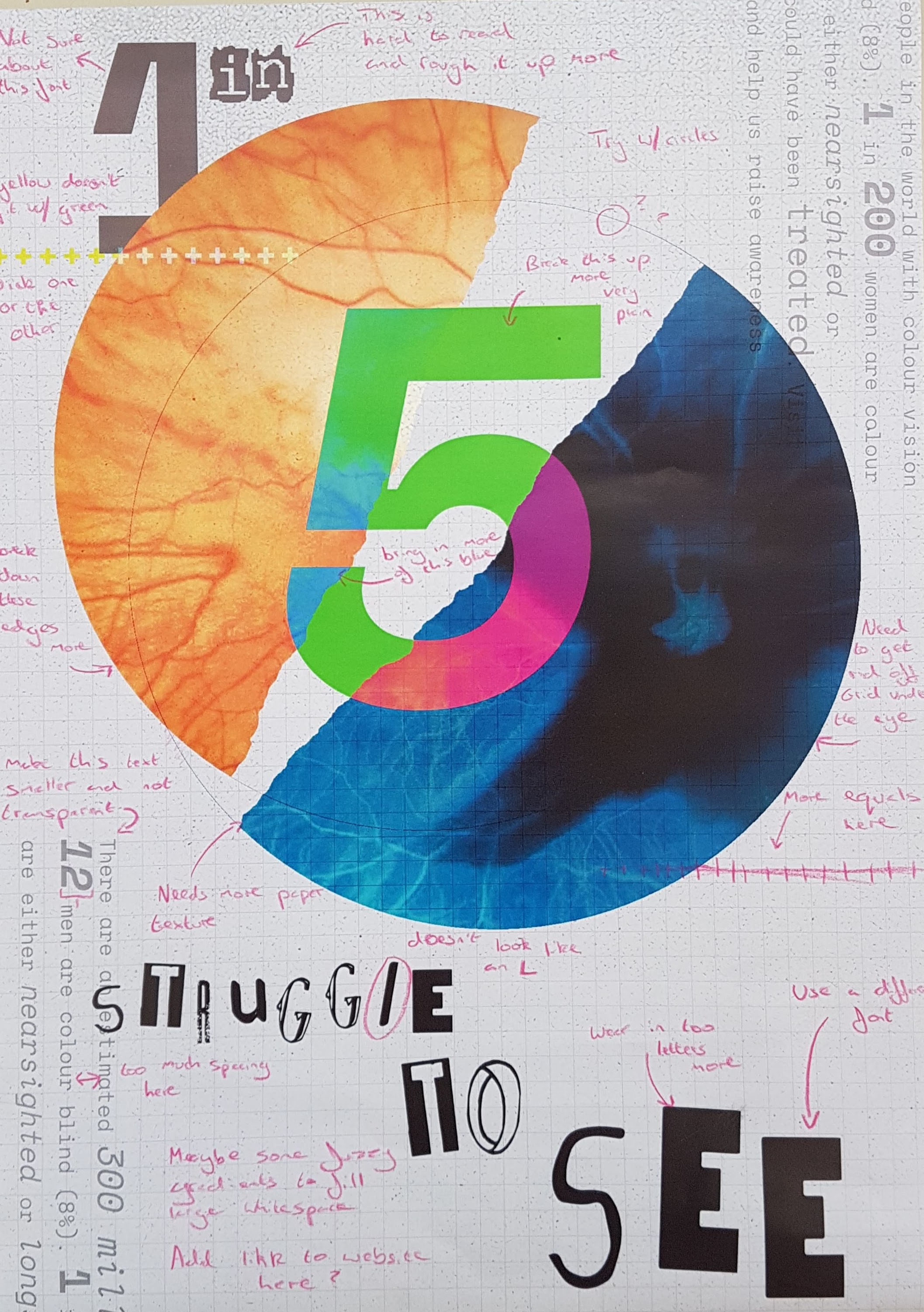
Based on the feedback I created here, I then came up with this second design:
Whilst this design is certainly an improvement, I still wasn’t happy with the colours and it seemed very disjointed and garish. In an attempt to fix this, I applied a filter that makes it appear like it would to people with Tritanopia, a form of colour blindness

This filter really makes the whole design seem far more cohesive and professional.