My Responses
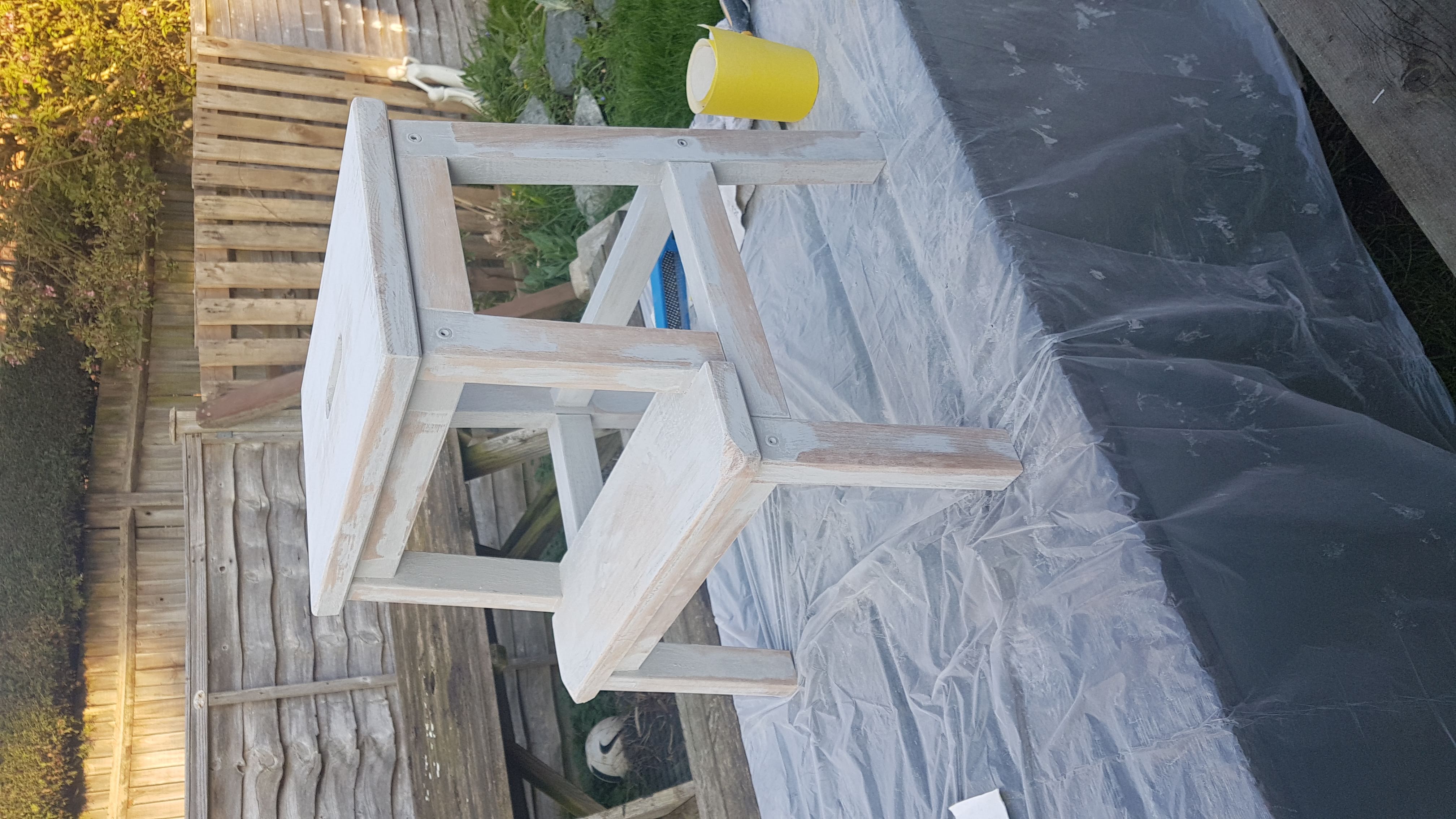
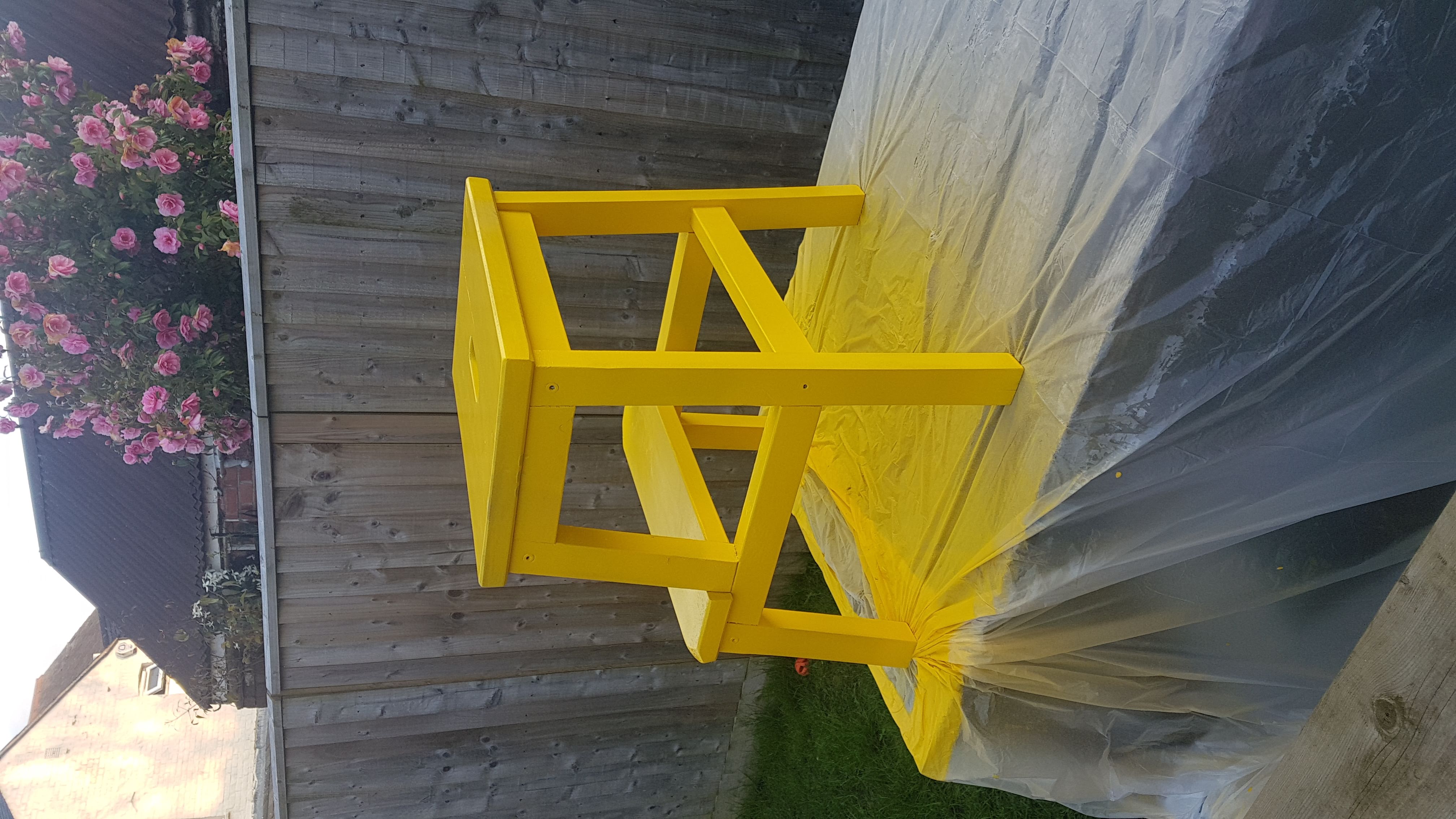
Step Stool
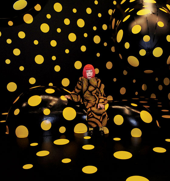
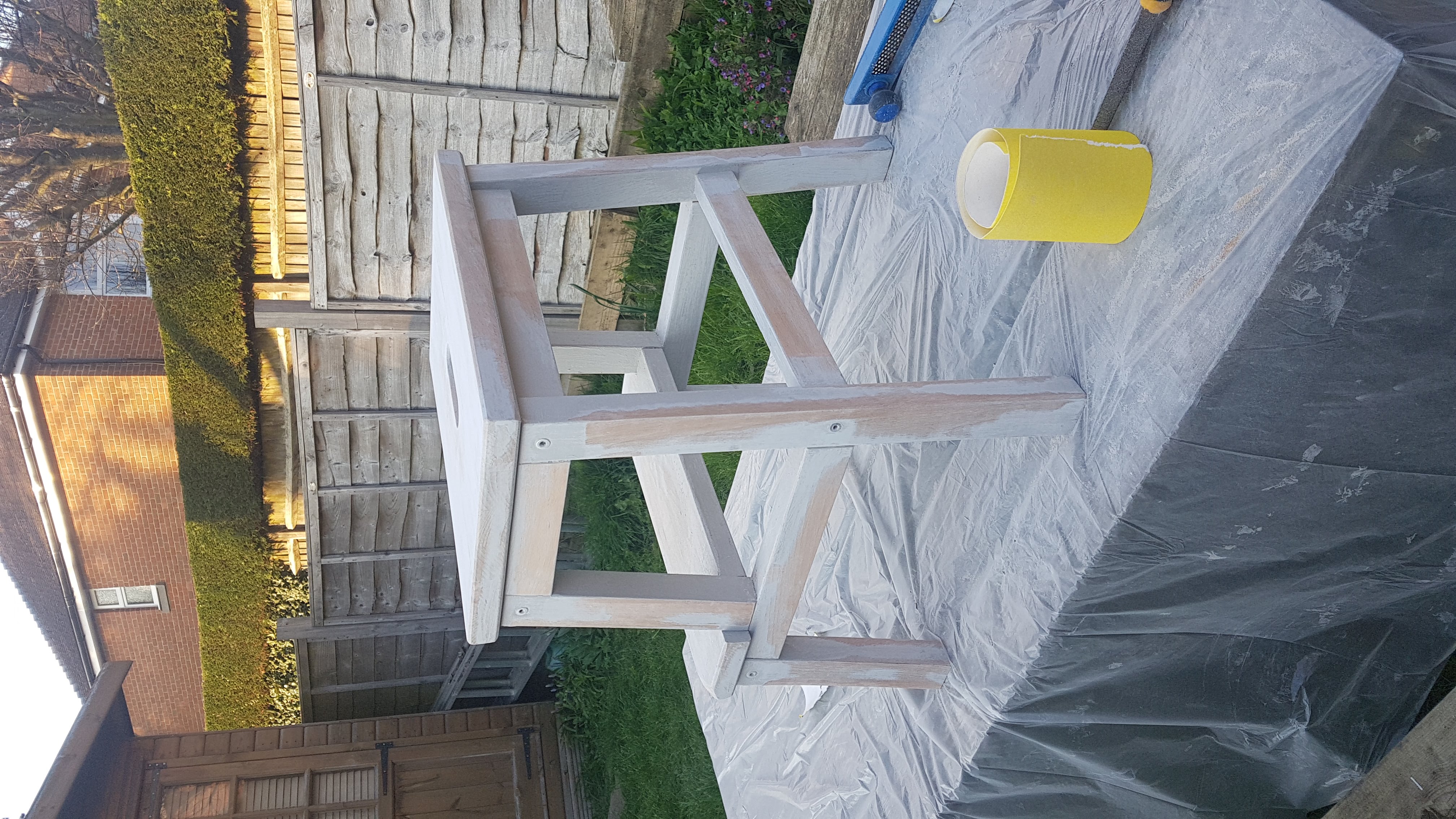
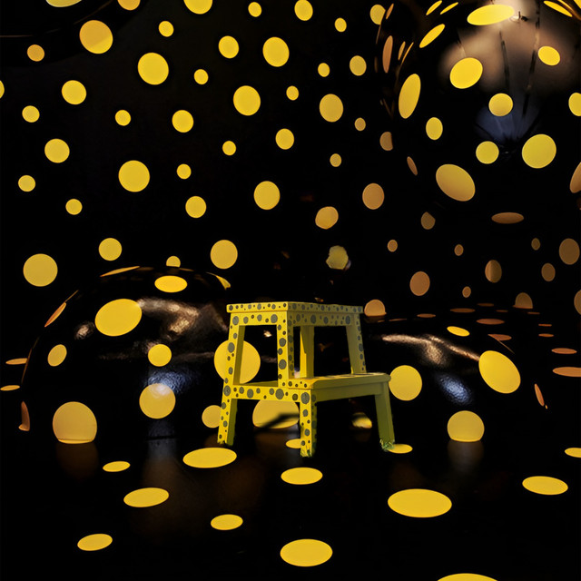
As a response to her work I decided to paint an old stool we had in a style similar to hers. I first sanded it, then I spray painted it yellow and then painted on her iconic black dots. I was inspired by this image, specifically the environment around it:
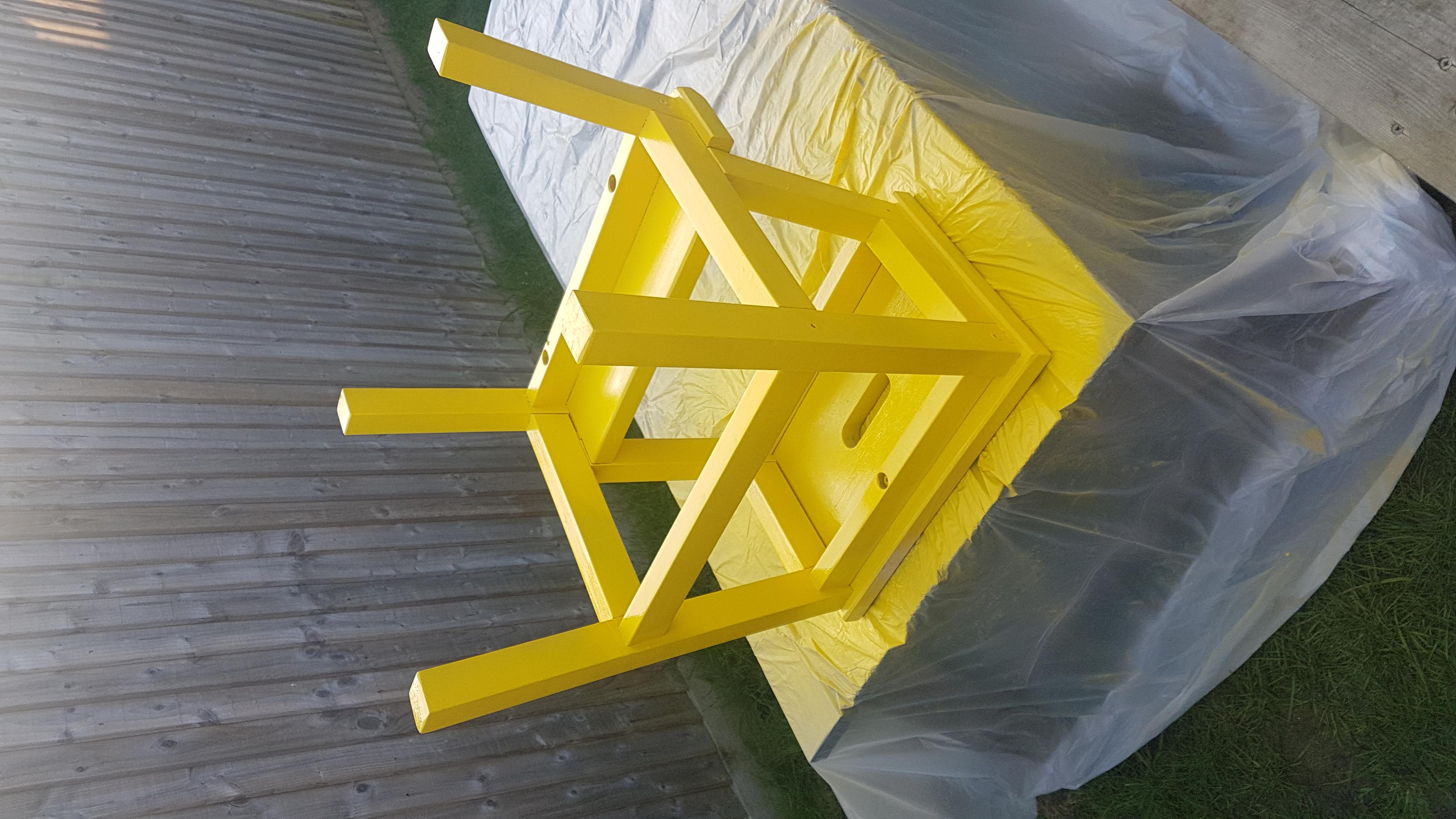
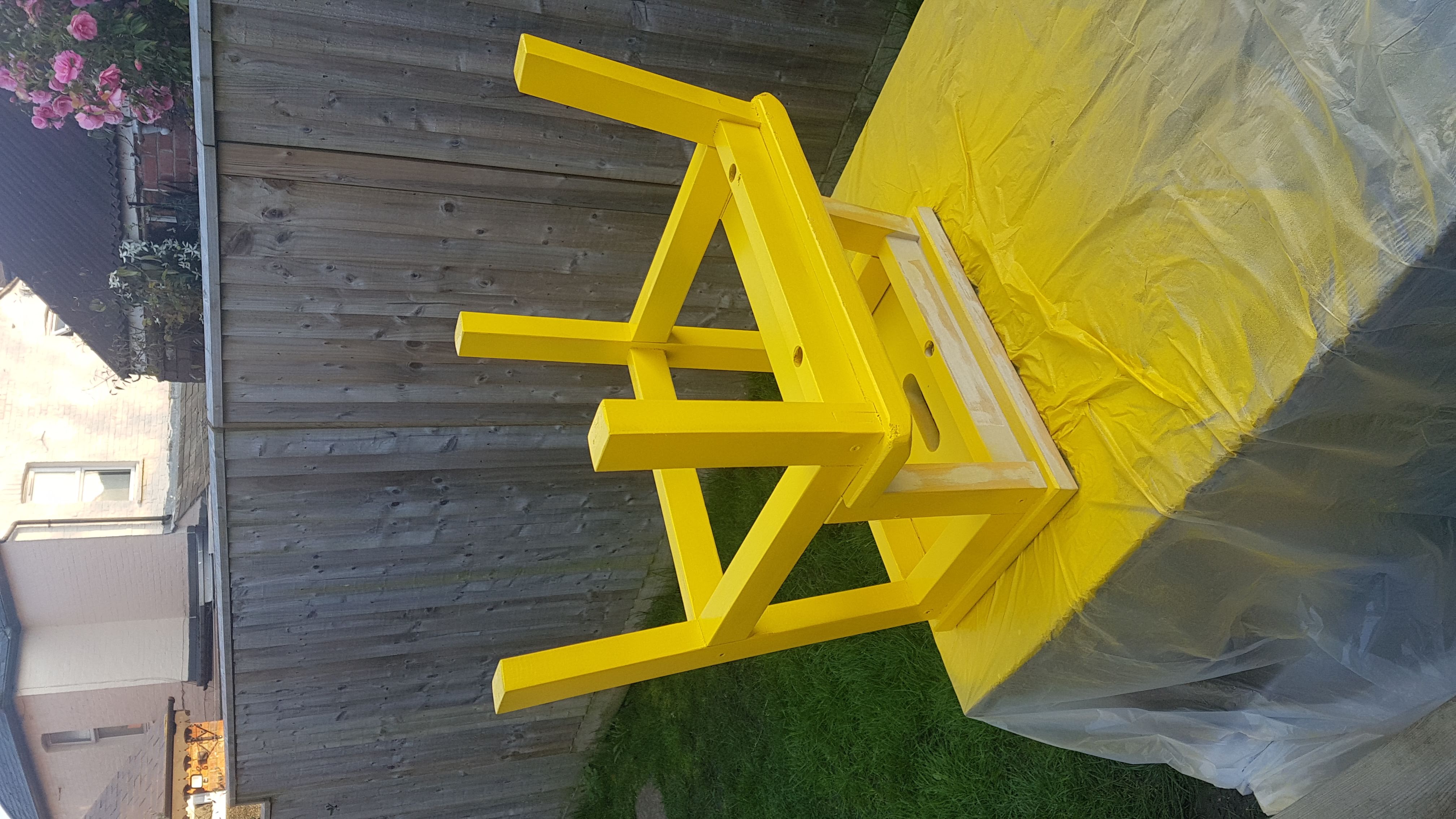
Base Paint
I first started by spray painting the stool a vibrant yellow
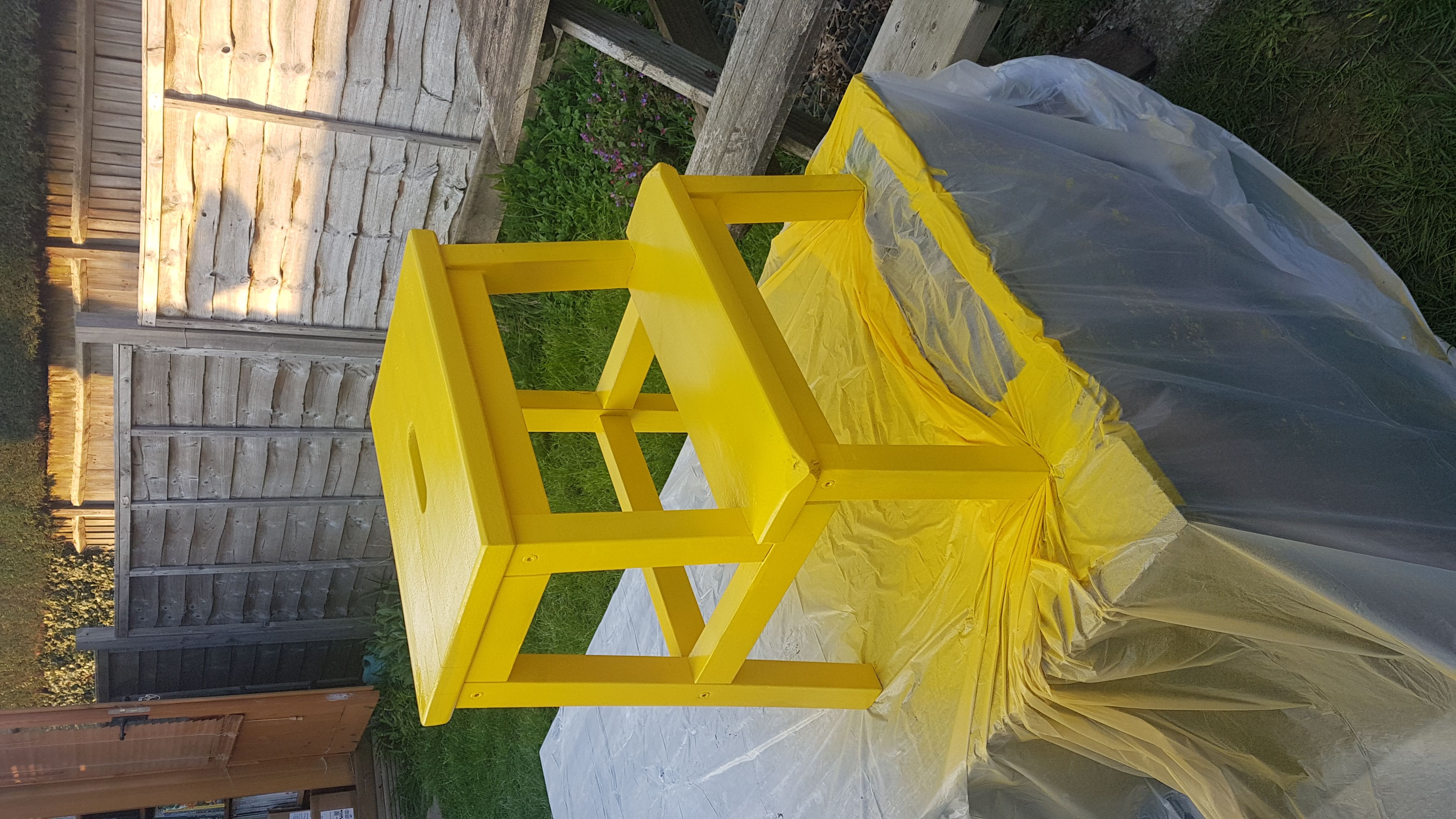
Black Spots
I then added the black polka dots in
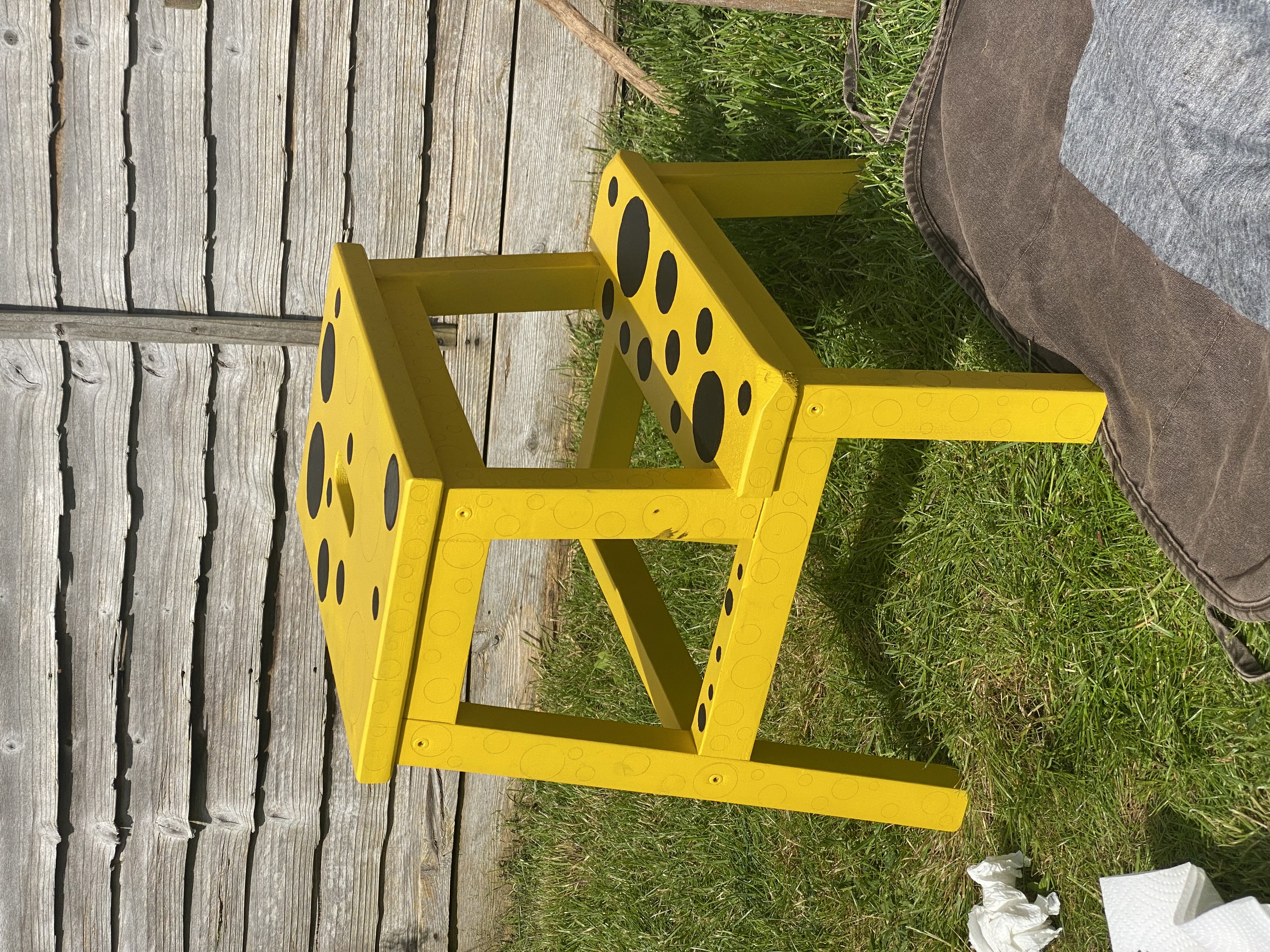
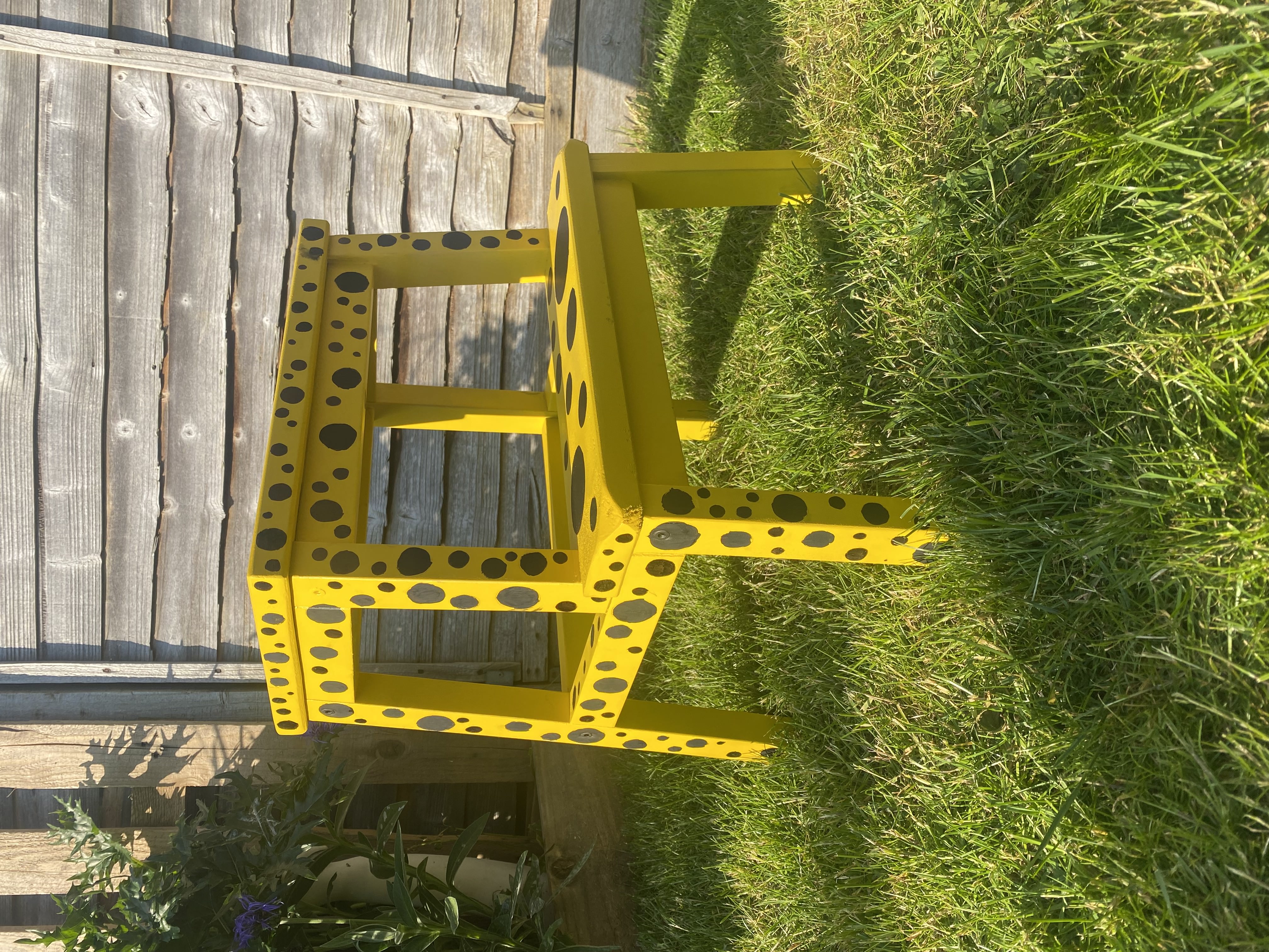
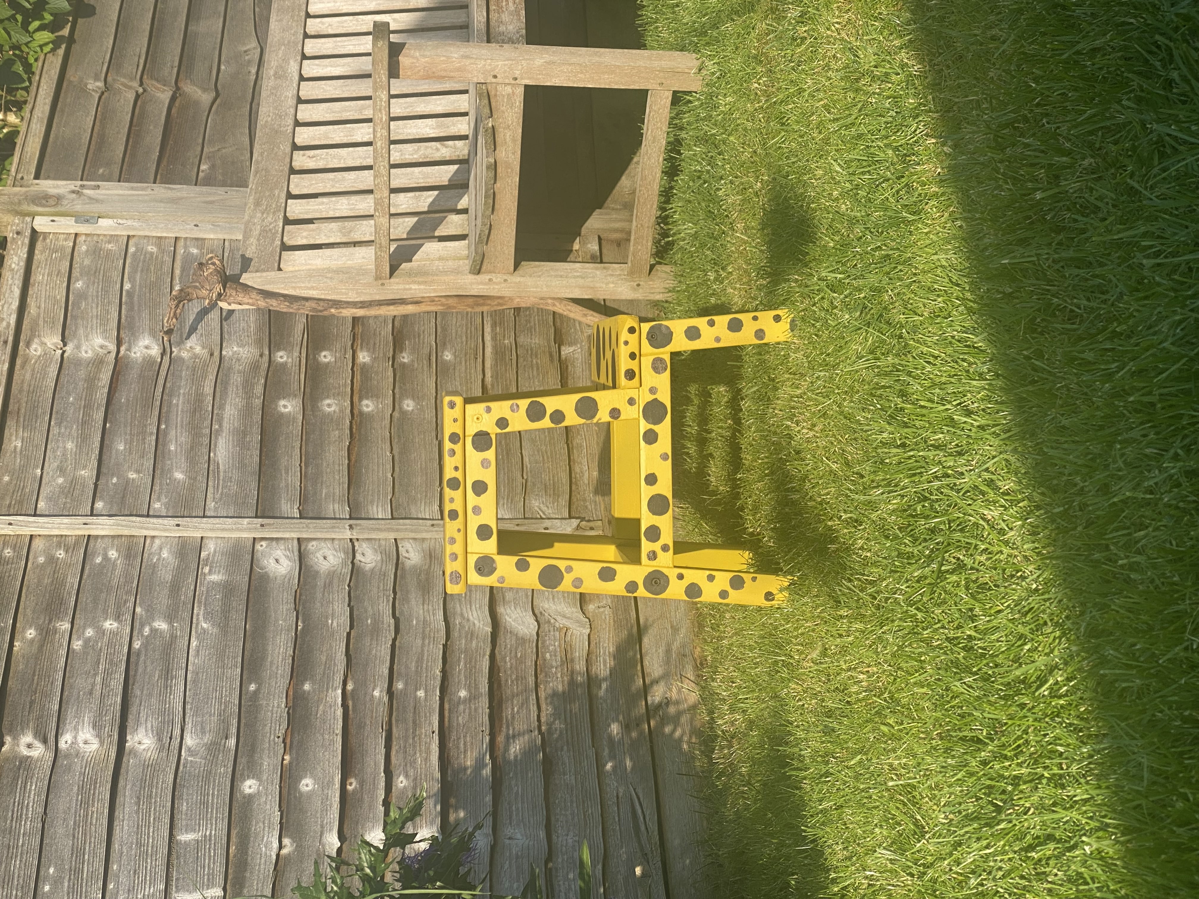
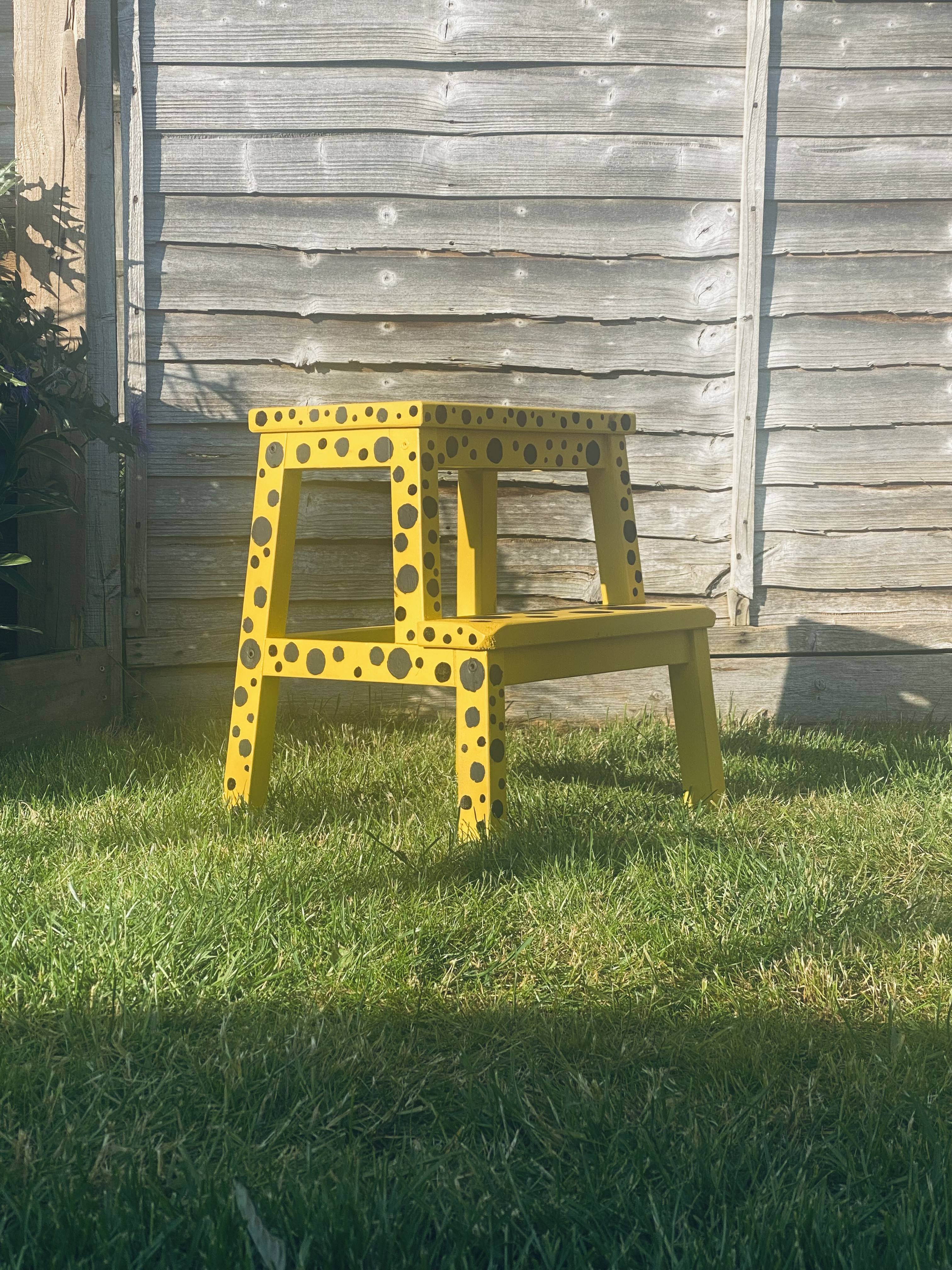

Overall I am very happy with how it turned out and I think that it encapsulates her style very well.
I then removed Kusama from then image and added my stool to it.

→
Experiment
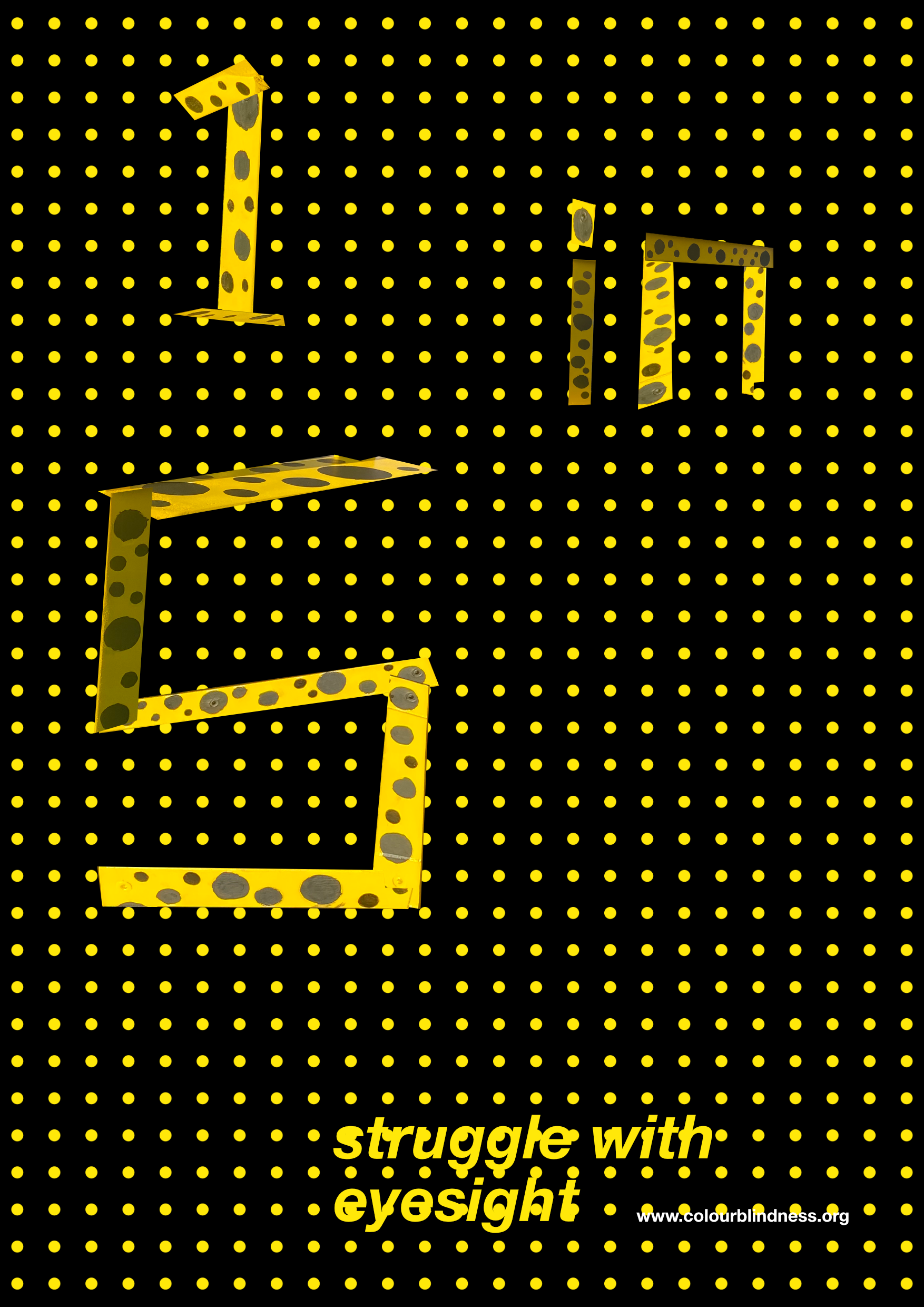
I then experimented with cutting the stool up into various letters and numbers that I could then use in a poster/infographic.

I really wanted to embrace the dotty style from Kusama and decided to continue her style by making the background spotted. I then picked a composition that looked balanced and added a tagline with a link to where you could find more information.
I’m very happy with this layout, but the yellow dots make it very difficult to differentiate between the numbers and the background. To help with this I added a black background to encompass the elements enough to make them visible, but not so big that it takes up too much space.
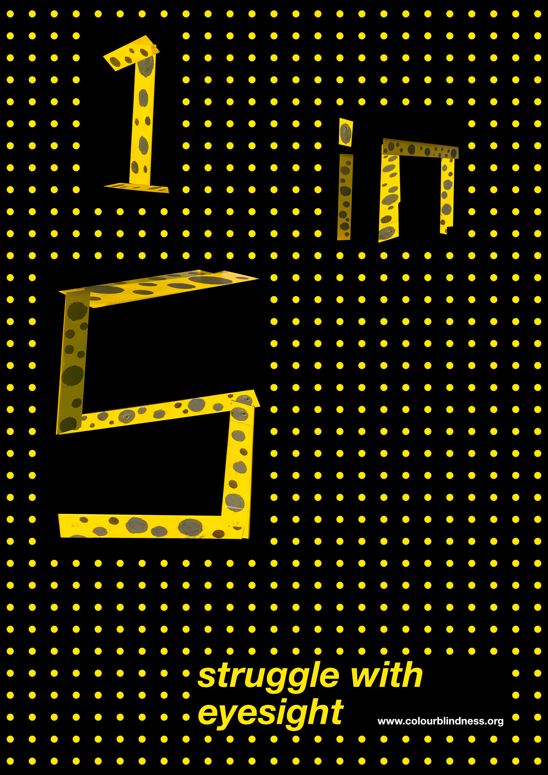
The overall feel of the poster was good, but I felt that it was missing another aspect to help make it pop. To help with this I experimented with adding another layer of circles which would emulate colourblindness. I like the concept of it but I felt that it took up too much of the screen and made it stand out less.

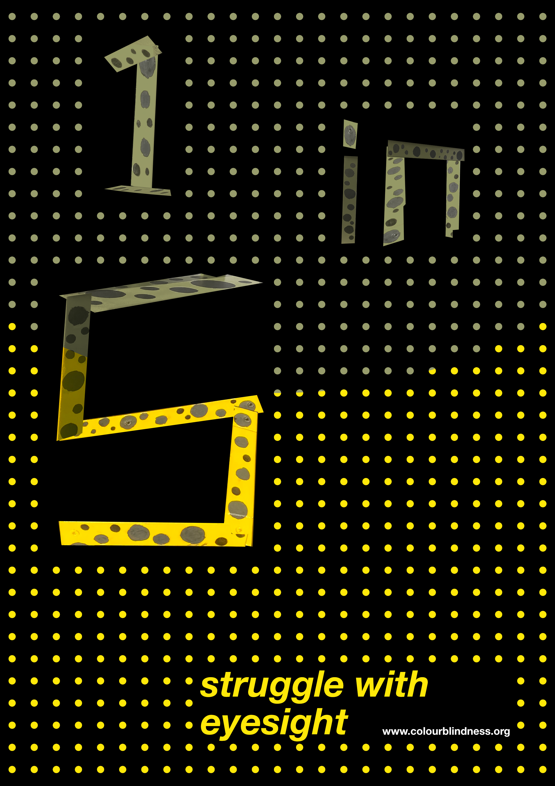
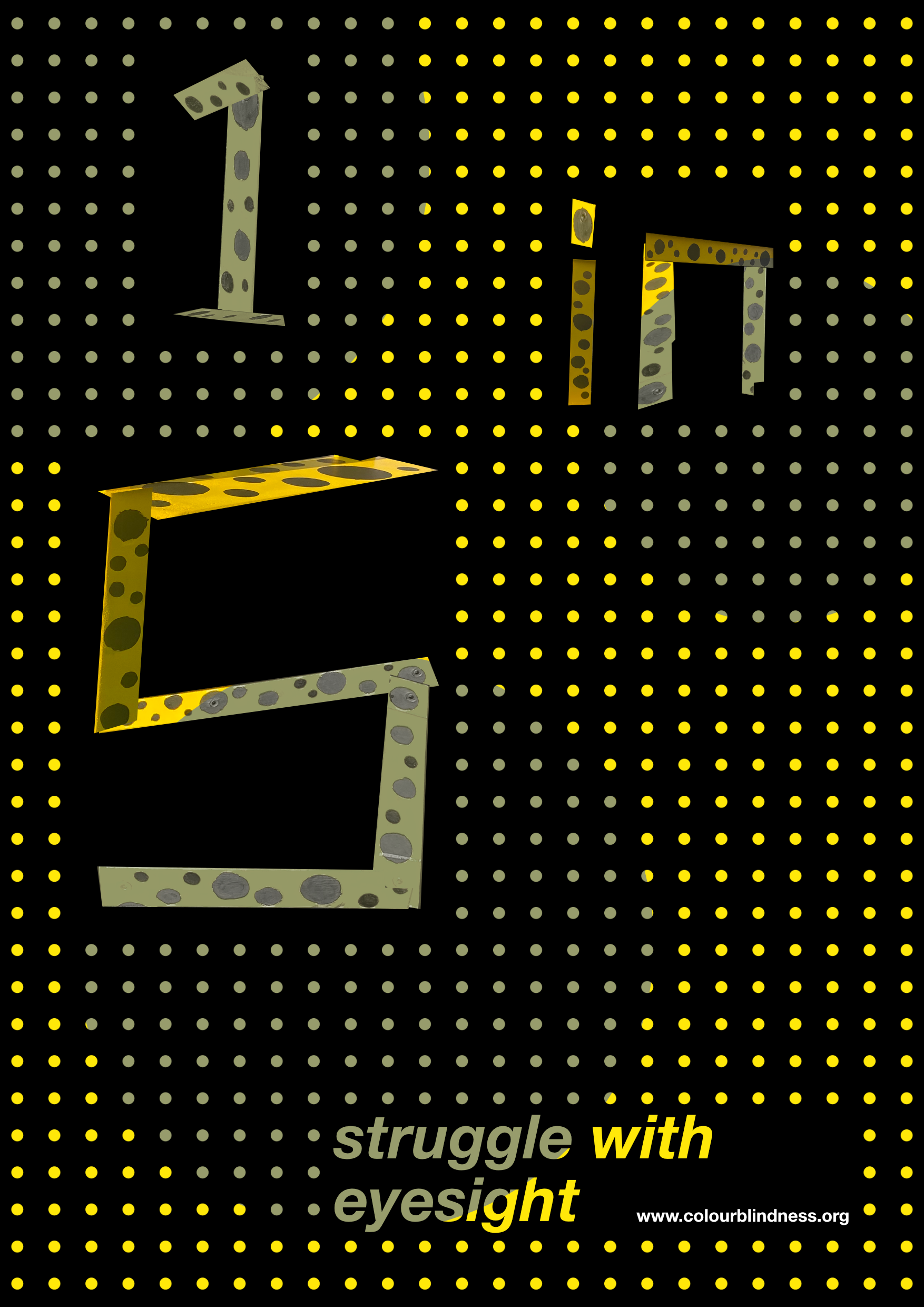
I then settled on using multiple dots scattered around the design, which I think works much better and further integrates the design with Kusama’s work
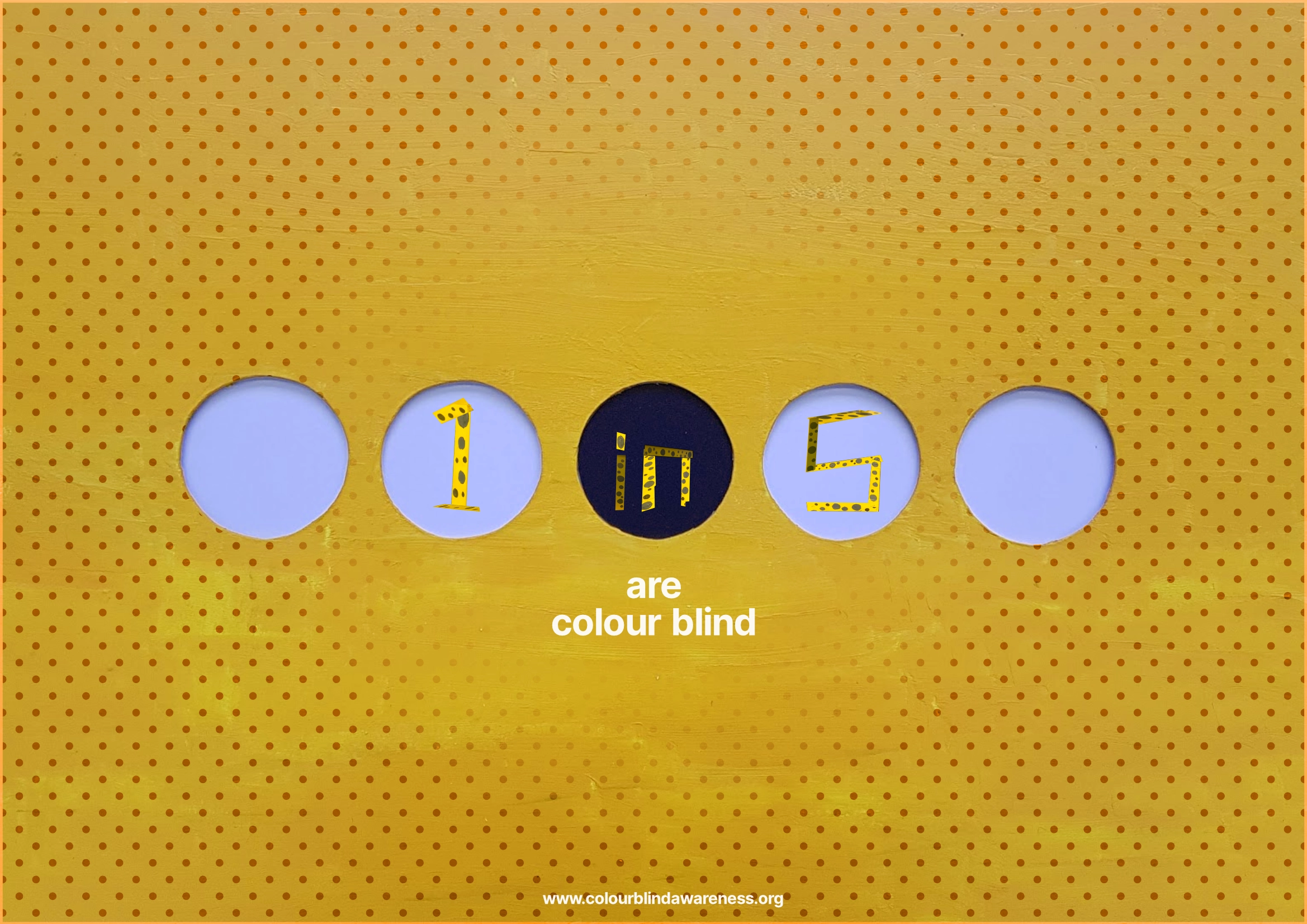
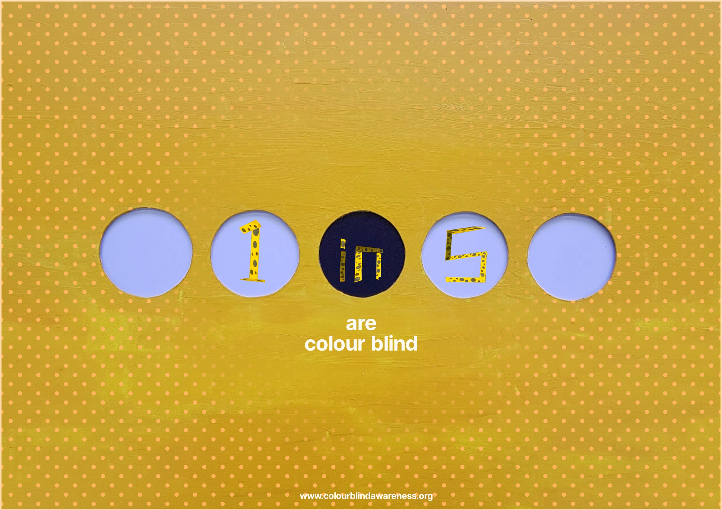
Poster
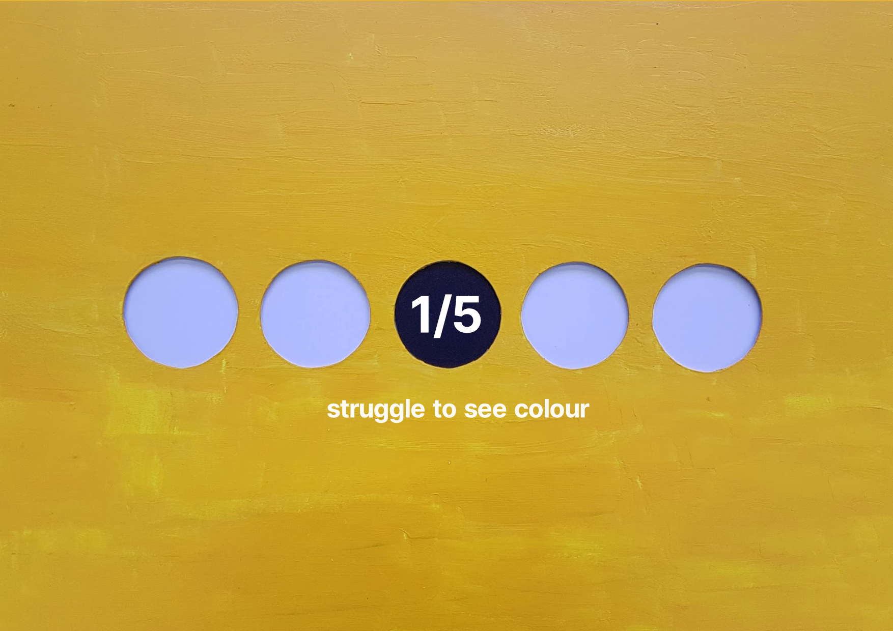
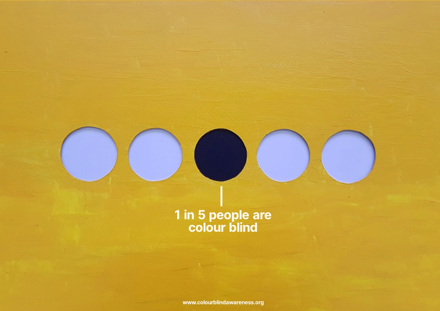
As well as creating the stool, I also created a poster. I had the idea to zoom in and focus on the dots that make up Kusama’s work
Digital Ideas
I first came up with a rough idea of composition and colours.

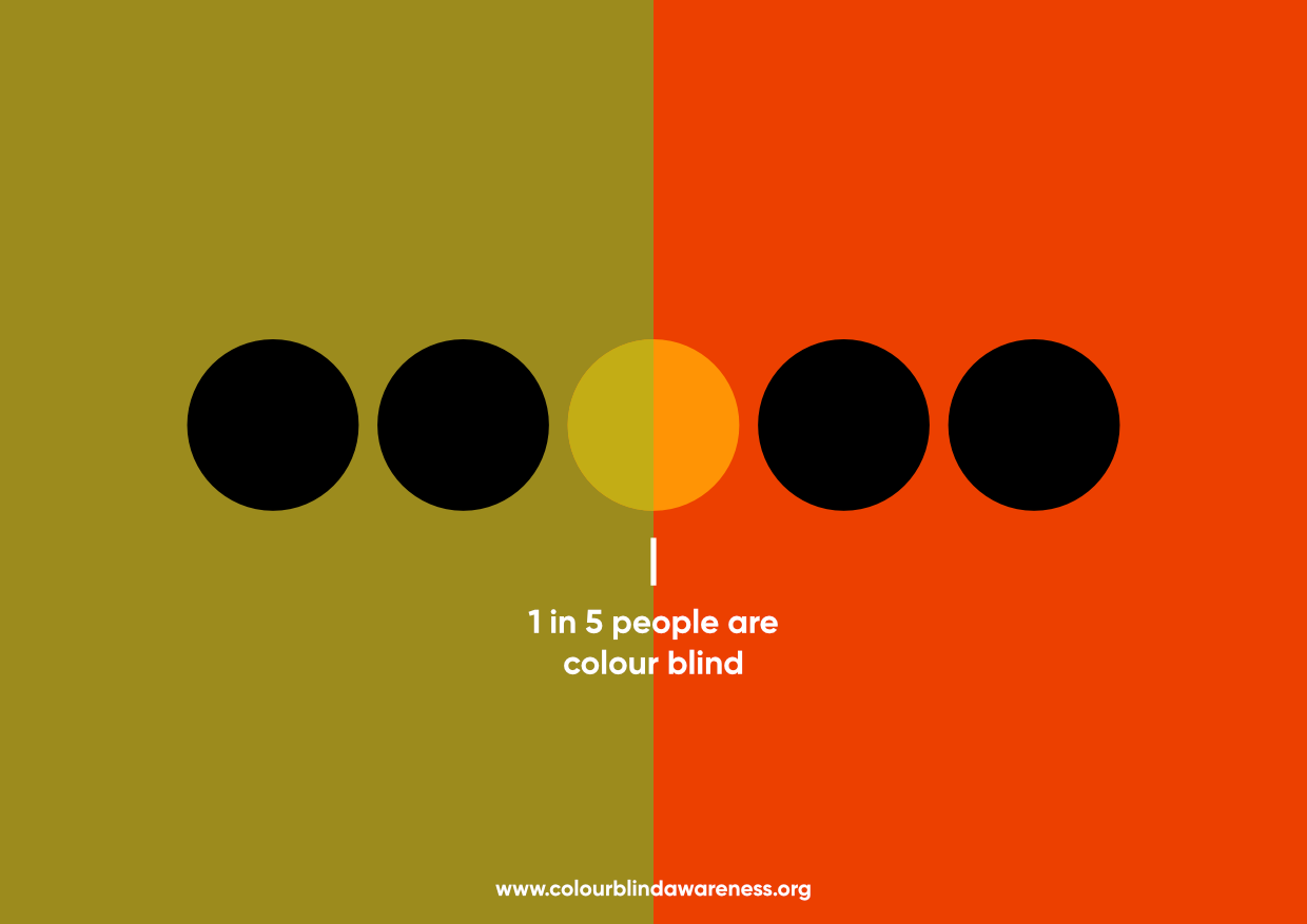
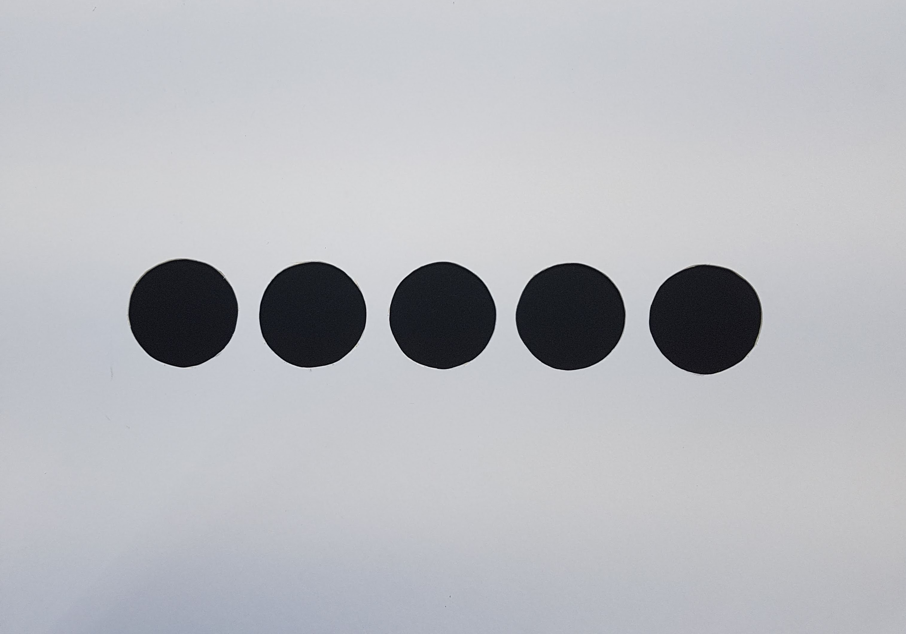
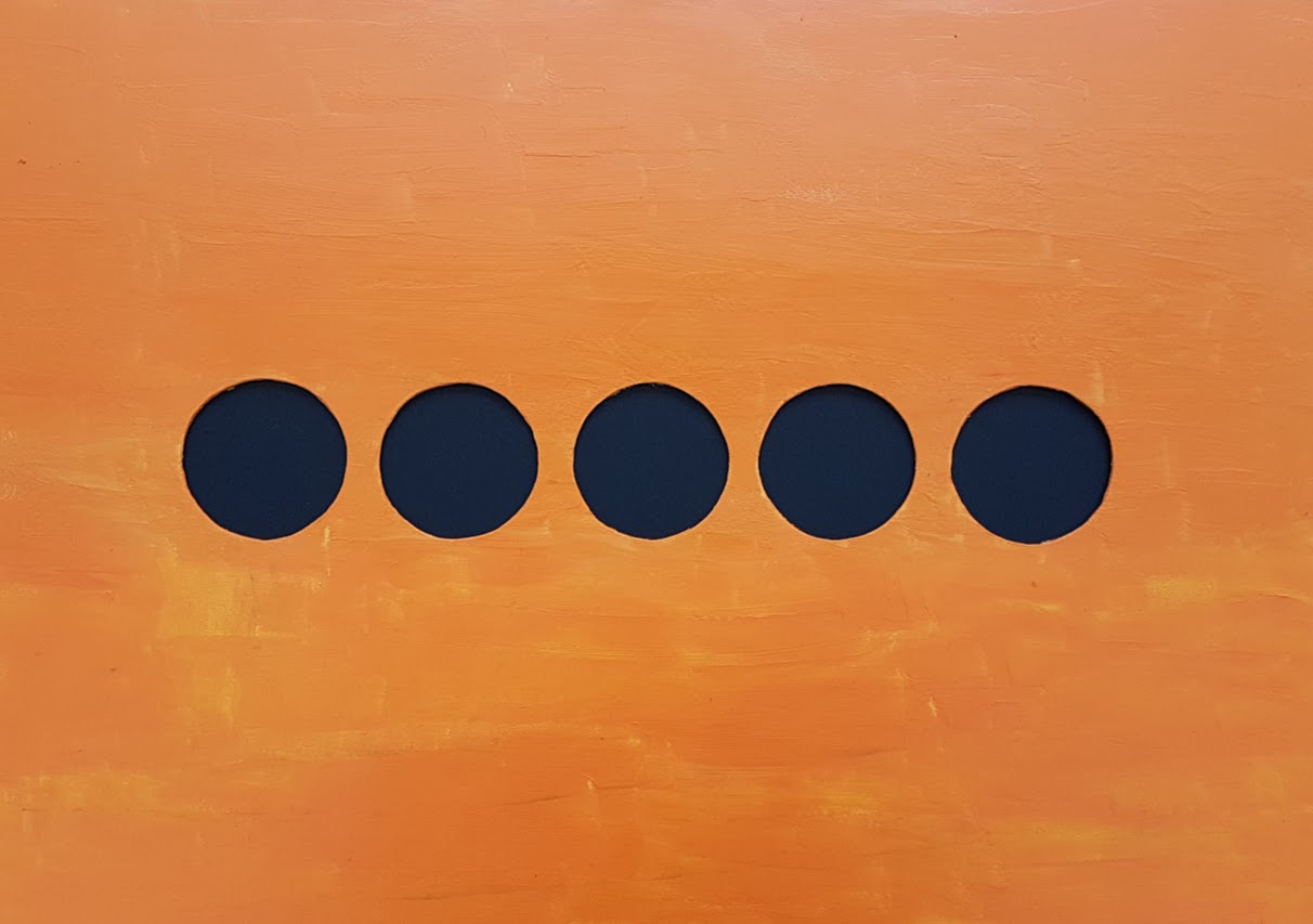
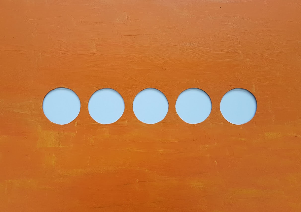
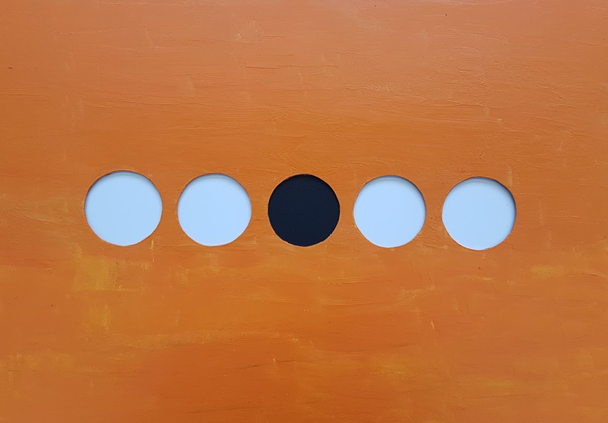
Physical Poster
I started off by cutting the holes in some mount board, and then I painted it a similar colour to that which Kusama used. I also tried experimenting by making the middle dot black to signify that 1 in 5 has a form of vision impairment.
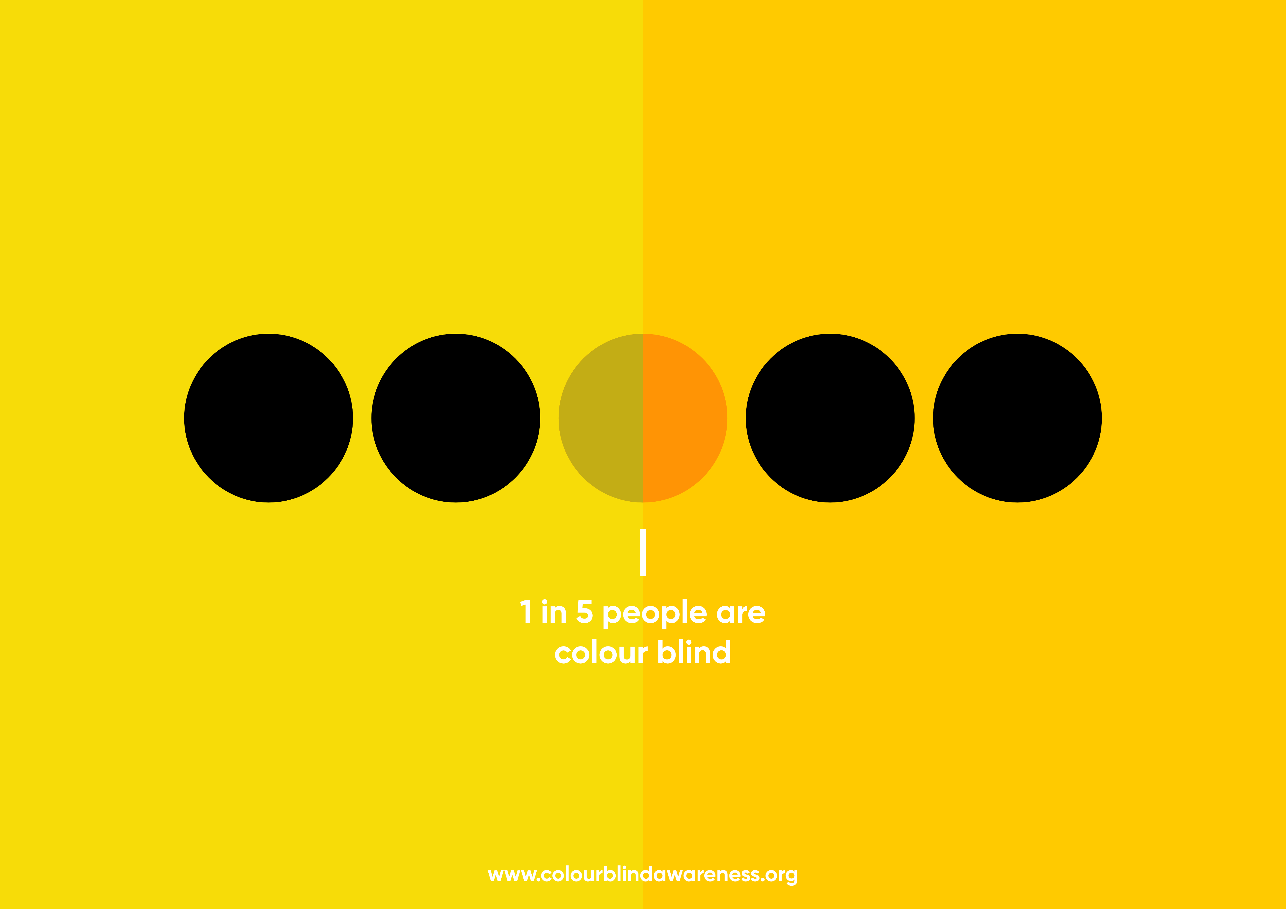
Digital Enhancements
I then made some colour enhancements to make the yellow pop more and experimented with two different layouts
Experiments
Next, I took the cutout numbers from the previous poster and integrated it.
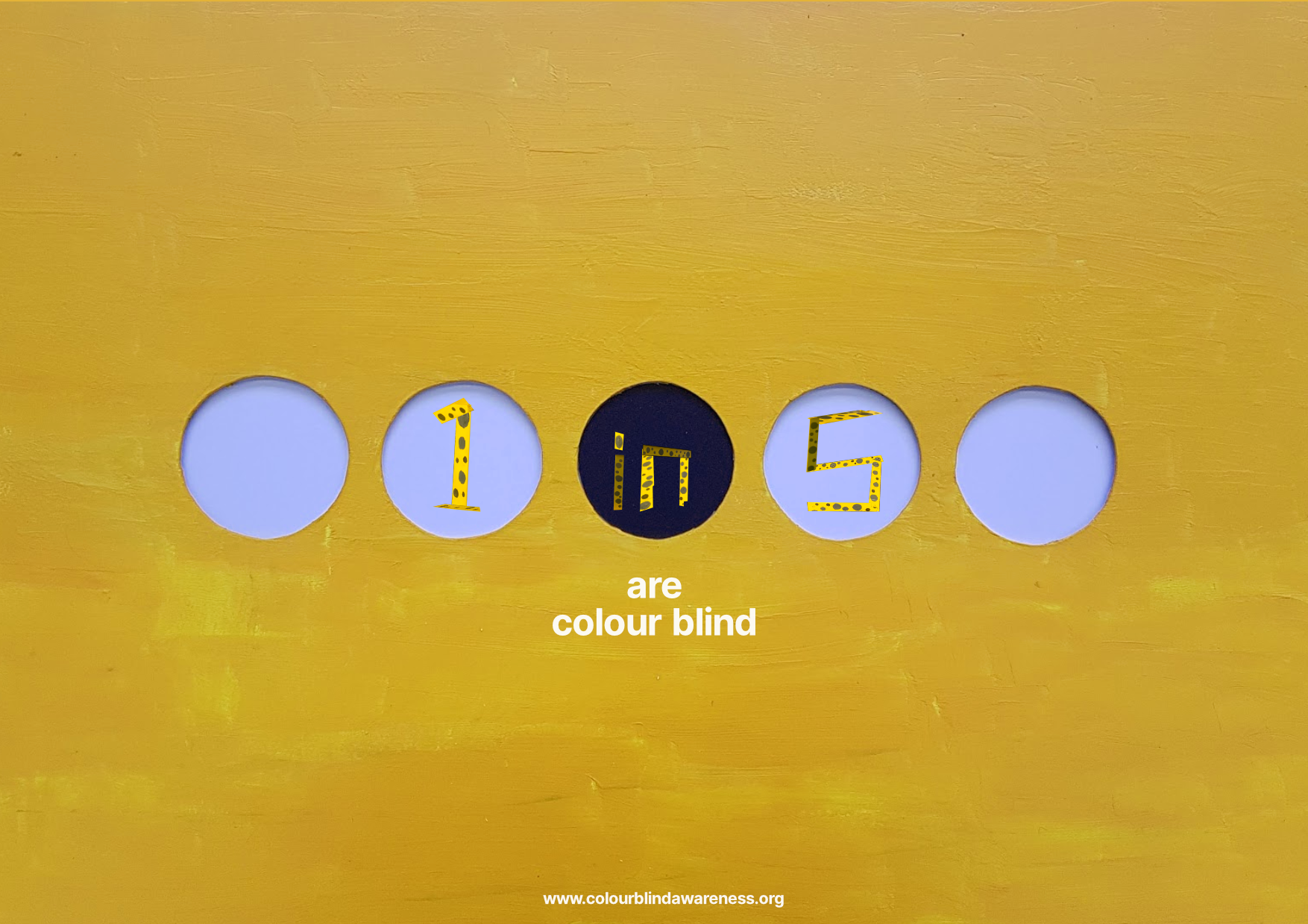
I then wanted to link back to the previous poster by including the dots in the background. I was originally planning to use a red colour for the dots to link in with red/green colourblindness, but I felt that it overcomplicated the design a bit, and I preferred the simplicity of the pale dots.