The Younger Demographic
Vision deficiencies are common among the younger demographic, but many of them are unaware of the causes, symptoms and treatments. Educating them about vision deficiencies can help them prevent or manage their condition, improve their quality of life and academic performance, and reduce the risk of later complications. To help with this I want to create a playful poster to help educate them.
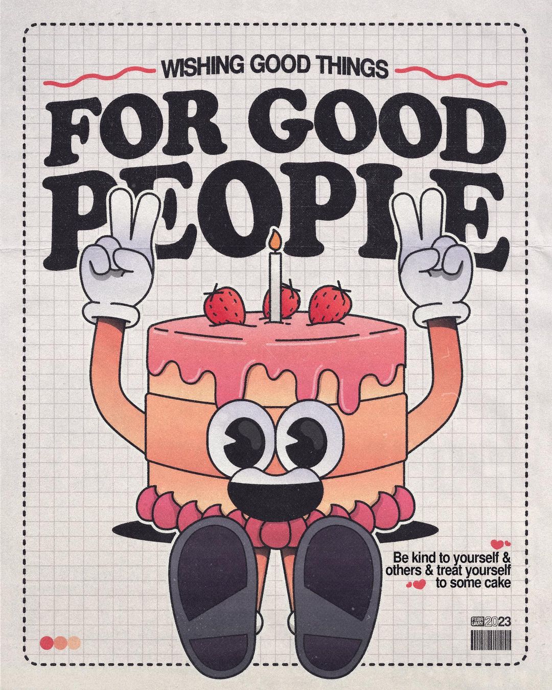
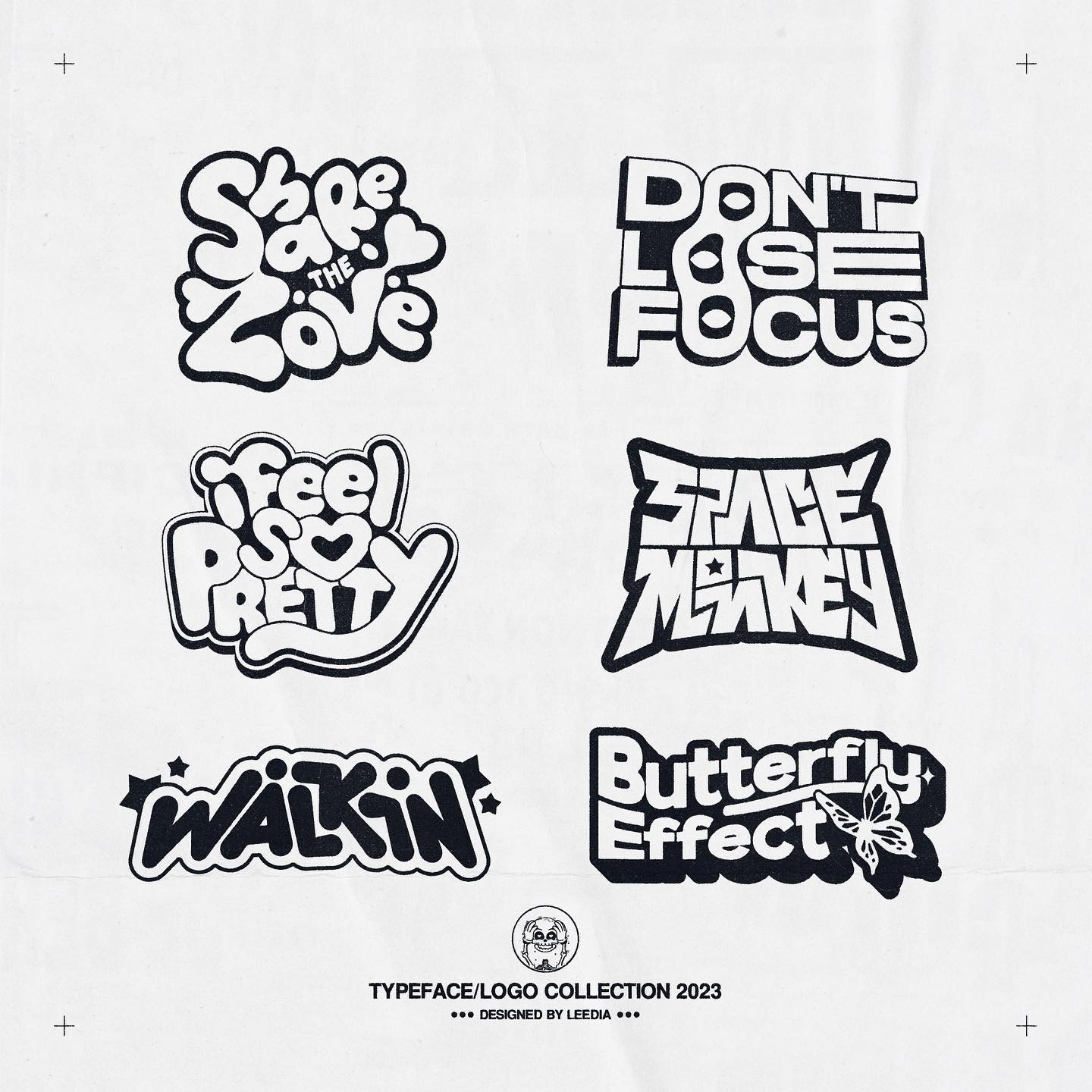
I found these images on instagram and I love the playfulness of them. The artist, Leedia, also uses very energetic typography which I really want to try and recreate in my own work
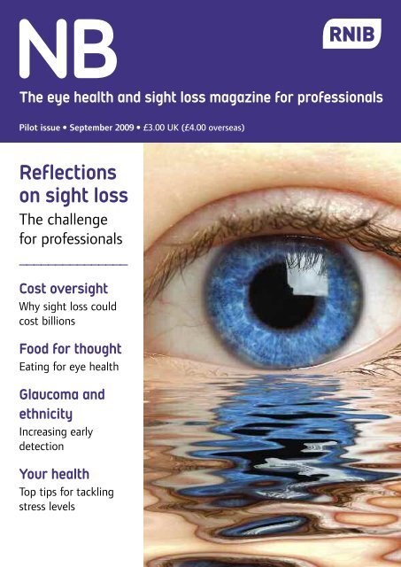
I was inspired by this similar poster by the RNIB, and I really love the striking effect of the piercing blue eye, something that I want to replicate in my own outcome.
My Process
1st Step
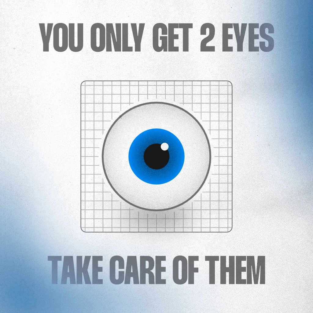
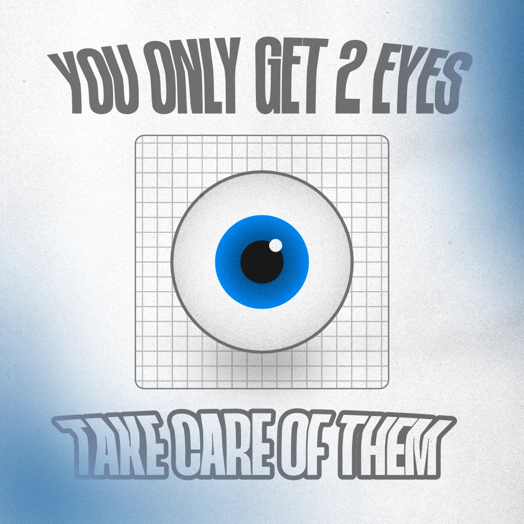
I first started by creating the focal point of the poster, the eye.
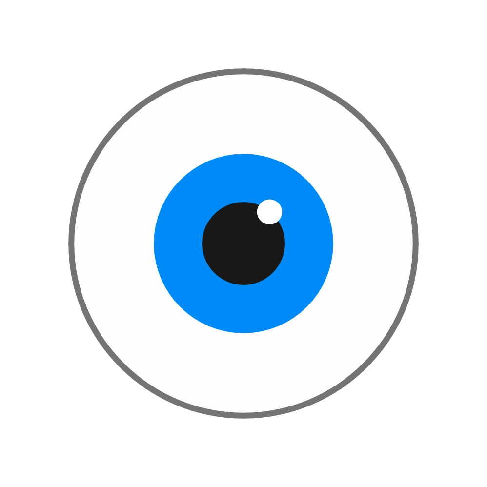
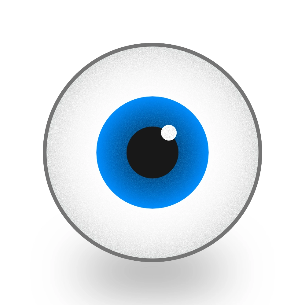
I wanted to keep it very simplistic and cartoonish, to try and mimick her style as much as possible. It also stops the composition from being too busy, as her main focus in her work is often her typography, and I don’t want it to detract from it.
I also experimented by applying some subtle noise and gradients to the eye, and I really liked how it turned out, and it makes it seem far less cartoonish and simple
2nd Step
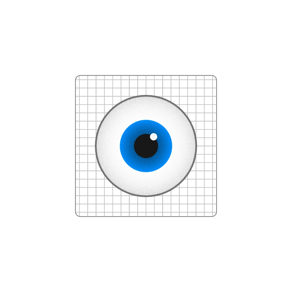
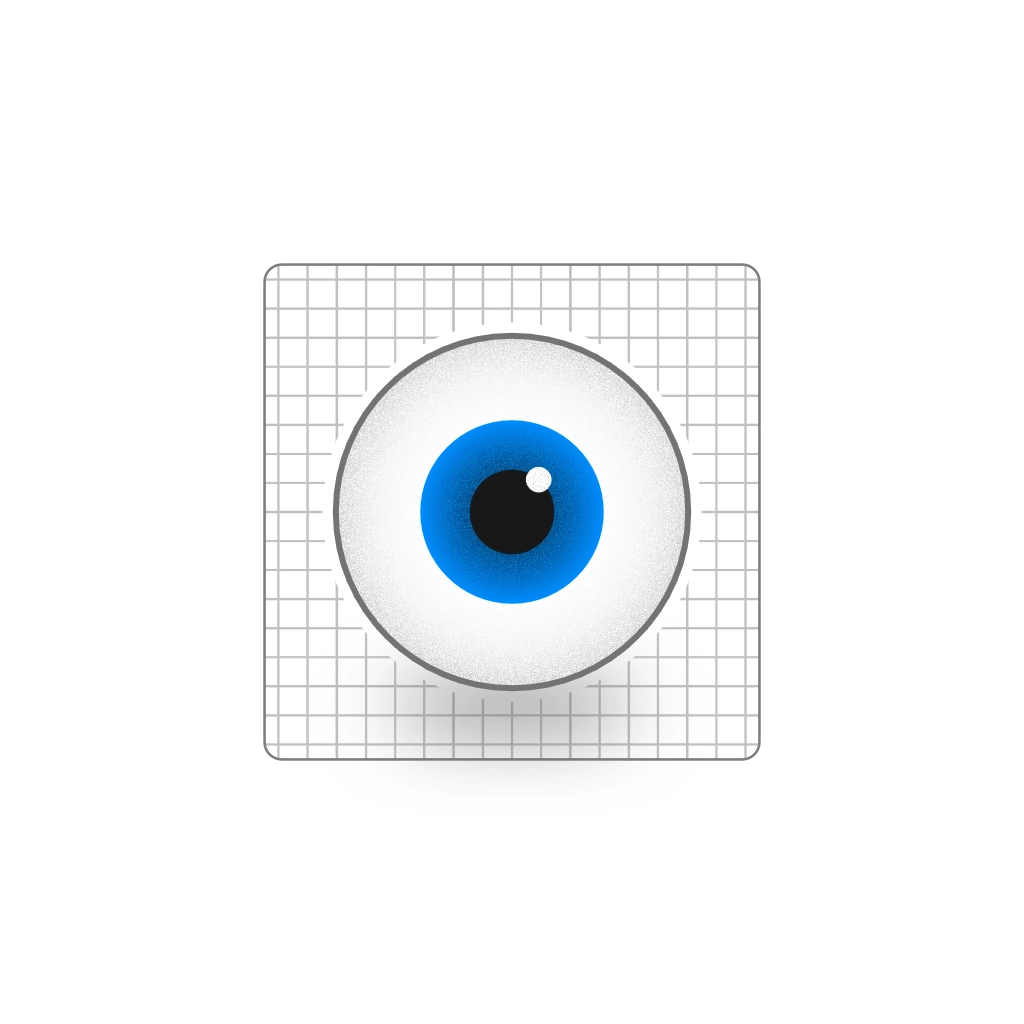
I then added the grid element that is often seen behind her work. I really like how this breaks up the design and gives the eye some grounding in the composition. I further added to this by giving it a subtle shadow and an outline to help seperate it from the background
3rd Step
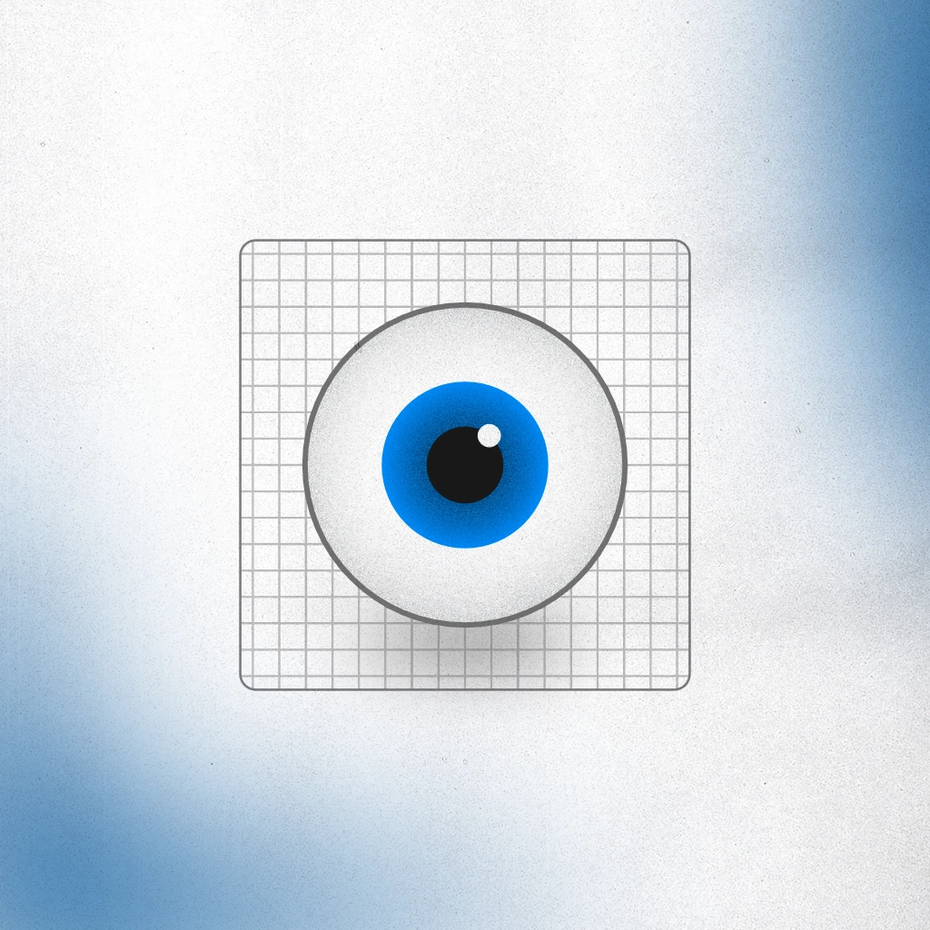
I then experimented with adding some coloured blobs to the edges. I wanted them to represent a Floater, an artifact that comes and goes, affecting vision and sometimes indicative of a more serious eye concern. I am really happy with how these break up some of the white space around the design, and it adds some nice texture to the otherwise plain background.
Typography
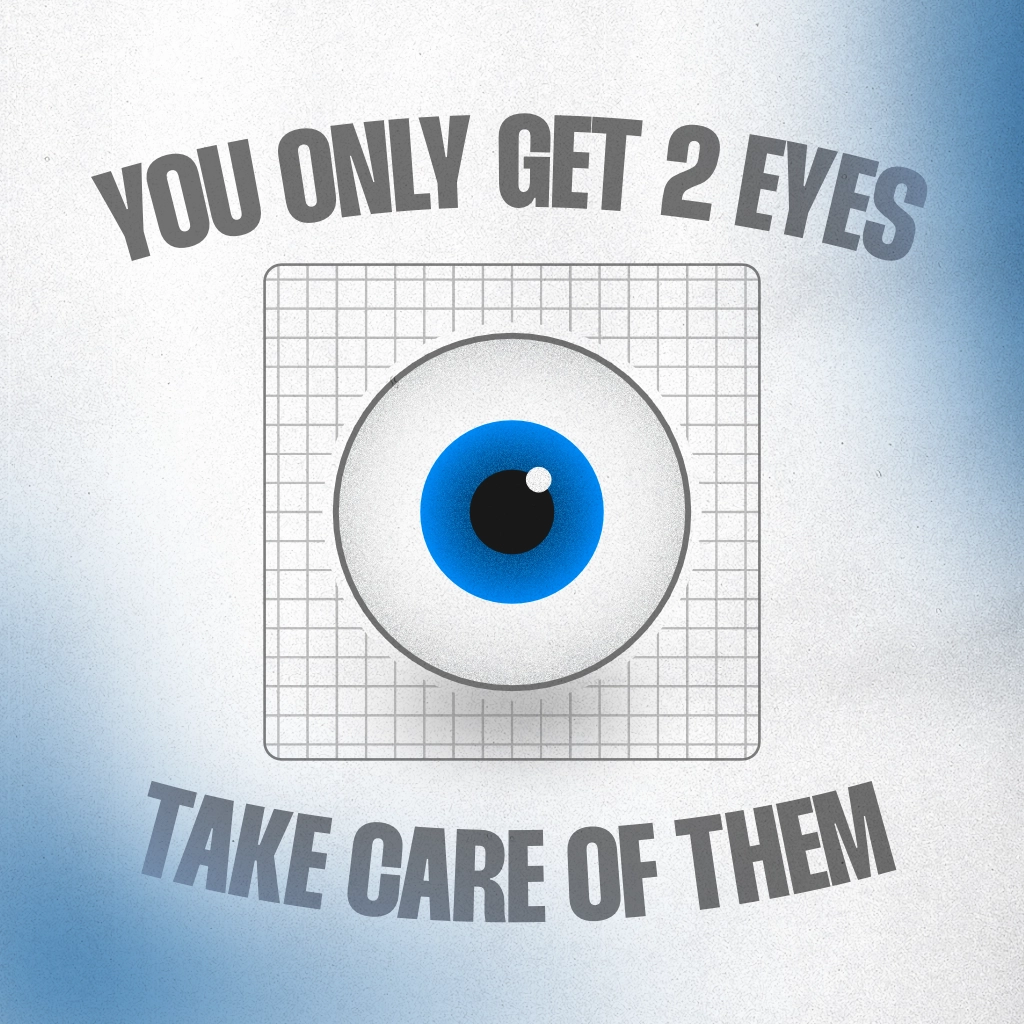
I then worked on the typography of the poster. I knew I wanted a powerful message to do with the eyes, and quickly settled on: You only get 2 eyes, take care of them. I first tried a very thin typeface for the primary font, but quickly found that it lacked power that I wanted the poster to have, and it was very hard to read from a distance. The much bolder typeface really suited the demanding statement, and it created a very powerful tone.
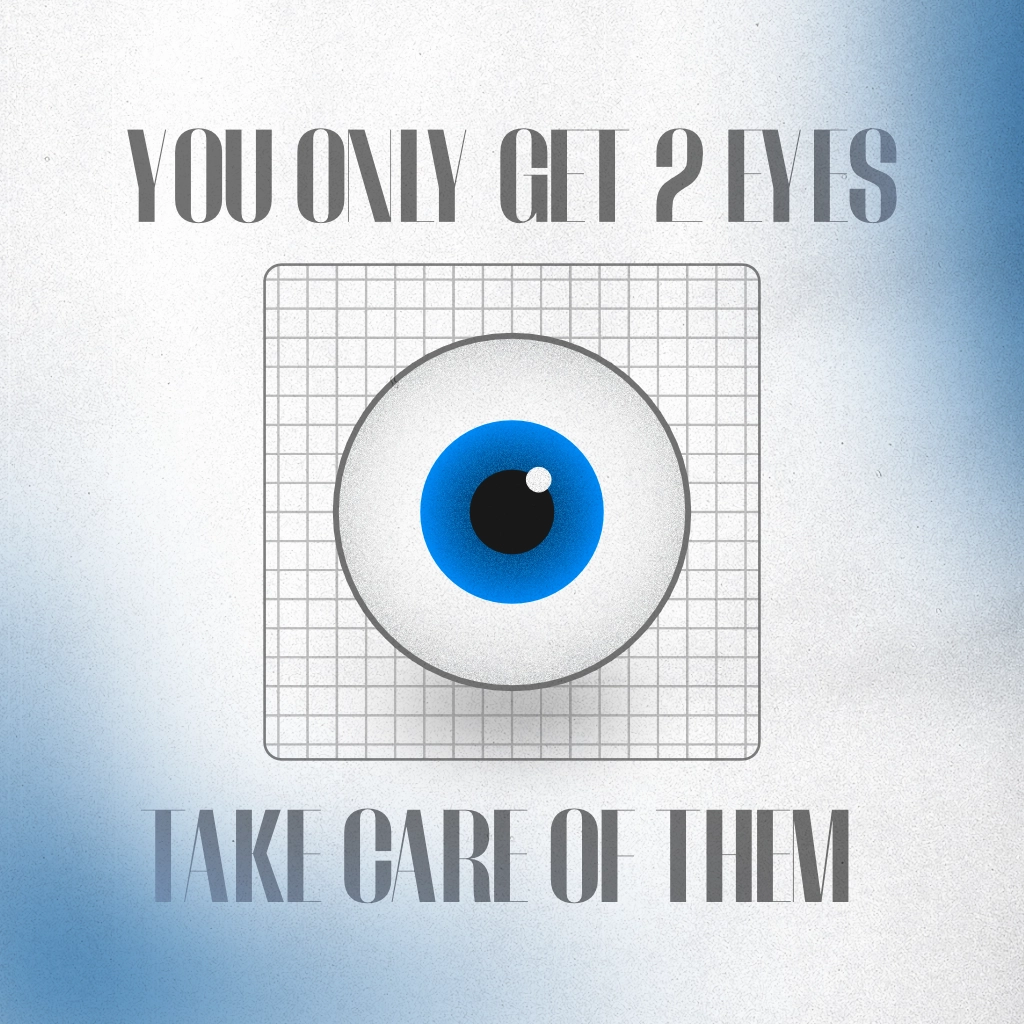
I really liked the bolder font, but it was very bland by itself, and didn’t really capture the playfulness of Leedia’s work. To try and help with this, I experimented with bending the text to an arc. Whilst it definitely helped with this, I still wasn’t happy with it. After further experimentation I came up with the following design:
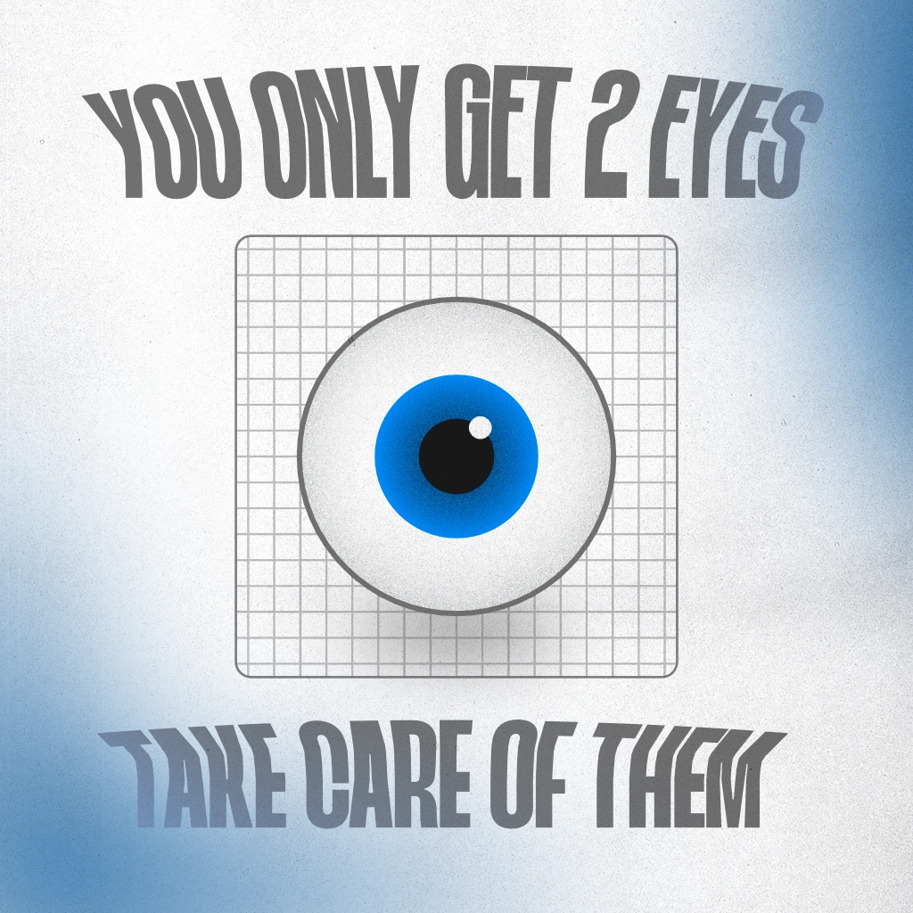
I then gave the second line an outline to add some variation and to further mimick Leedia’s style.
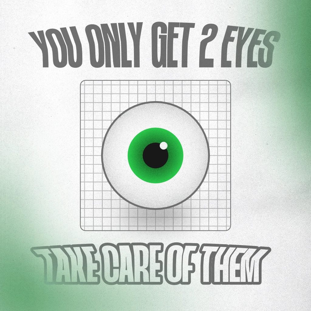
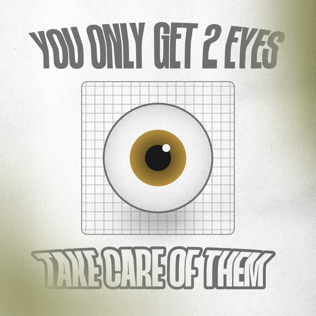
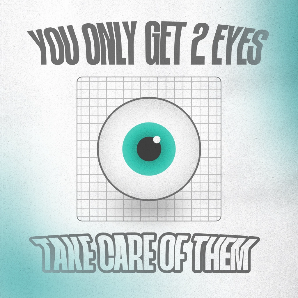
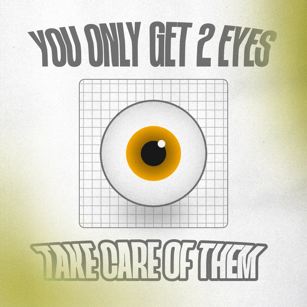
Colour Variations
I then made some colour variations with my composition. I really wanted to try a bloodshot eye, to see if it created a sense of warning, almost scaring the audience into taking care of their eyes.
Hover over the image to see how different colourblindnesses see this image
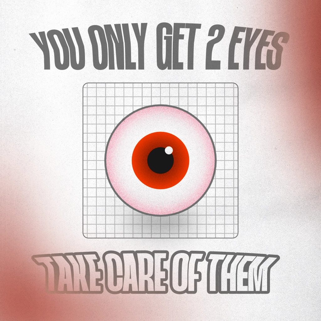
This creates a very ominious image. I then created variants in some other common eye colours: