Response 2
Layout
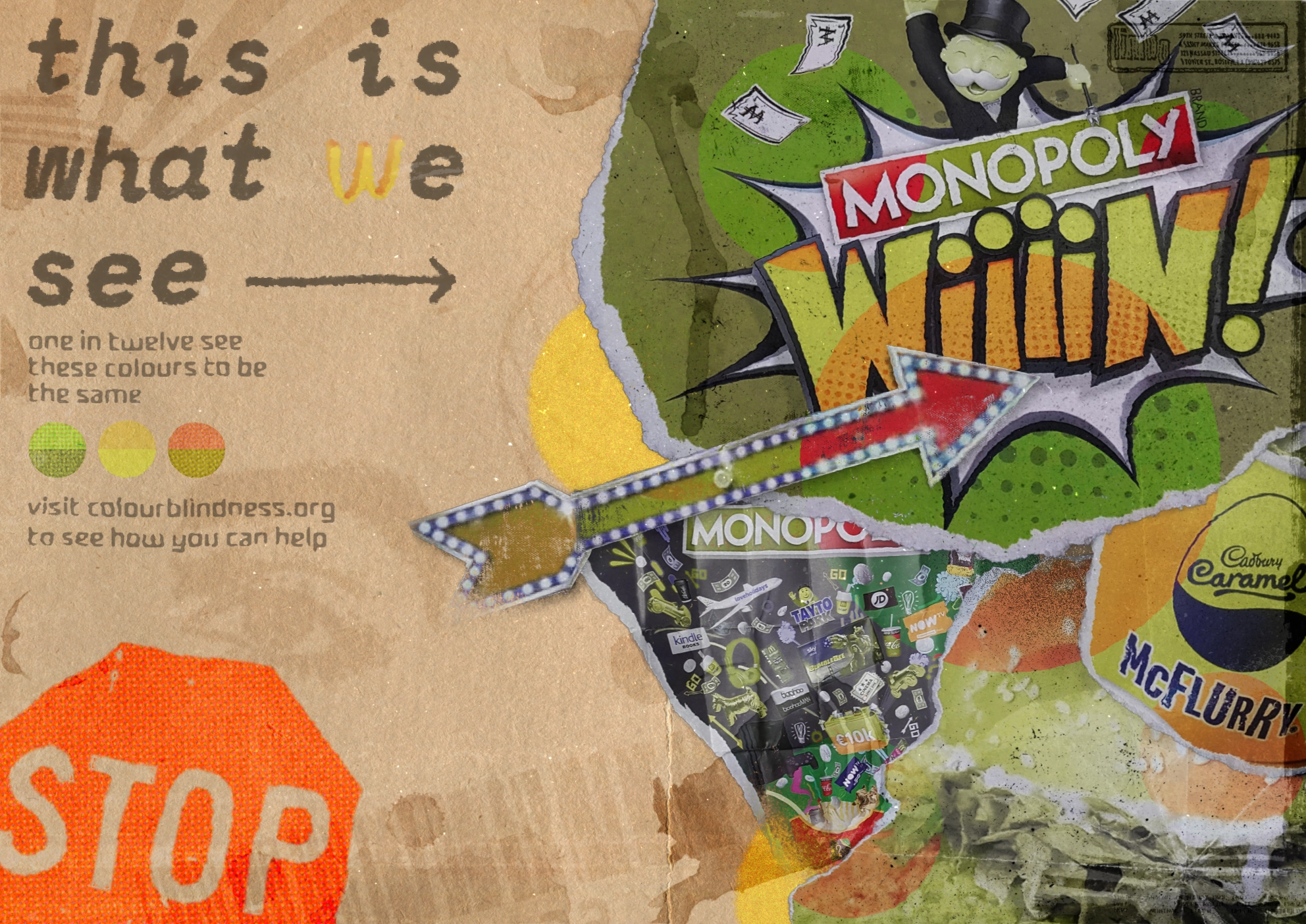
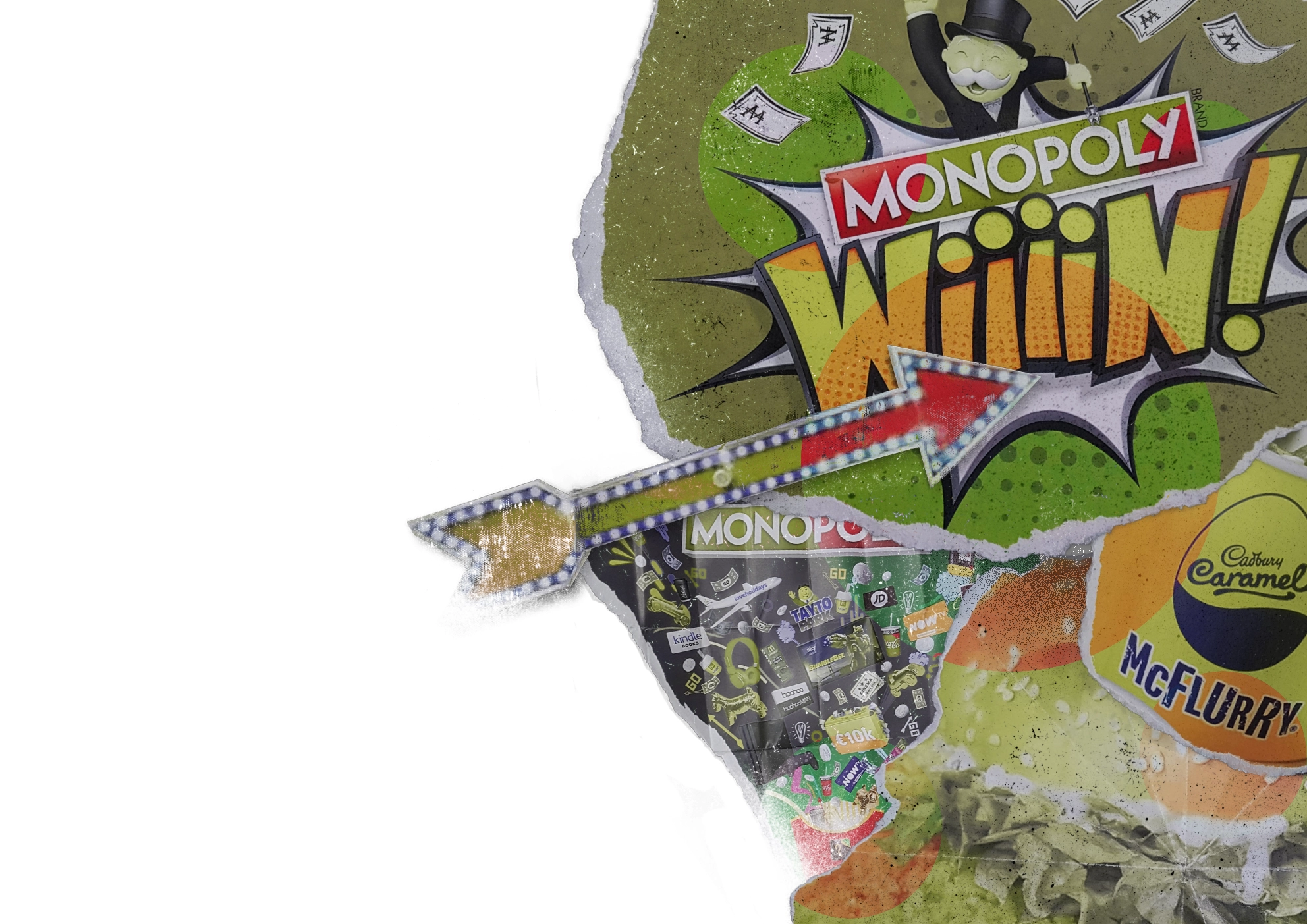
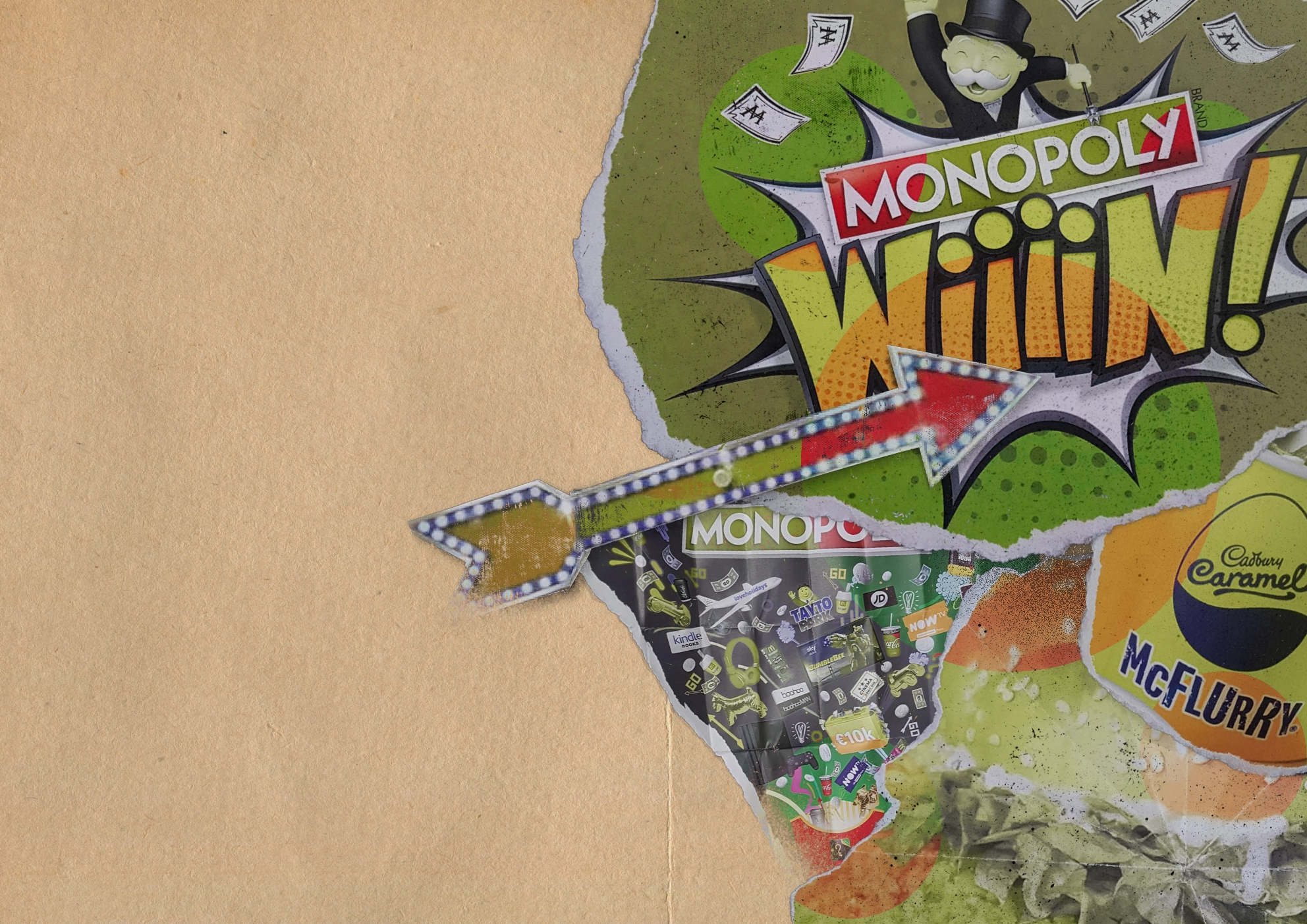
I started off by importing the same elements as I did for the last outcome. For this design I wanted to have the focal point on the right and then have room for information on the left. I then distressed some of elements by slowly removing parts of it with brushes.
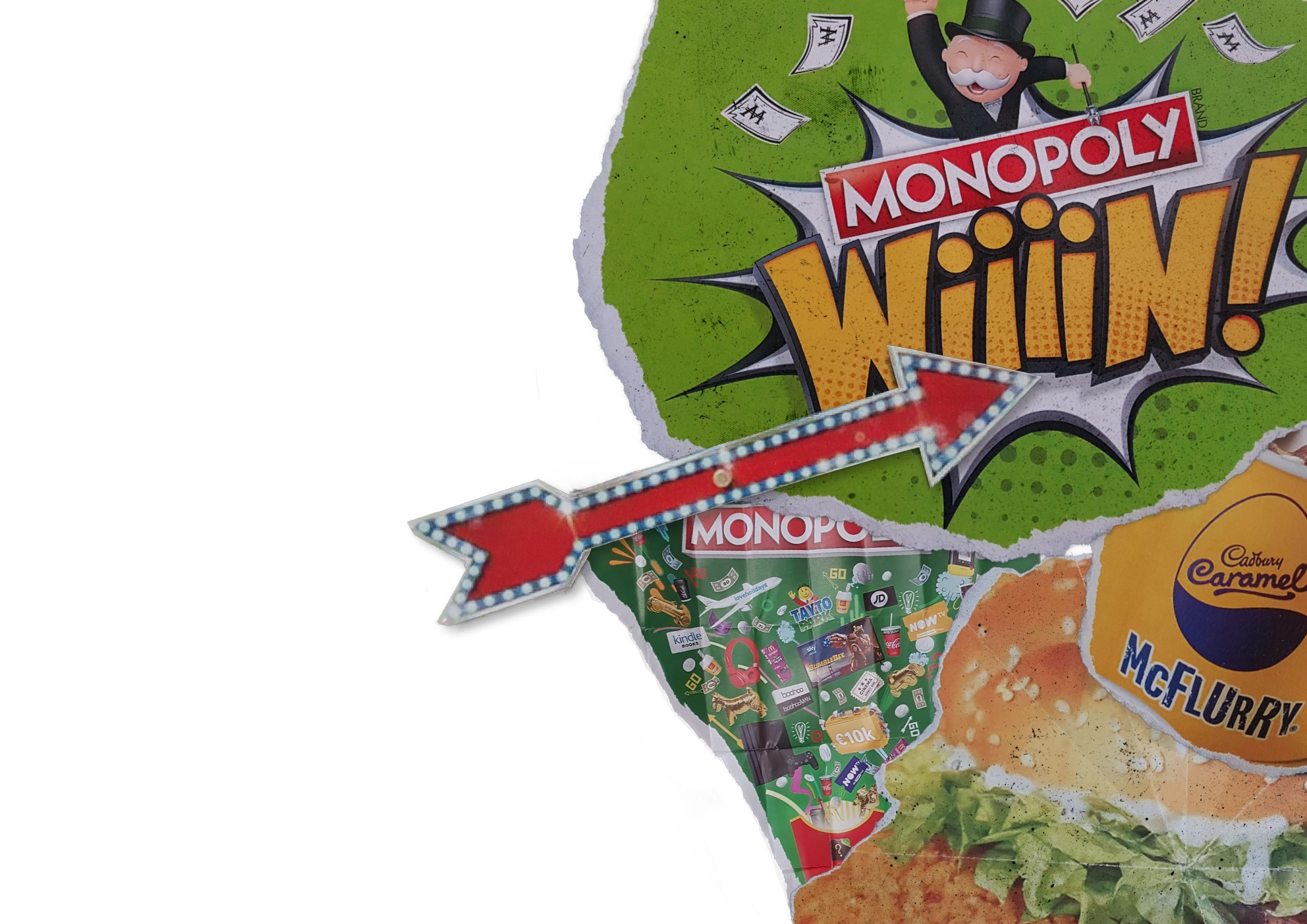
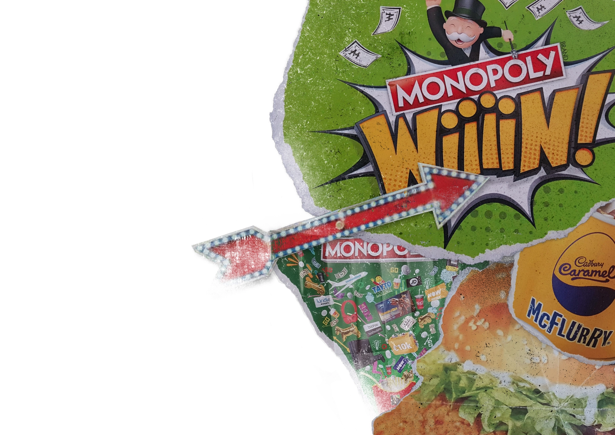
I then added peepholes similar to the previous outcome:
Additions
I decided to add a paper background to help give it some texture and make it seem more rudimentary and crude.
I wanted to have a catchy, straight to the point title, and decided on “this is what we see”. I quite liked the idea of using an upside down McDonald’s M for the W to help add some continuity. I also added some circles to act as a side by side for what red/green colourblindness is like.
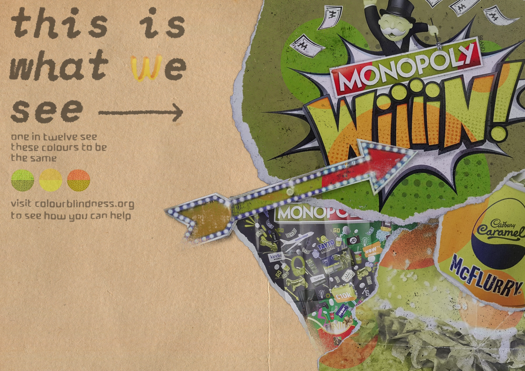
I then added some more stamp-like elements to help fill it out and add some more texture. I also added some stains around the image to help emphasise the grunge effect