Optician Poster
The idea of using the glasses as a window is very creative and I wanted to create a design based around it. However, I want to take this concept further so it reveals some useful information about eyesight beneath the lenses as currently it’s not at all informative.
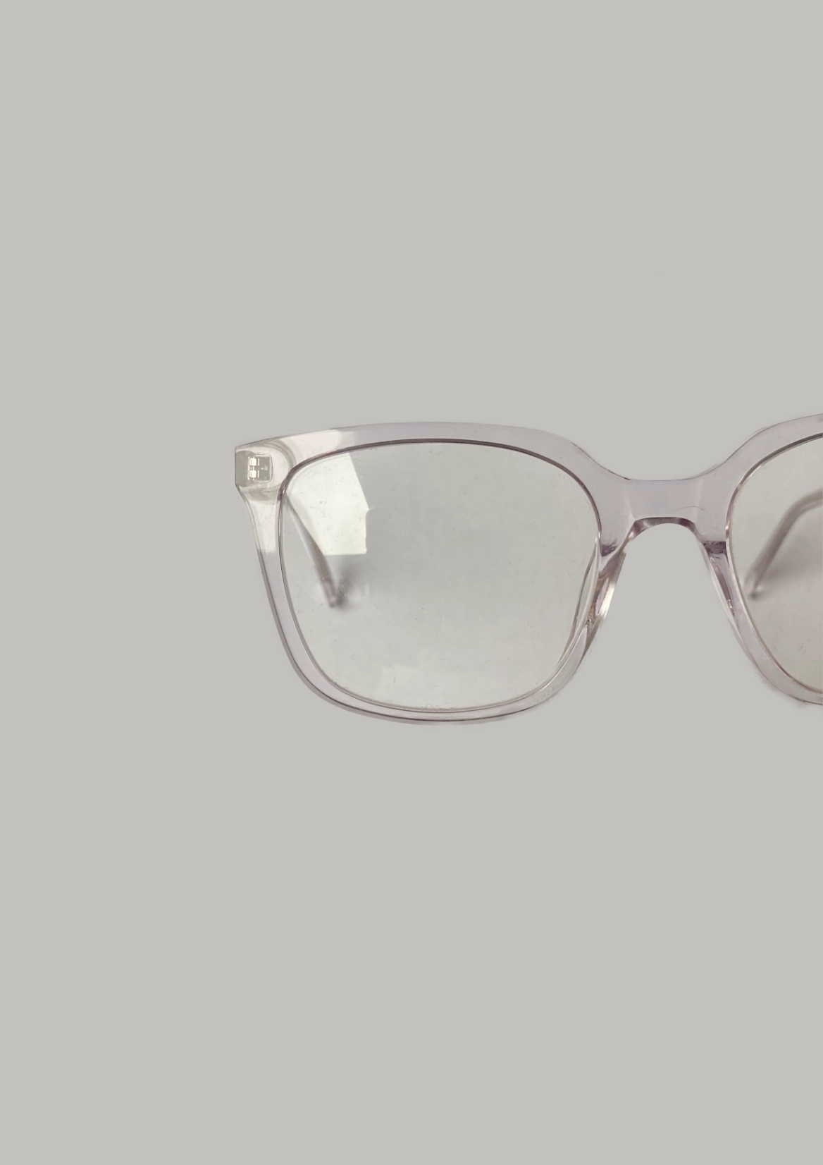
I took the following photo of my own glasses to help inspire my own design:
My Process
1st Step
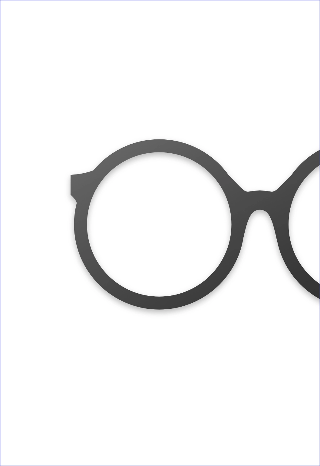
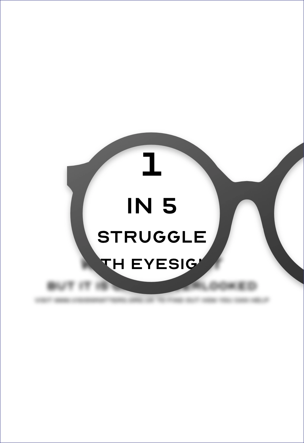
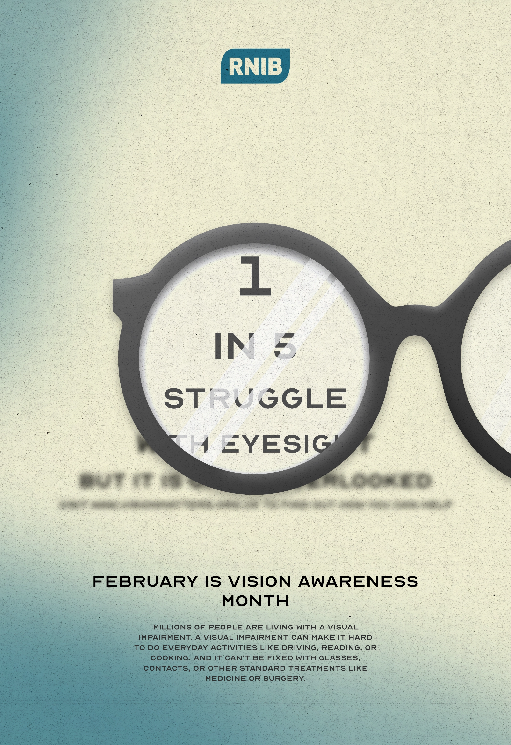
I first created a simple set of glasses frames, similar to the ones above. I gave it a very subtle gradient to help give it some more depth. I knew that I wanted the glasses to be off center slightly, as to cover the centred text that I would later add. I wanted the typeface to try and match that used in tests at the opticians. They tend to use a sans serif font which appears to have been squashed slightly. I also created the pyramid of descending sizes that they also use.
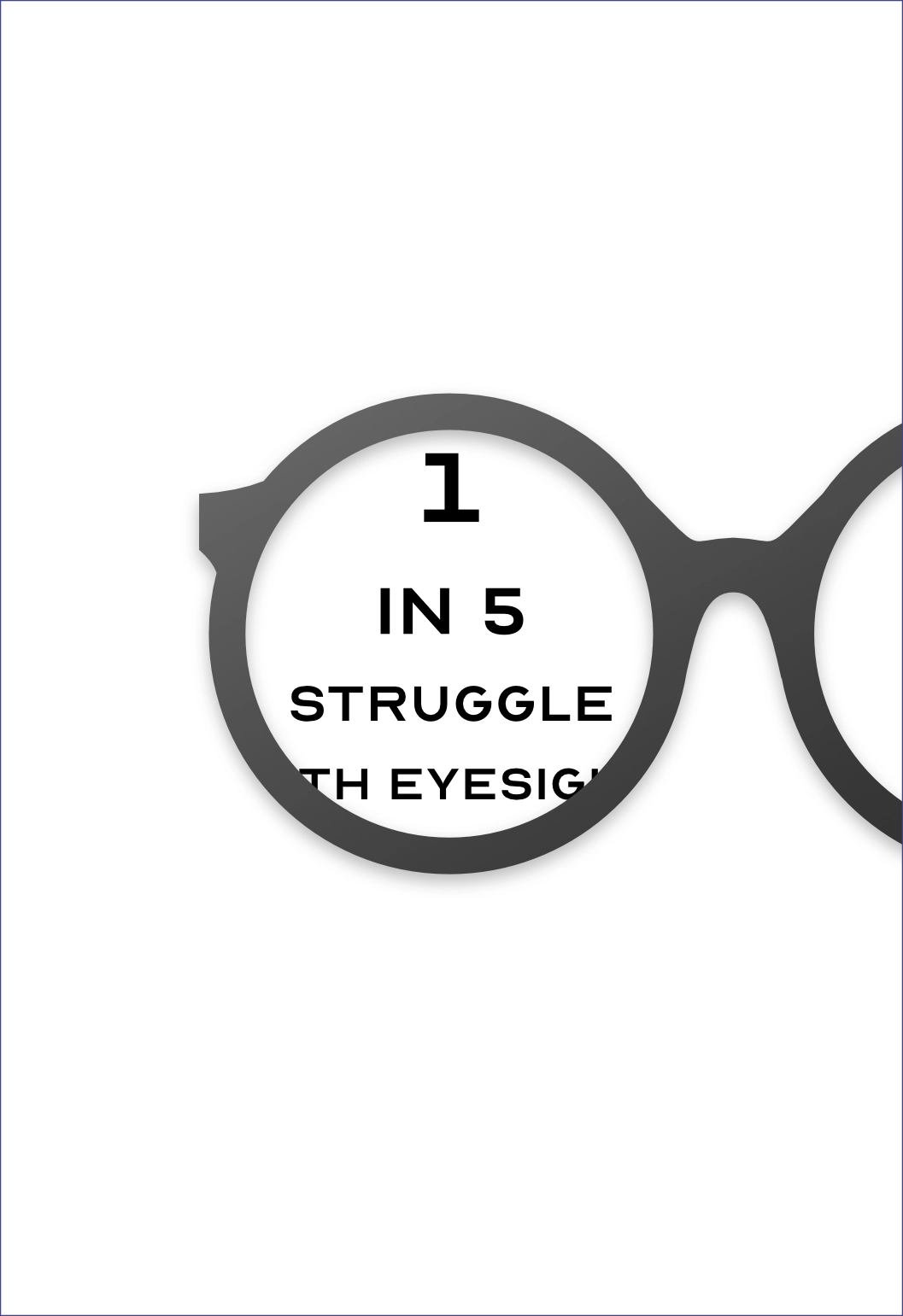
I then also created a blured version of the text for outside the glasses. This is to mimic short/long sightedness, and it really helps to promote the message of vision awareness.
2nd Step
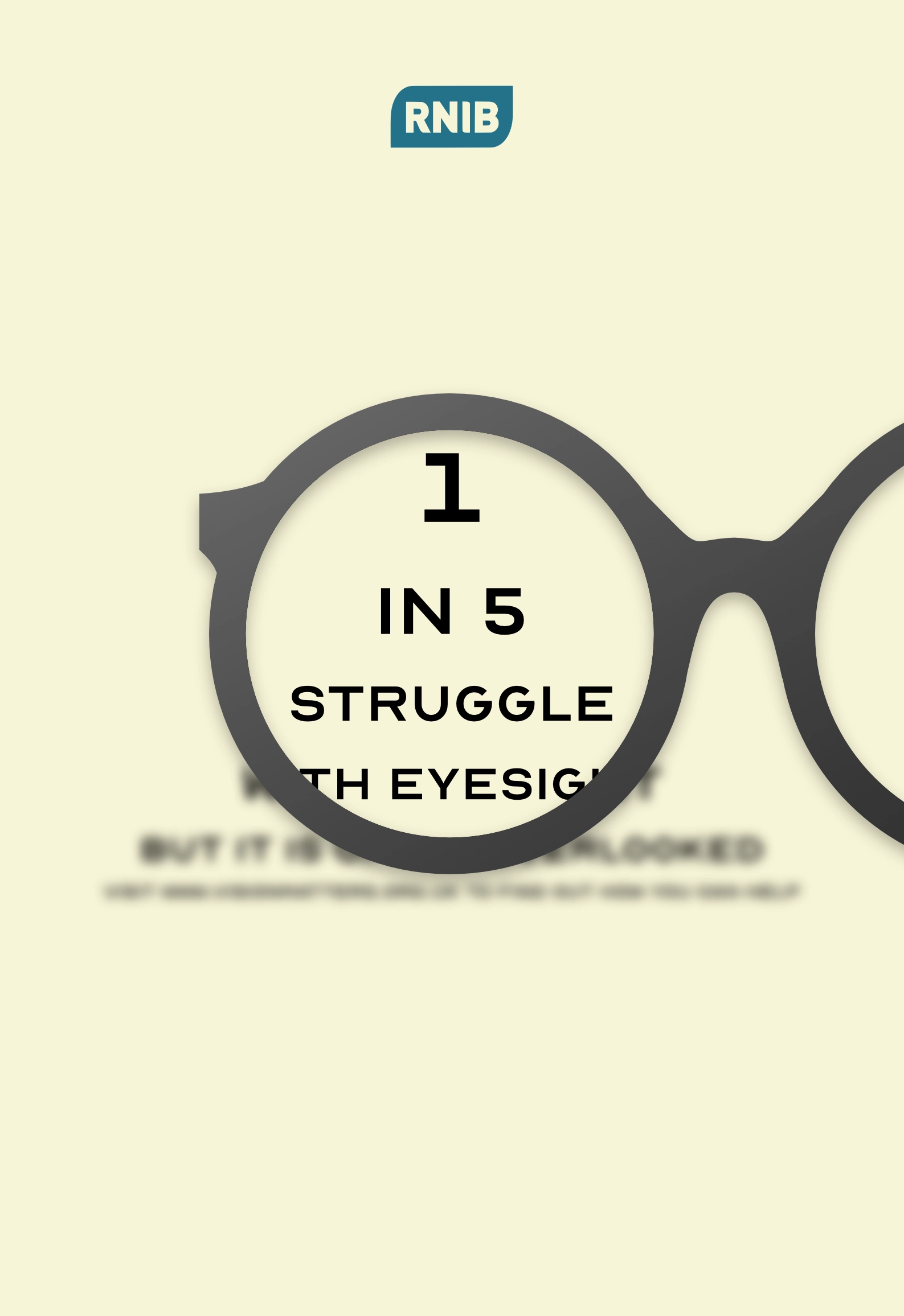
I then added the RNIB logo to my design, and replaced the white background with a more neutral beige as I found the white very jarring
3rd Step
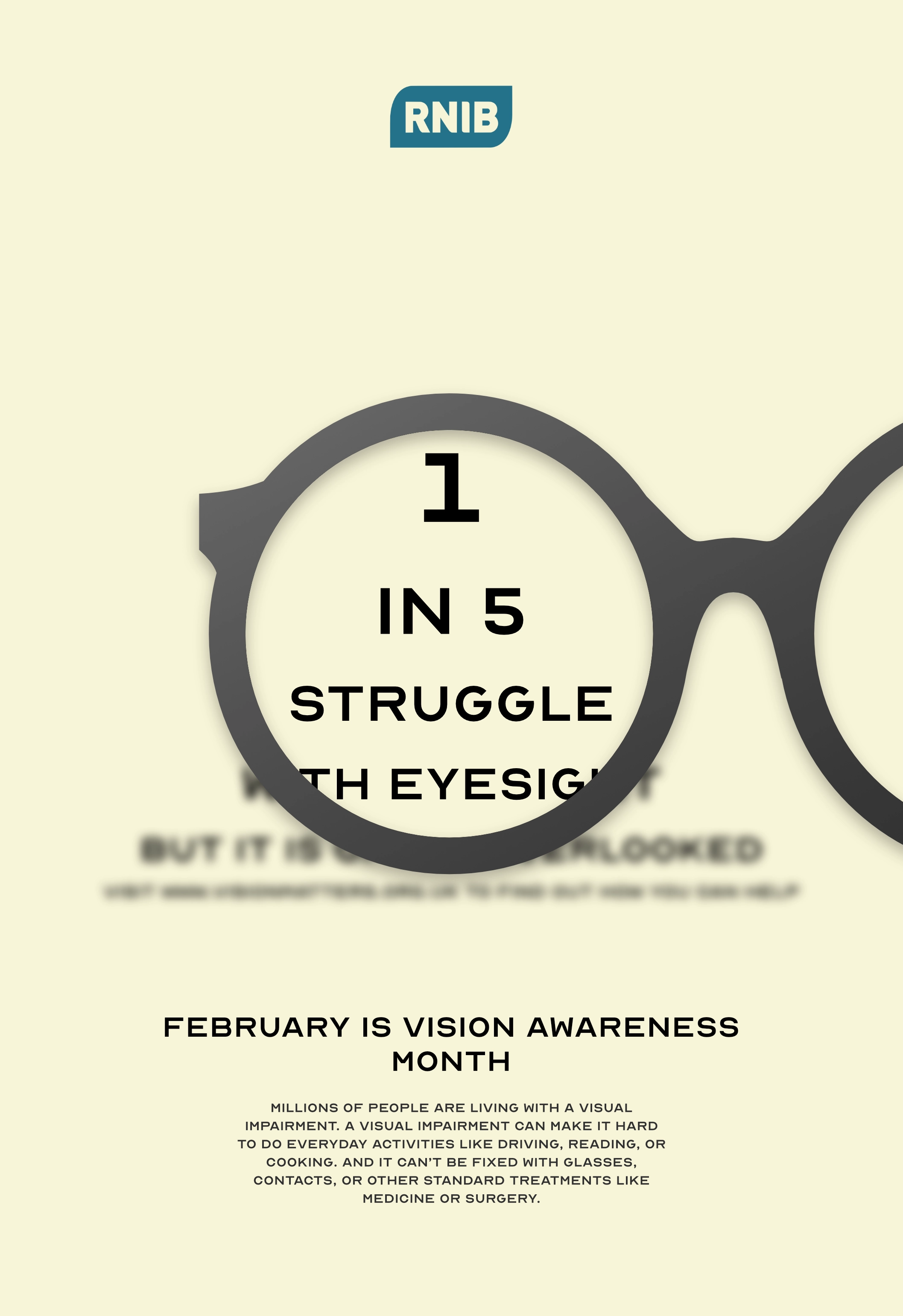
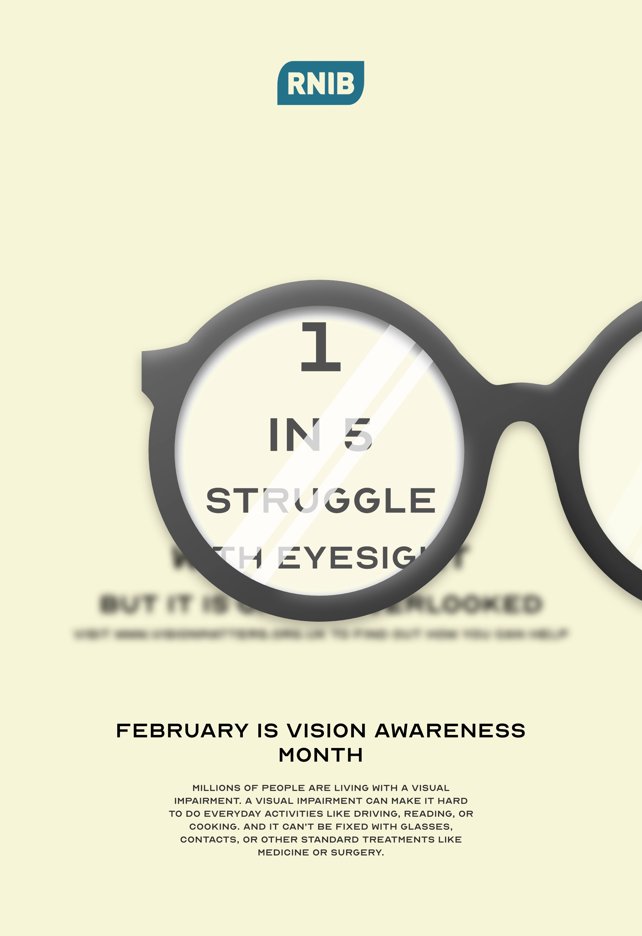
At first I quite liked the simplicity of the design, but when I later came back to the design I found it very bland. To help ammend this, I added some lenses to the frames, and then some glare lines. This really helped to break up the otherwise dull poster and makes the glasses pop more. This is further helped as I also added some very subtle highlights and shadows to the rims of the glasses. I also experimented with adding some noise and blobs of colour, to further break up some of the whitespace.
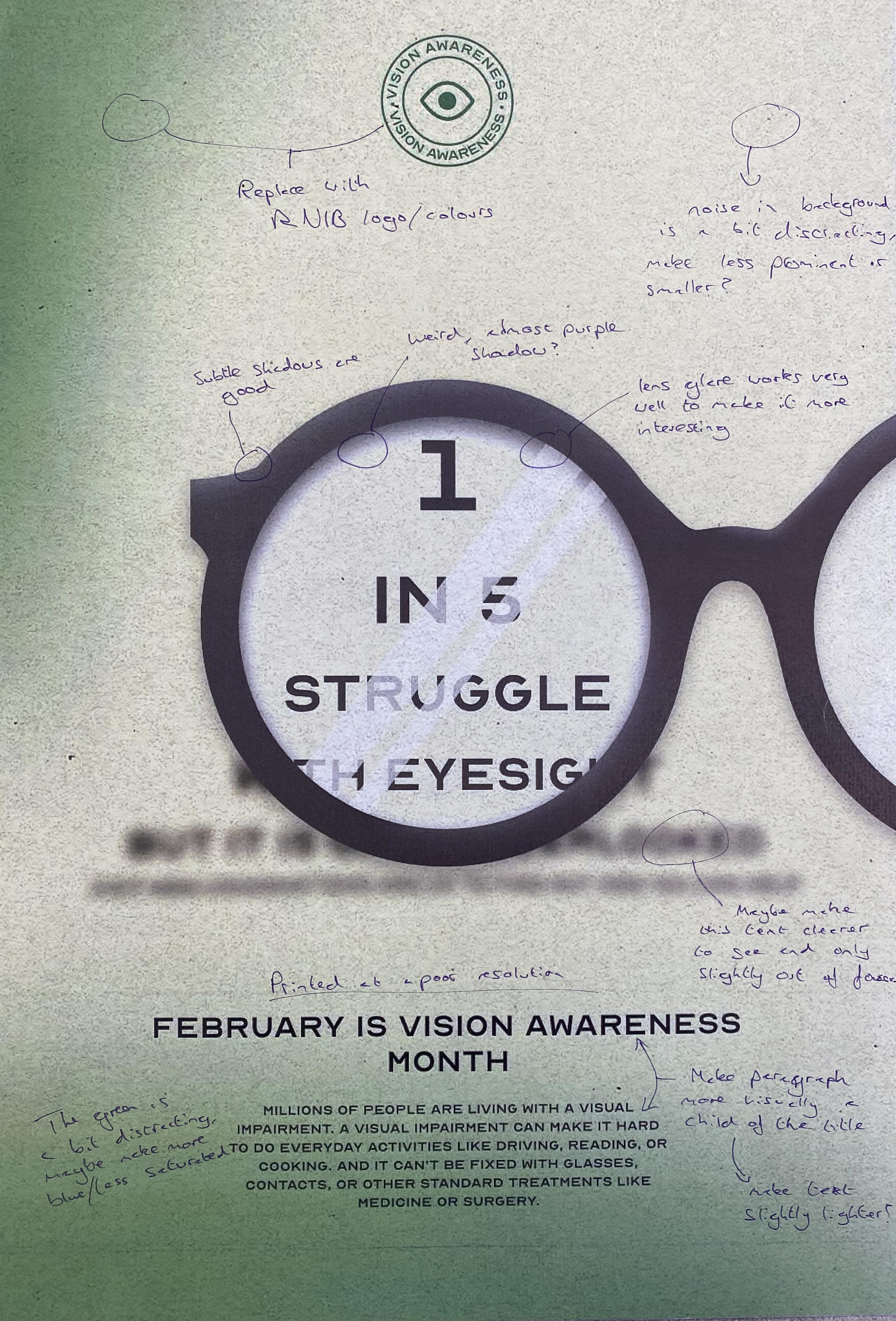
Adjustments
During the design process, I would print off the poster and annotate various changes I would then make:
Colour Experimentation
At this point, I was very happy with the composition, but I felt the purple colour scheme didn’t really fit that well. I ended up preferring a green colour scheme instead, as green has connotations of health, life and renewal, which are all aspects of my fictional company.
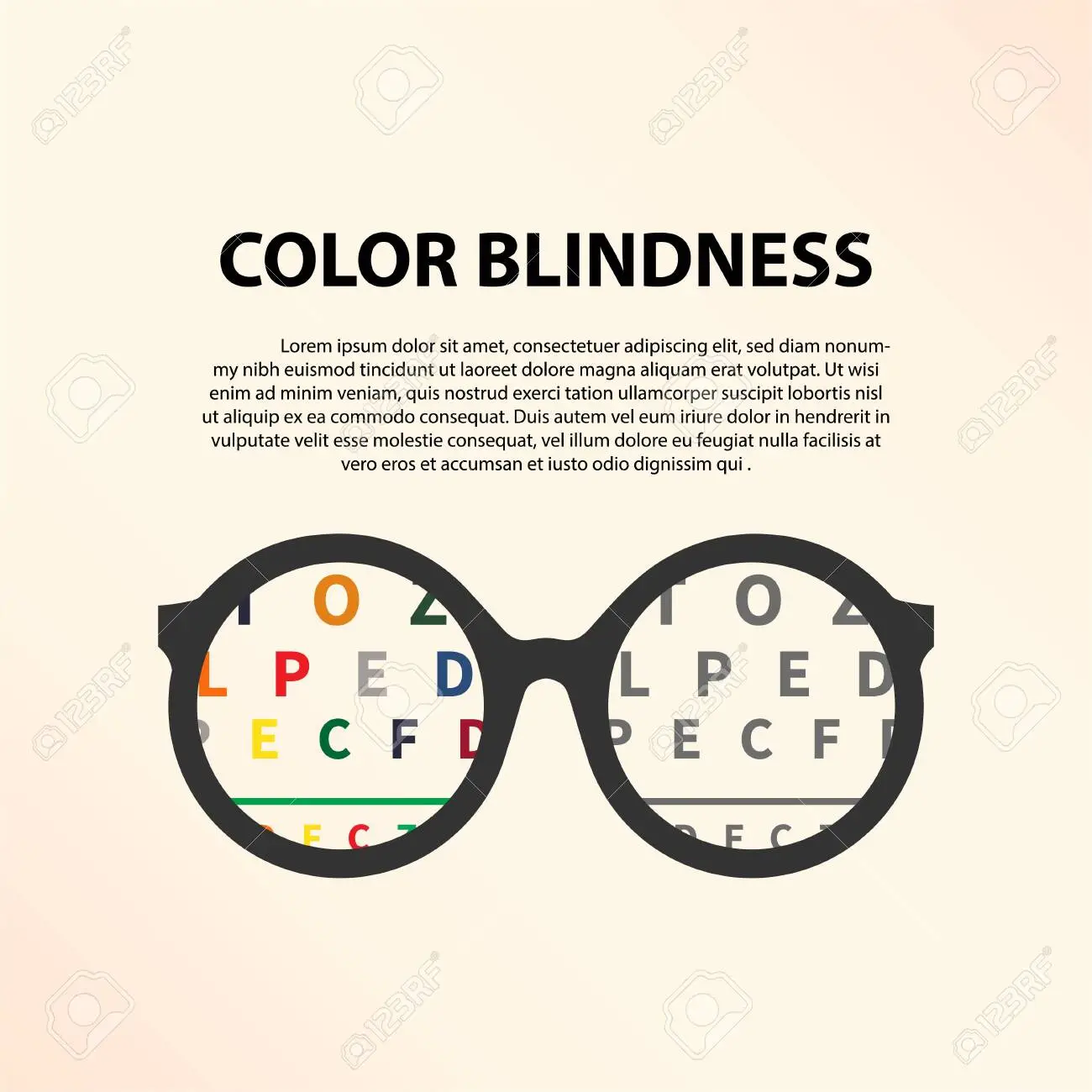
Hover over the image to see how different colourblindnesses see this image