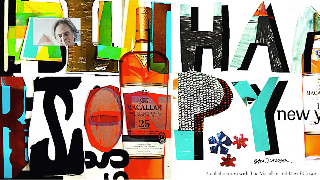
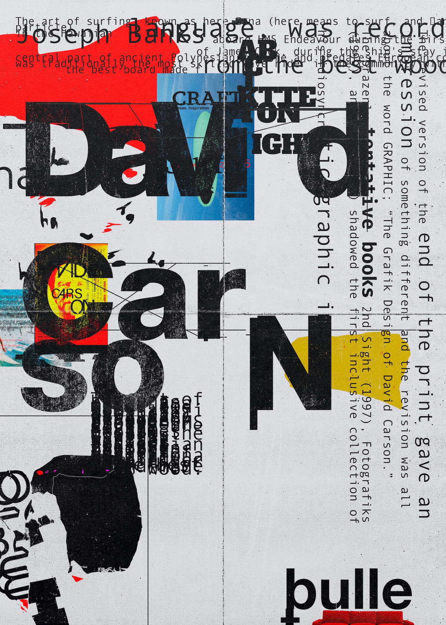
David Carson
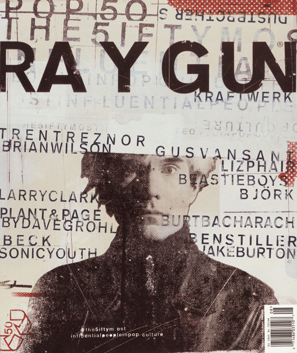
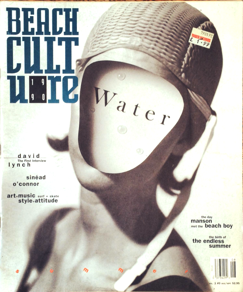
Carson was born on the 8th of September 1955 in Corpus Christi, Texas and attended San Diego University with a Bachelor of Arts in Sociology. He initially pursued a career as a professional surfer before transitioning into graphic design in the late 1980s. Carson gained popularity whilst he worked at Ray Gun magazine and later created his own design firm.
Carson was inspired by a variety of sources such as the Californian surf/skate culture and underground music scenes. You can also see his work mimic that of street art and graffiti, where he replicates the imperfect and spontaneous energy. His designs use a mix of distorted typography, photography and hand drawn illustrations to create dynamic and unconventional layouts.
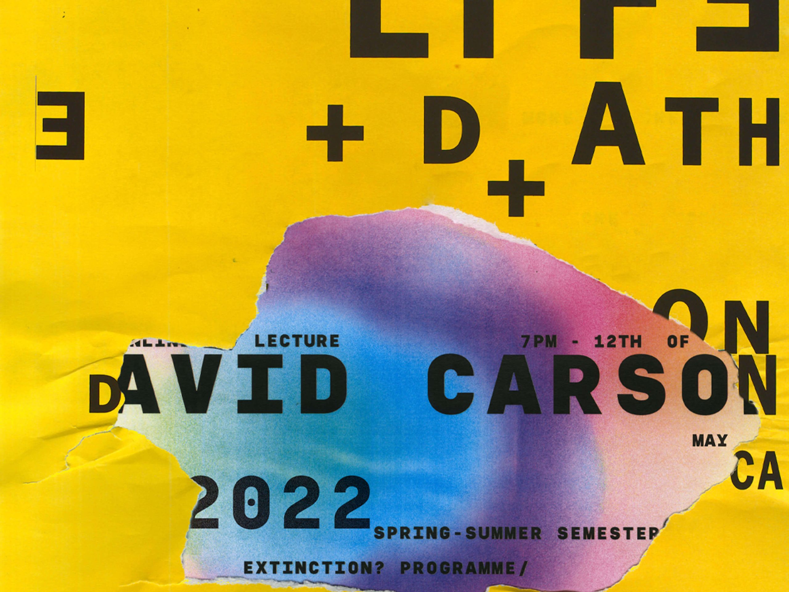
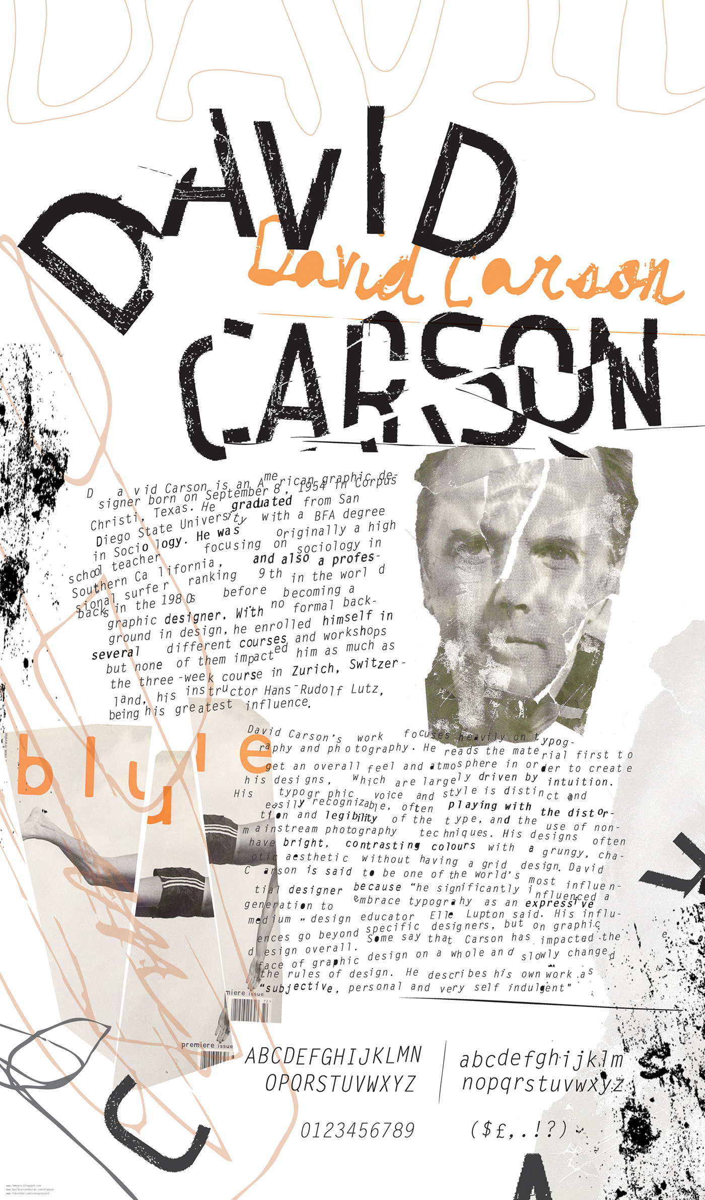
Carson is often described as the “Father of Grunge” and you can definitely see how his work has influenced this style. The subtle layers of grunge really make his work appear more weathered and eroded, and the distinct primary colours that he uses makes his designs really eye catching.
You may think that the often difficult to read style of Carson contradicts the message that I want to present, however, I think that his style captures what I see quite well. The subtle blurriness to some elements emulating symptoms to long and short sightedness and the random squiggles or lines that disrupt the page mimic myodesopsia (floaters). However most importantly they grab the attention of the audience with this unorthodox style, which is the primary goal for my series of posters.