Mockups
Isometric Drawing
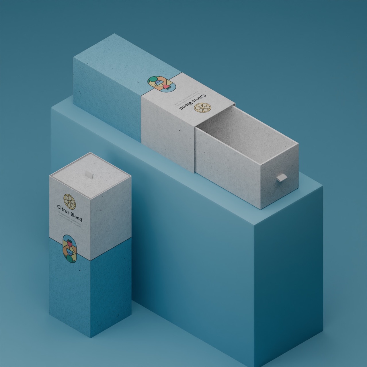
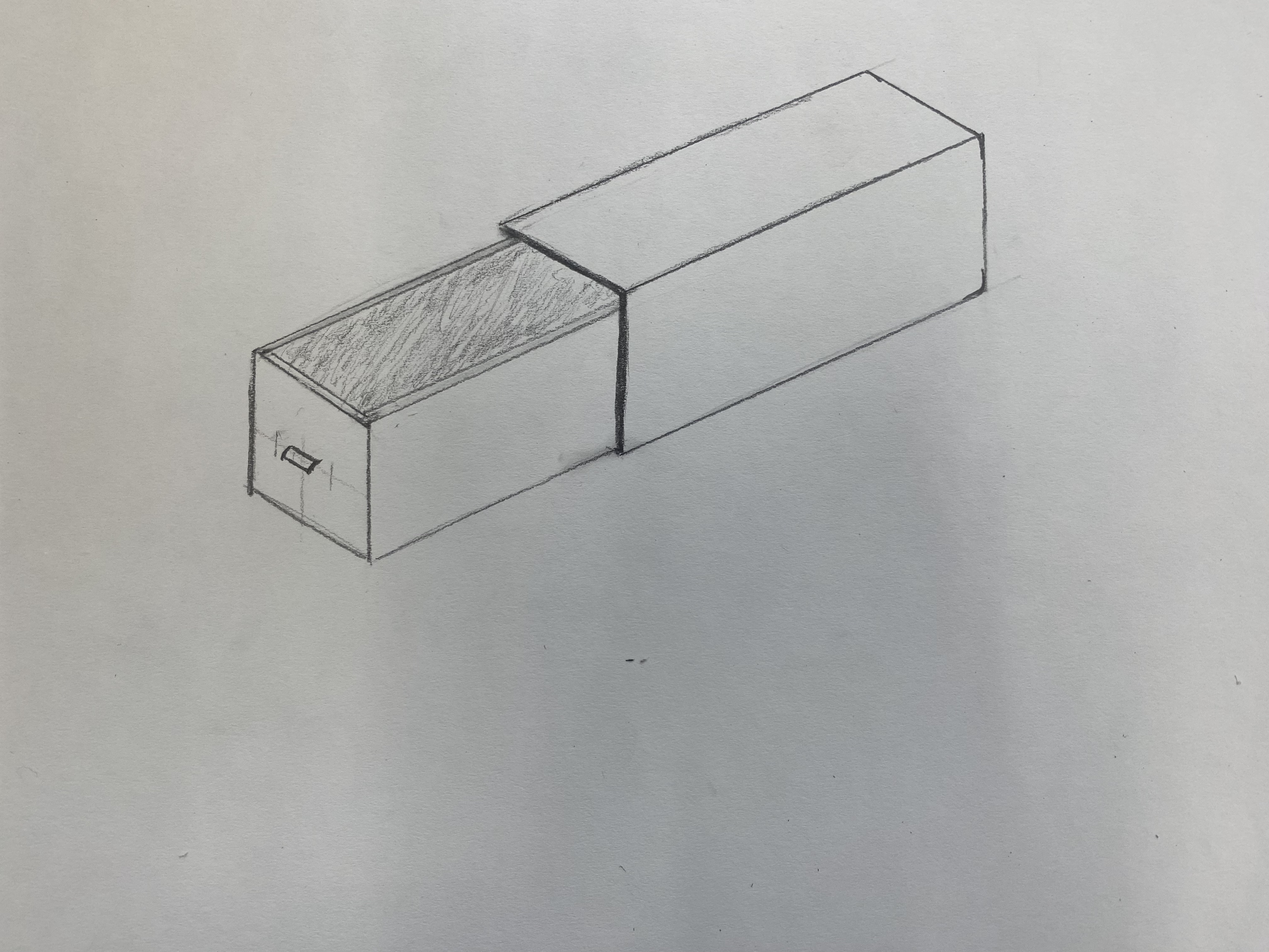
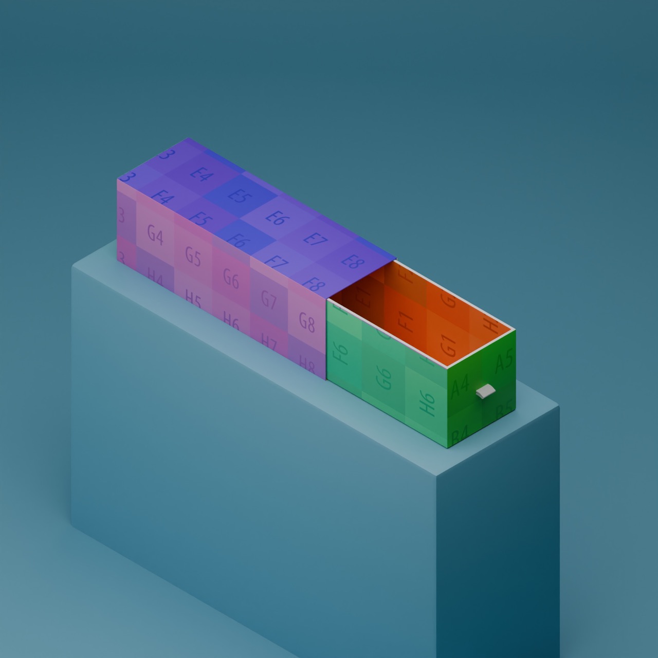
I first started by creating an isometric drawing of roughly what I wanted the design to look like. I went with a basic rectangular box which could be accessed by pulling it out of its sleeve. The sleeve was going to be sealed on one end, so to help customers pull it open I would add a small cloth pull tab to one end. As well as being functional, this also helps to market the product as up-market.
I planned to keep the inner box a plain colour and put my design on the outer sleeve. This was to help reduce manufacturing costs as you could reuse the same inner box no matter what flavour.
Digital Mockup
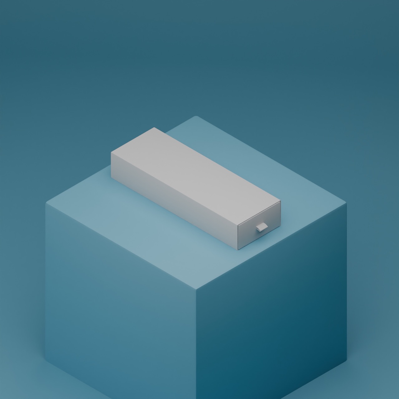
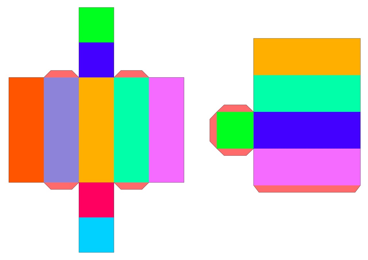
I then started work creating the model in Blender. This was to help me visualise how it would look with out going through the process of printing, cutting and folding the design everytime I made a change.
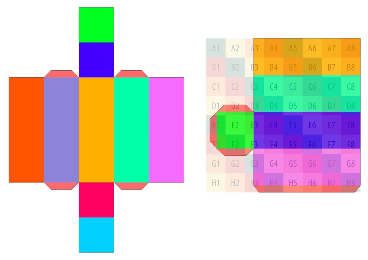
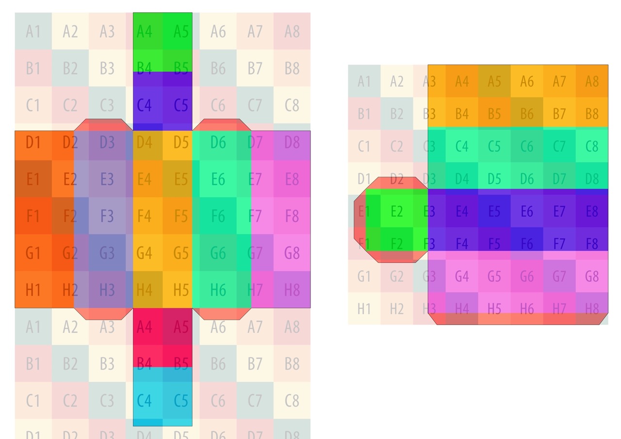
I experimented with using a flatter style of box, but quickly realised that it would be impractical to store a large number of tea bag inside. By going through the process of UV unwrapping I could then edit a texture map and see it update on the model in realtime. The multicoloured squares you can see on the right image is testing to make sure the texture isn’t stretched and is lined up correctly.
Below is the texture map. Its an image which has the box nets of the inner box and the sleeve. I used a variety of techniques involving separating the sides into different colours to UV map the texture correctly. Once I was happy with this, I could then begin adding my design to the packaging.
Iteration 1
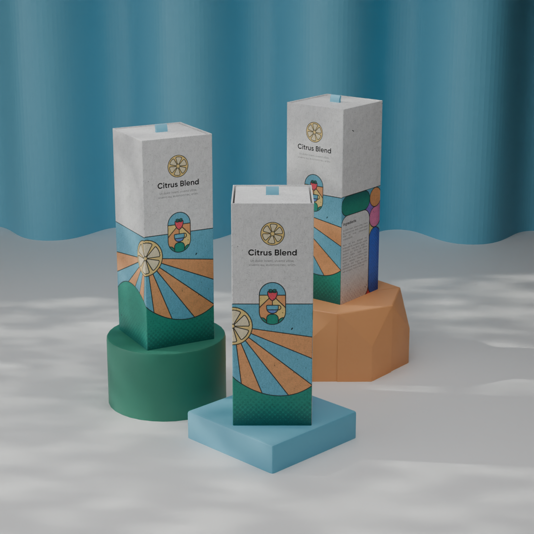
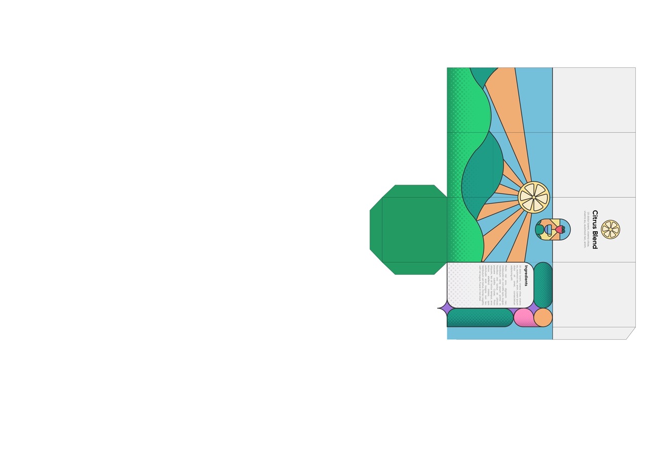
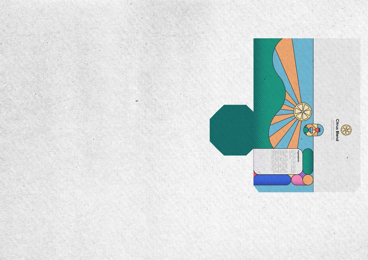
For my first packaging design I decided to create the packaging for the flavour “Citrus Blend”. In my first iteration I split the sleeve into 2 parts with one being 1/3 and the other the remaining 2/3. I then placed the citrus fruit all along the lower band in a pattern. I also introduced the halftone pattern in the background to help give it dimension. I also experimented with having the fruit overflow from the band.
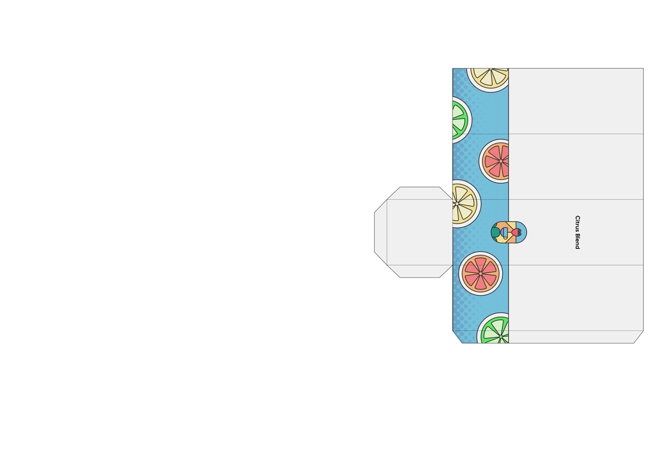
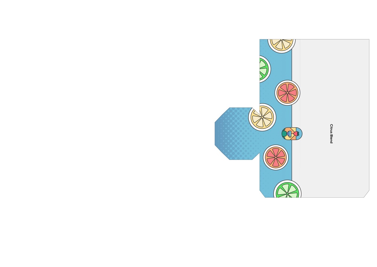
However, I felt this design was a bit bland and not very eyecatching. To help with this, I decided to give the packaging a 3D aspect. This would be another layer on top of the band with holes cut in revealing parts of the design below.
Iteration 2
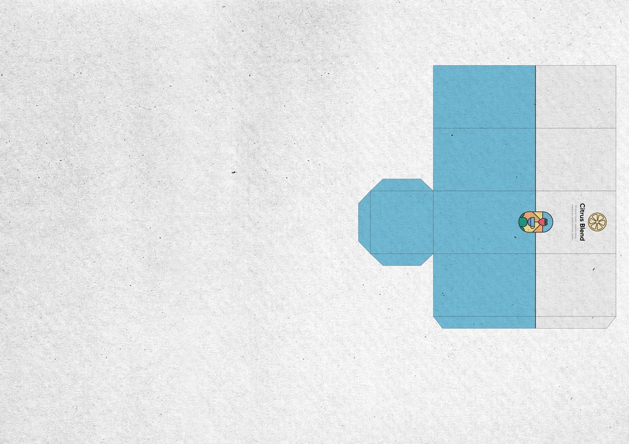
For my next iteration, I increased the size of the band and instead made the ratio more similar to 50/50. This was to help give the design more room, hopefully making the overall package more eyecatching. This was because the majority of the previous iteration was mostly whitespace, making it appear very bland.
I first worked on the small title and tagline at the top. I included the main item of fruit from the flavour to help communicate what the customer can expect from the tea in a simple glance.
I also reworked the design to instead be a scene of rolling hills with a large sun shining down on it. I replaced the sun with a lemon, helping to suggest that its packaging for a citrus flavour. The link with hills and the outdoors helps to develop connotations of nature and health benefits with the customer.
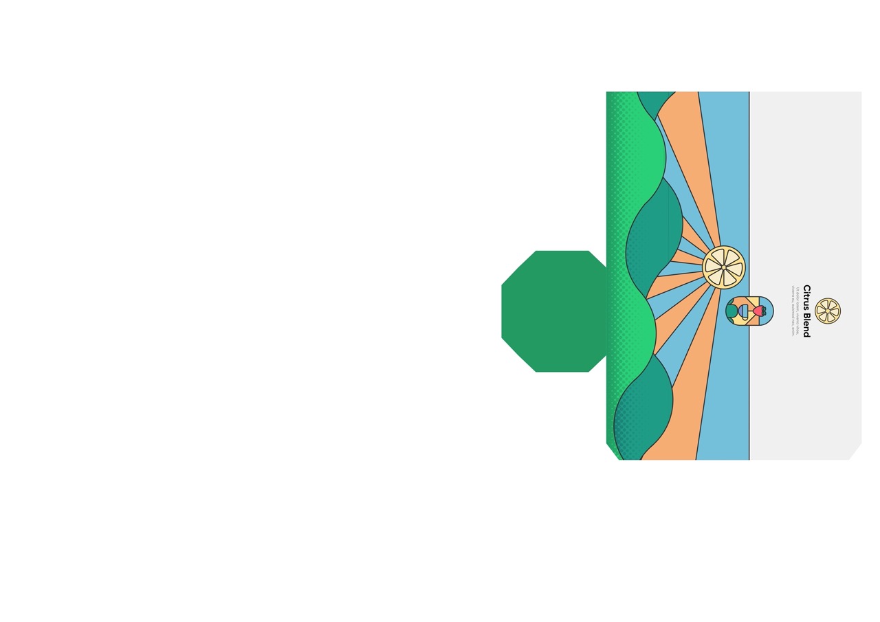
I then included a section for the ingredients and other important information. I also removed the first layer of the hills. This would allow me to implement the 3D parallaxing effect that I used in the original design by having the foreground hills appear floating infront of everything else.
3D Renders