Moodboard
Below are a series of moodboards looking at the different aspects I want to explore within the brief.
Packaging Moodboard
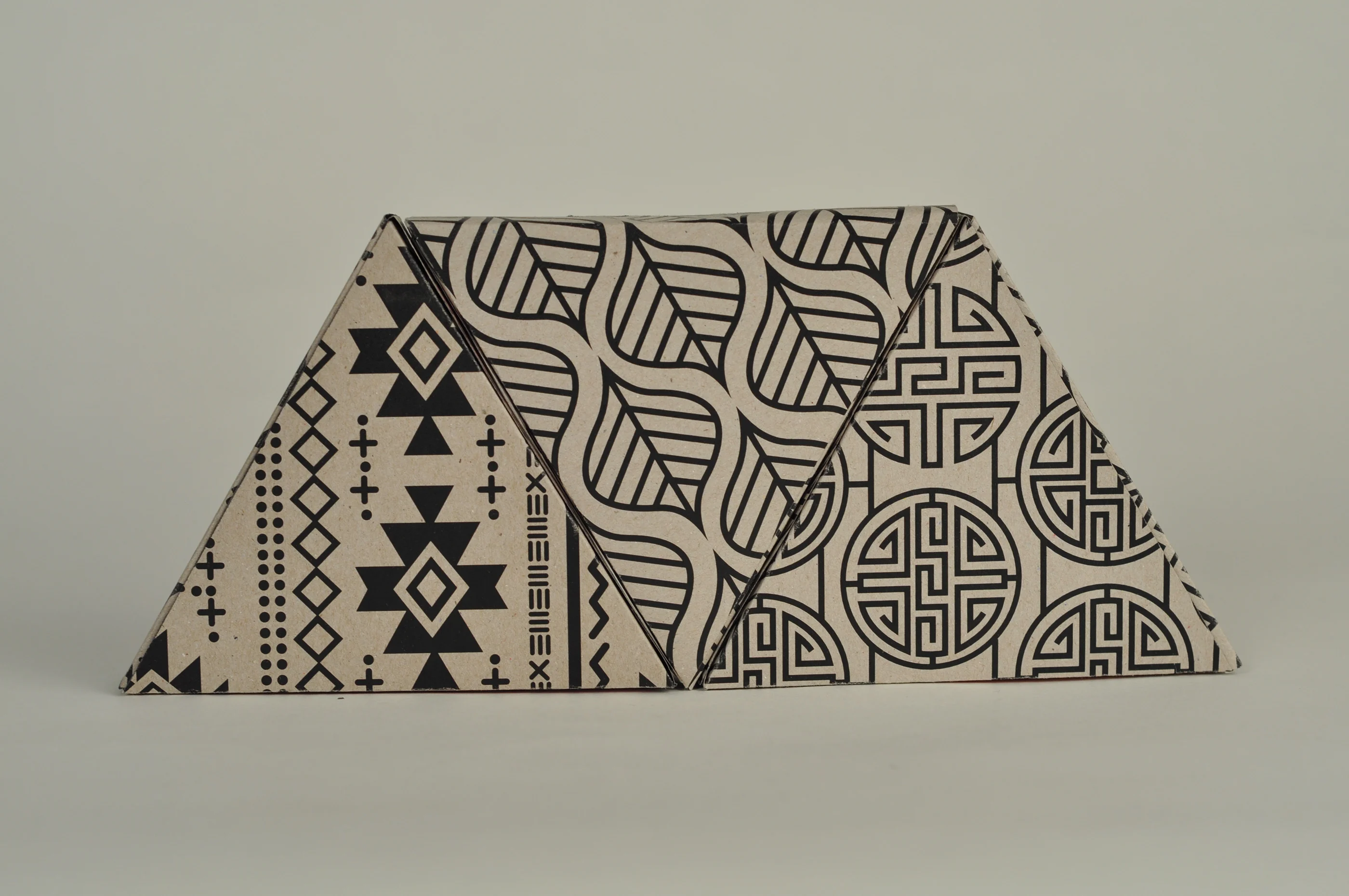
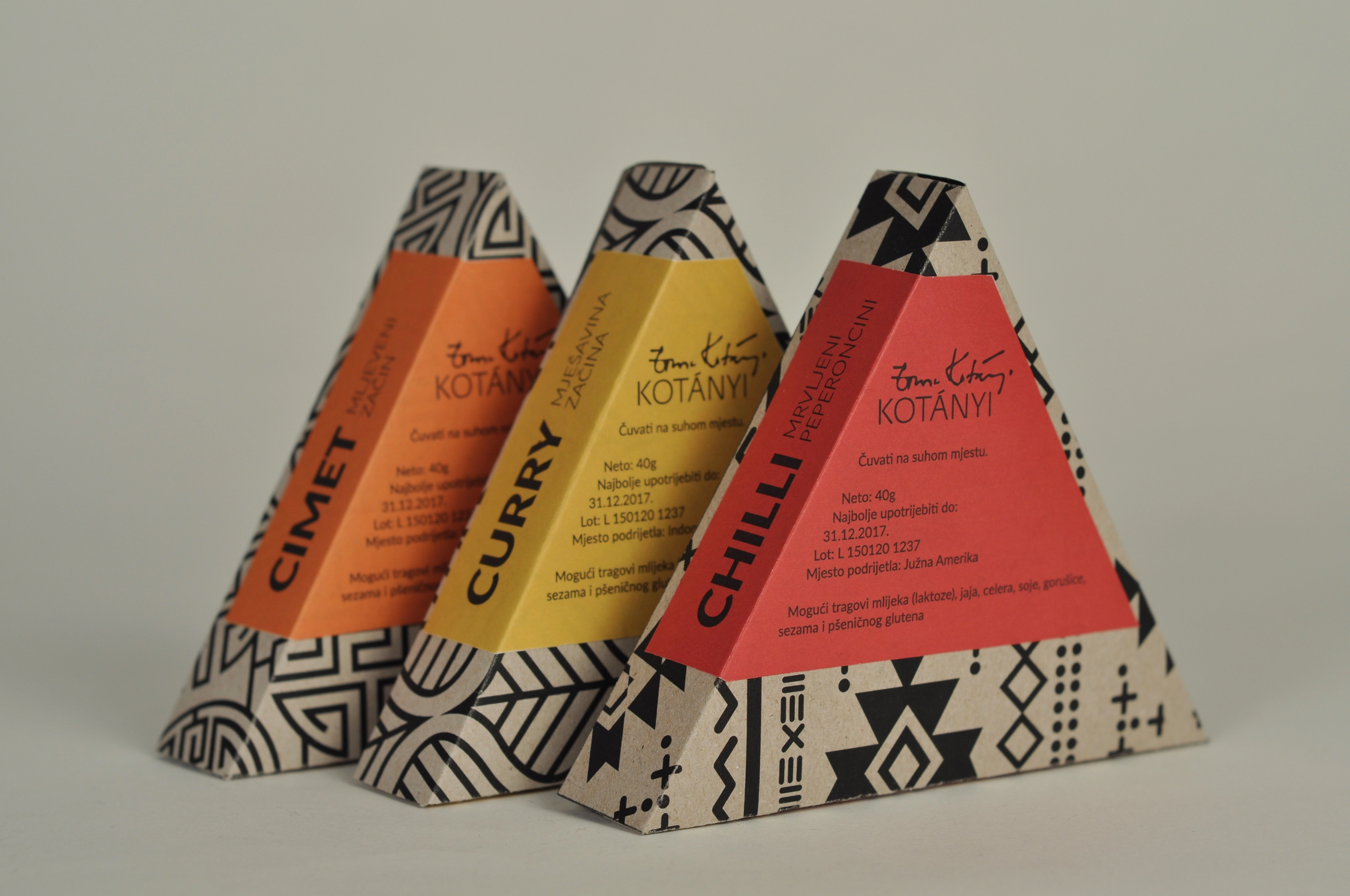
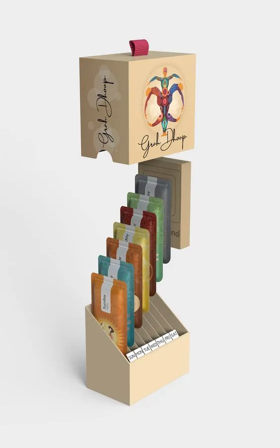
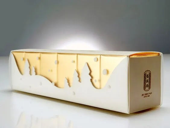
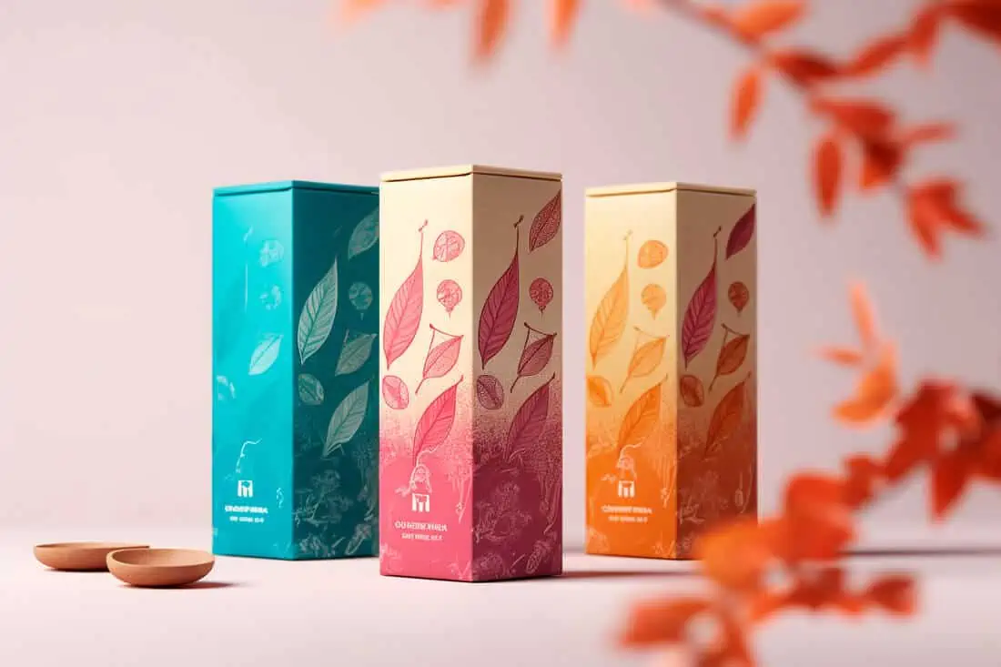
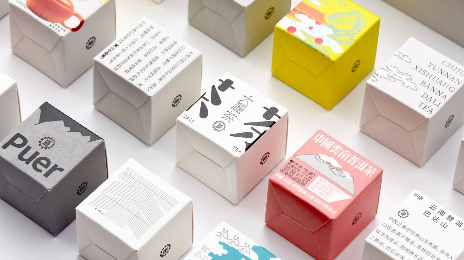
Unique Packaging Shapes
I really love the shapes of the packaging used here, especially as they are used to create tessellating patterns, making a more unique way to present the product to the customer, as opposed to the traditional, rectangular boxes. I also really like the abstract patterns used to decorate the box, and how they help to present the flavour of the boxes contents.

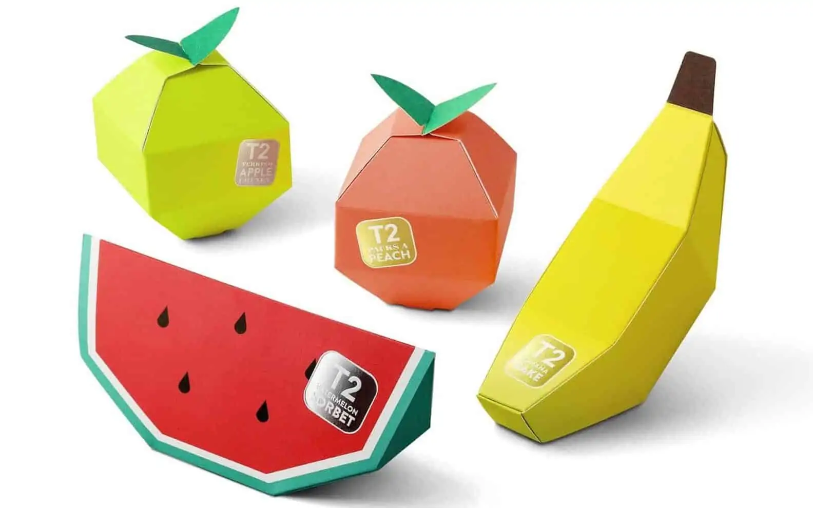
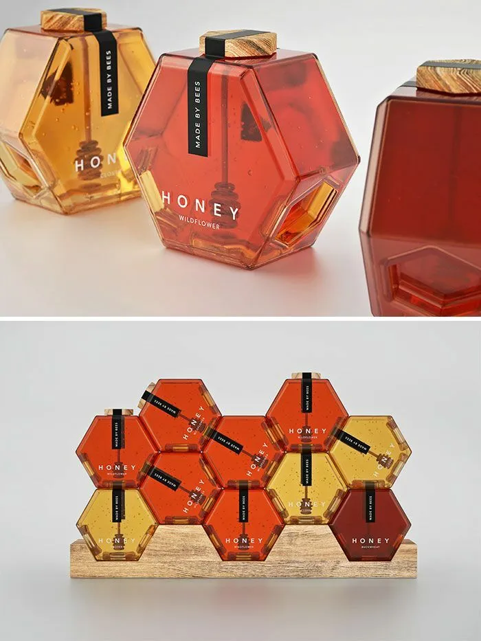
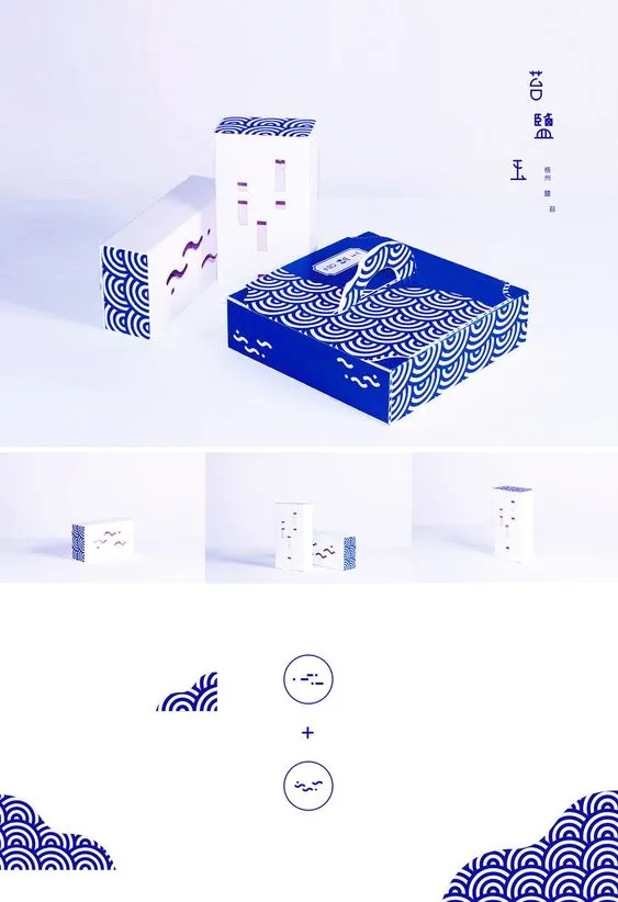
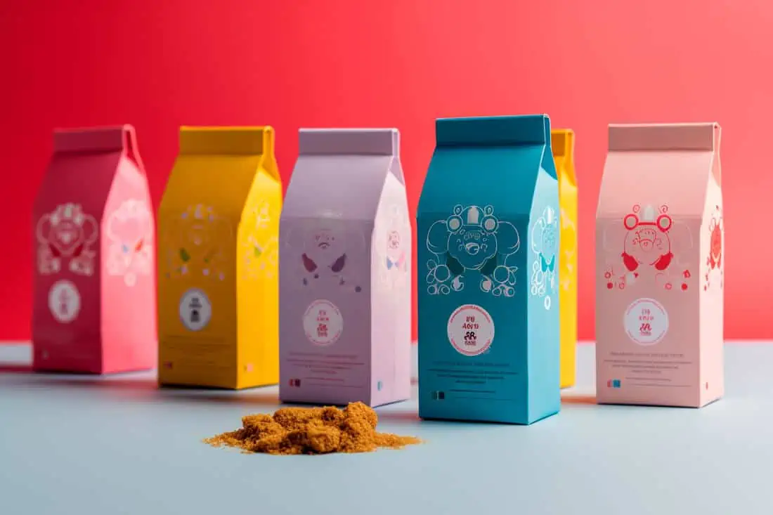
Unique Packaging Continued
Continuing with using unique and interesting shapes as packaging, these two examples continue to make packaging a more interesting experience. The playfulness of the first example really helps to market the product to a younger audience. The second example also uses tessellating shapes, and I really love how it uses the unique shape to present the product as more than an object you put in a cupboard, but instead as a focal point in your kitchen.
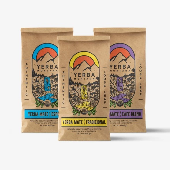
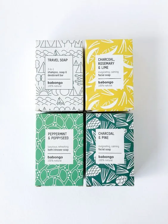
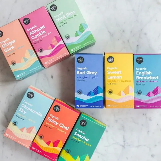
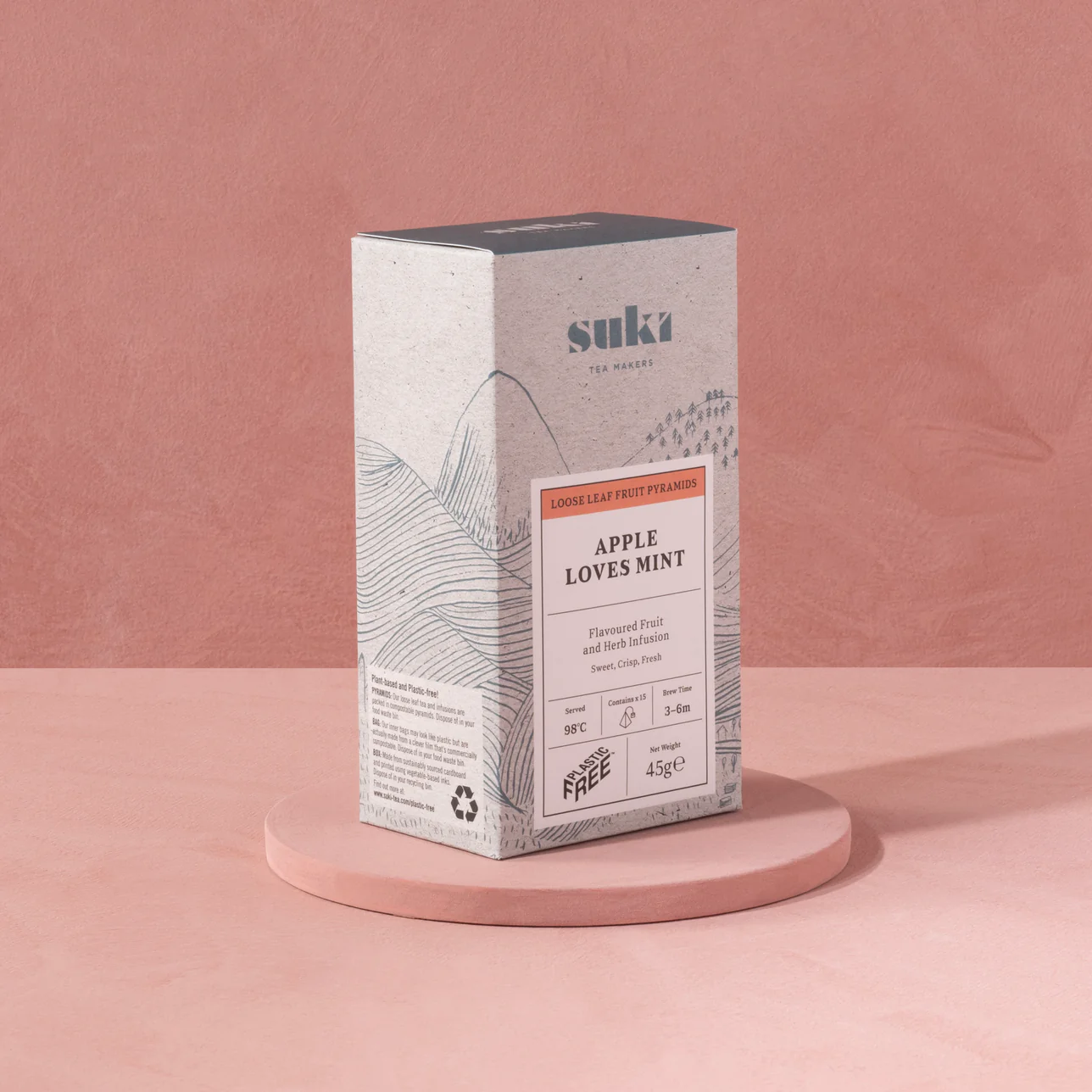
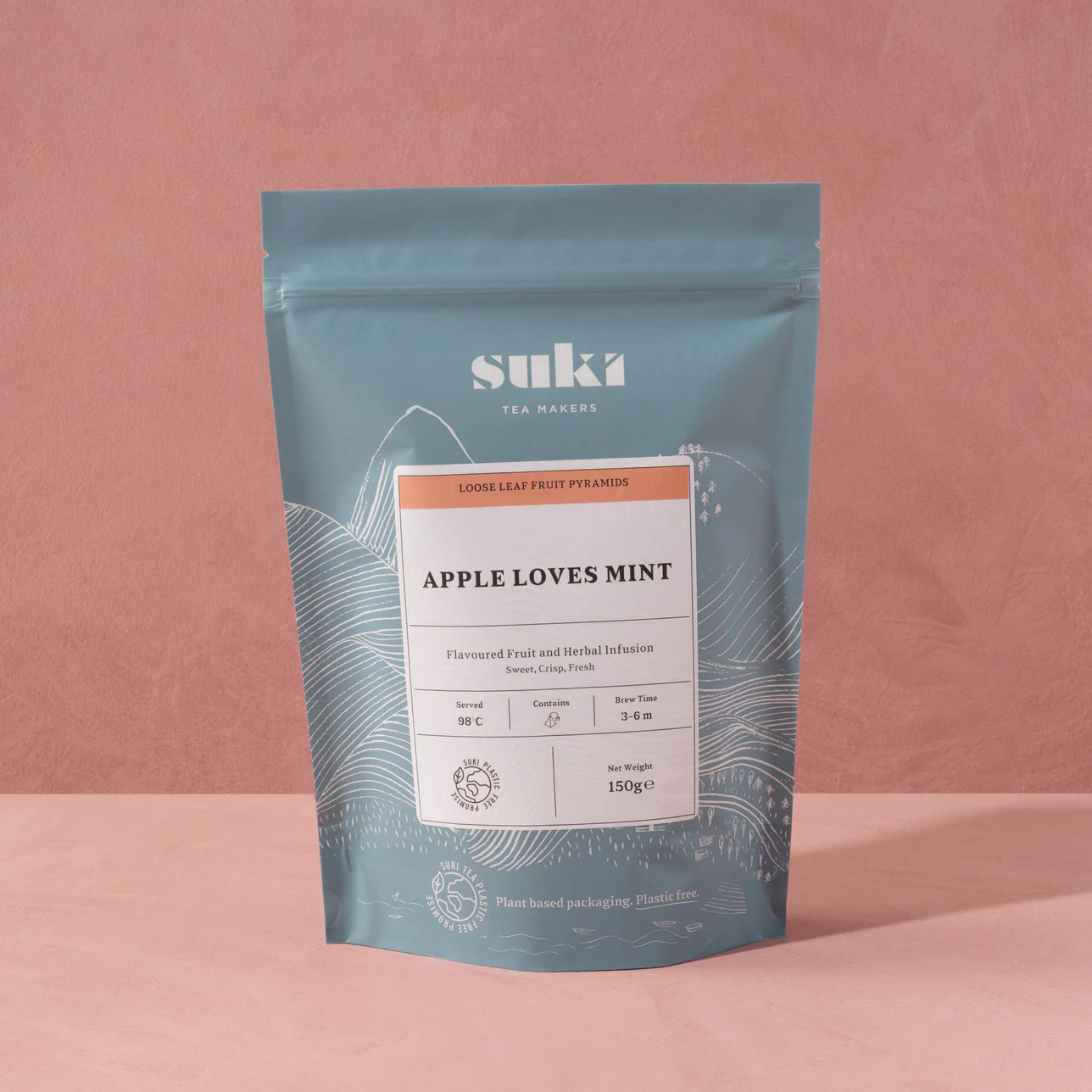
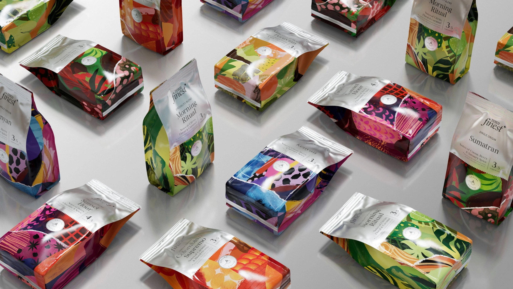
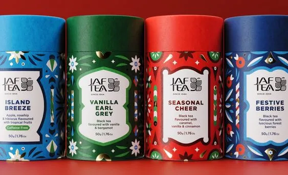
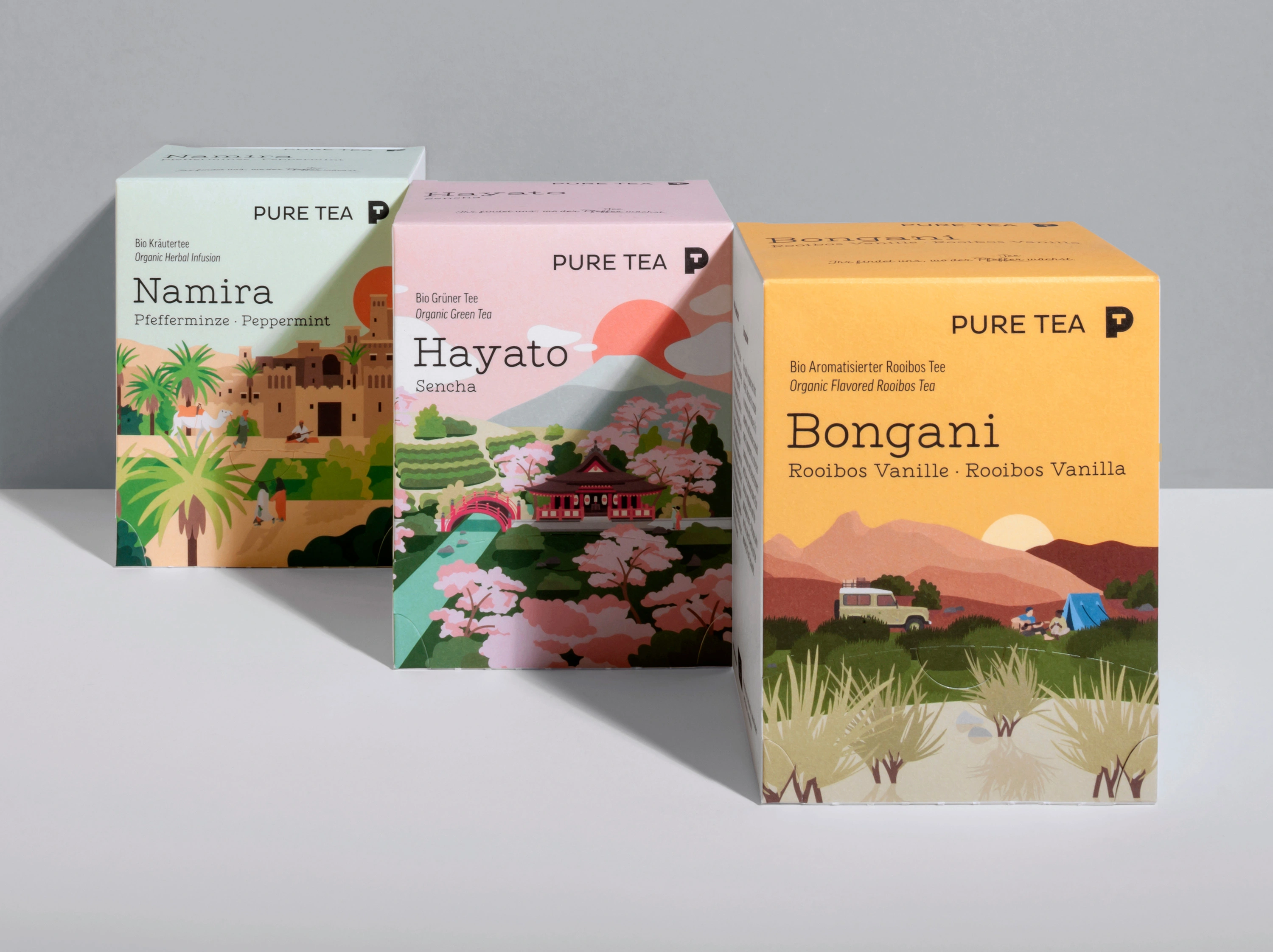
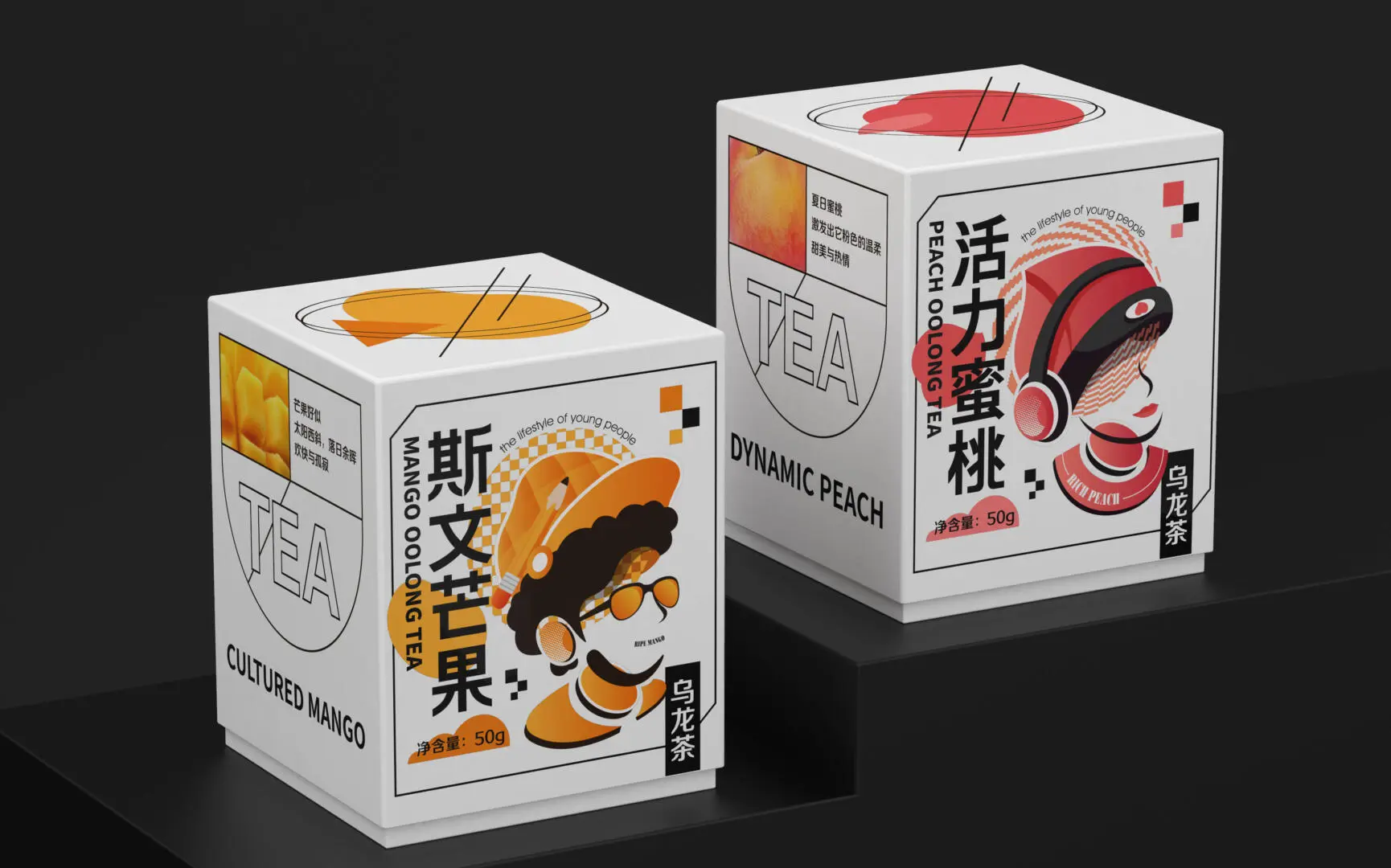
External Aspects
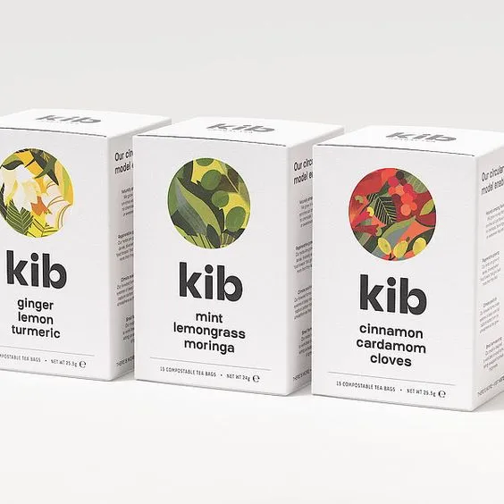
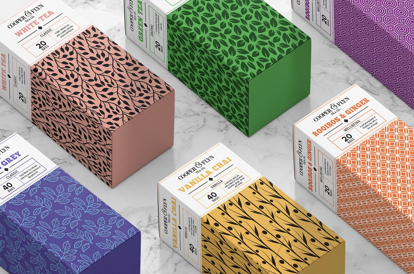
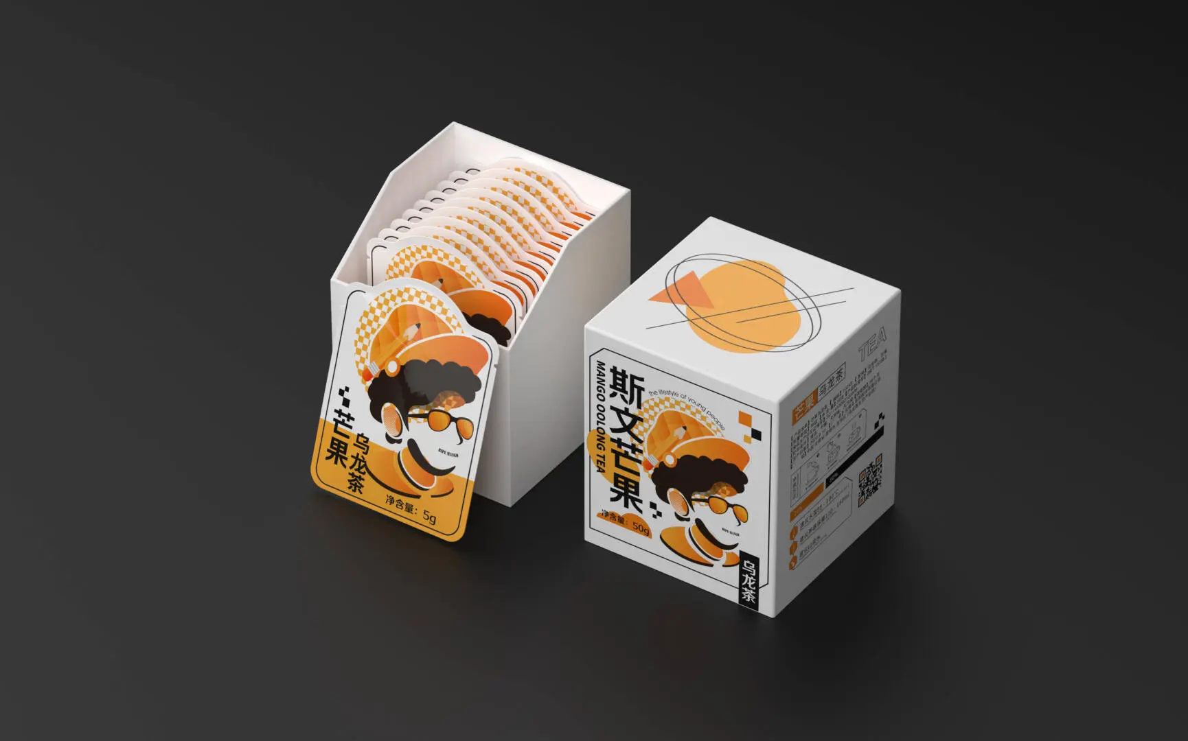
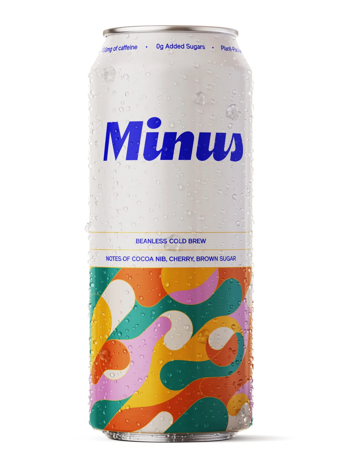
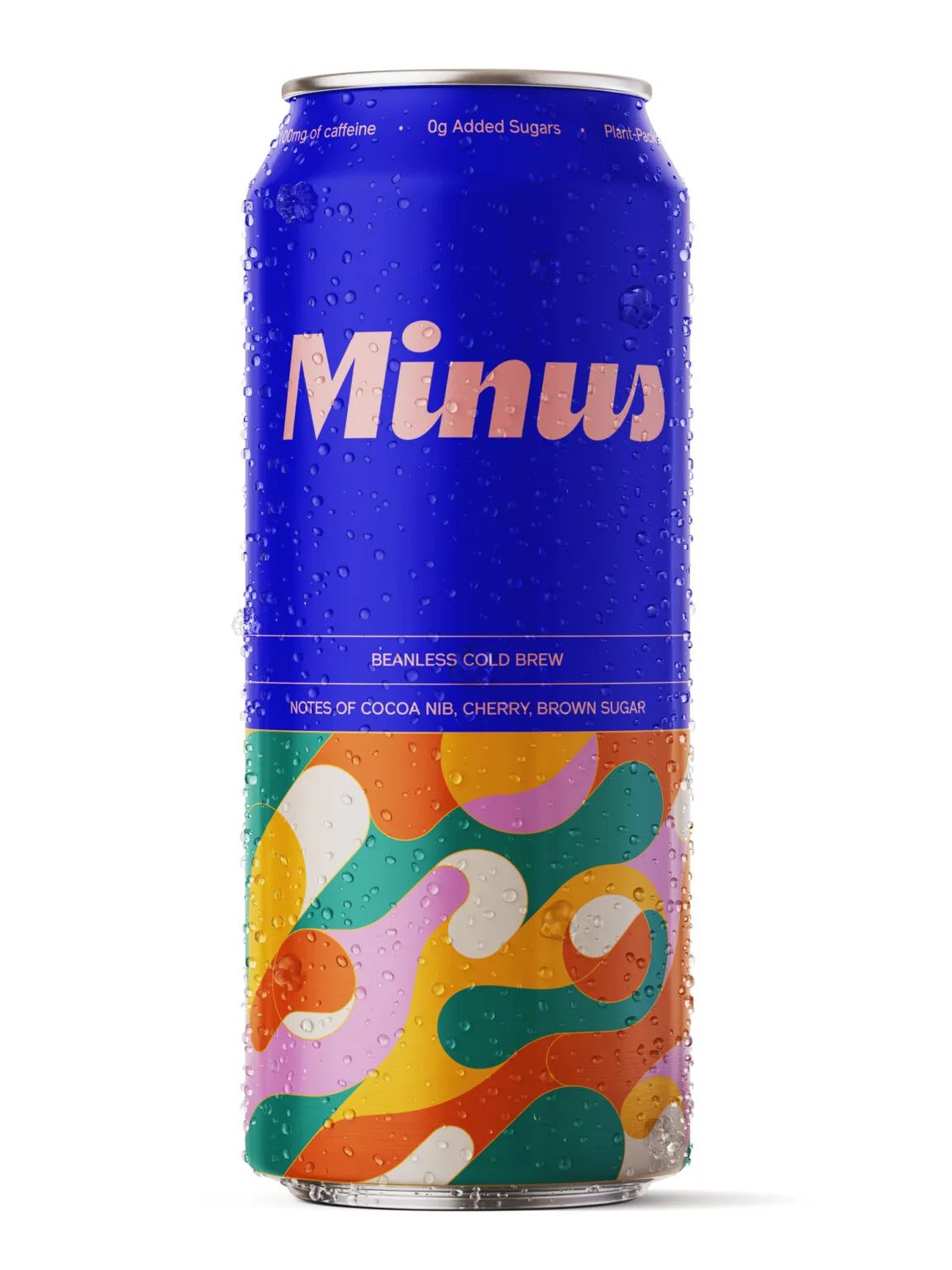
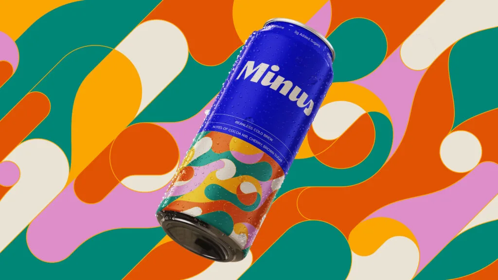
Lots of existing products use decorative art to help represent what flavours you can expect from the contents of the product. This helps to make the packaging more appealing to customers as they know what to expect.
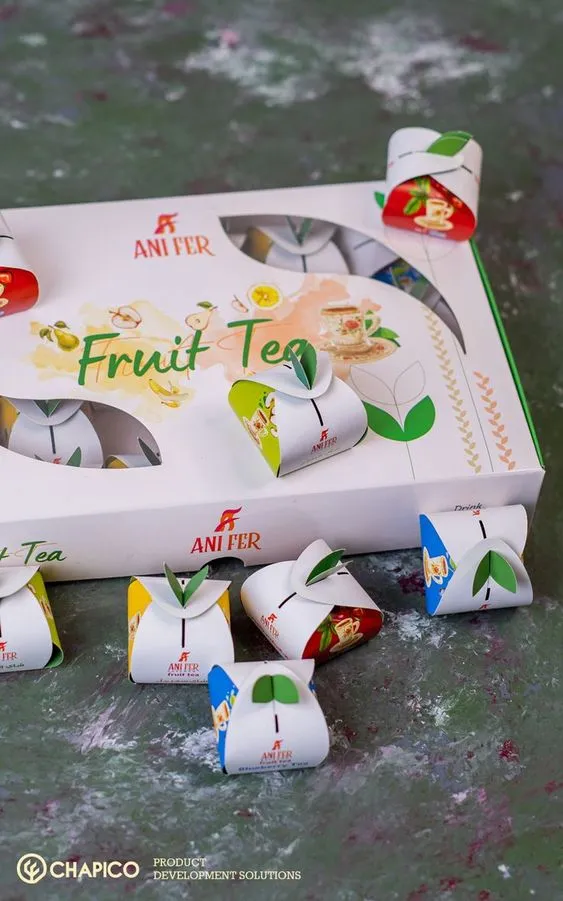
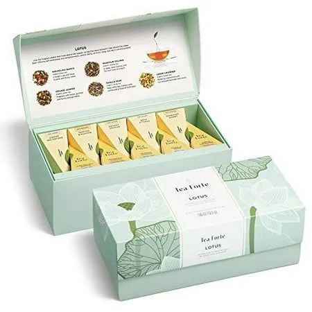
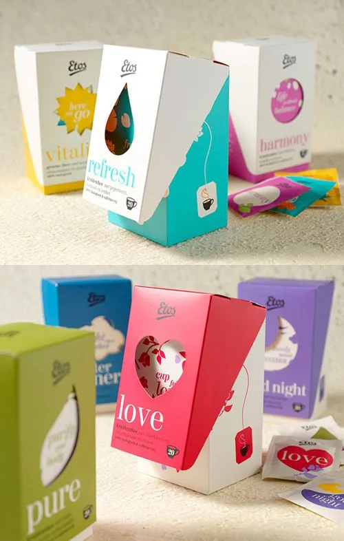
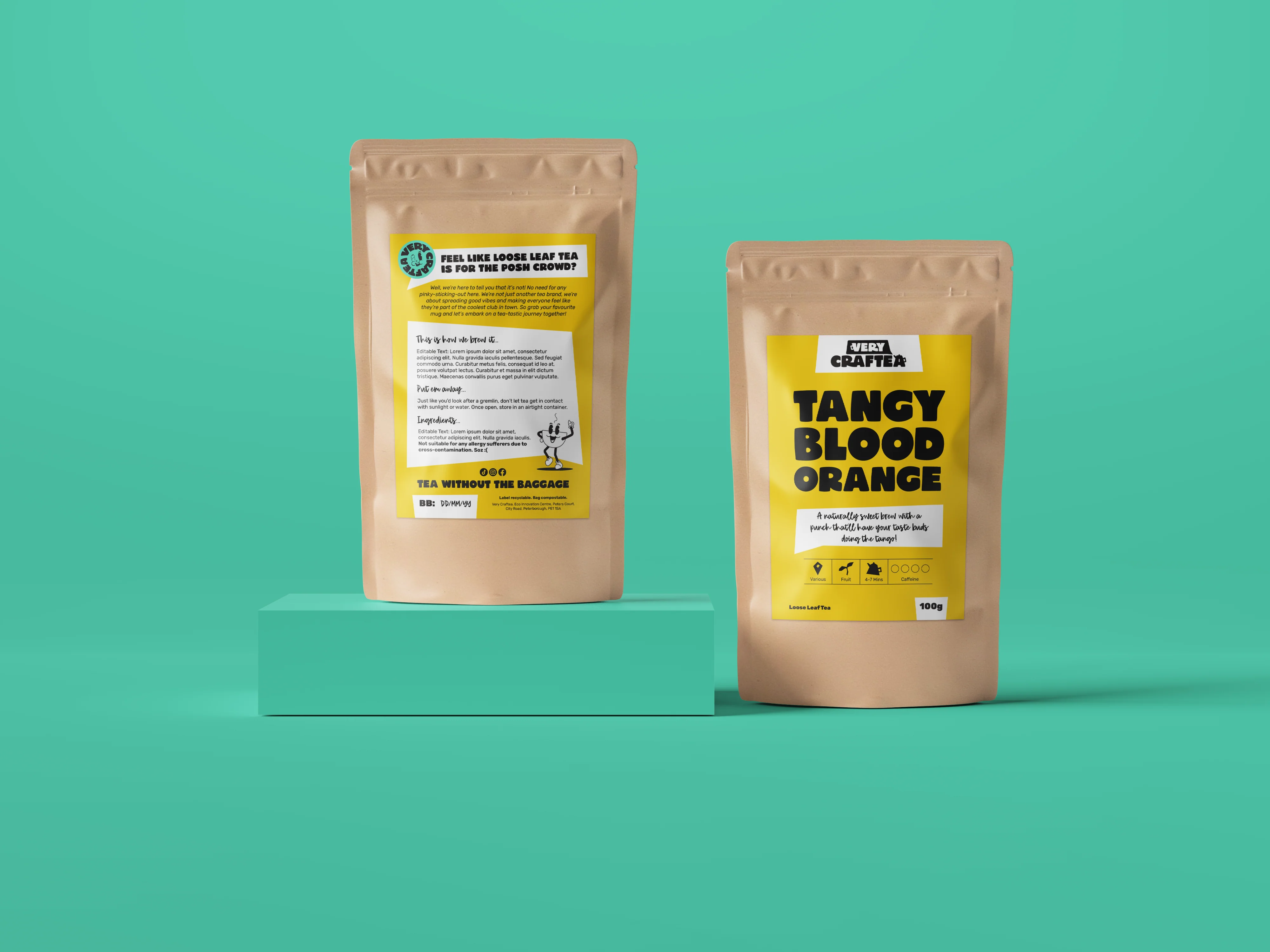
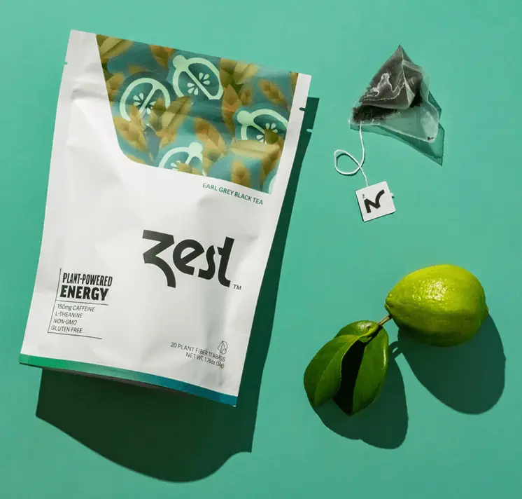
Unboxing
Here, the designers have turned what is otherwise a very mundane unboxing experience, and turned it into a more memorable experience. In the first example, they have turned the tea bags into mini packages, making them feel more personal. In the second example, the designers have have included a small paragraph explaining some tips on how to make the best cup of tea with their product.
Below are some more items in my moodboard:
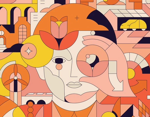
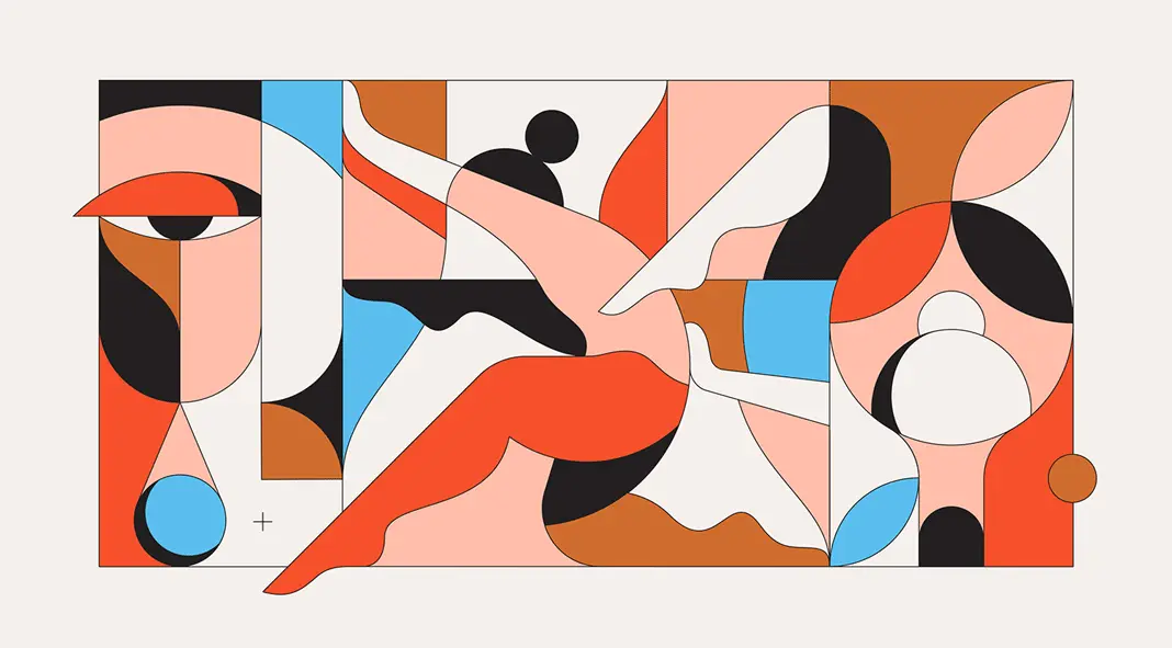
Brand Styling Moodboard

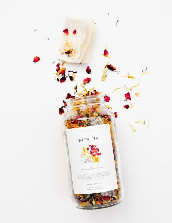
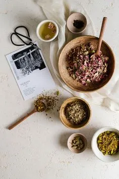
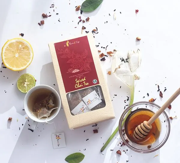
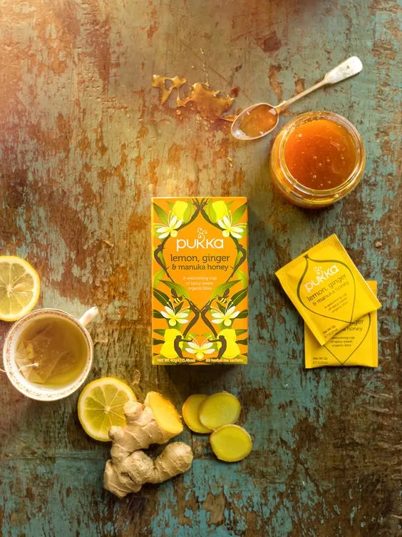
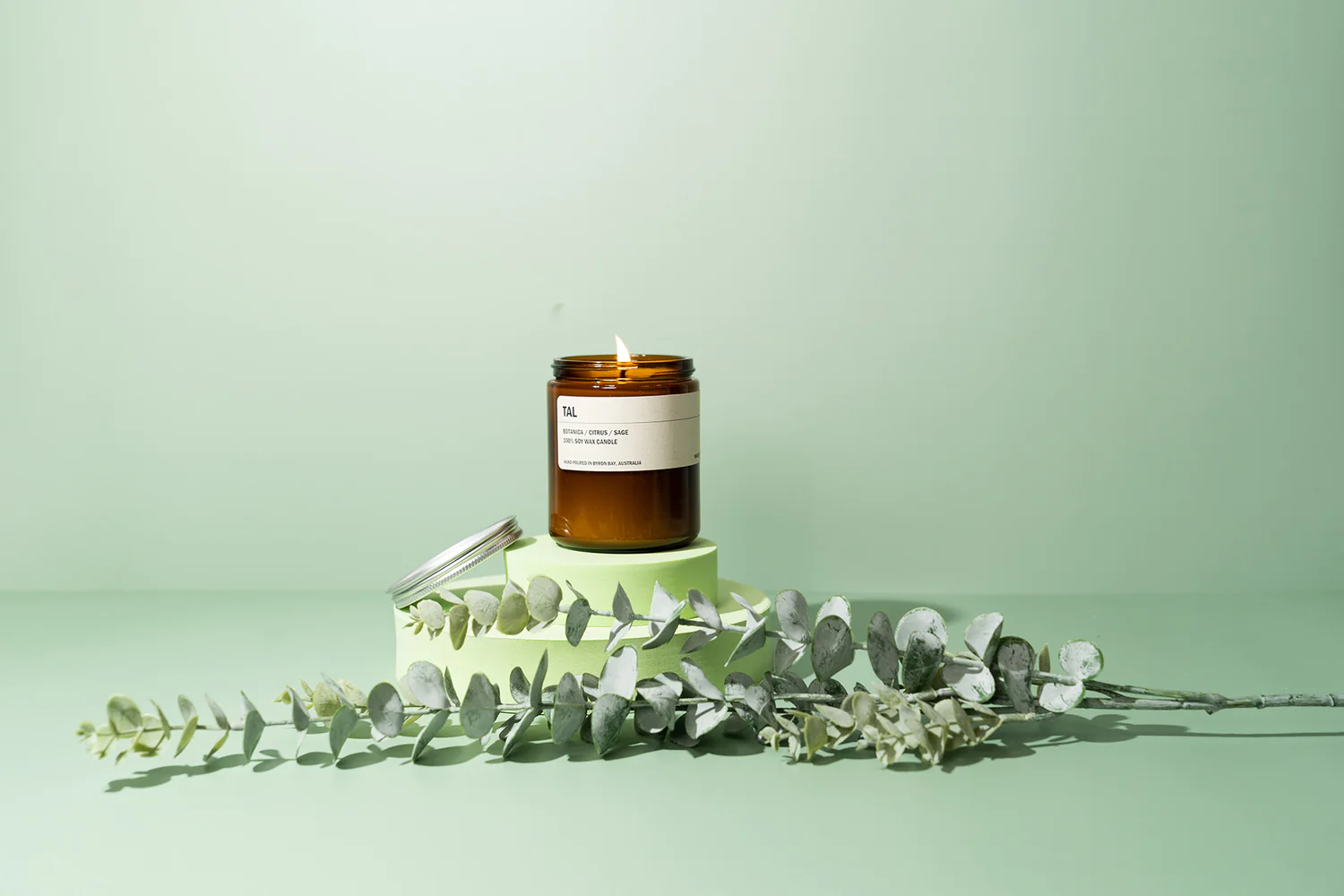
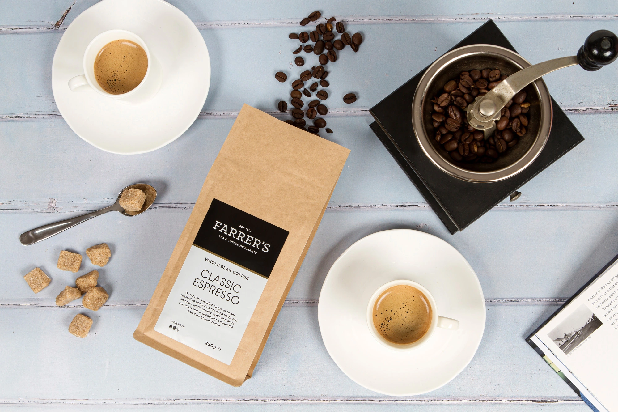
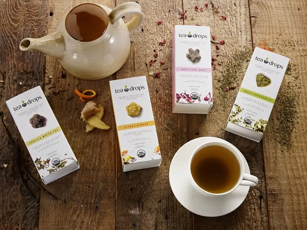
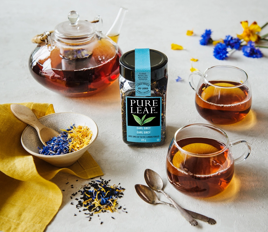
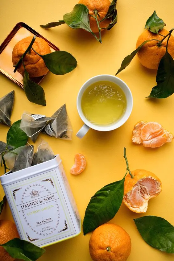
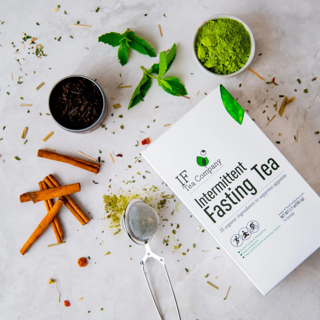
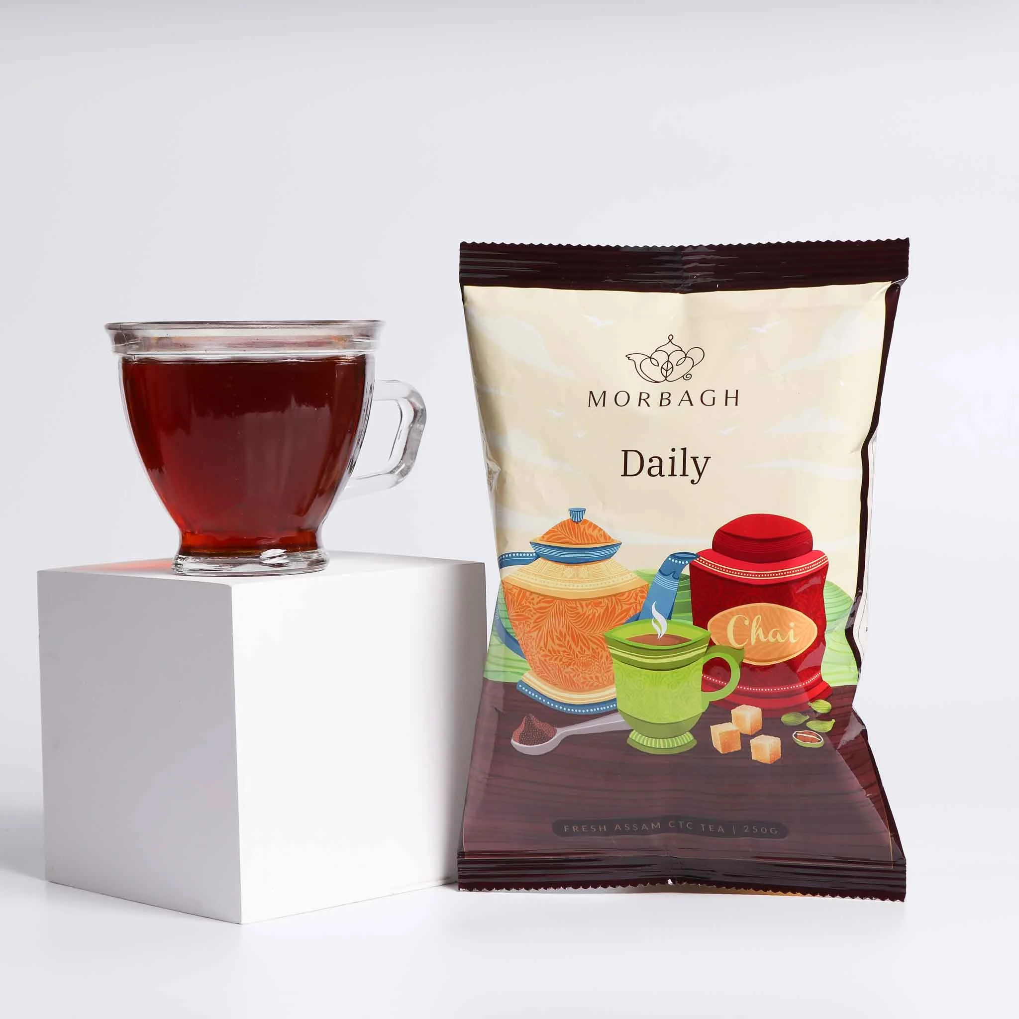
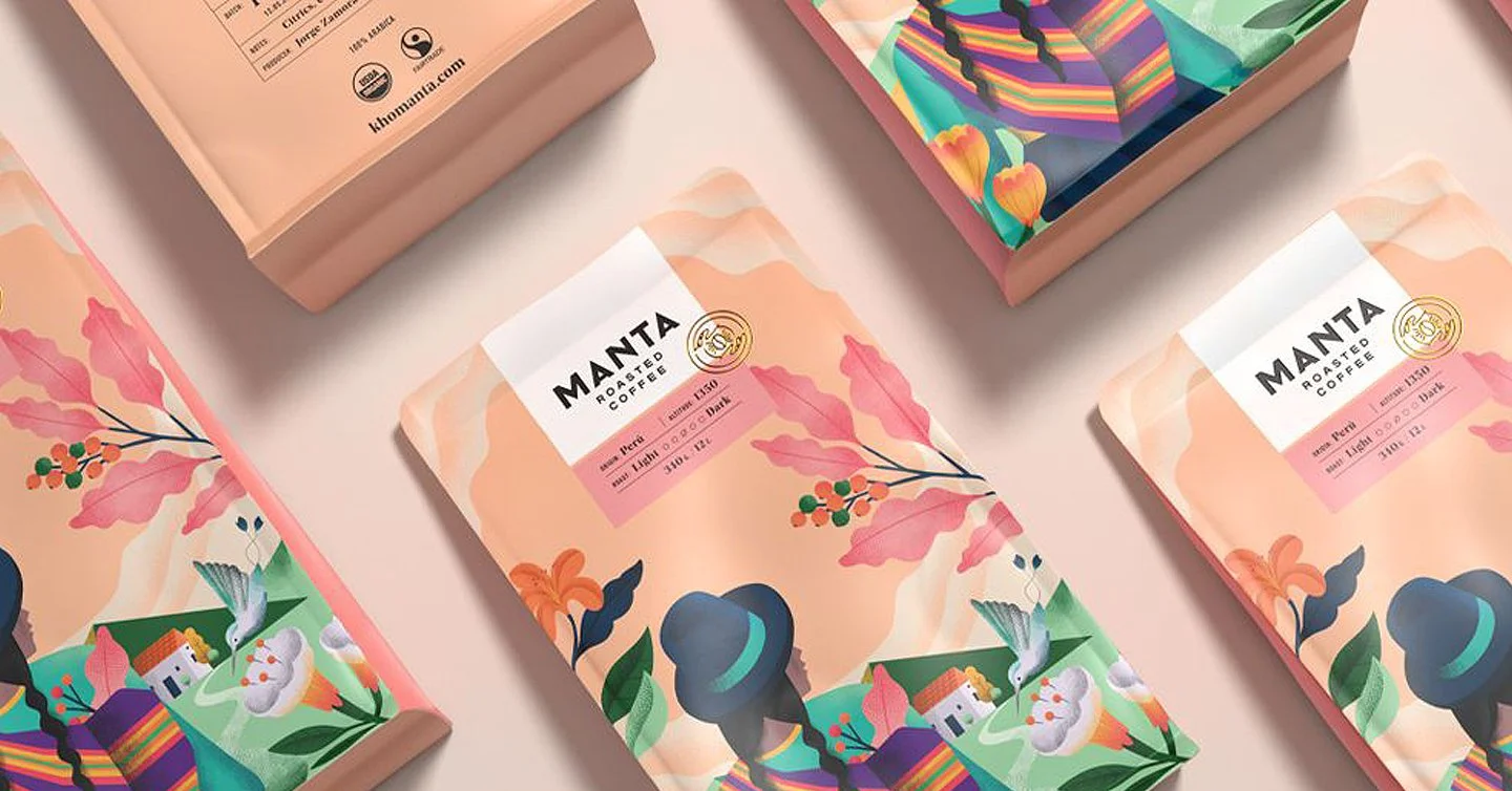
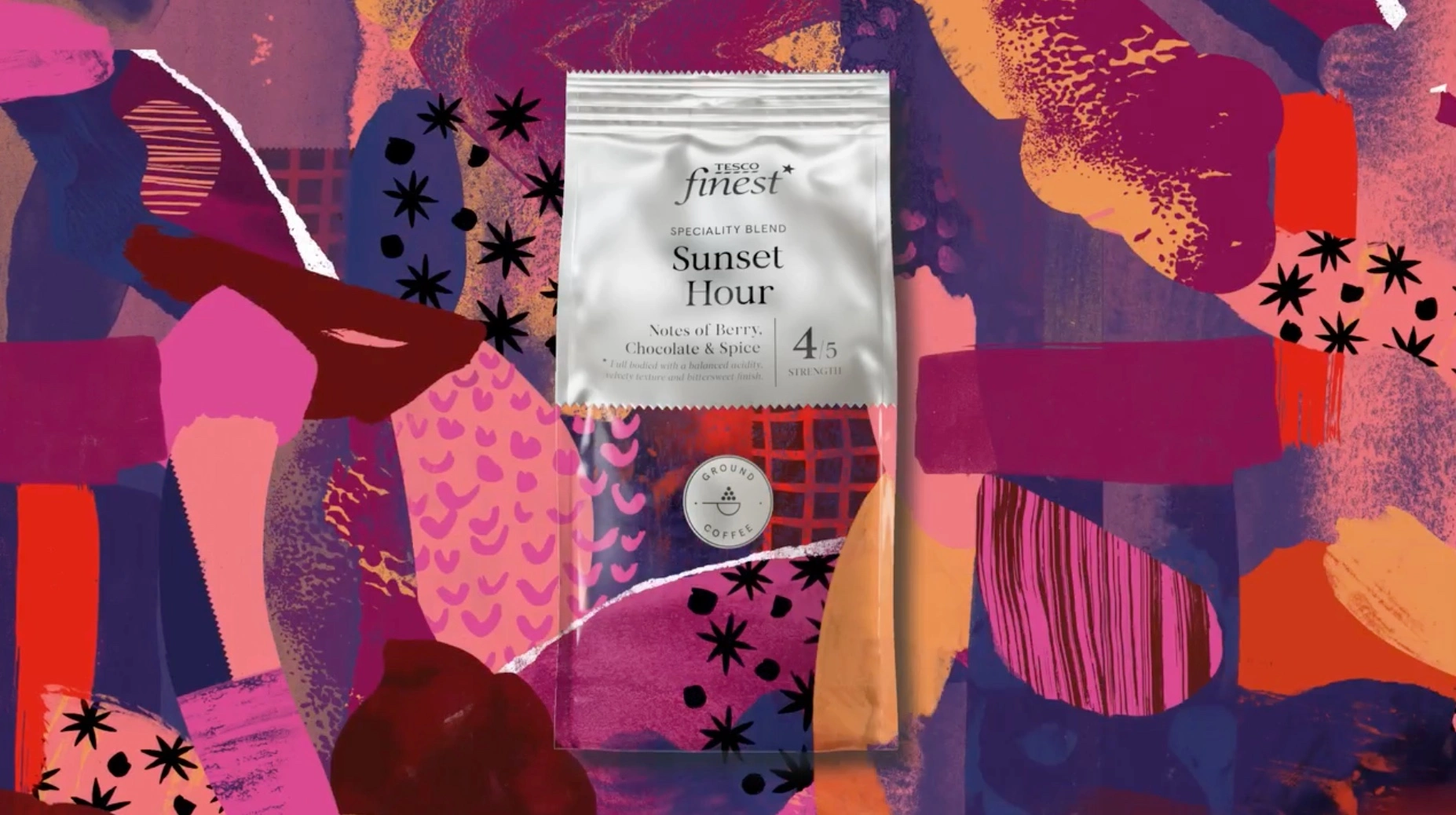
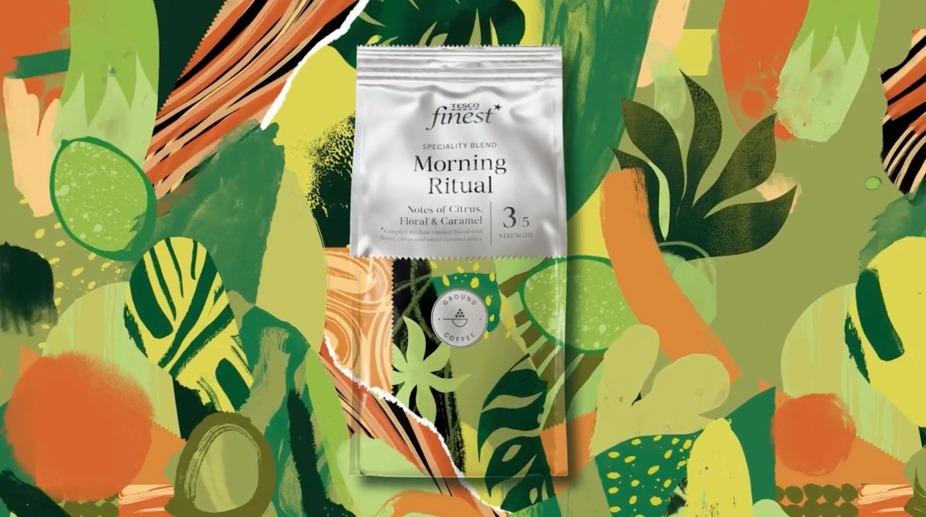
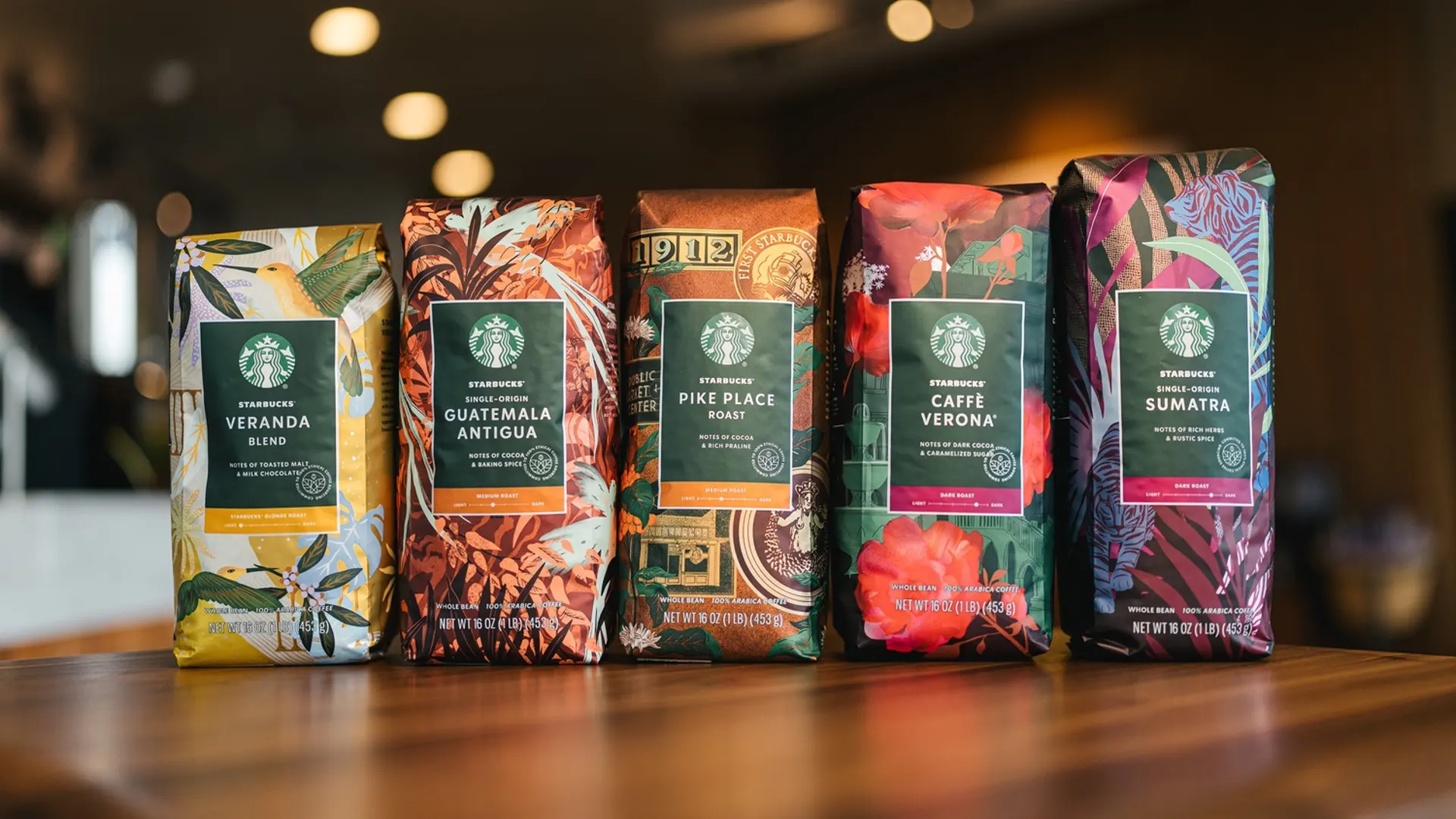
Product Photography Moodboard
Throughout the images below, most of them clearly demonstrate what sort of ingredients are in the product. This helps to give the customer a clear idea of what they can expect from it before buying. As well as this, a lot of them also include pictures of the final product, further expanding on this idea.