Artist Research - My Response
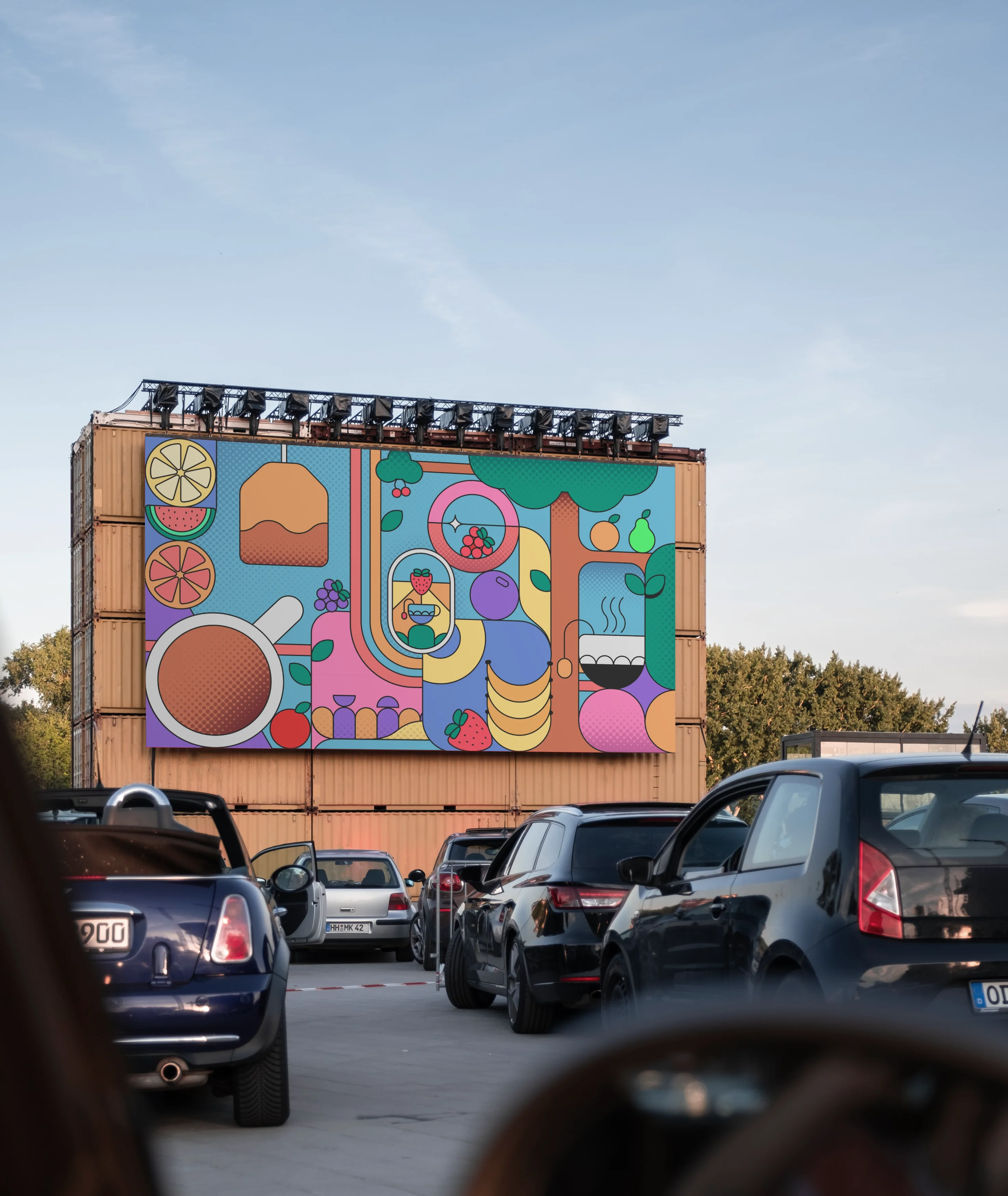
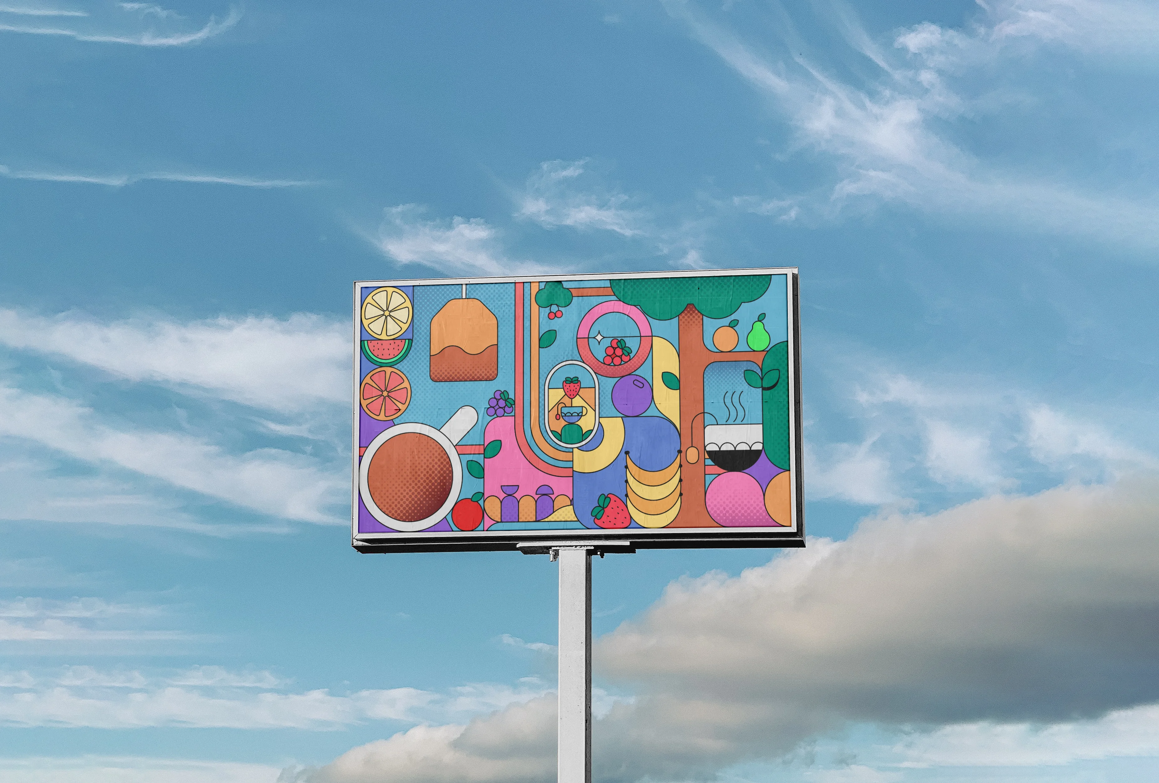
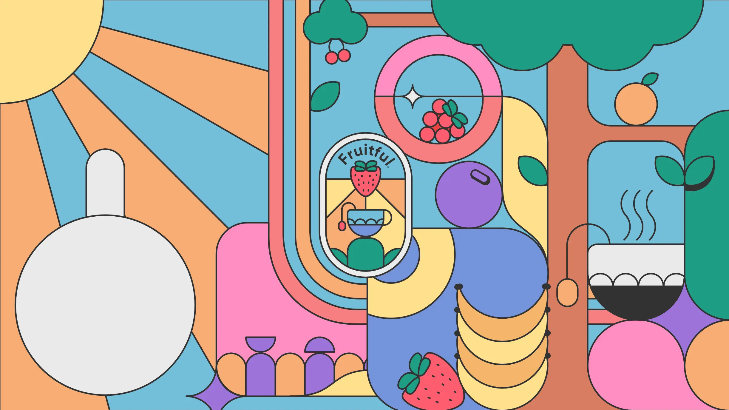
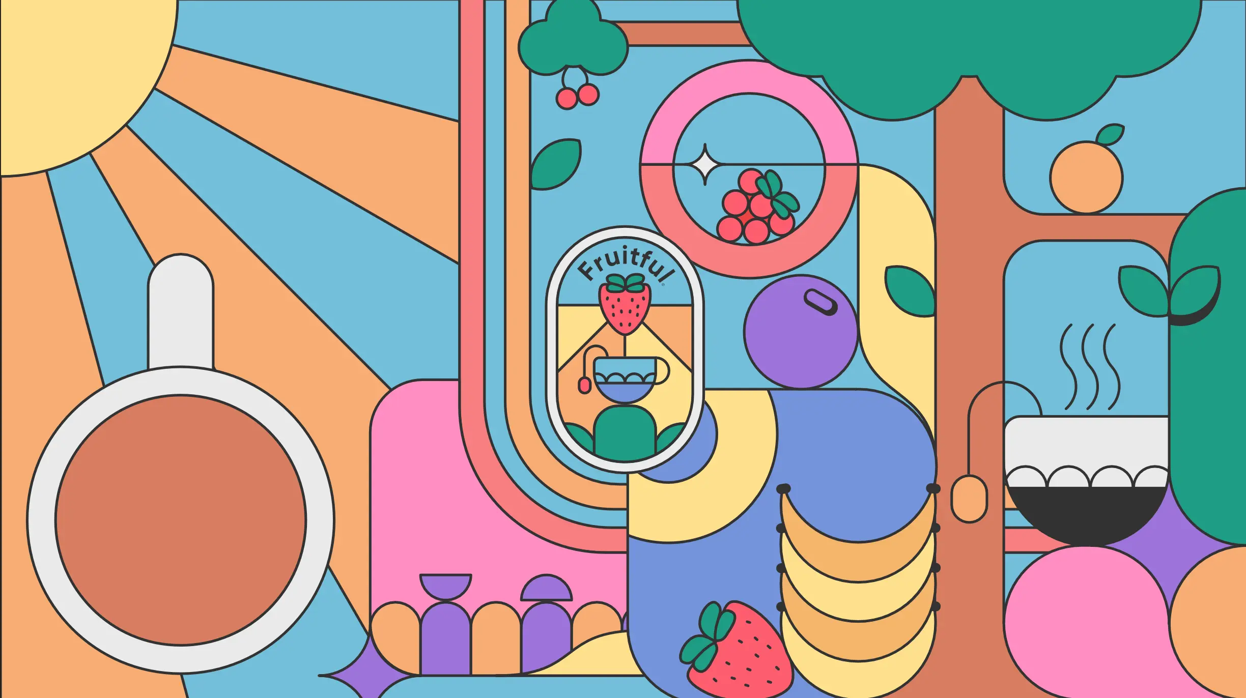
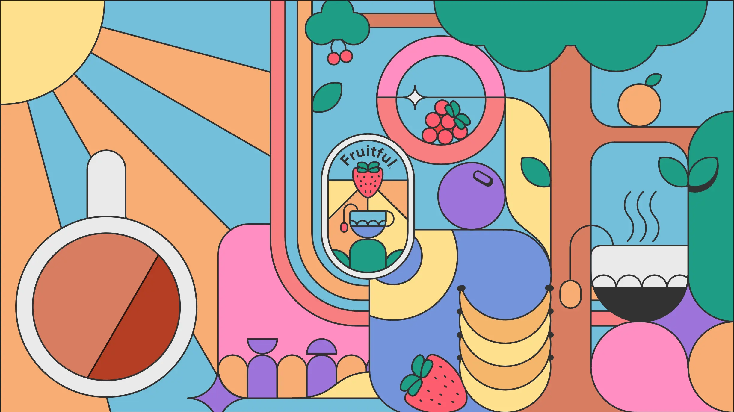
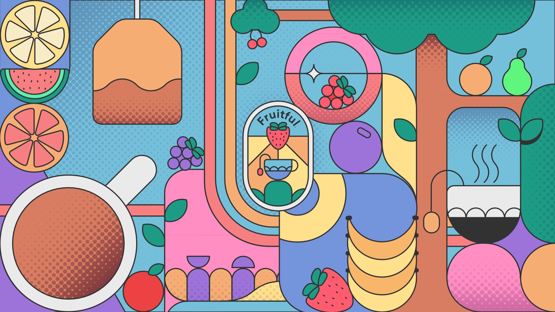
In response to their work, I decided to make a general graphic which could be used in a variety of ways. I chose to aim for a more traditional billboard, but it could easily be adapted for a vertical poster for example.
I wanted to keep the tessellating compilation of various rounded shapes that is prevent across their work, interweaving items related to the product where I could. I wanted the outcome to represent the natural flavourings that is used throughout the company, and so included various fruits from my priamry source images





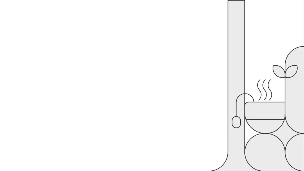
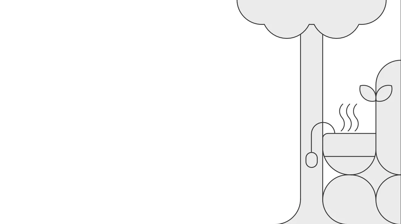
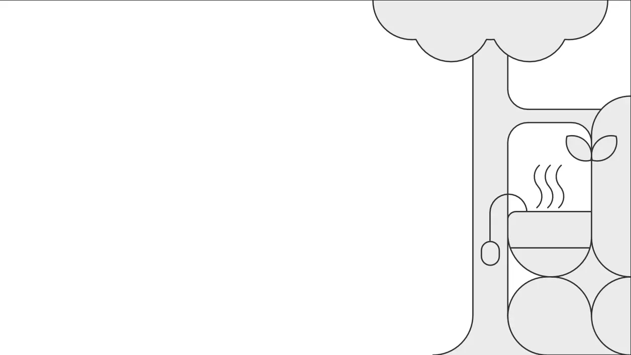
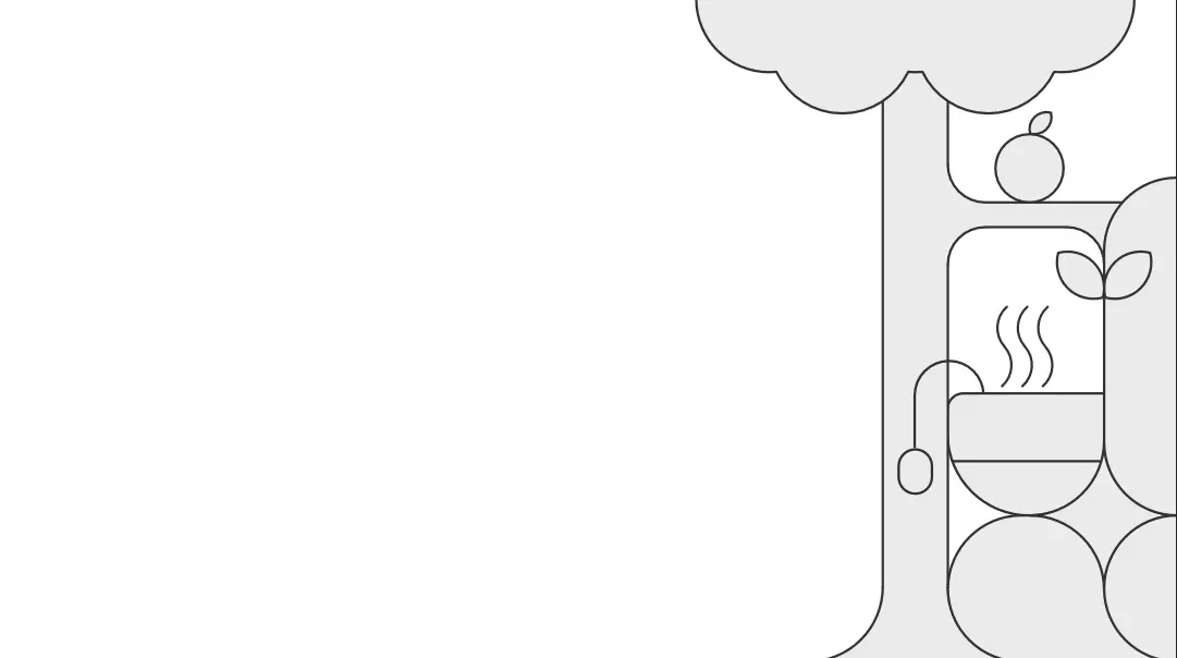
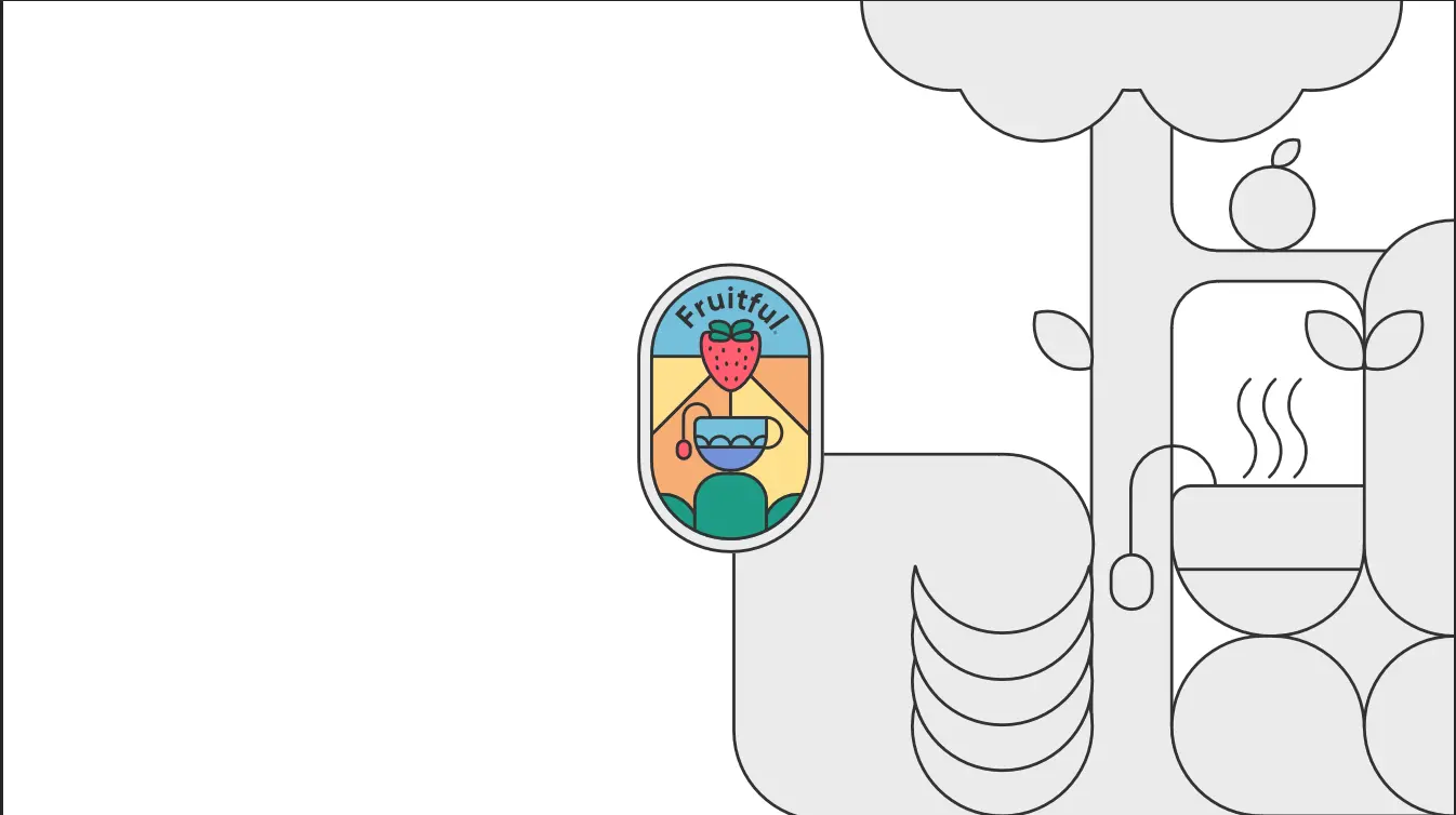
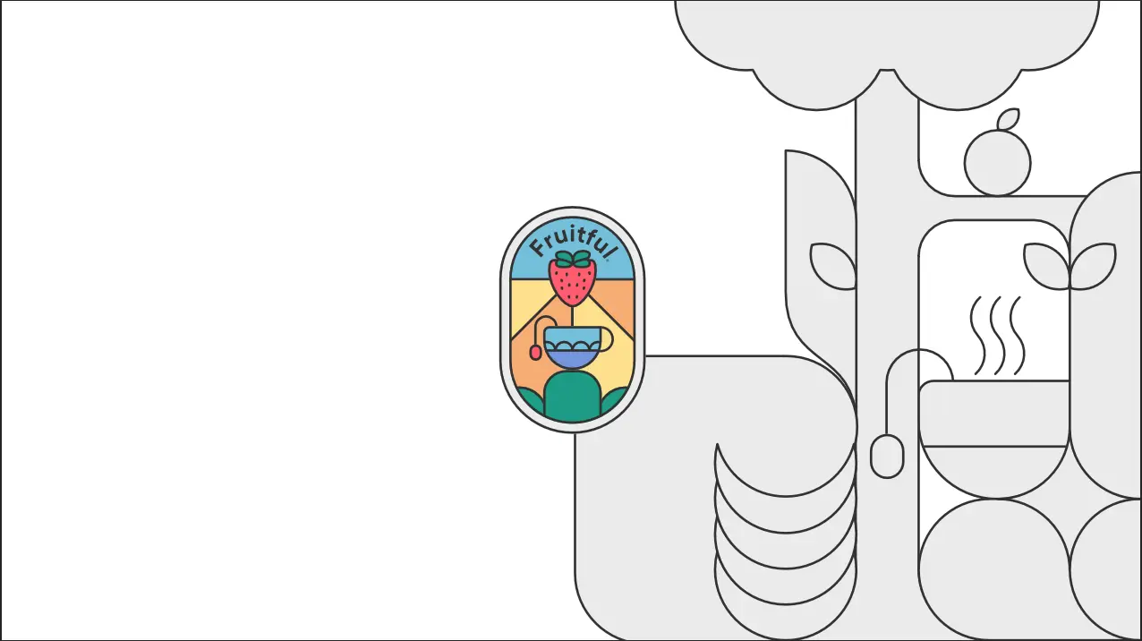
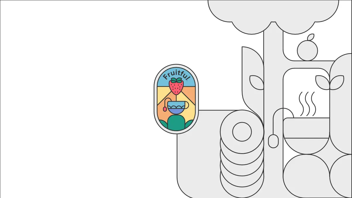
I started off by ignoring colours, as I instead wanted to get the composition right. However, I soon realised that colour could affect where I wanted certain items due to different colours potentially clashing, so I filled them in. I tried to pick only colours from my design document, but I quickly realised that I would struggle due to the limited palette of shades.
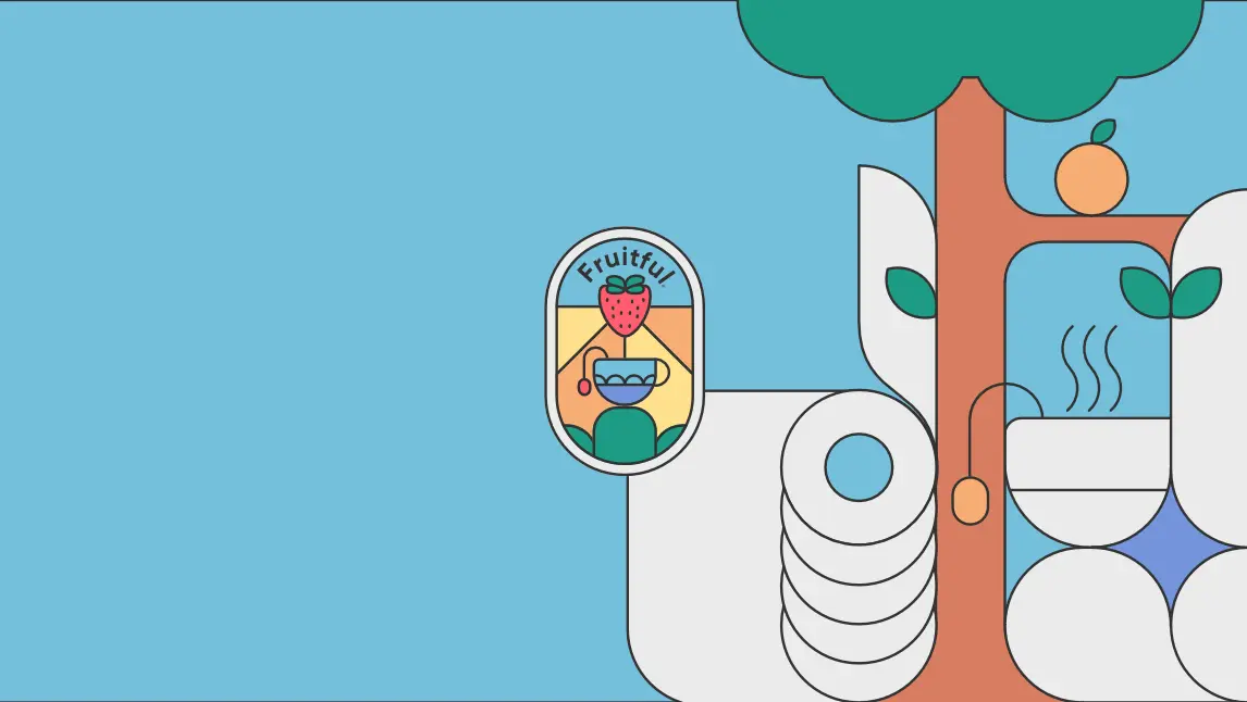
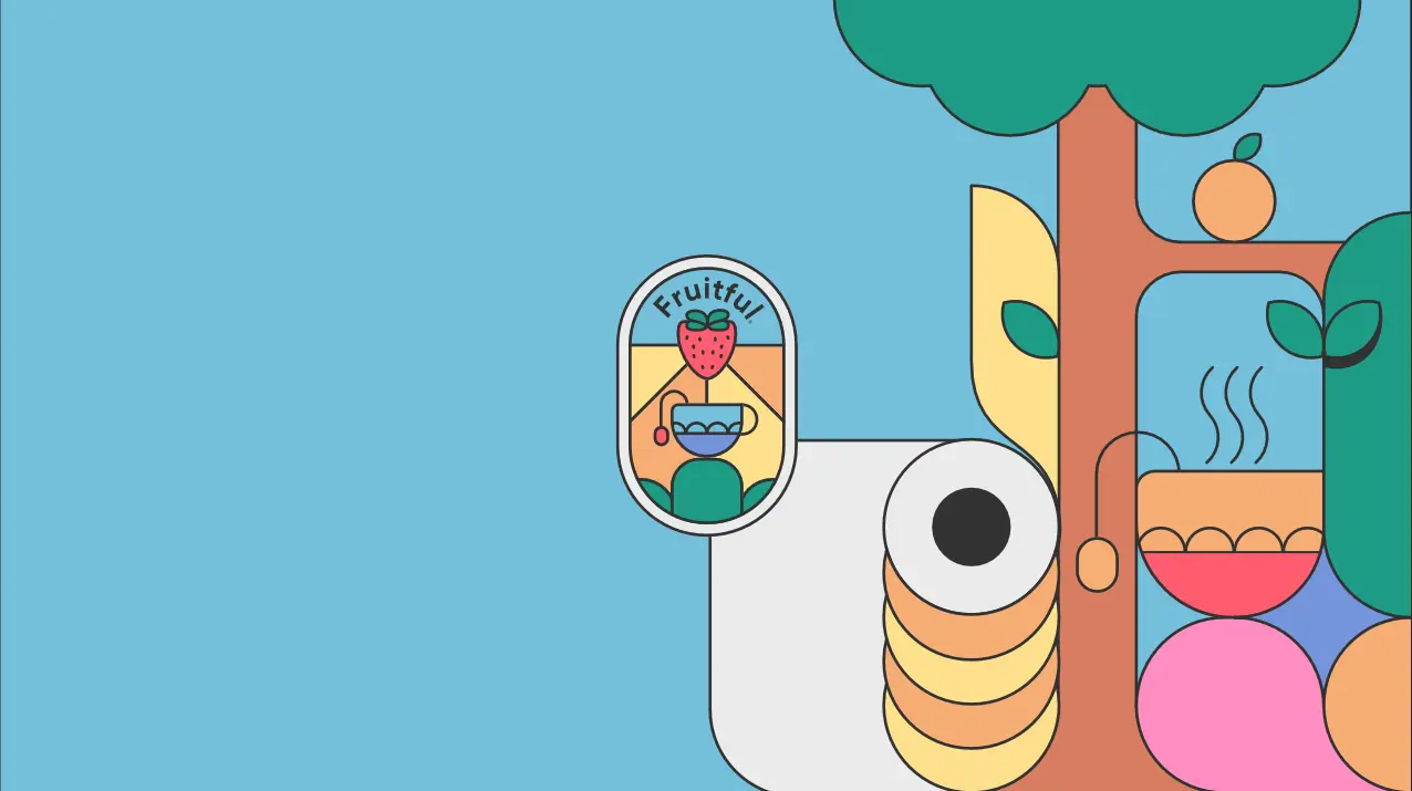
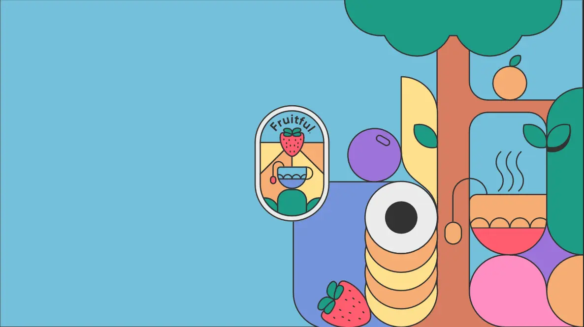
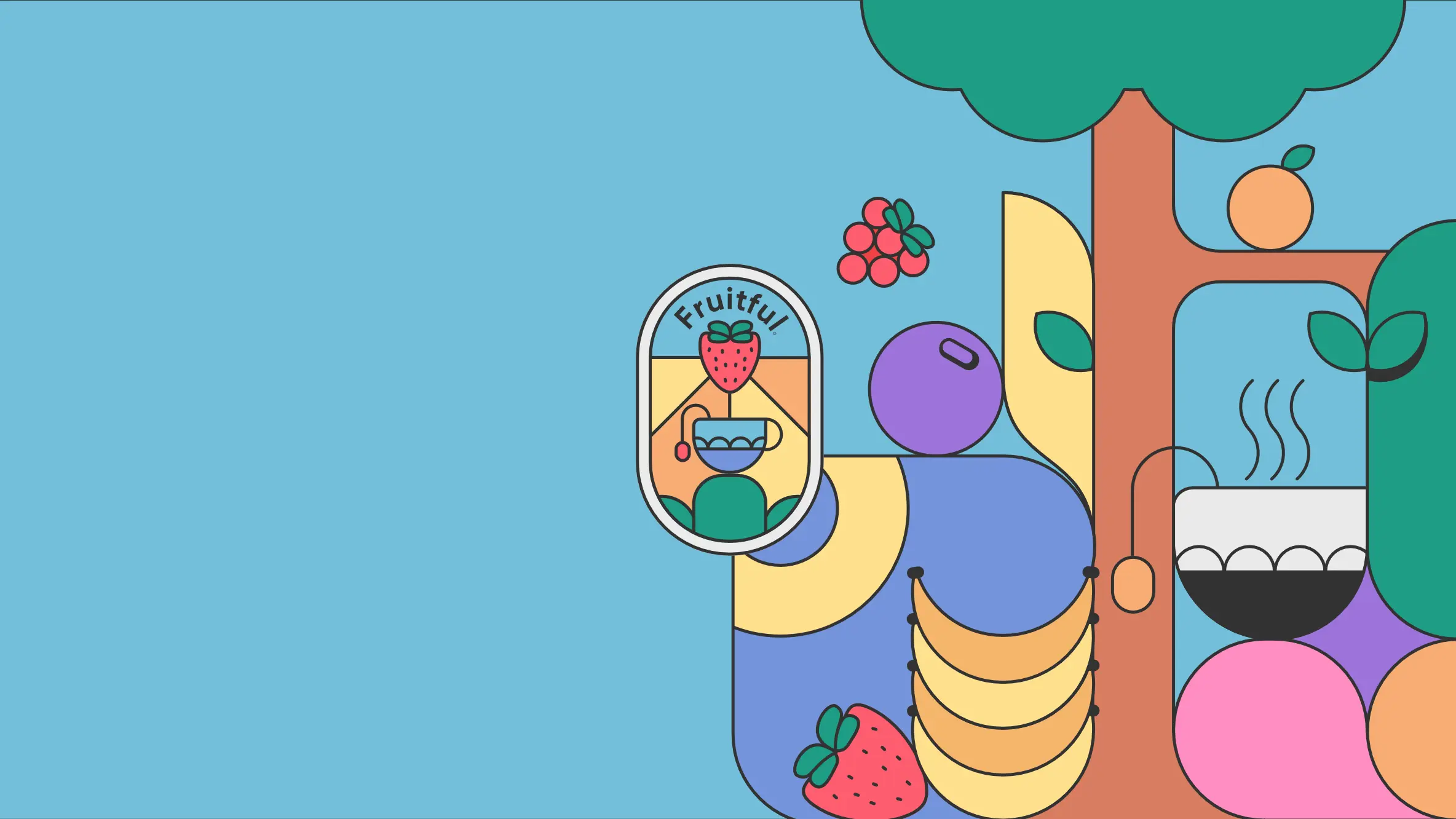
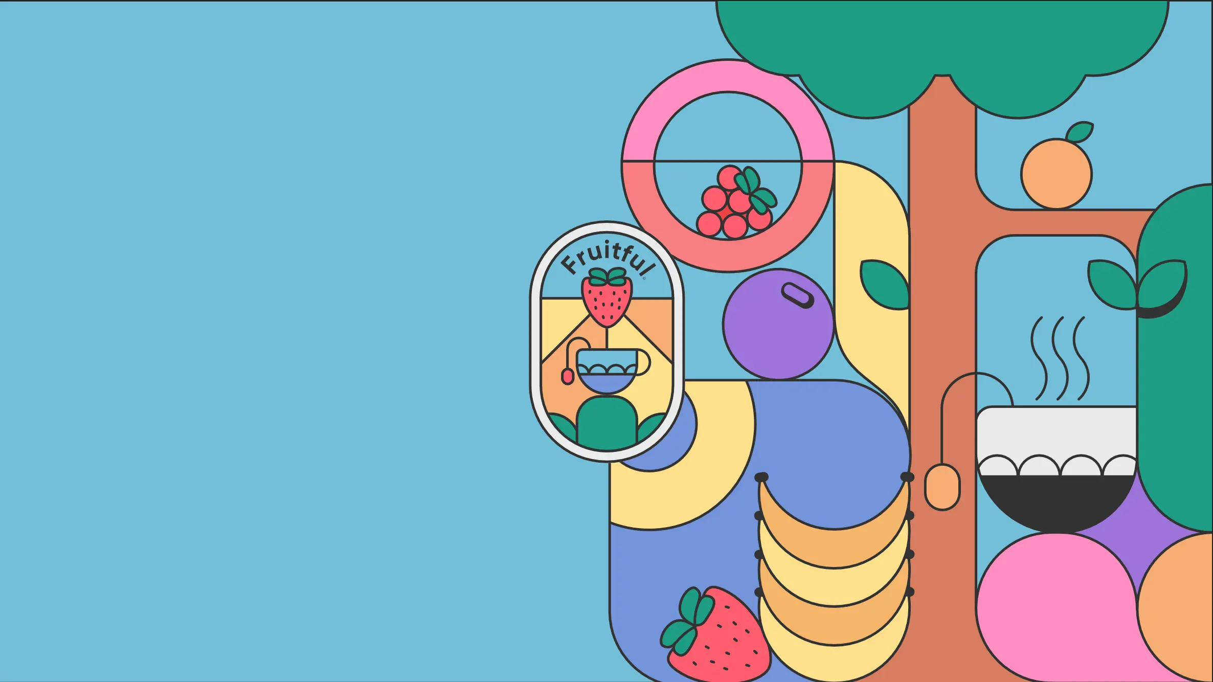

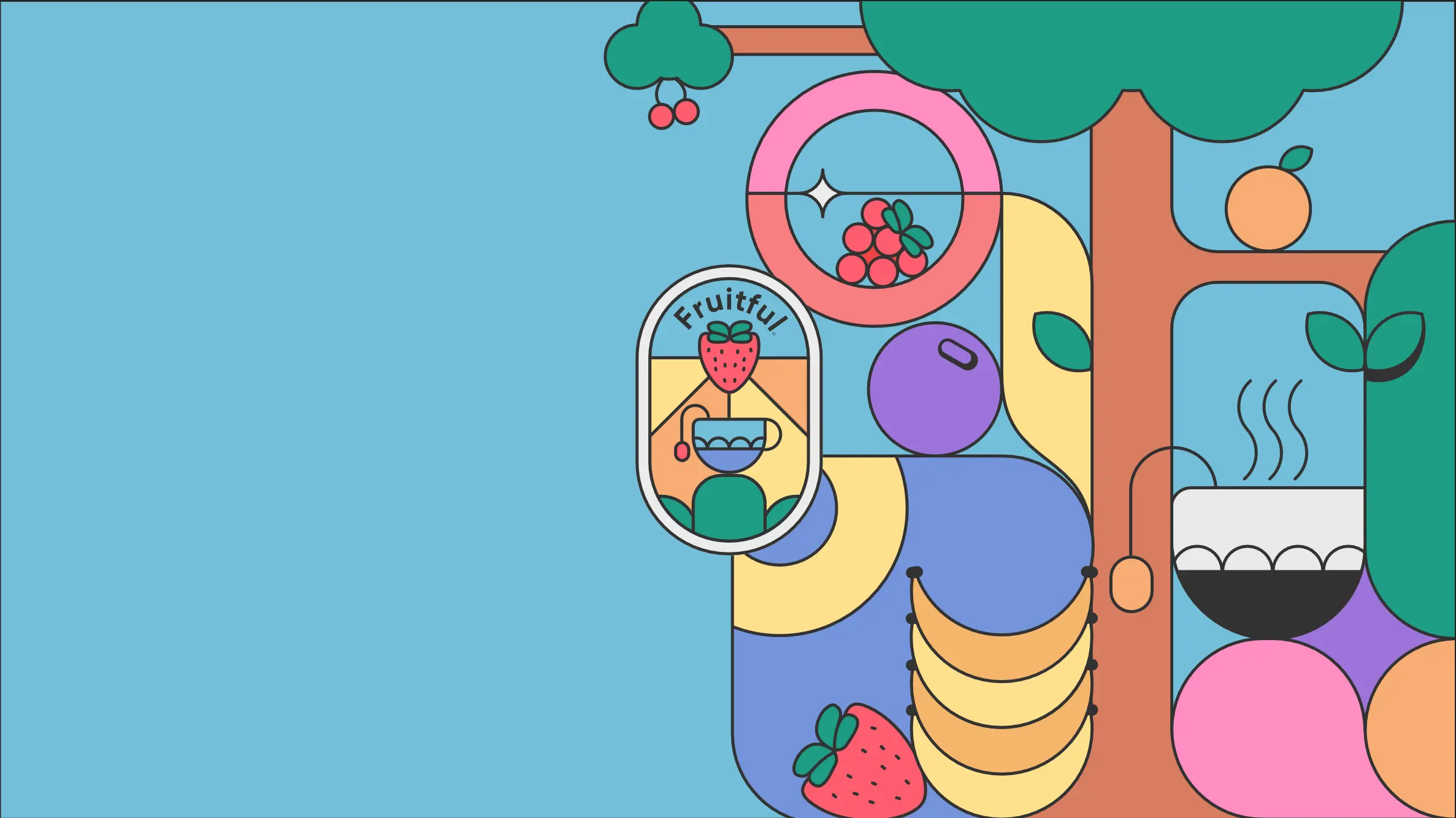

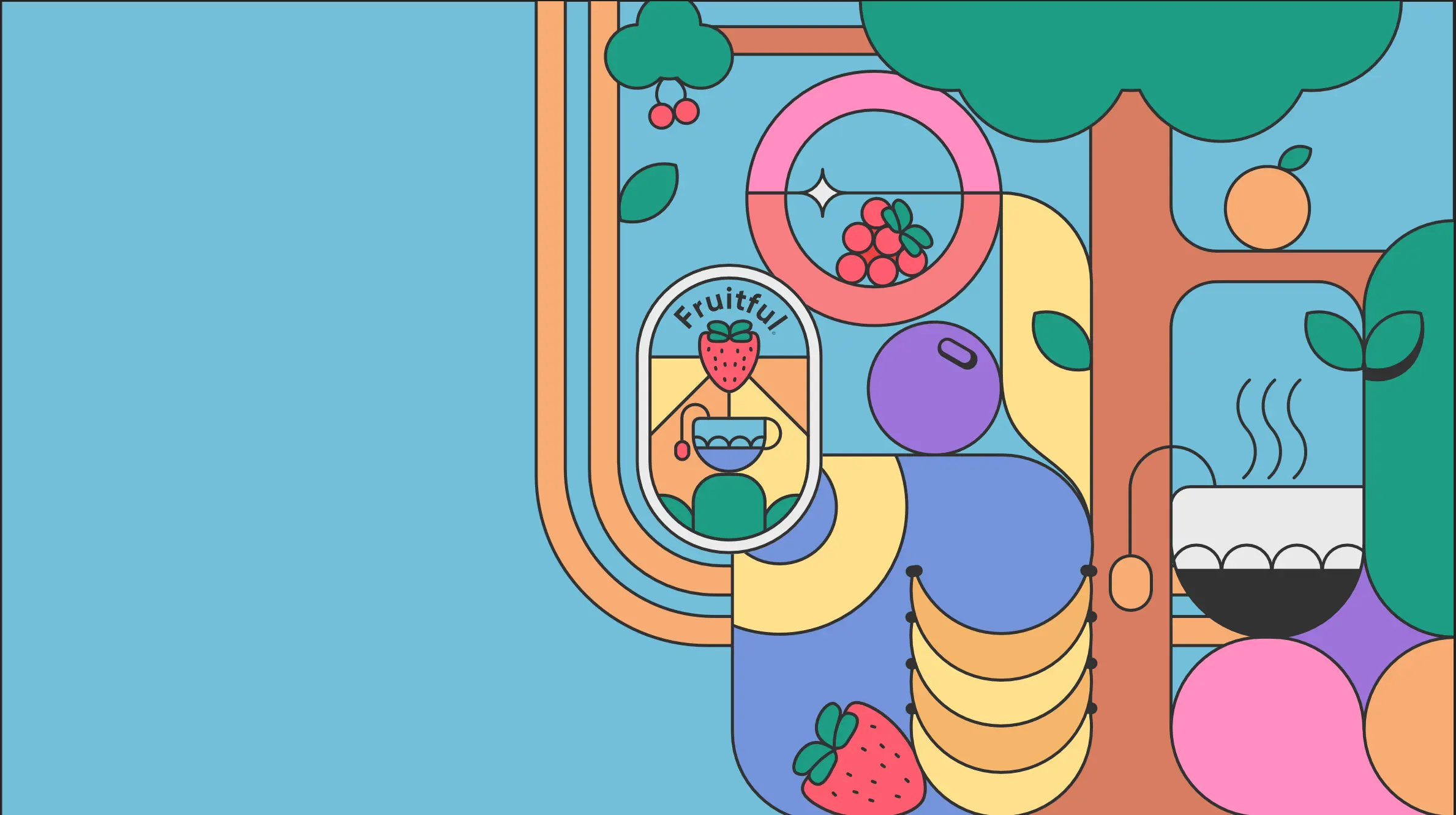
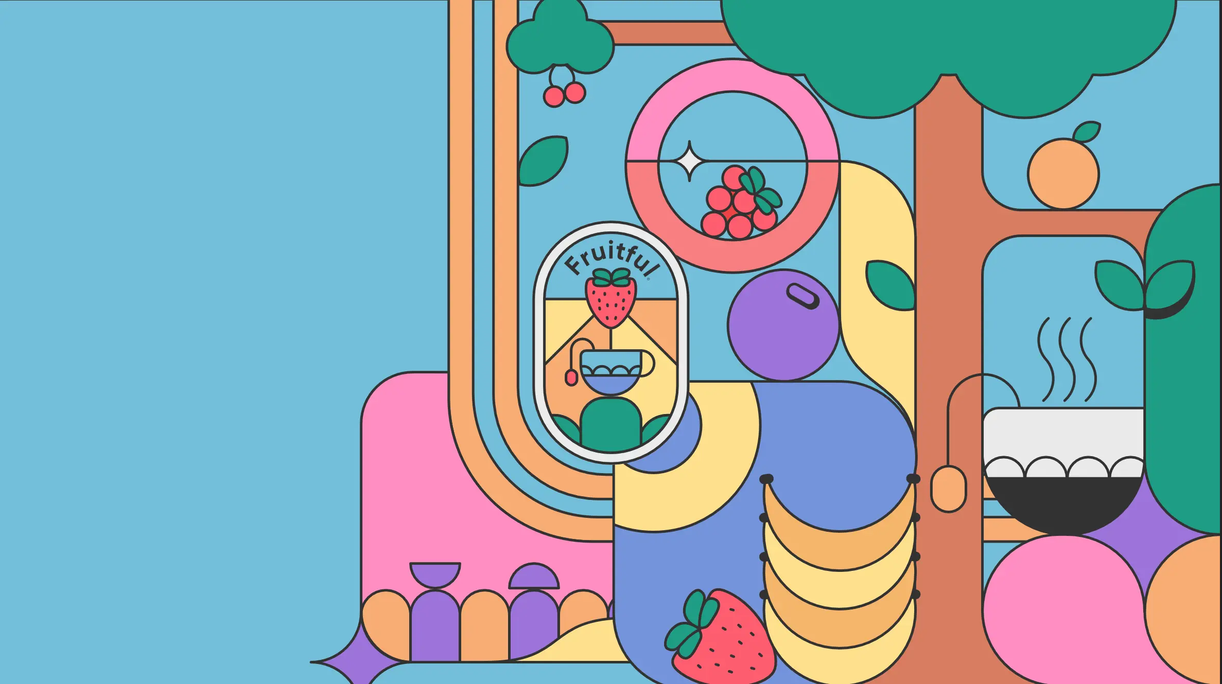
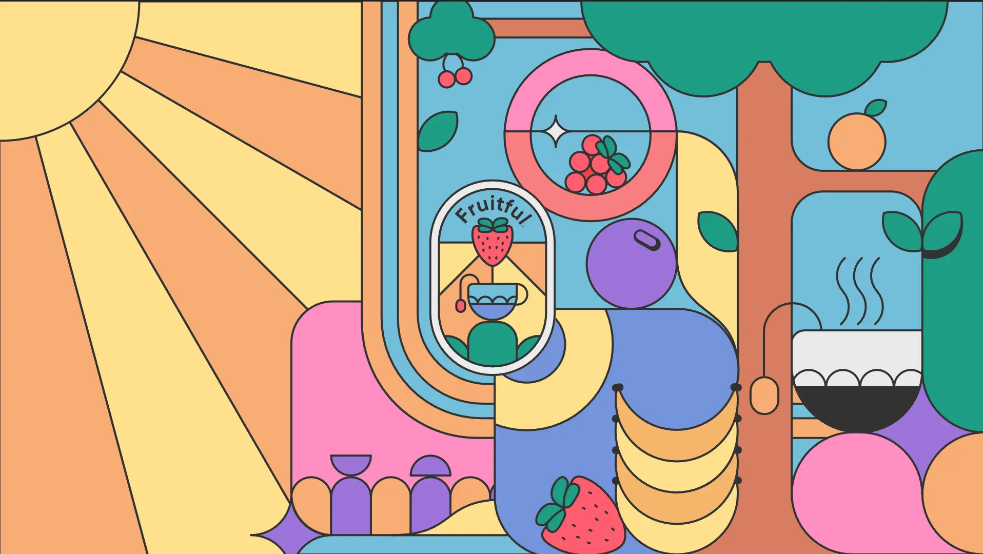
I experimented lots with composition and different elements, the largest of which being the sun. However I felt that it dominated the left side too much, and the light colours drew the eye away from the focal point.
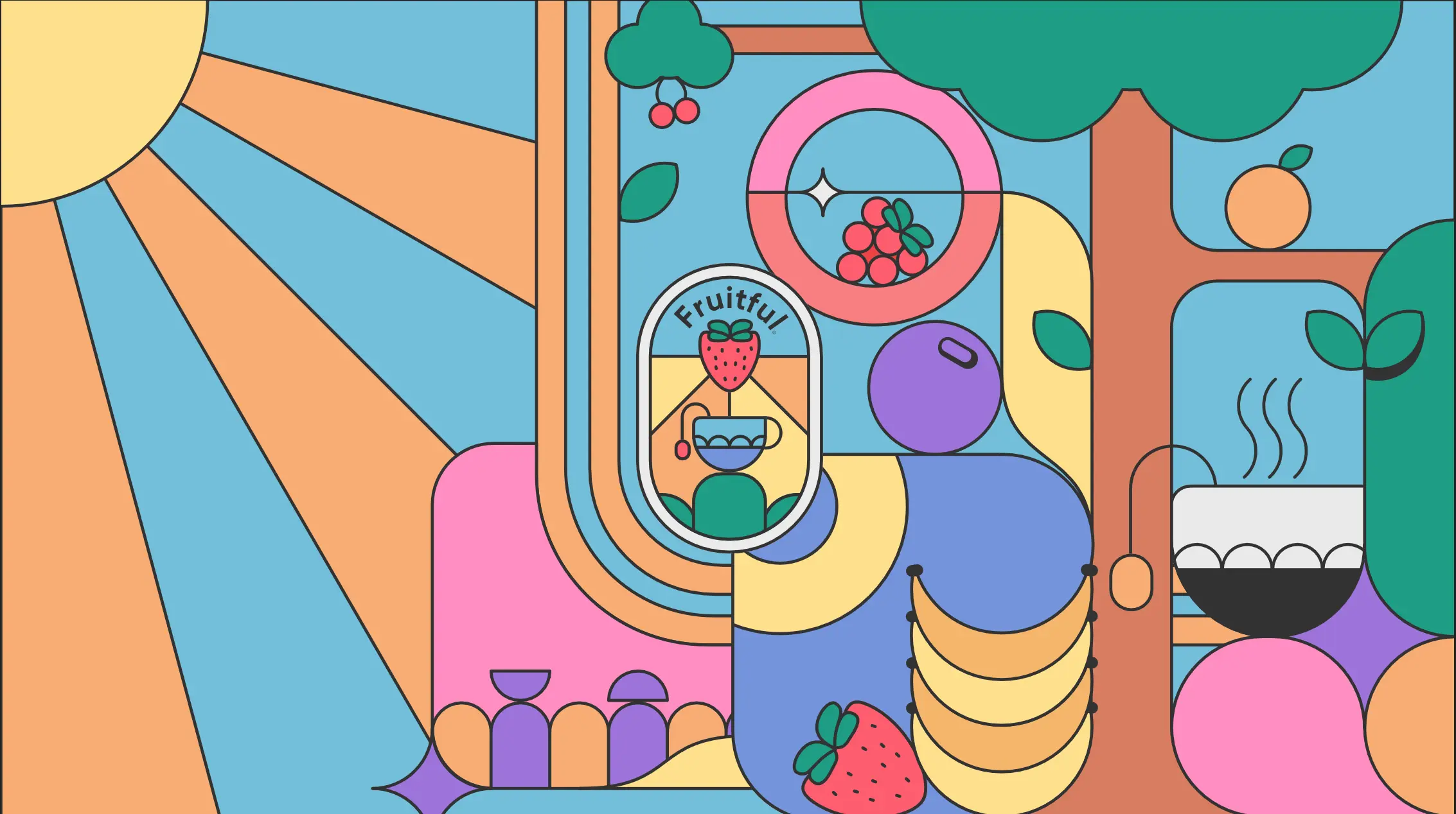
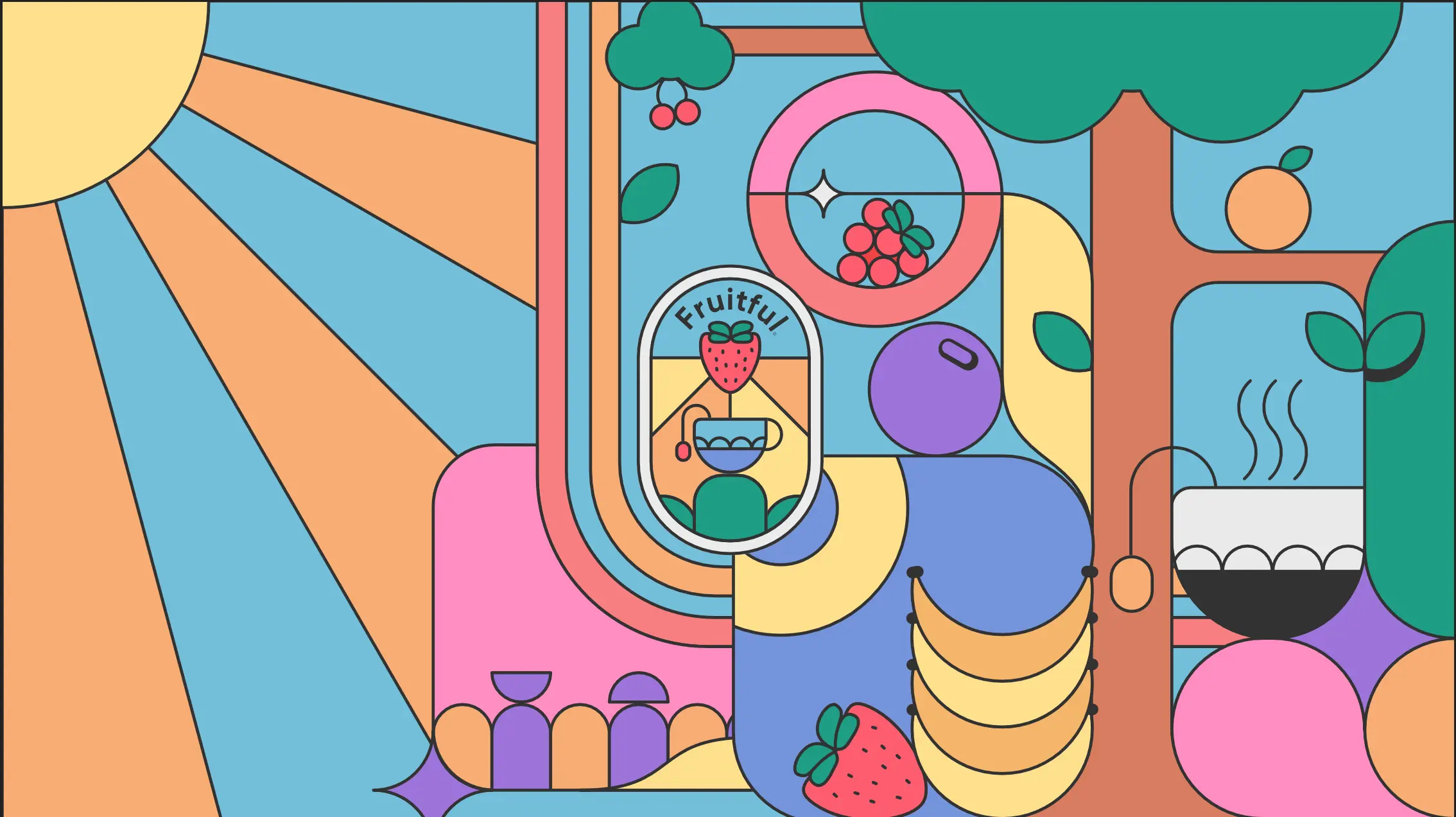
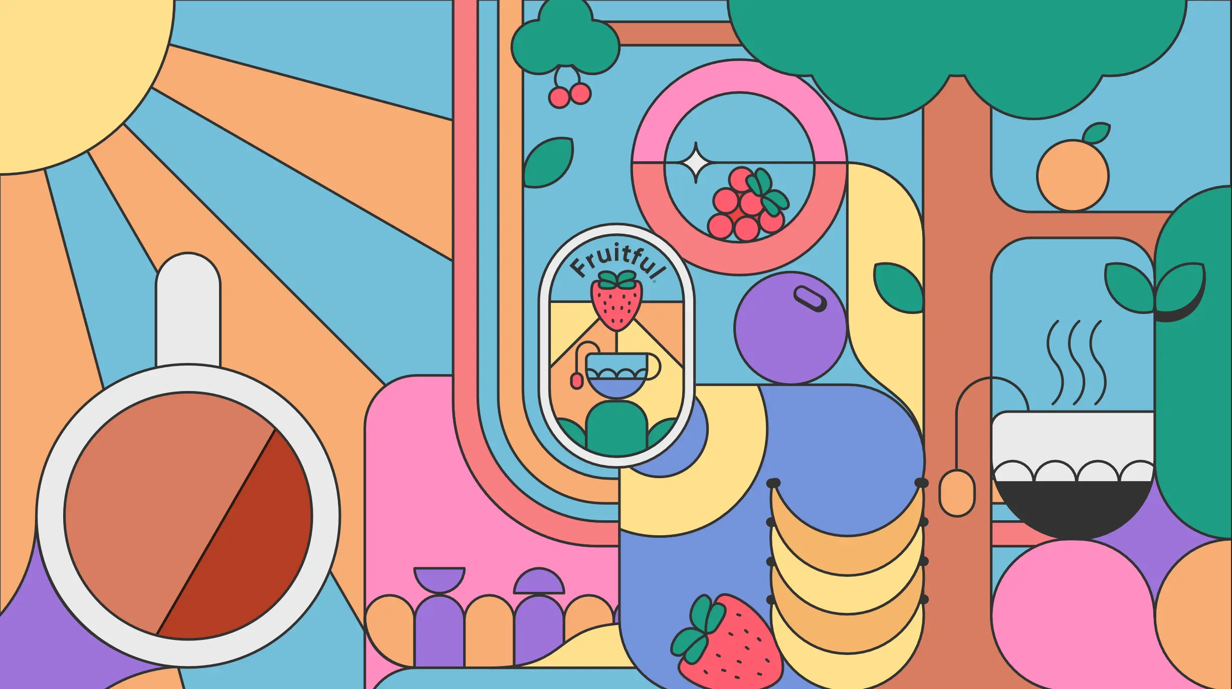
To help give the overall outcome a bit more dimension and less 2D, I used a dithering effect often seen in comics to act as a gradient or shadow on some objects. I also used this around the central logo to help separate it from the design.
**I then made a mockup to see how this design would work as a billboard: **
