Primary Source Photographs
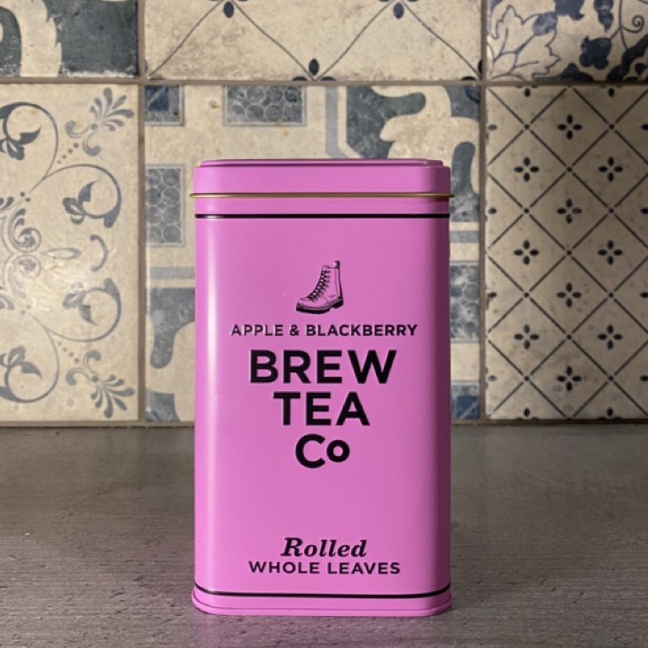
Brew Tea Company
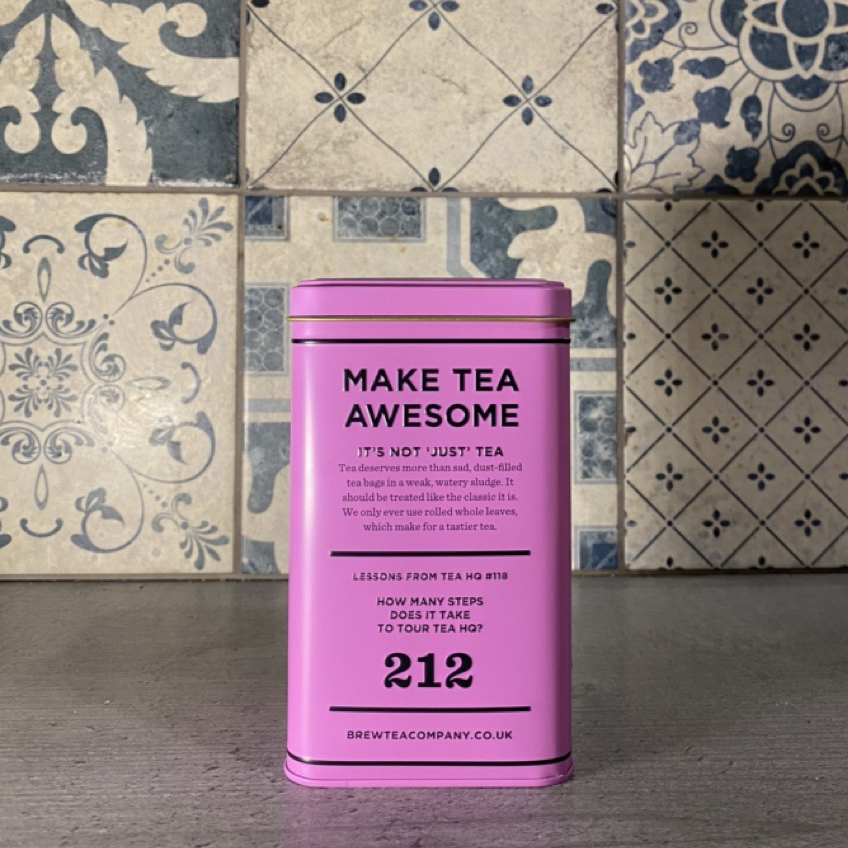
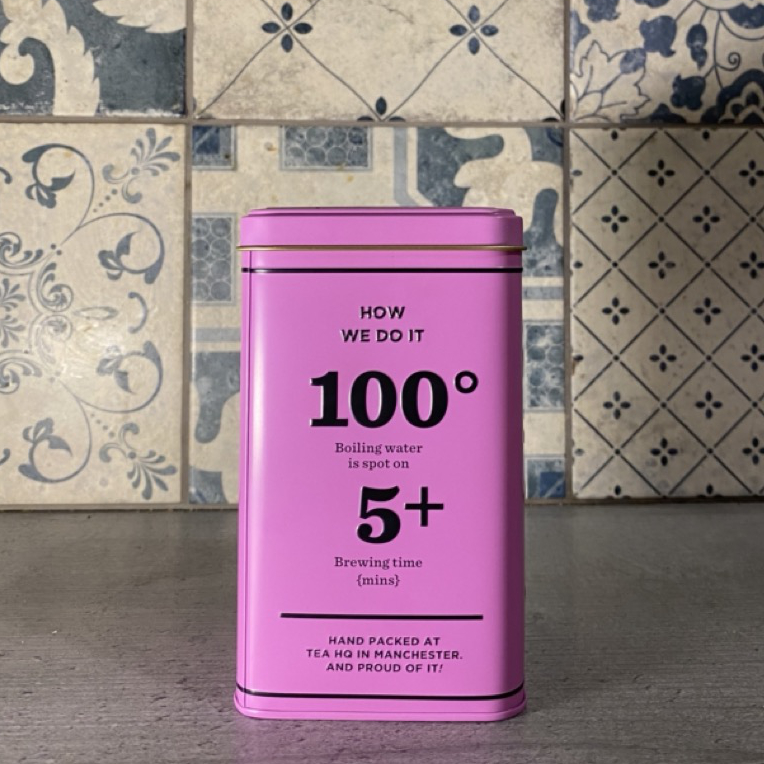
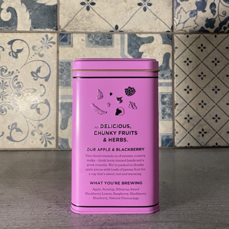
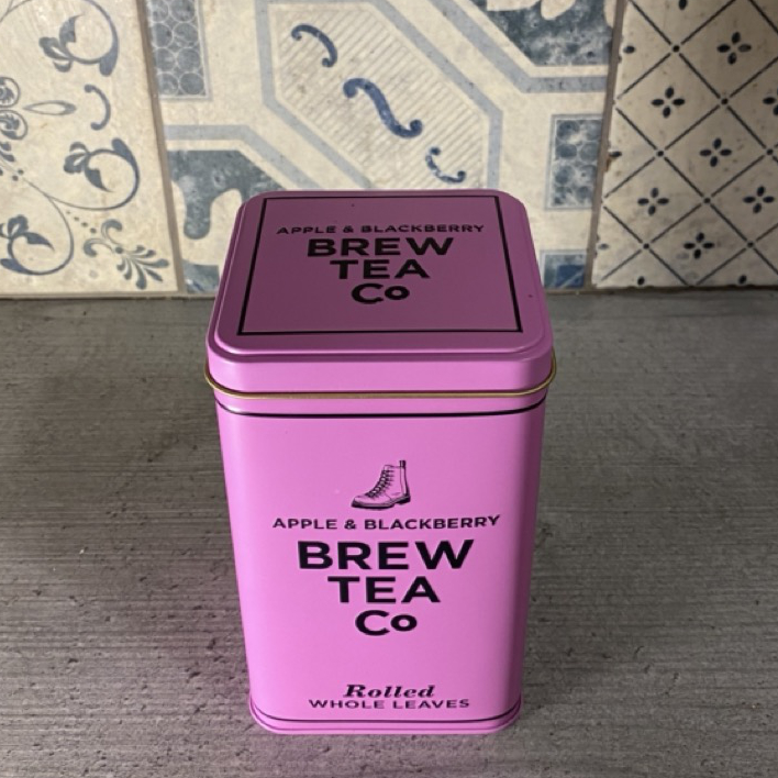
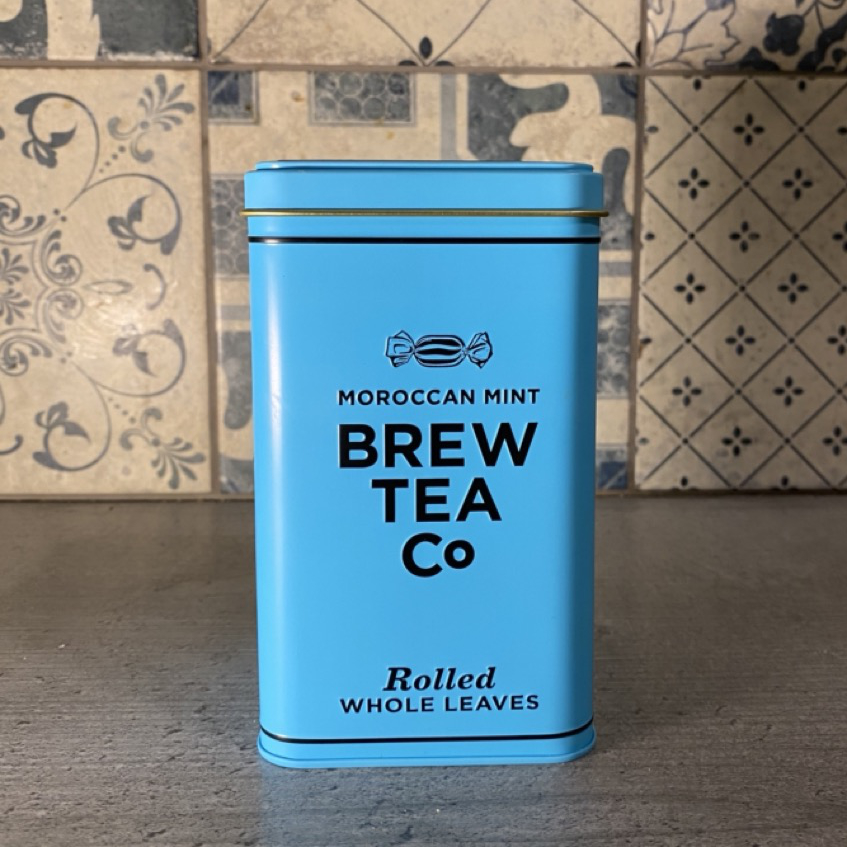
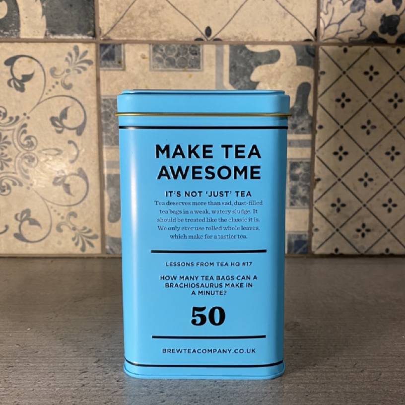
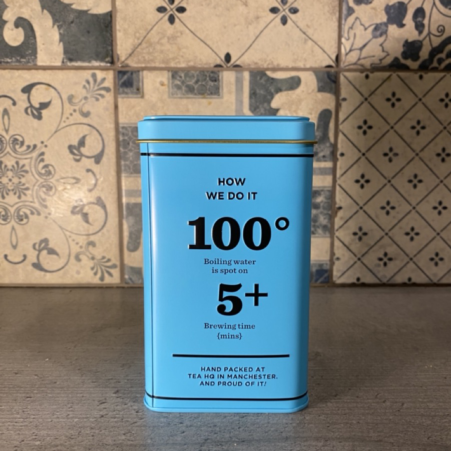
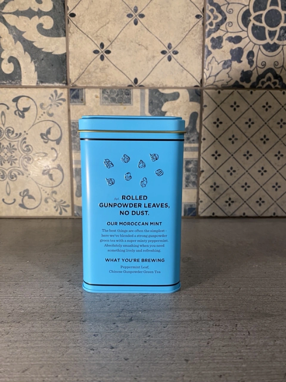
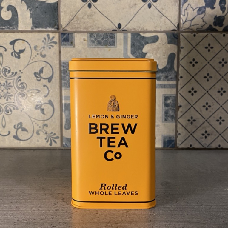
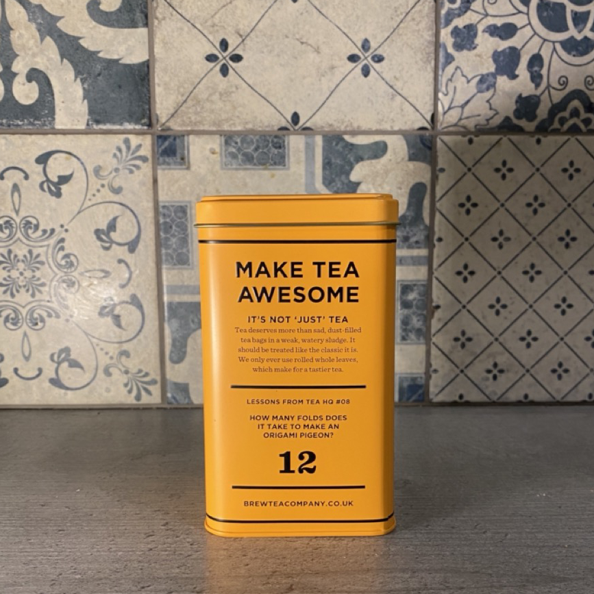
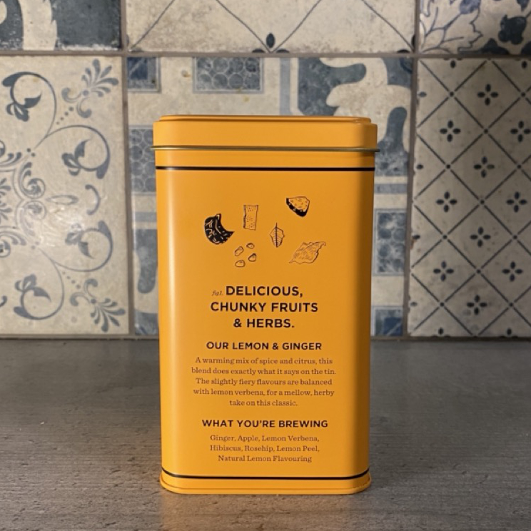
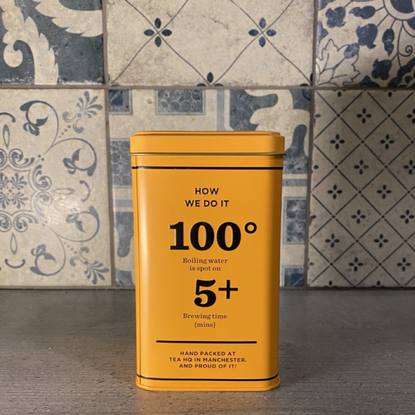
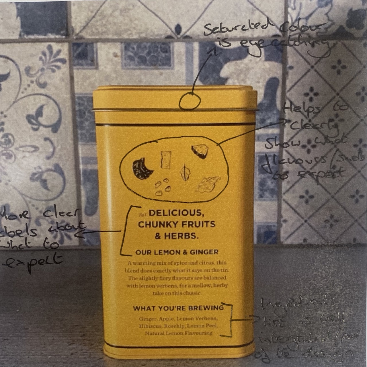
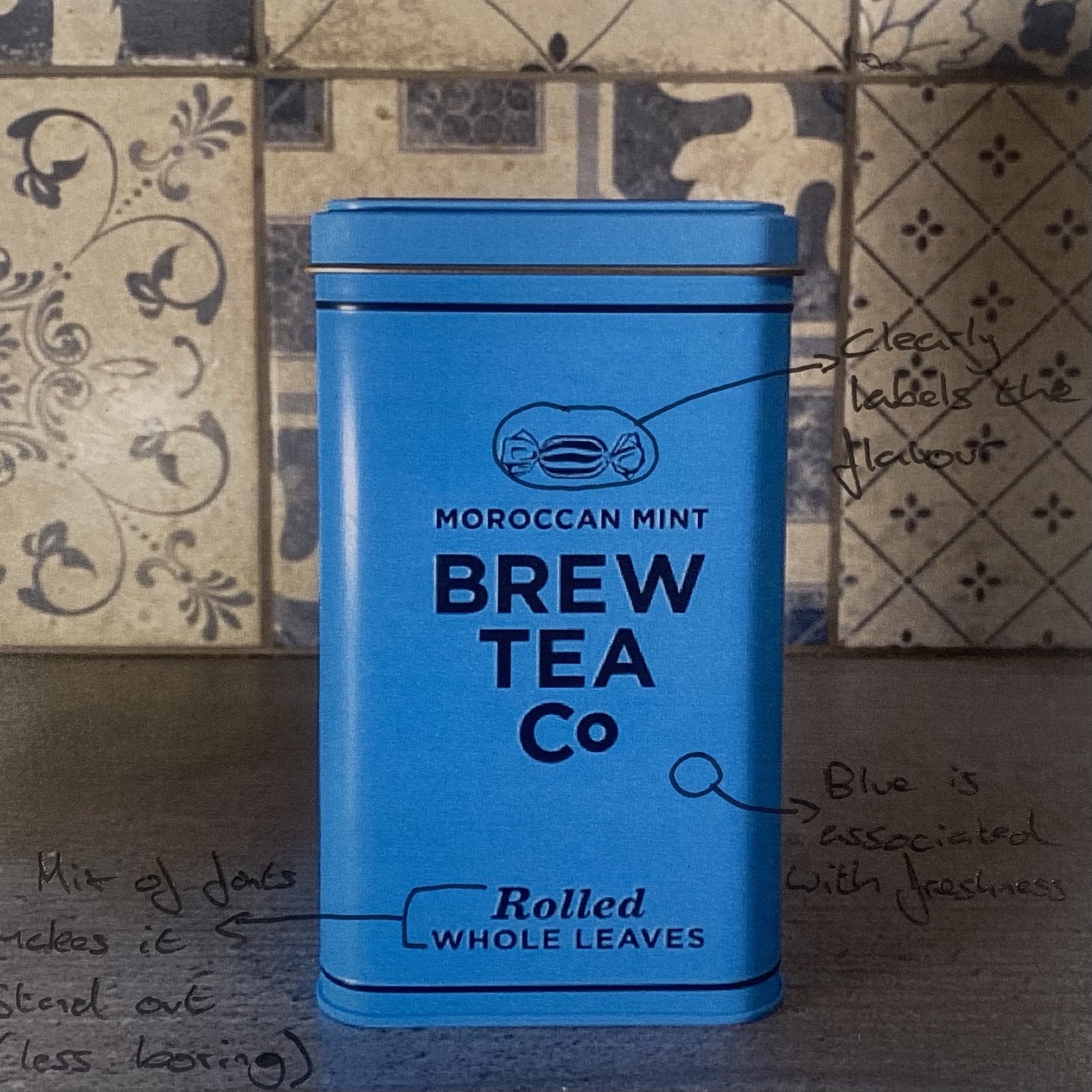
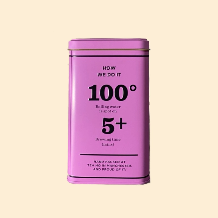
Below are some images from the Brew Tea Co, a brand who specialises in creating refillable containers for a variety of flavours of fruit tea. As well as selling the containers as pictured, they also sell smaller top-up packages, helping to make their business more sustainable. They use a very simple packaging design. The alternation between serif and sans serif typefaces allow them to tastefully bring more attention to certain words/statistics in a professional way. They use saturated colours to help differentiate between flavours, and use a small icon to further demonstrate this. They dedicate one side of the packaging to promote their company mantra, another to present some information regarding how to make the perfect cup of tea, and the last to go more in depth of the flavours you can expect from the tea itself.
The final product is very minimalist compared to some of its competitors, but it clearly demonstrates that it is a more “high end” tea company. I really like how they include the best way to make tea as it helps to lower the barrier for entry when making tea. Although it seems like a trivial task, it can get quite complicated when using loose leaves.
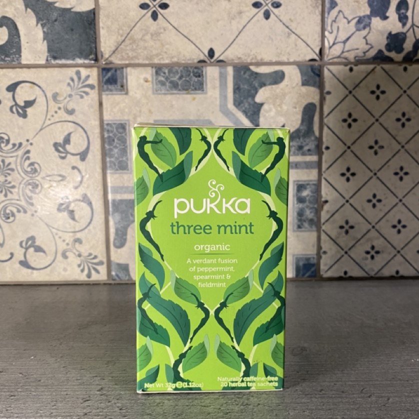
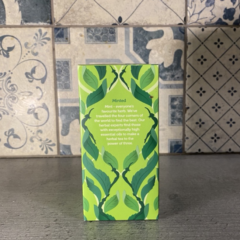
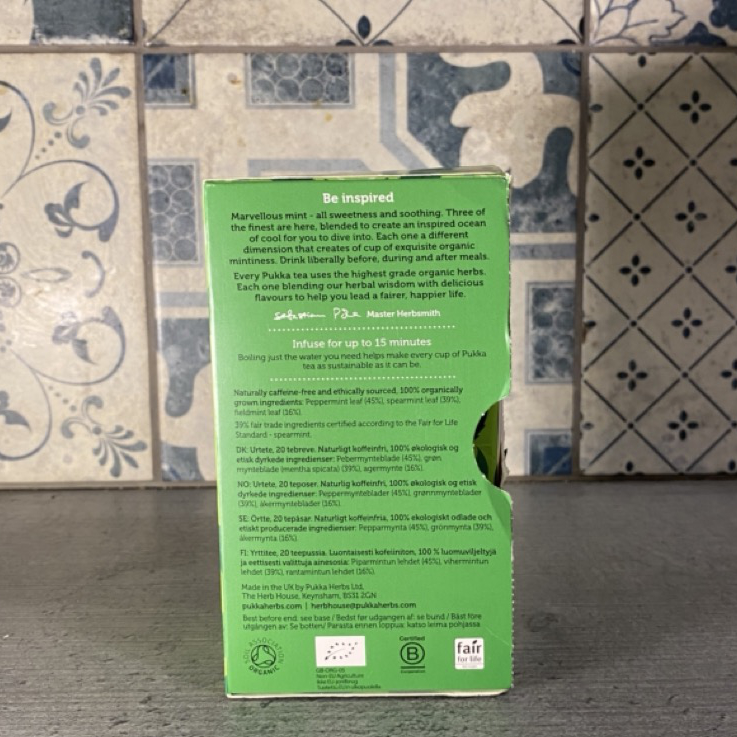
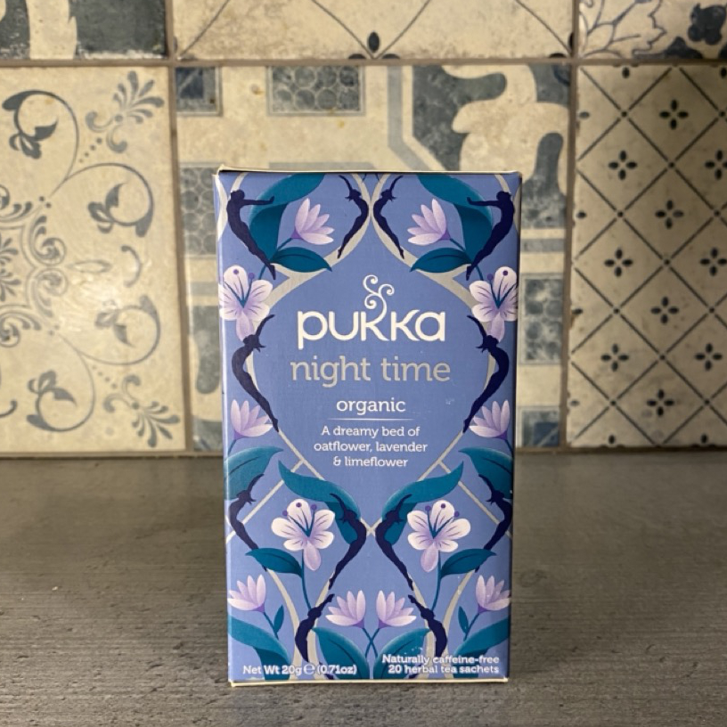
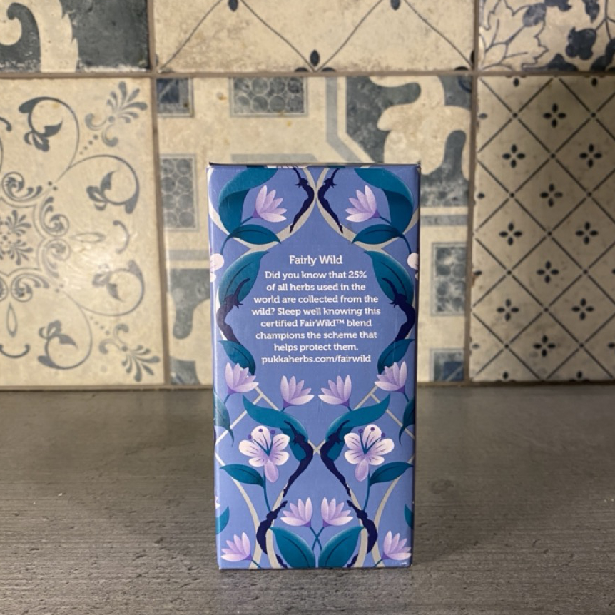
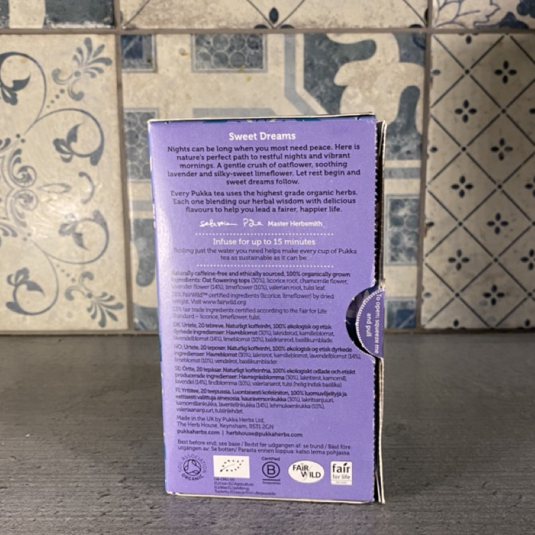
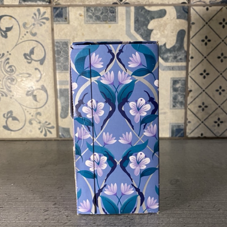
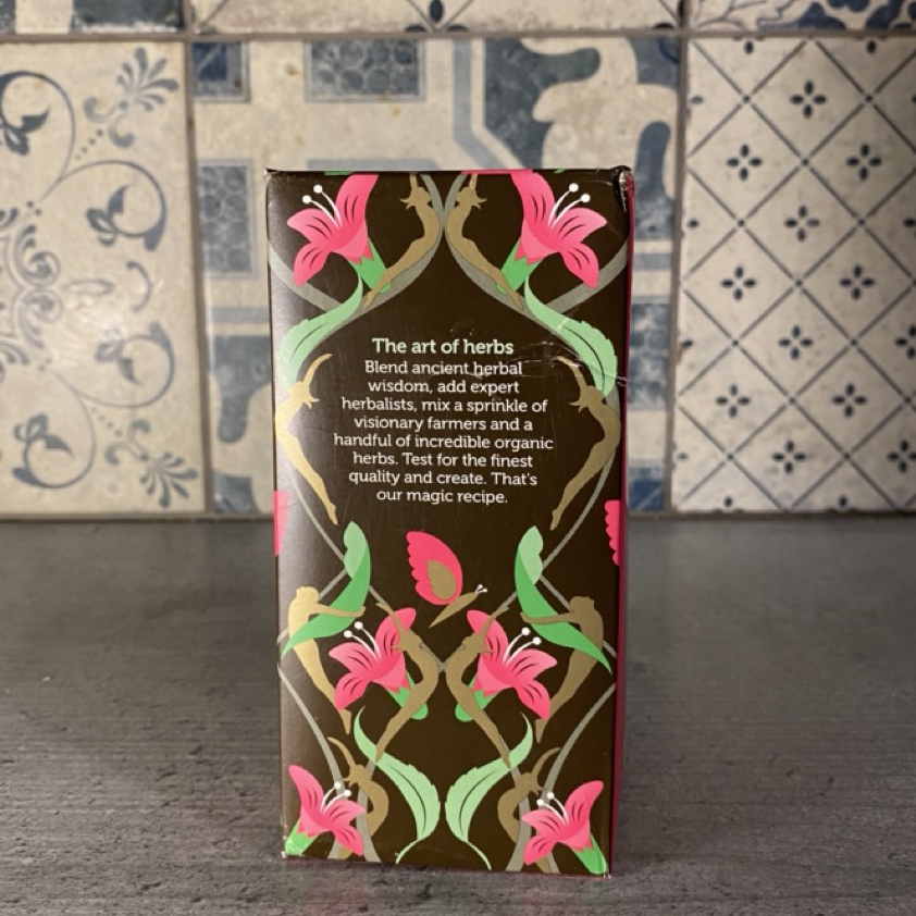
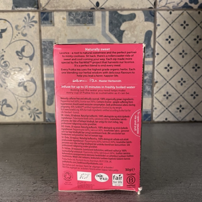
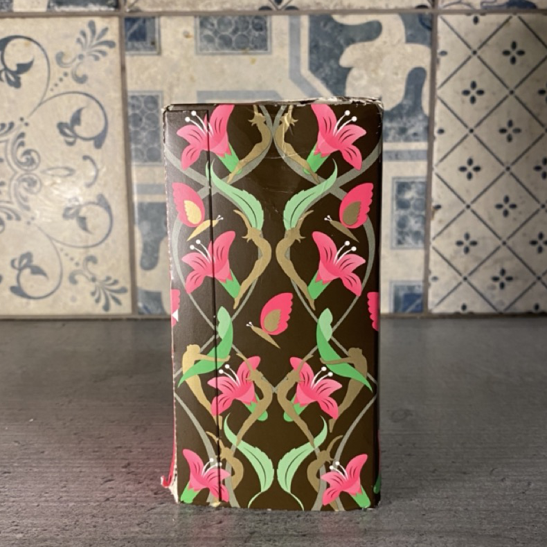
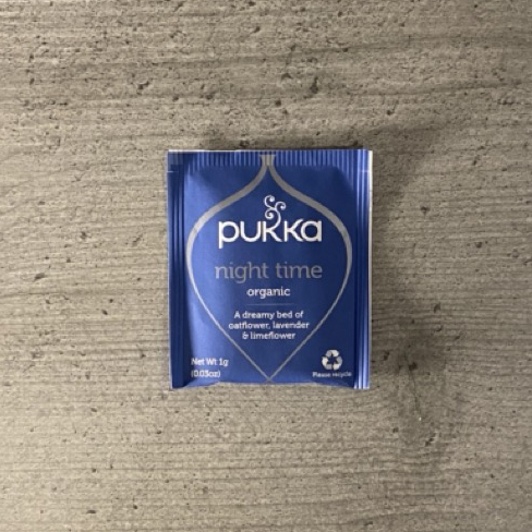
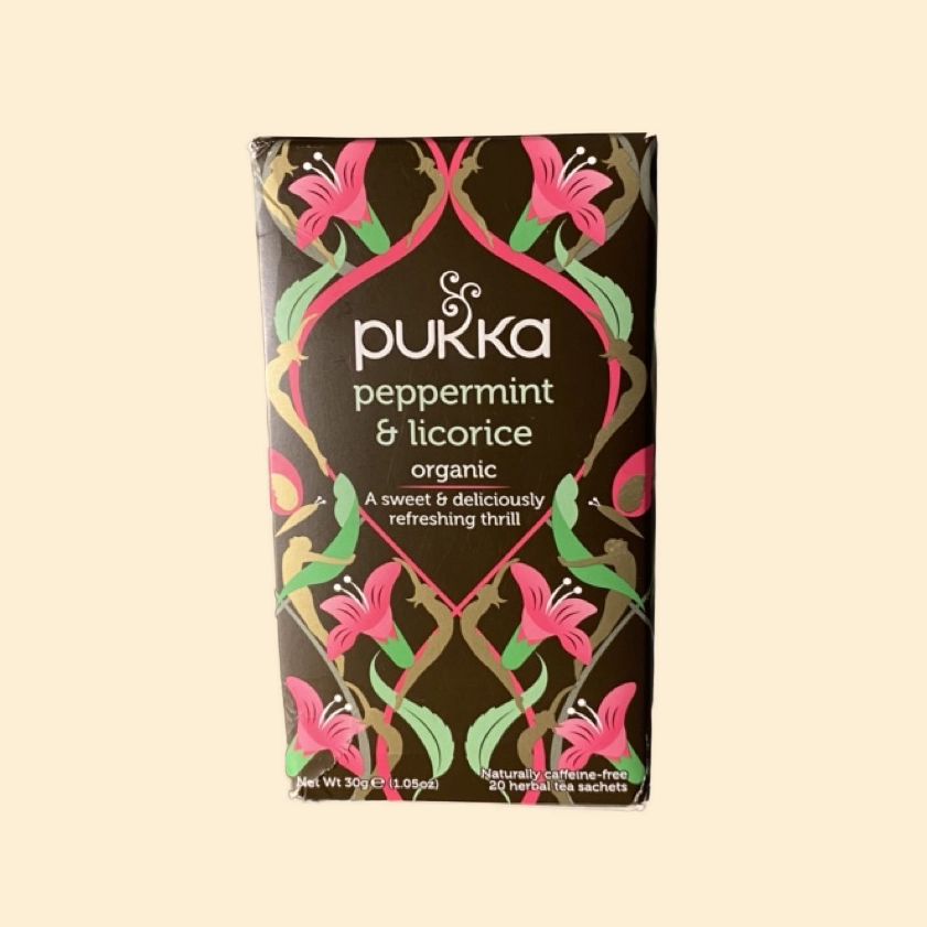
Pukka Tea
Packaging
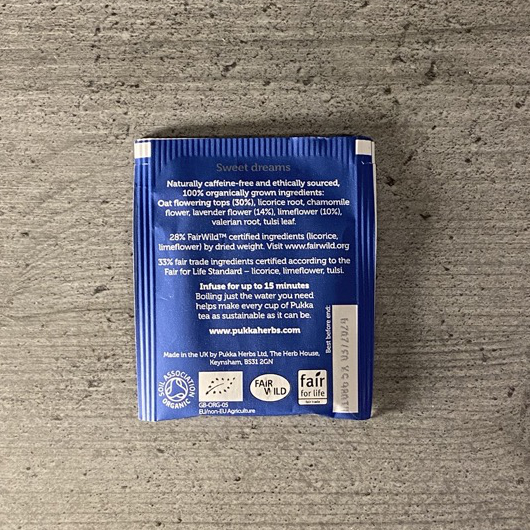
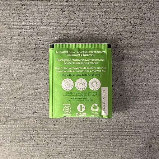
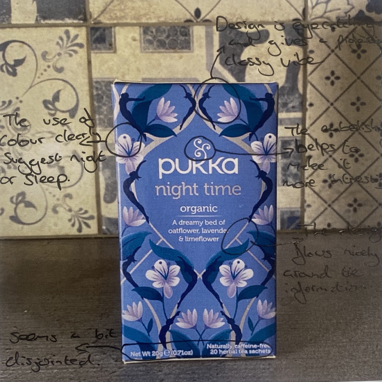
Pukka uses a similar concept to the Brew Tea Company, where they use easily distinguishable colours and patterns to help discern different flavours. I think using patterns in addition to colours is a far more accessible way, as those with visual impairments such as colour blindness have another attribute to differentiate between them. As well as this, the patterns give a clear indicator towards what you should expect regarding the different flavours in the tea, by using the different ingredients within it. The pattern wraps around the entire packaging, and cleverly creates spaces to display information. They too include a small section helping to explain the more complex flavours within the tea.
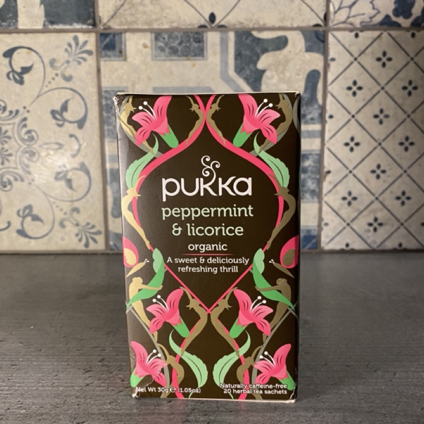
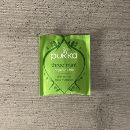
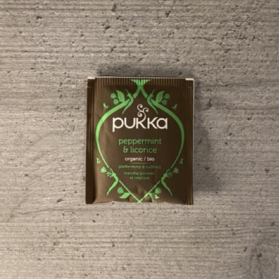
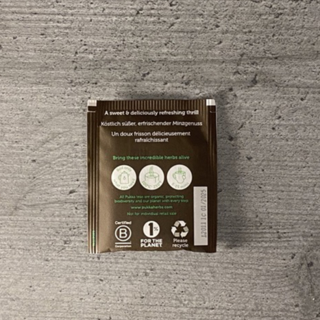
Tea Bags
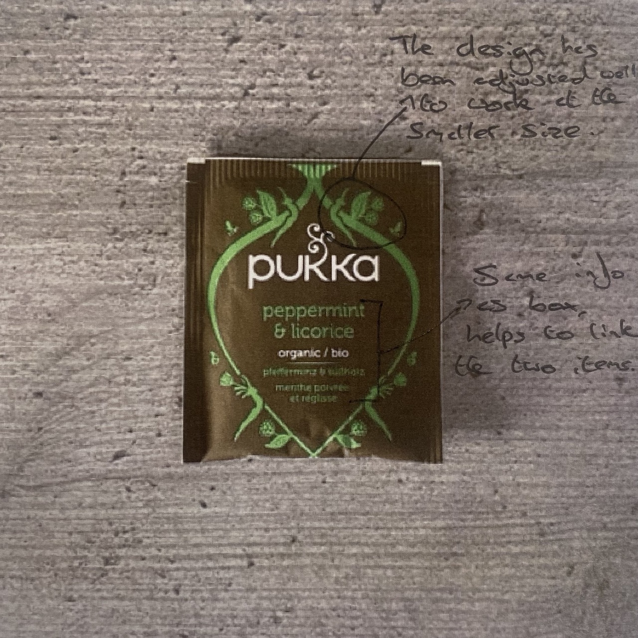
As Pukka primarily creates tea bags rather then loose leaf, they also include designs on the packaging of the tea bags. They use the same colours but instead decide to drop the majority of the pattern. I think this works well due to the small size and nature of the tea bags. Including a pattern on them as well as all the information needed would result in a very cluttered and confusing design. However, they do still include small parts of it in a tasteful way, helping to keep visual clarity with the main packaging.
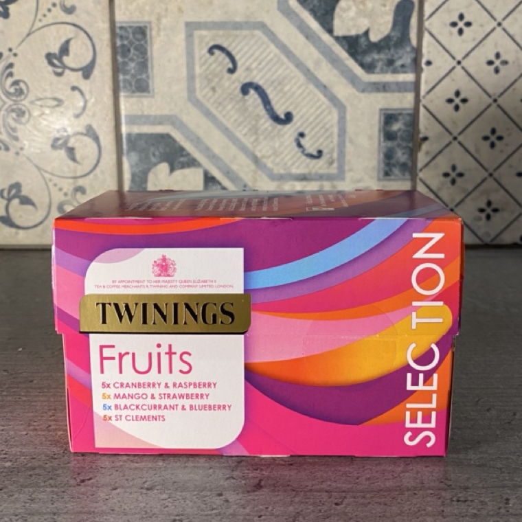
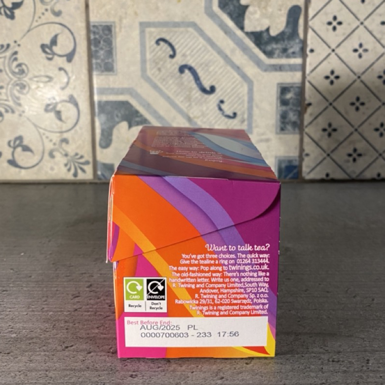
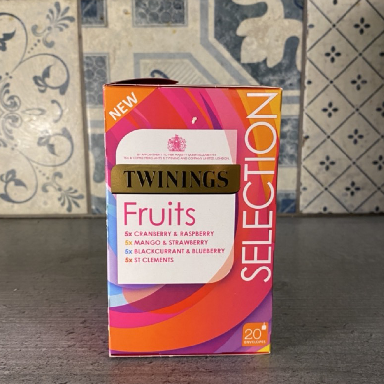
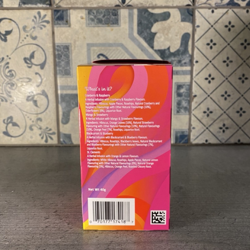
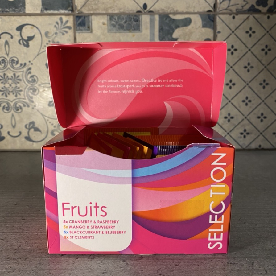
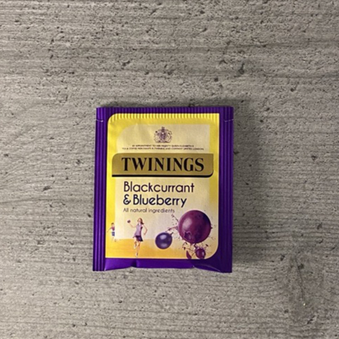
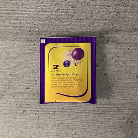
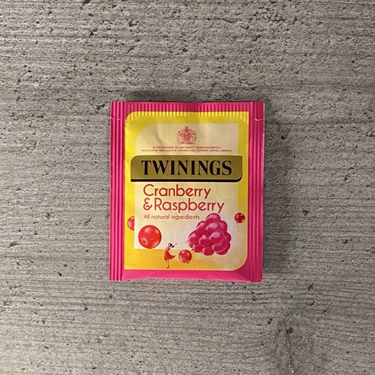
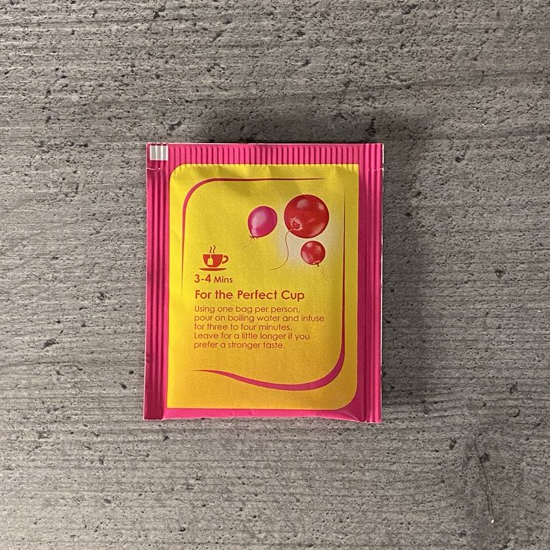
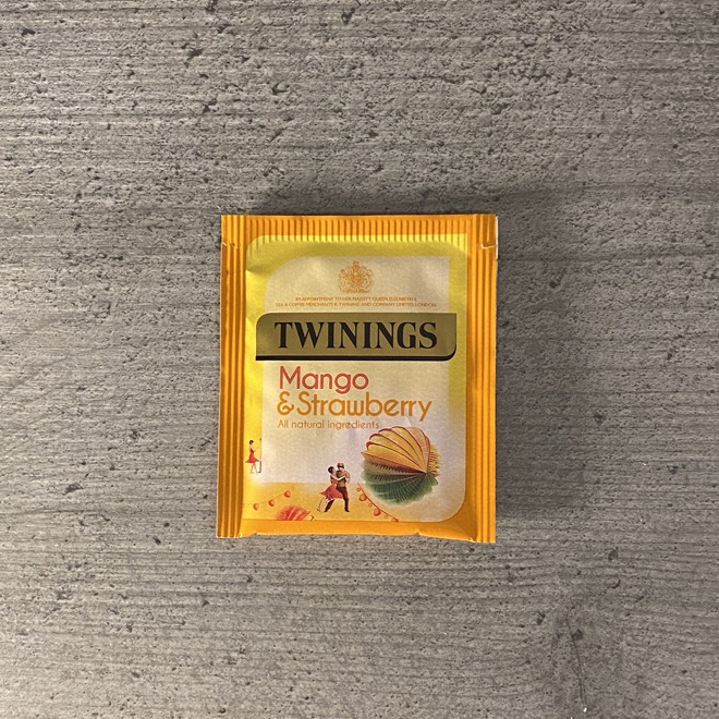
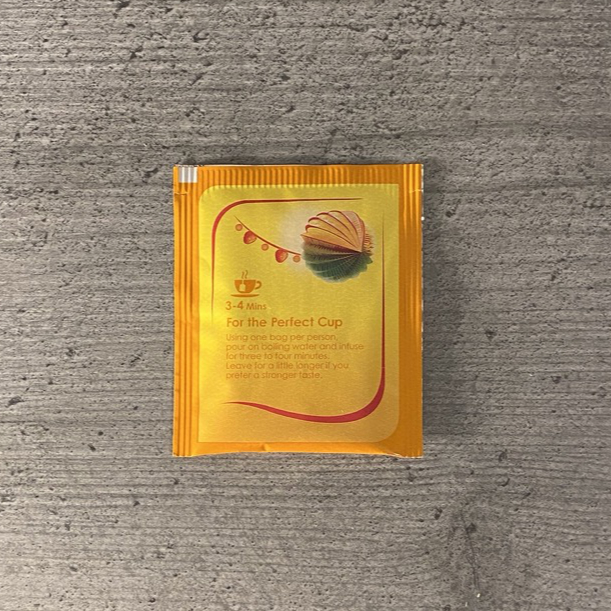
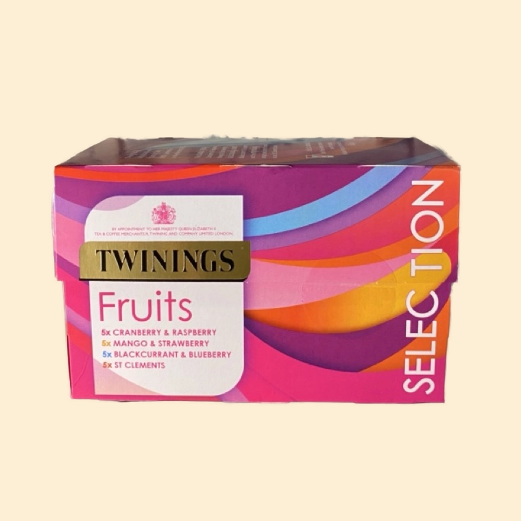
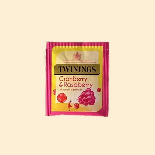
Twining’s Tea
Packaging
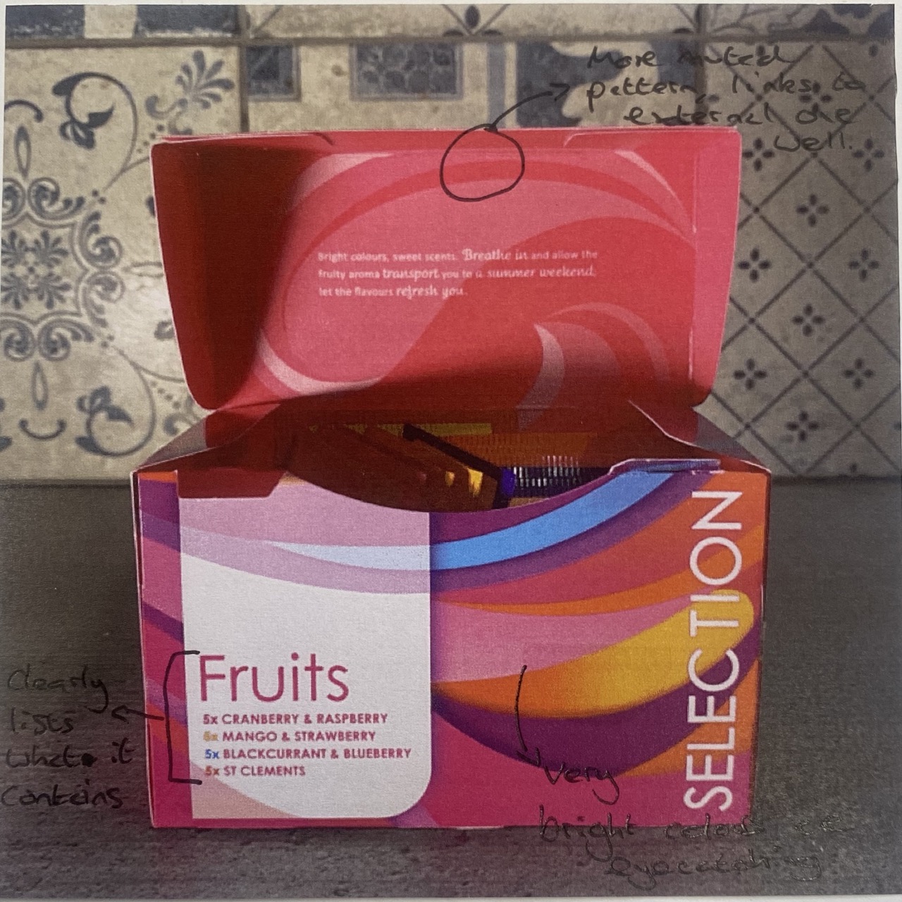
Twining’s have chosen to go with a more abstract design on their packaging. They use the different colours from the flavours ot create an eye-catching and engaging pattern. The packaging includes a small mechanical latch within the cardboard. It closes with a satisfying click, helping to evoke a sense of quality and attention to detail. Another clever thing is that you can orient the packaging either landscape or horizontal and there is a side which will be the right way up. This helps to make the packaging more versatile and user-friendly, as it allows consumers to display the product in whichever orientation works best for their specific needs or preferences. However one downside I noticed was the lack of compartments within the box. This resulted in the different flavours of tea bags becoming a mess and making it difficult to find certain flavours.
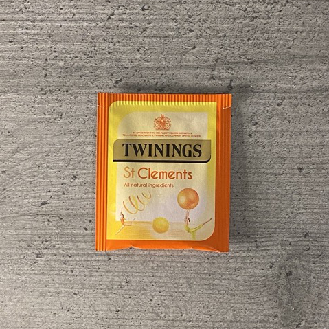
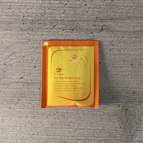
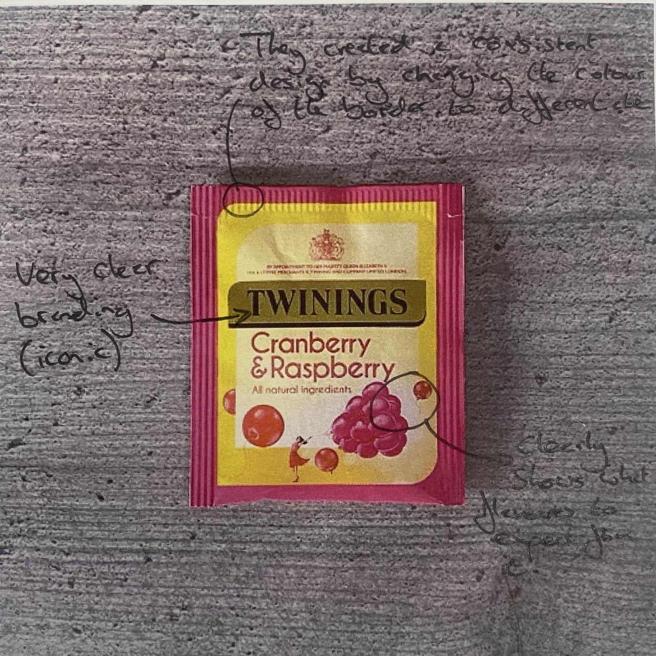
Tea Bags
Similar to the Pukka tea bags, they also use colour to differentiate between flavours. However, they instead do this via a coloured border. This helps them to keep their iconic branding the same across all flavours, maintaining visual identity. They also include little pictures to further discern the flavour. They also include a small blurb on the back, but I found it to be too much information for such a small area, and the font size is incredibly small, making it very difficult for those with visual impairments to read. I believe all information similar to this should be included on the primary packaging instead.
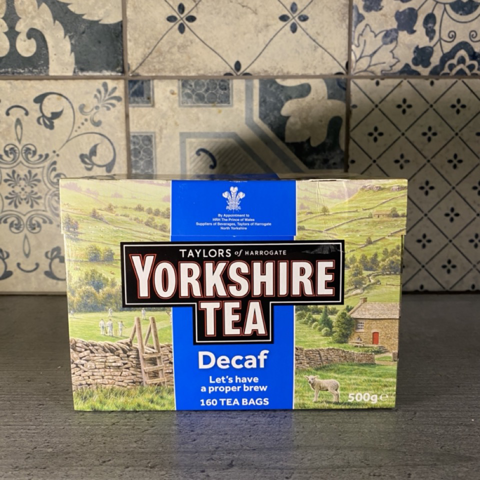
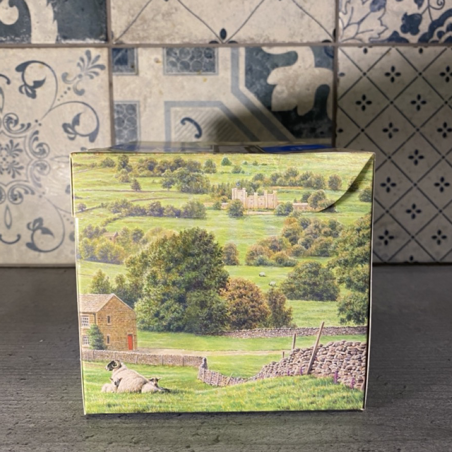
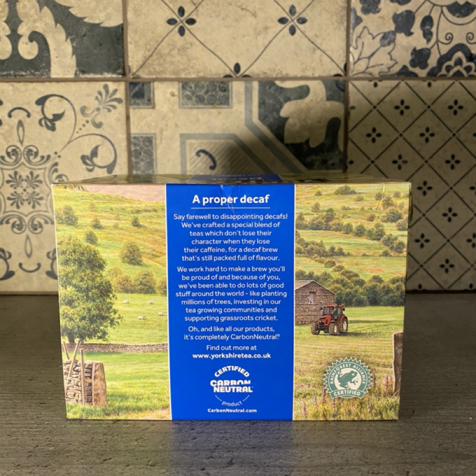
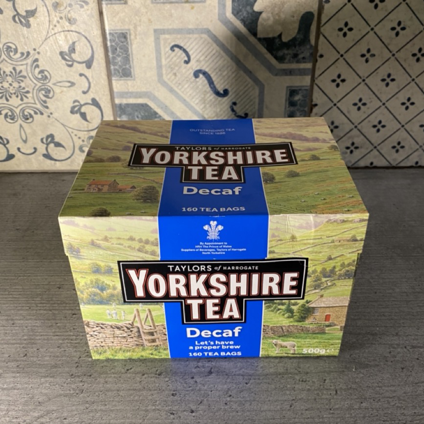
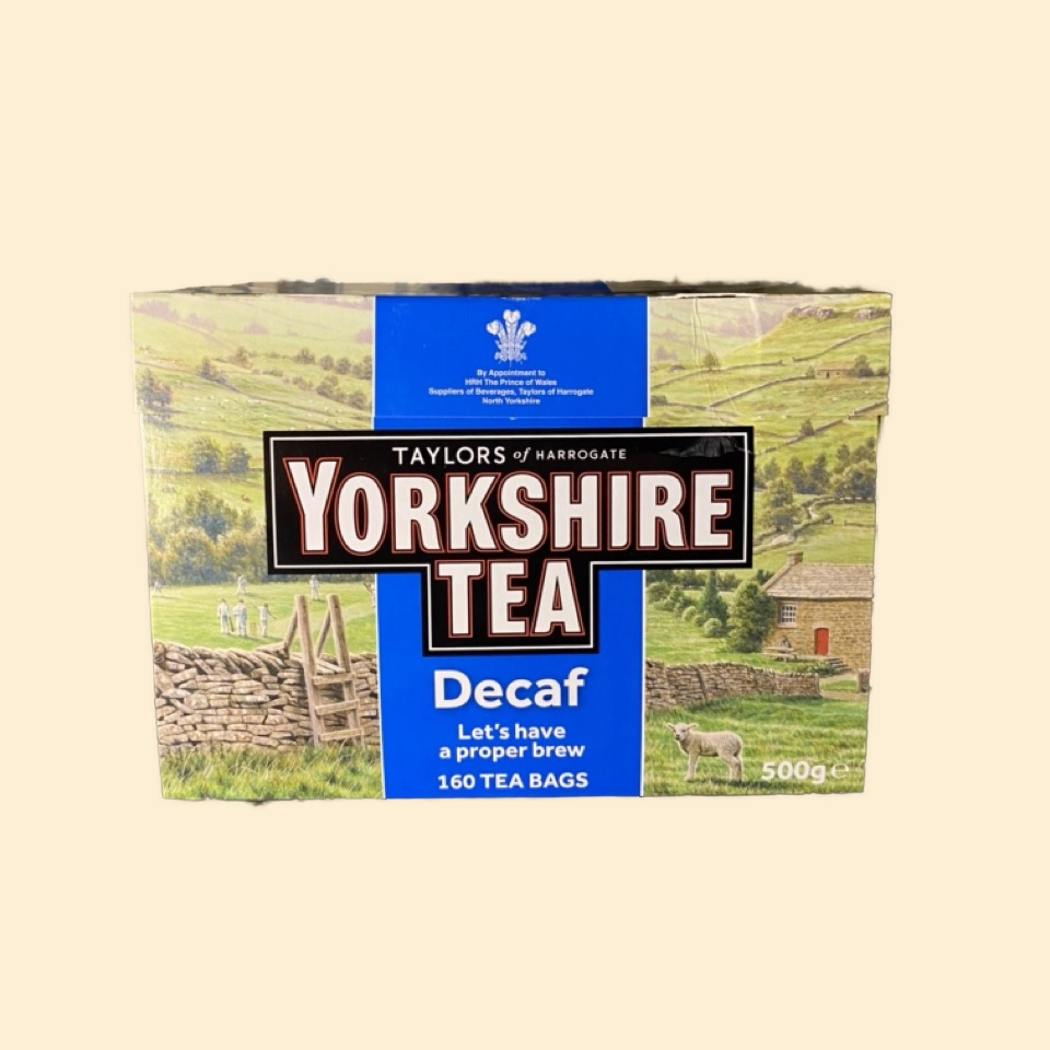
Yorkshire Tea
Yorkshire Tea’s branding is very iconic, and they do well to differentiate between different flavours without loosing their brand identity. Instead of changing up the image in the background, they instead change the strip of colour down the middle. In regular tea bags its red, in decaf its blue and gold for their “premium” variety.
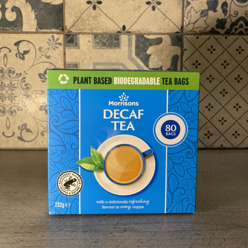
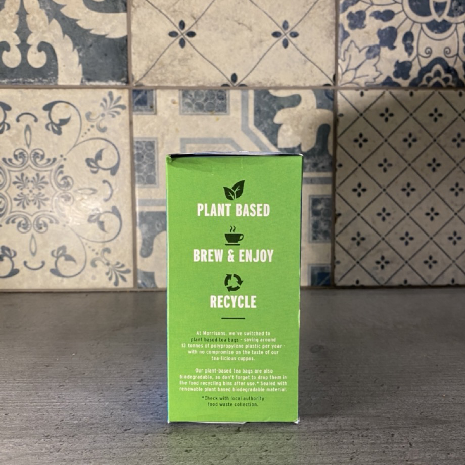
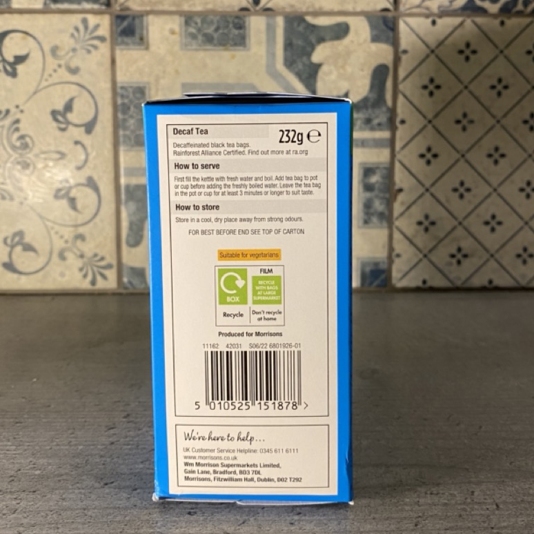
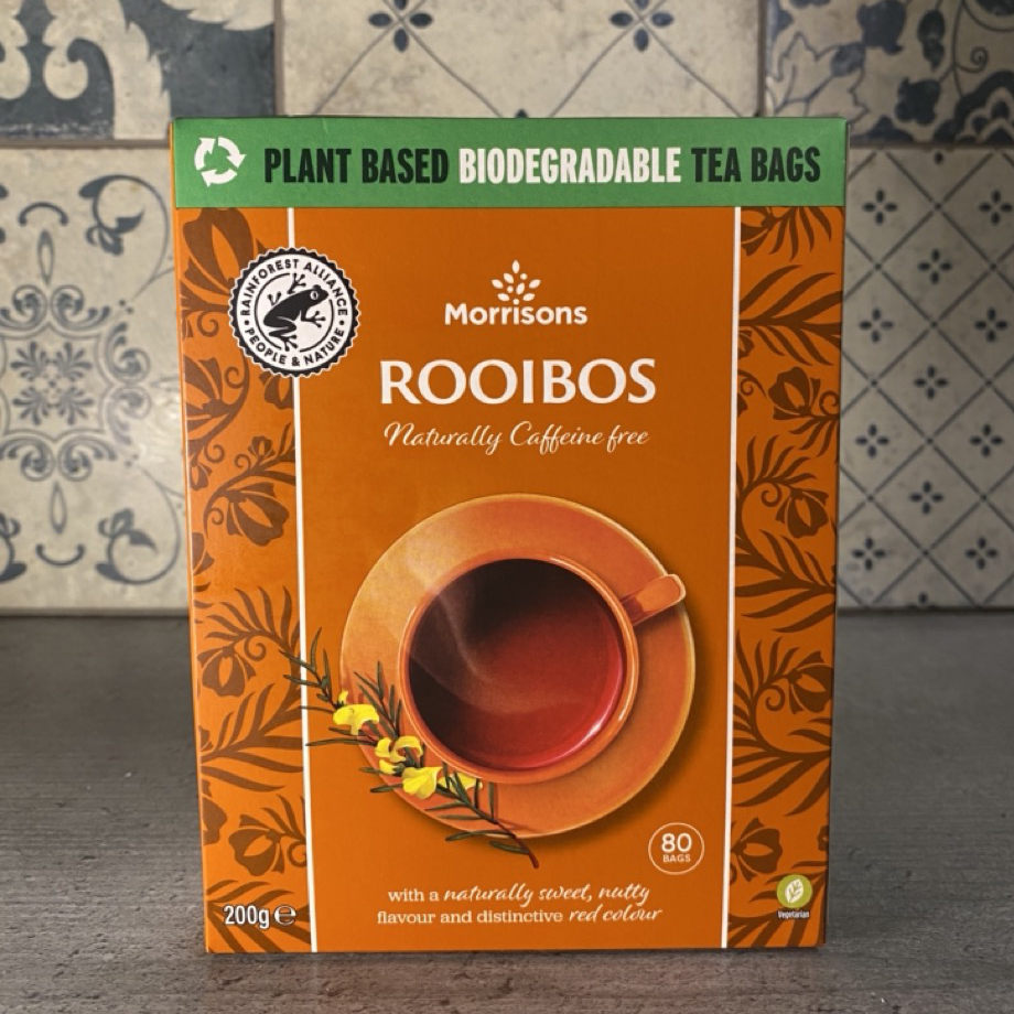
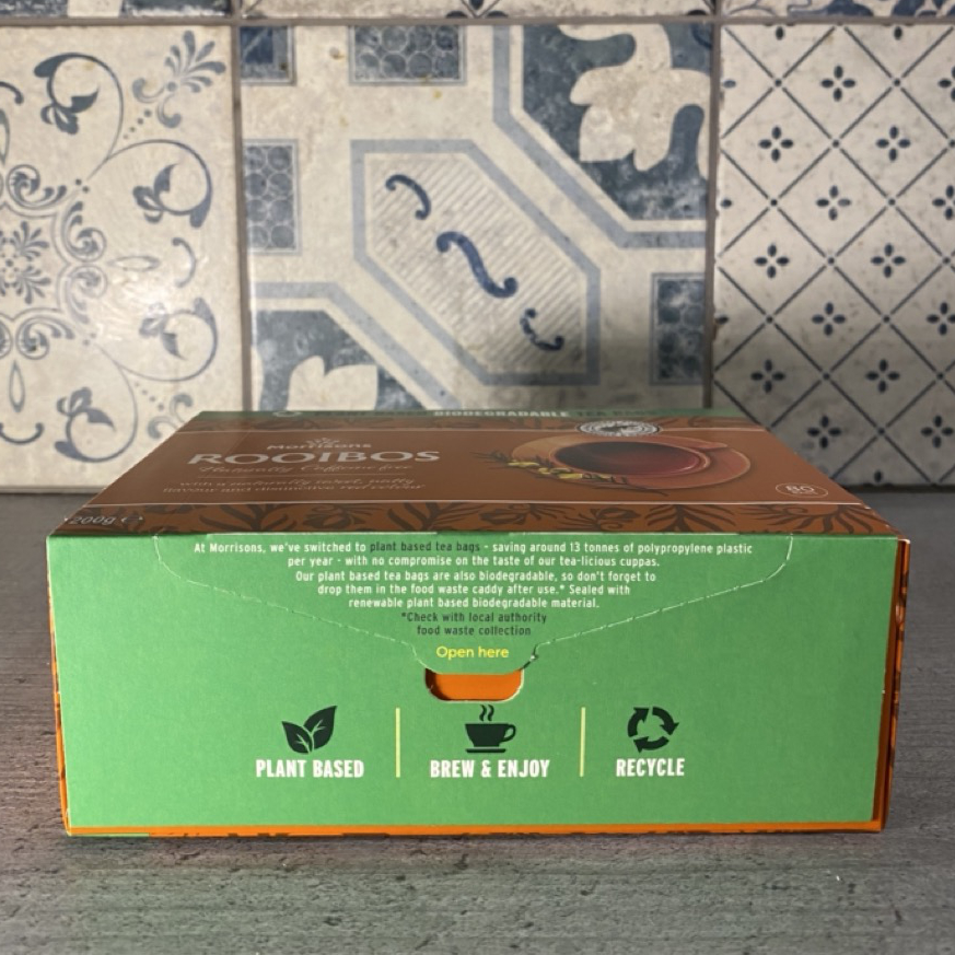
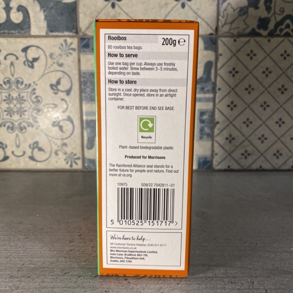
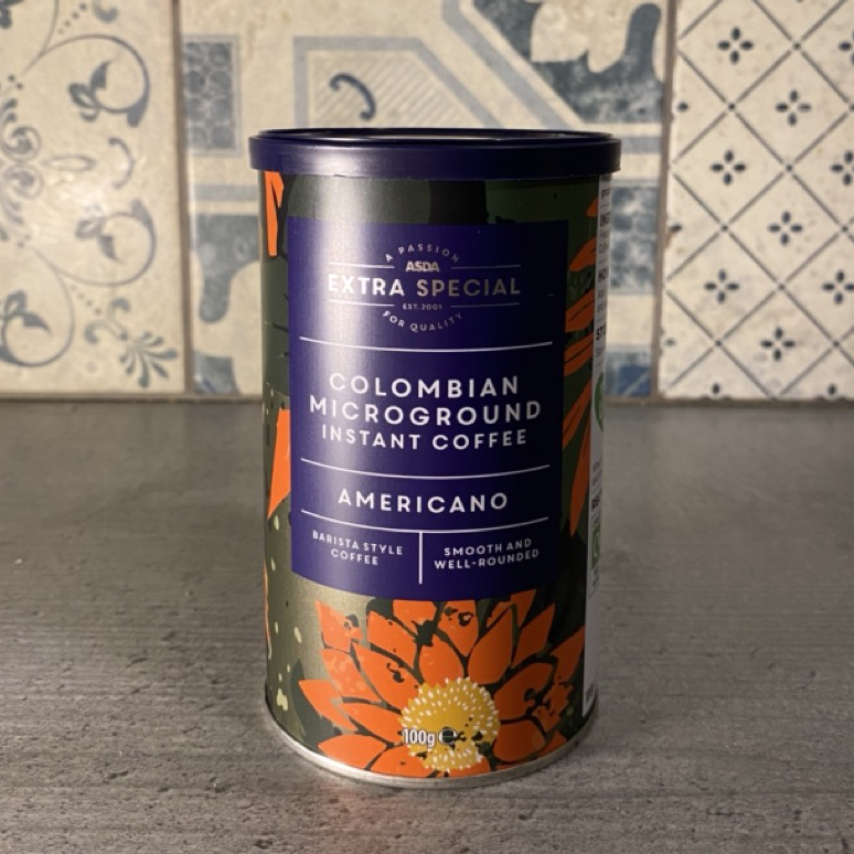
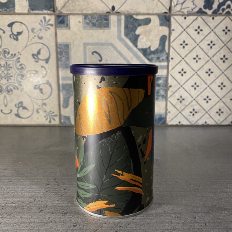
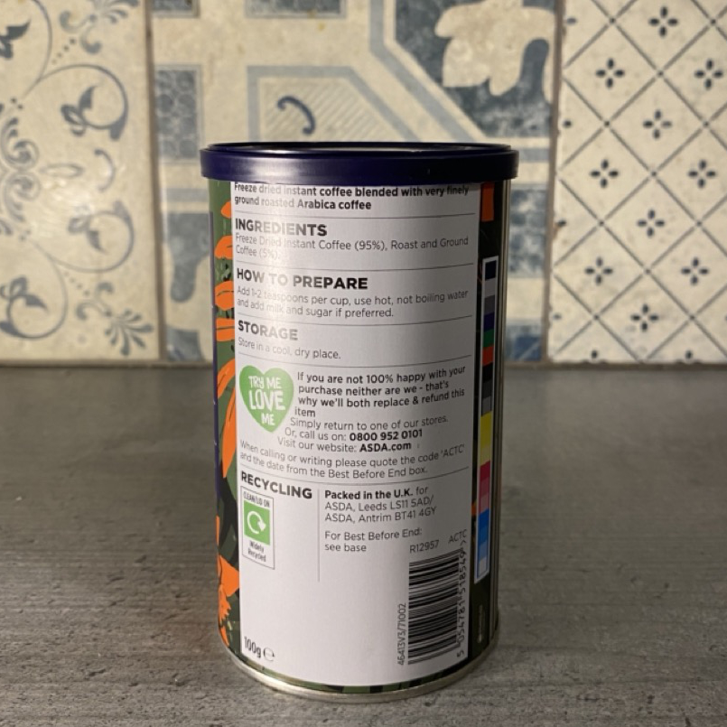
Supermarket Tea/Other
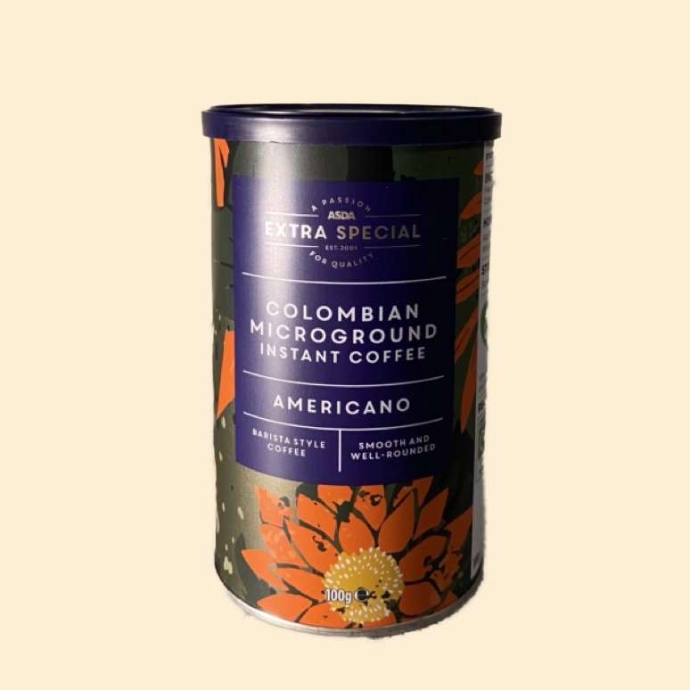
Below are a variety of other tea packagings. The Morrison’s own brand has created a distinct visual identity and uses clear techniques to differentiate between flavours. However, the green ribbon at the top detracts from the premium quality that other companies have. As well as this, the extra information is simply contained in a white box, and feels very disconnected from the rest of the packaging. I like how the Asda coffee packaging uses a unique pattern/artwork to present the type of coffee included, however it also suffers from having a white box to display information.
Further Annotations
Furthermore, I then also printed off some of these photographs and annotated them physically, helping me to highlight some of the advantages/disadvantages of the various types of packaging.
Separating the background
As well as this, the background I used to take these photographs may have influenced how I felt about the designs due to the complicated patterns potentially interfering with them. To help with this, I selected some and manually removed the background to help view it in a more neutral environment.
Fruit
I also took some photos of fruit and cups to help influence my work: