Branding Guidelines - Typography
I wanted my brand to emanate professionalism whilst also still giving a fun and playful vibe. Many brands these days will do this by selecting a more interesting serif font which is used in titles and other large formats. This helps to gain the customers interest and is only used on a larger scale with few words to help minimise eye strain.
However where smaller text is used, they will instead pick a more traditional sans serif font due to the increased readability at smaller scales in areas such as the ingredients, where accurate legibility is required for allergies and other important information.
I decided to follow this style and separated my search into these two categories.
Playful Font
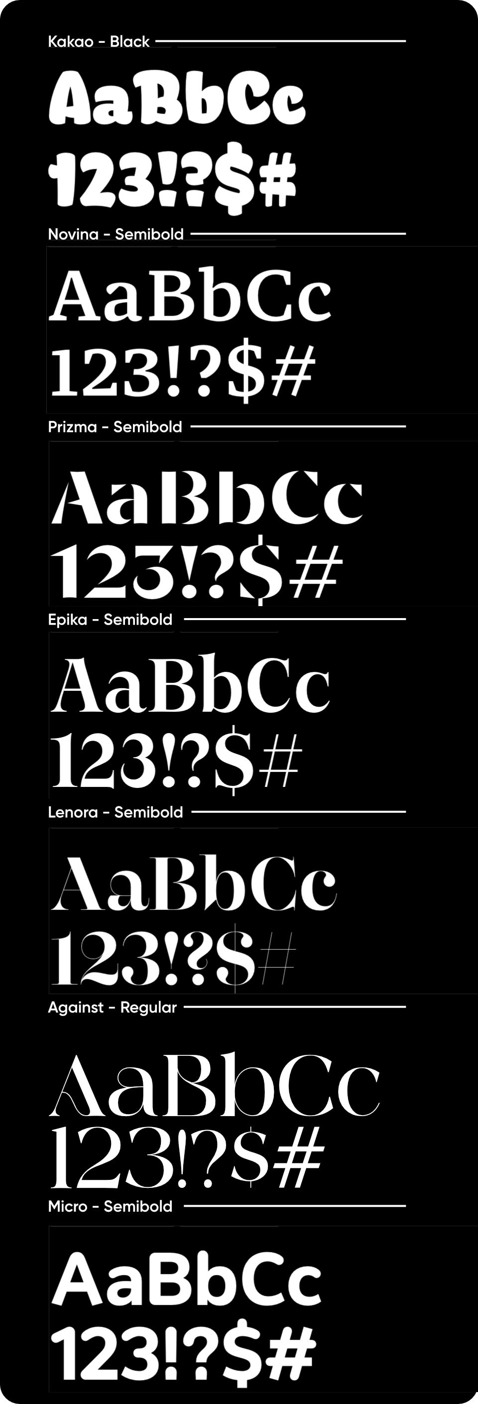
I created the following design to help present some of the font options I found.
I then evaluated the options:
- Kakao - It feels very bubbly and playful. Whilst this plays in well for the more relaxed part of my brand, I feel as though it would detract from the up-market aesthetic more, impacting how customers view the brand.
- Novina - This feels much more professional and clean, but it looks quite boring. It’s similar to a font that would be used for increased legibility and I don’t think its eye catching enough.
- Prizma - This is far more eye catching but could be percieved as being too “edgy”. It also looks too futuristic for my brand.
- Epika - Similar to Novina it doesn’t look eye catching enough, and more akin to a typeface used in a book.
- Lenora - This font is far more appealing due to the wide contrast in strokes throughout the typeface. However this does also detract from it, as some strokes appear far too thin in some places, potentially impacting recognition from large distances.
- Against - This font does better job than Lenora and finds a more neutral balance between stroke width. I also love how the curves break up what would otherwise be a far more rigid font. Furthermore, this font includes a feature called font ligatures. This means that some of the common letter combinations have special glyphs where they flow into each other, helping to increase the variety within the typeface.
- Micro - This font seems a bit too bland. I also don’t really like the mixture of rounded corners throughout the typeface as it seems a bit inconsistent.
I decided to use Against
Sans Serif Font
Again I created another design to present some of the options.
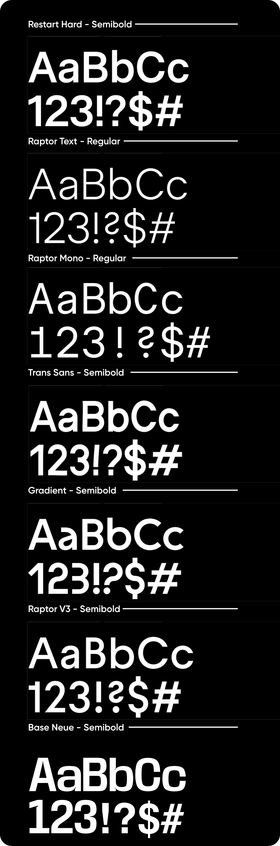
Similarly, I then evaluated the different options. Most of the fonts could be very effective, as the primary goal of this font choice is simply to work well for legibility. I decided against Raptop Text as the font weight was too light for what I pictured, and was worried that customers might struggle with legibility at longer ranges. Raptor Mono didn’t feel professional enough as mono fonts are often used in more futuristic graphics. Trans Sans and Gradient both felt “off balance” as some of the glyphs lean strangely. This can cause people with dyslexia to struggle with reading. Base Neue was a strong option but I again felt it didn’t suit the style I was going for. As well as this it has some small flairs within the typeface which would cause visual clutter at small sizes, decreasing legibility. Due to the issues in the other fonts I decided to use Raptor V3.