Design Document
Cover and Contents Page
I first started by creating the front cover of the document. The goal for this isn’t to be eye catching, as it’s used as reference material for other designers. However, I decided that it needed some kind of element to help fill the first page, and could represent what my company is. I chose to take some elements from my artist response, as I really like the composition and how it clearly displays aspects from my company.
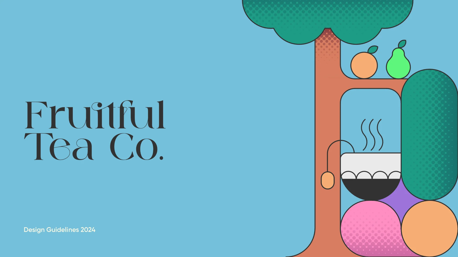
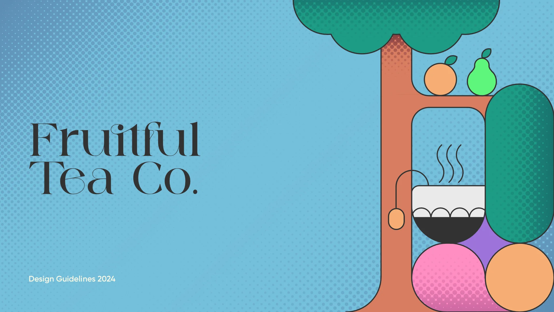
I also decided to bring in halftone aspects, helping to breakup the otherwise bland, solid blue background. This helps make the document seem less daunting and more approachable. I decided to use this background throughout the document.
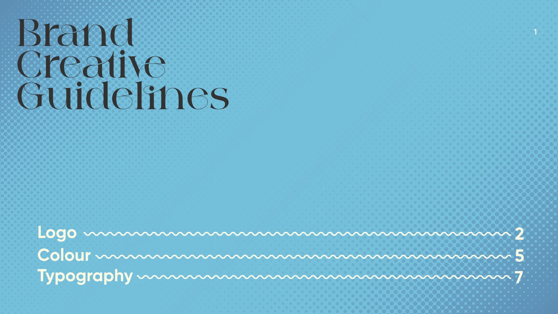
I then also created a simple contents page for the different categories:
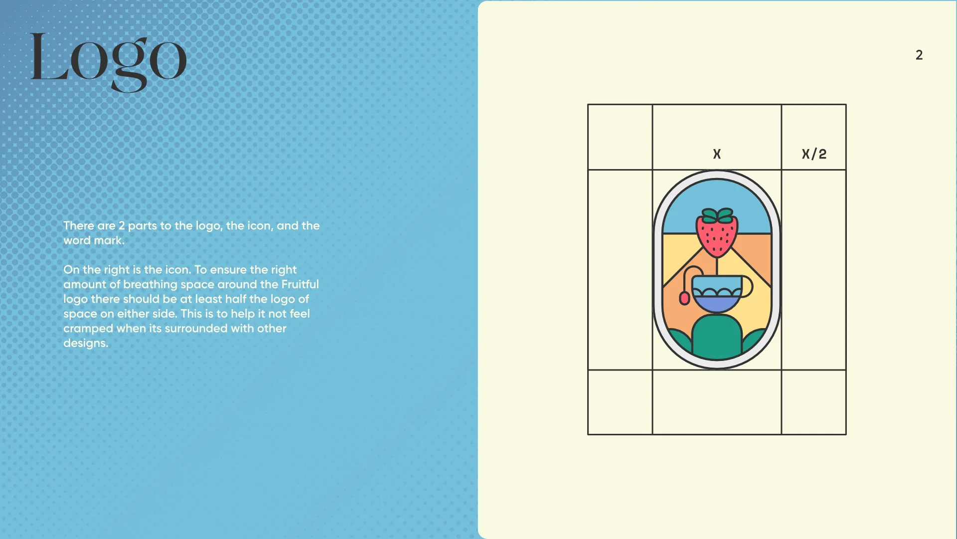
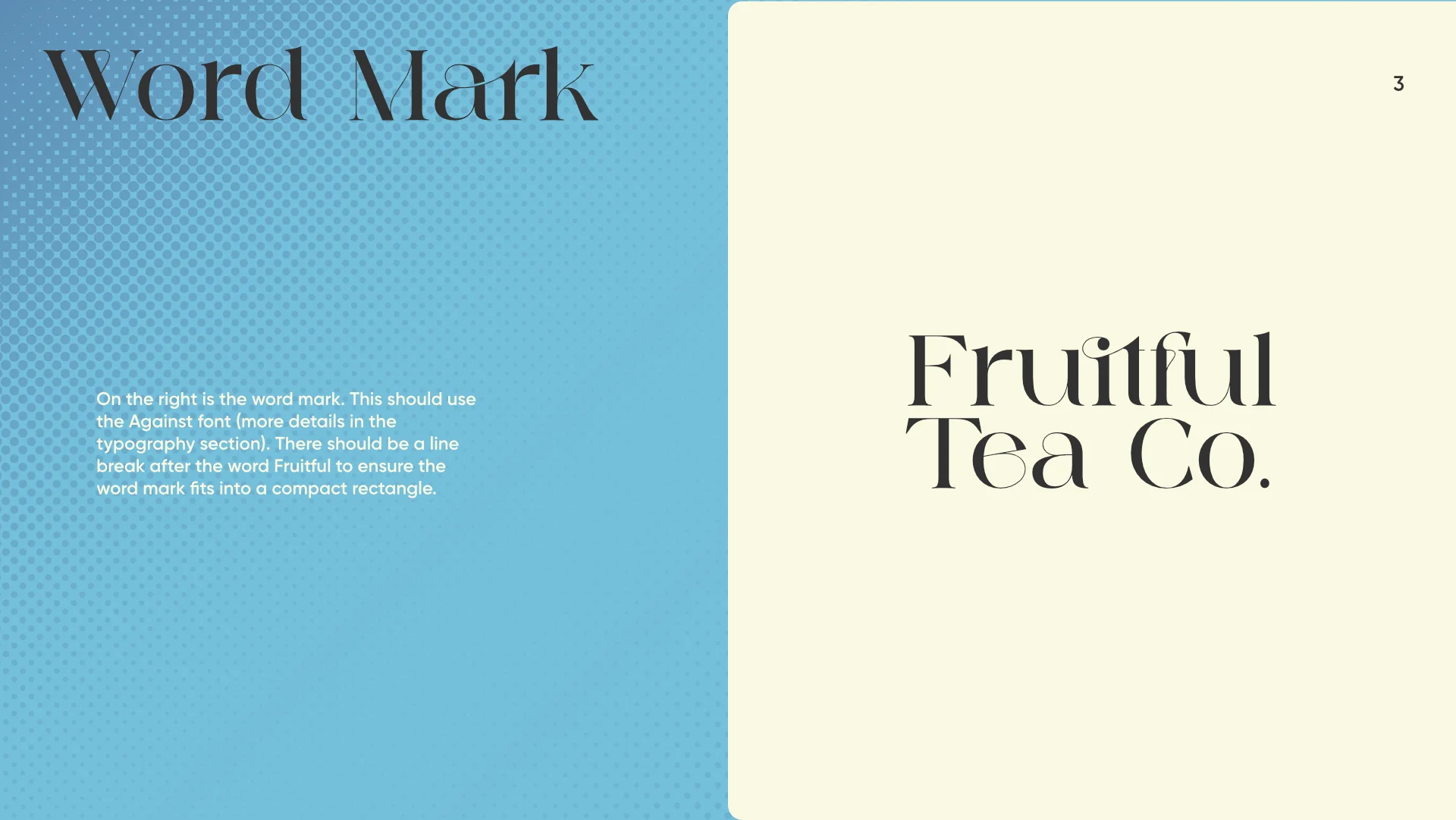
Logo and Wordmark Page
I wanted to keep the pages as simple and digestible as possible, so I often chose to spread out certain parts of the guidelines across multiple pages. This can be seen here with the logo. Instead of combining the two pages into one, I separated them, also helping to suggest that they are individual aspects to the design and therefore don’t always need to be consumed together
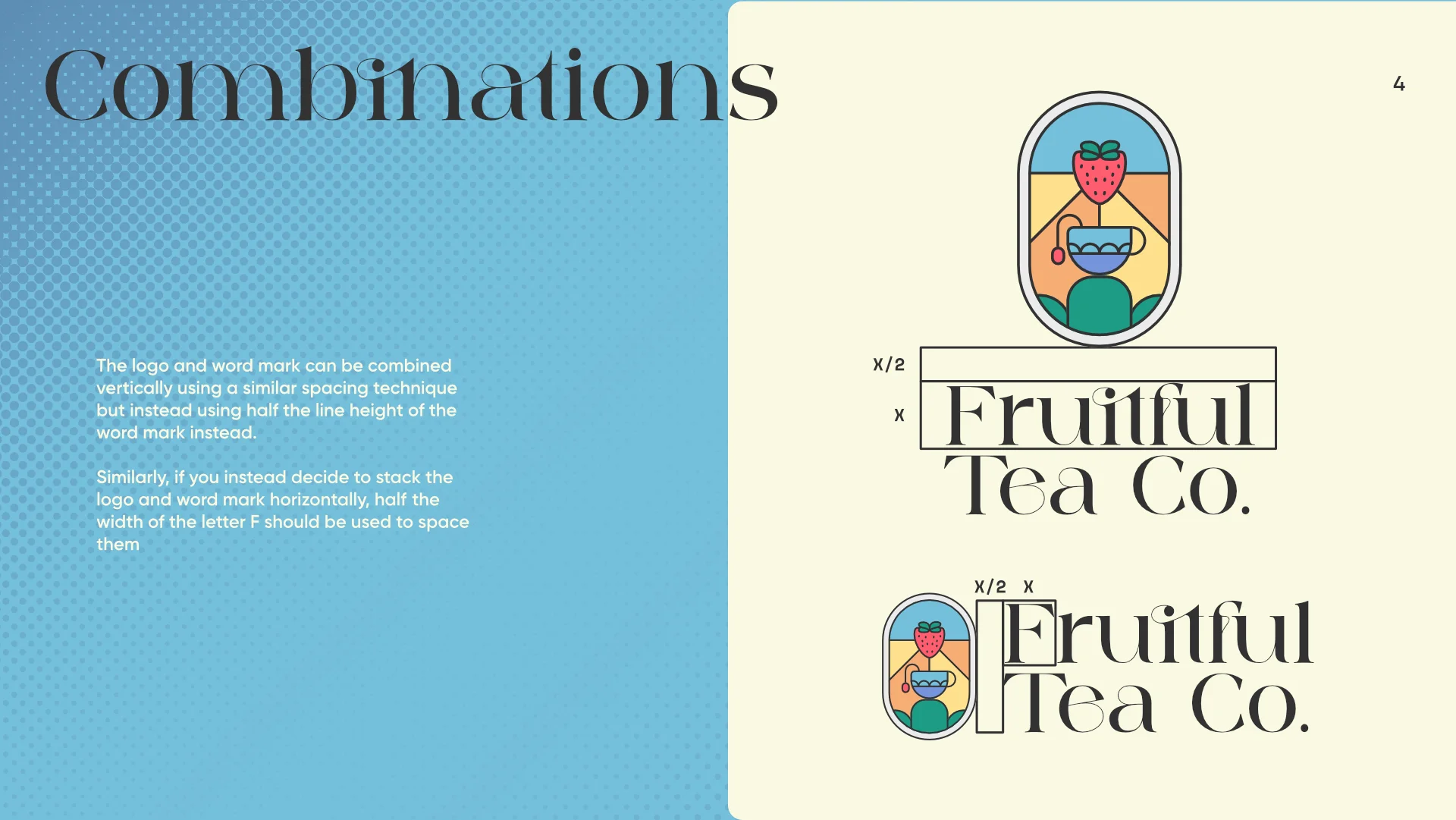
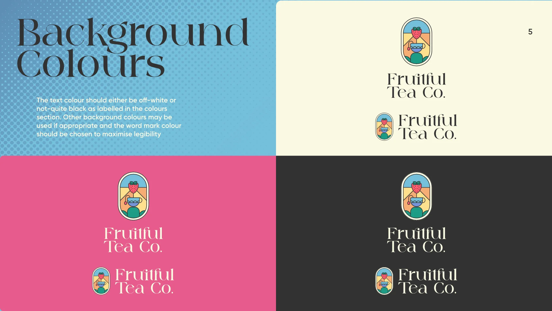
I did however include some examples of how to combine the two aspects, and how to space them correctly. I used the height of certain letters to help the designers easily gauge the spacing, instead of using arbitrary values. I also included some examples of appropriate colour combinations to use with them.
Colour Palette Pages
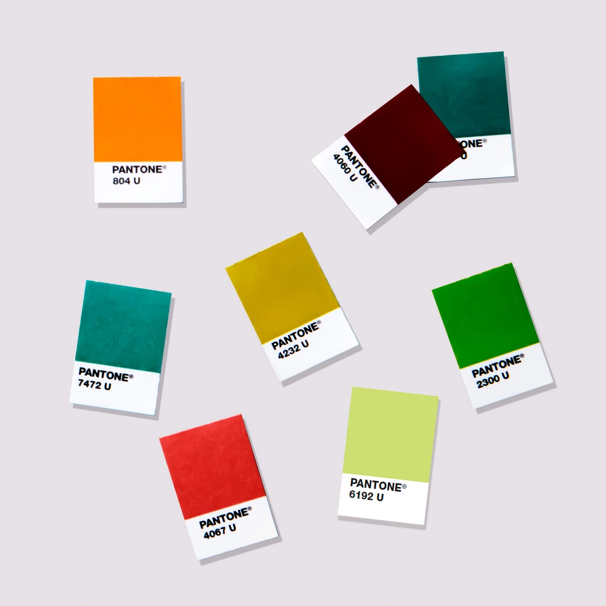
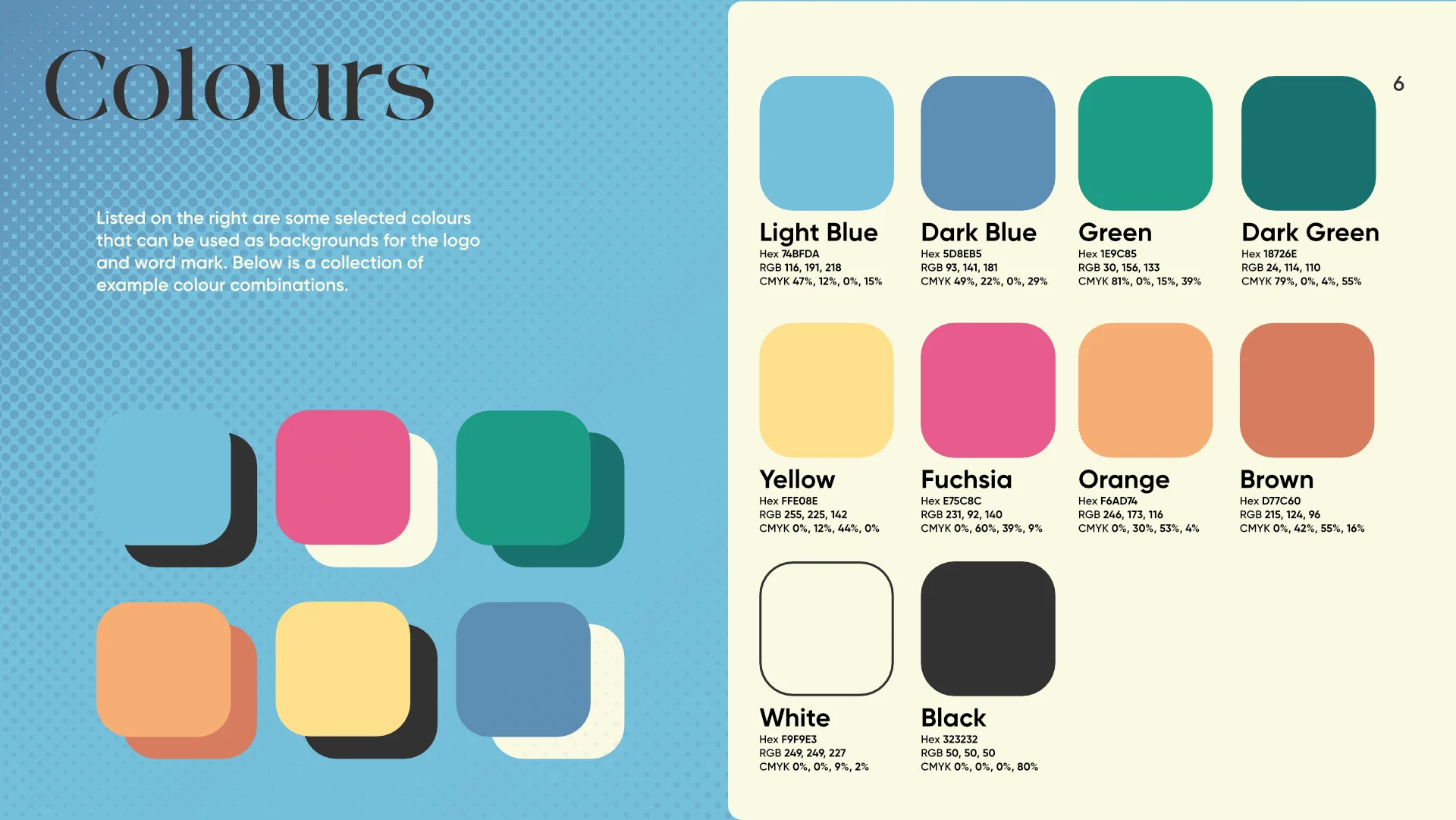
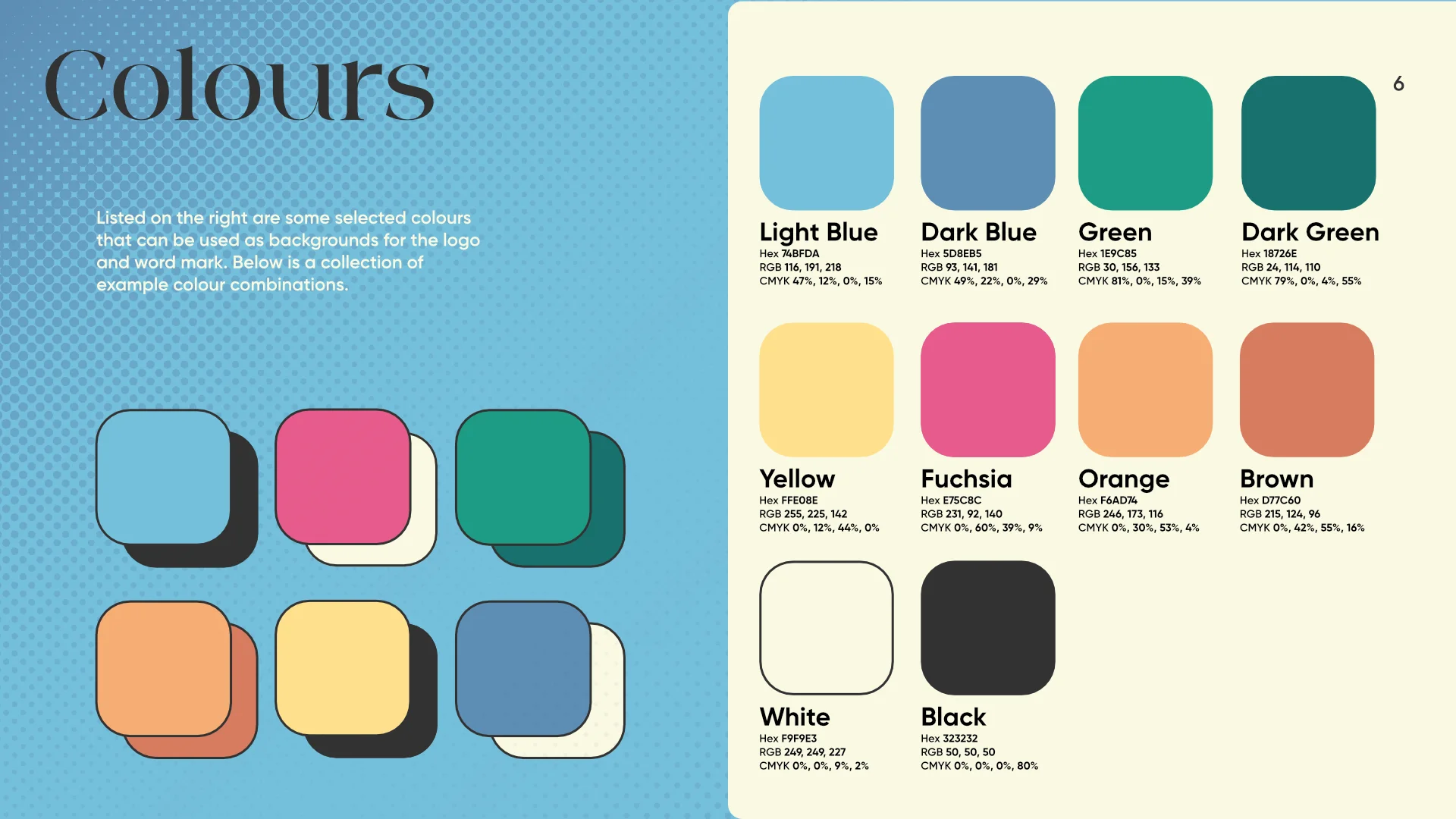
When I created the colours page, I took inspiration from pantone chips and how they easily display important information about the swatch. However I added more information such as the colour codes in Hex, RGB and CMYK, all common forms of displaying colour in design.
I also experimented between displaying the colour combination example swatches with and without a border. I thought the first example looked more aesthetic, however the second one helped to differentiate the colours from the background and meshed better with the art style.
Typography Page
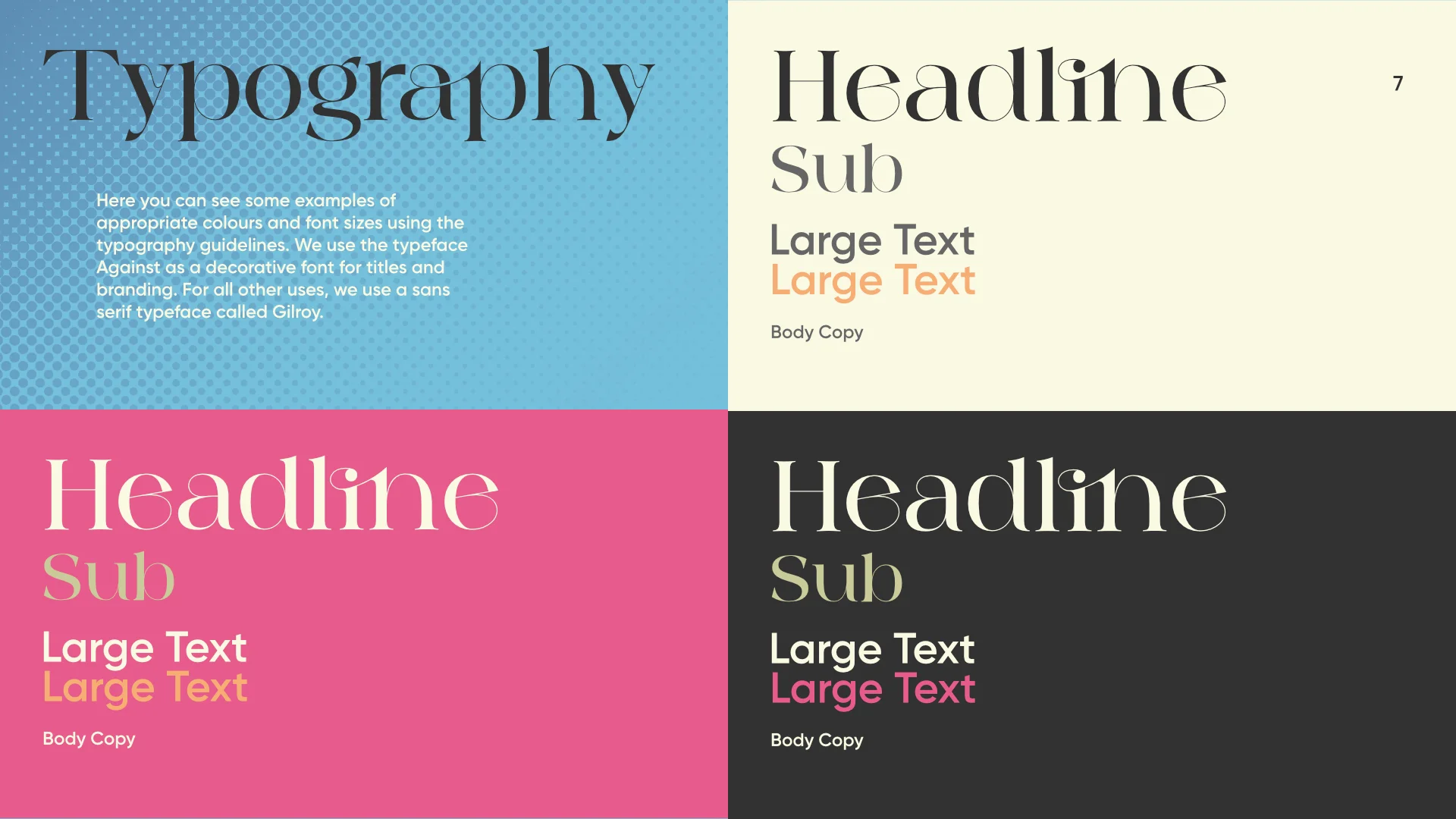
The typography page is similar to previous, where I prioritised showing examples of what styles to use and when, helping give prospective designers a better idea on how to use it.
Final Outcome
Below is a virtual flipbook of the final pdf: