Branding Guidelines
To help develop a consistent identity across all forms of graphics such as posters, packaging and other promotional material, I decided to create a set of branding guidelines which I could then reference and follow throughout the rest of my project.
I drew inspiration from other branding guidelines by existing and established companies when creating my own version. Below you can see some of these examples:
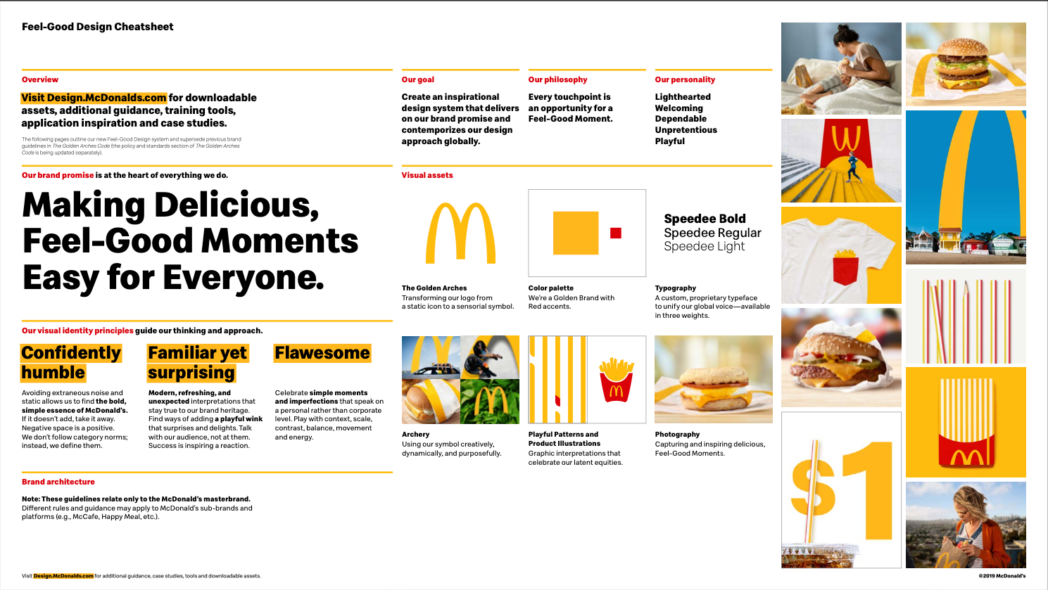
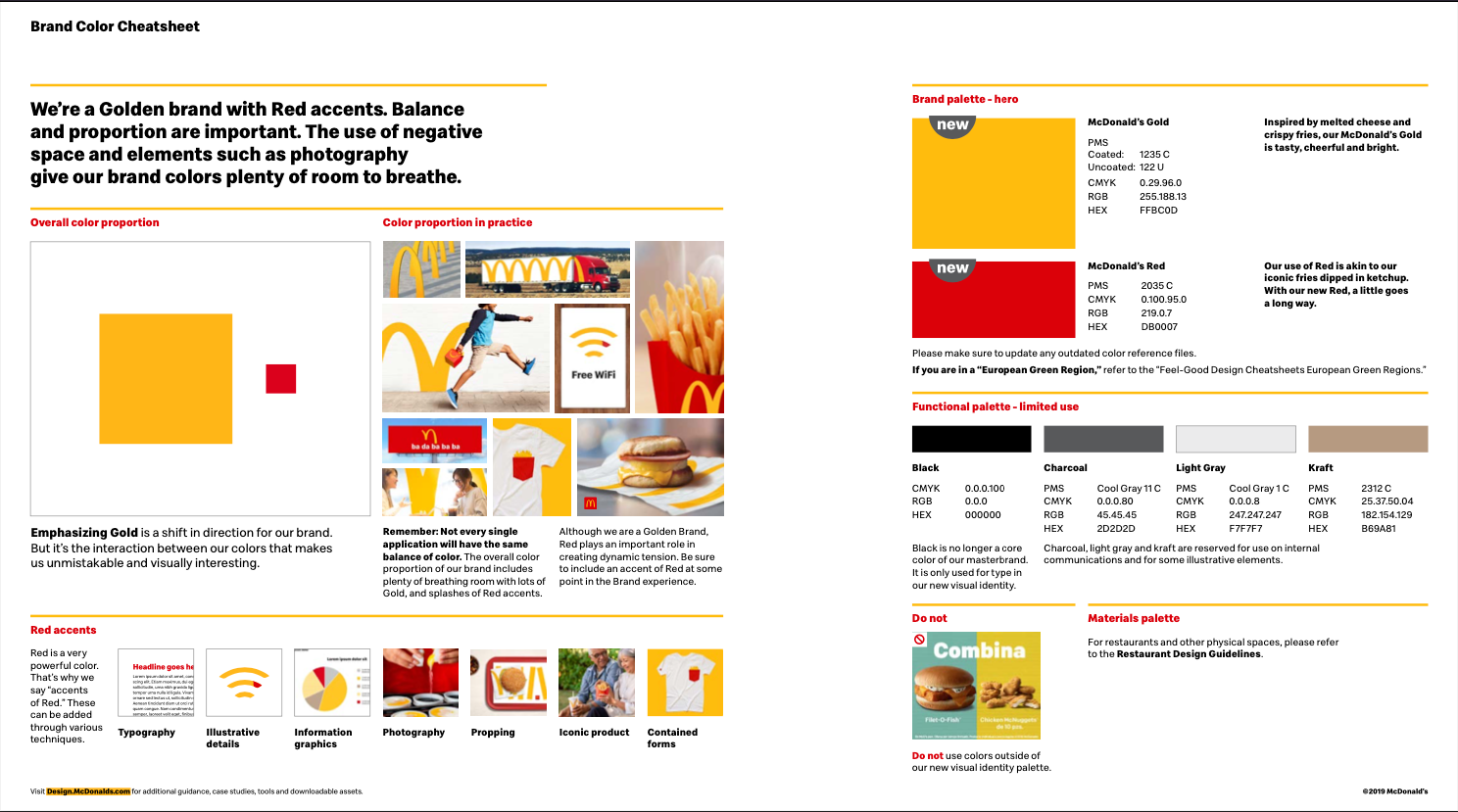
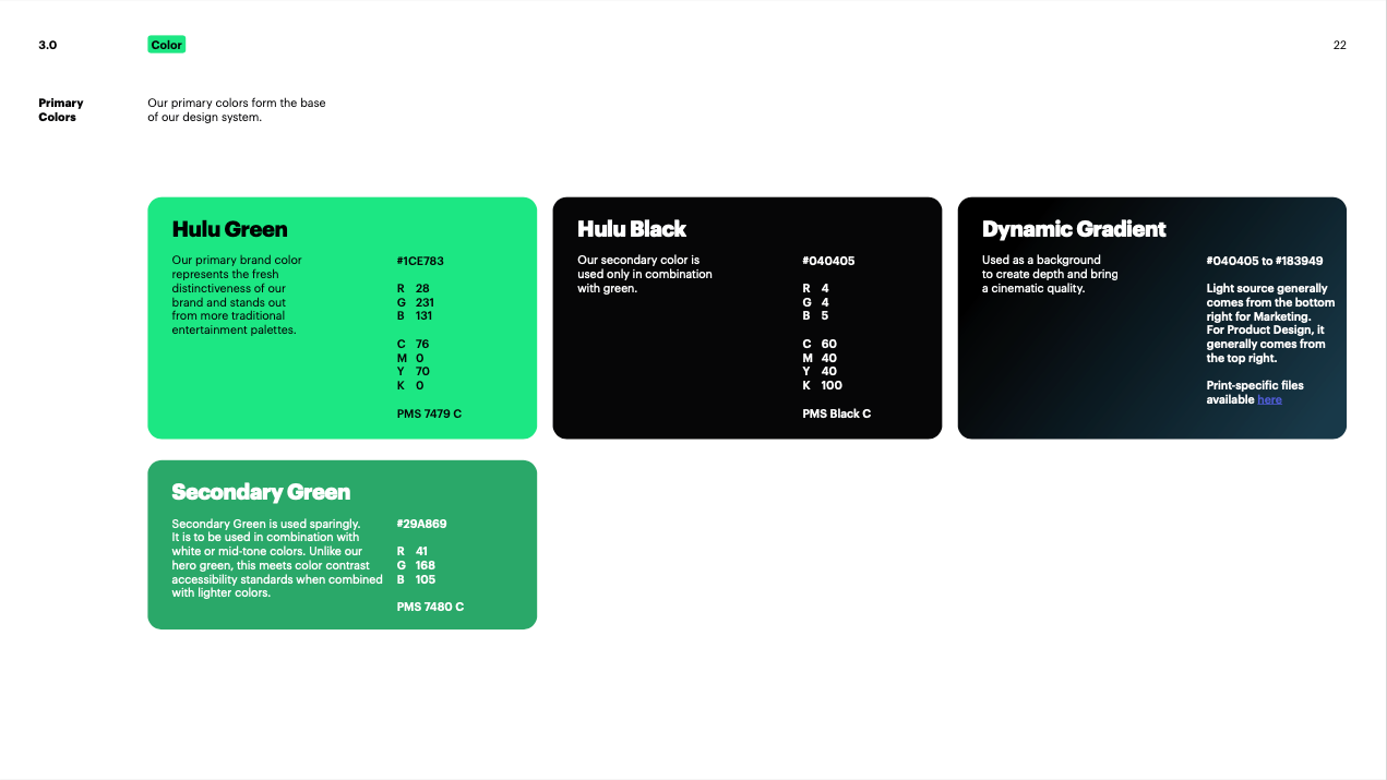
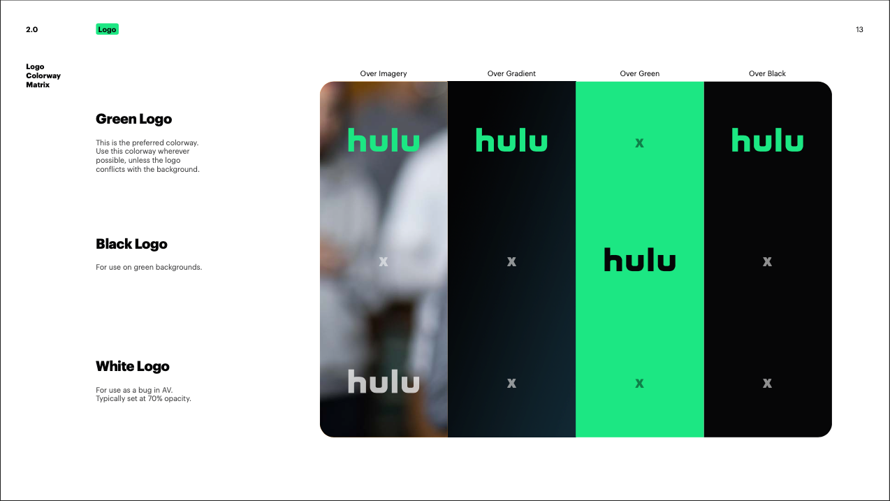
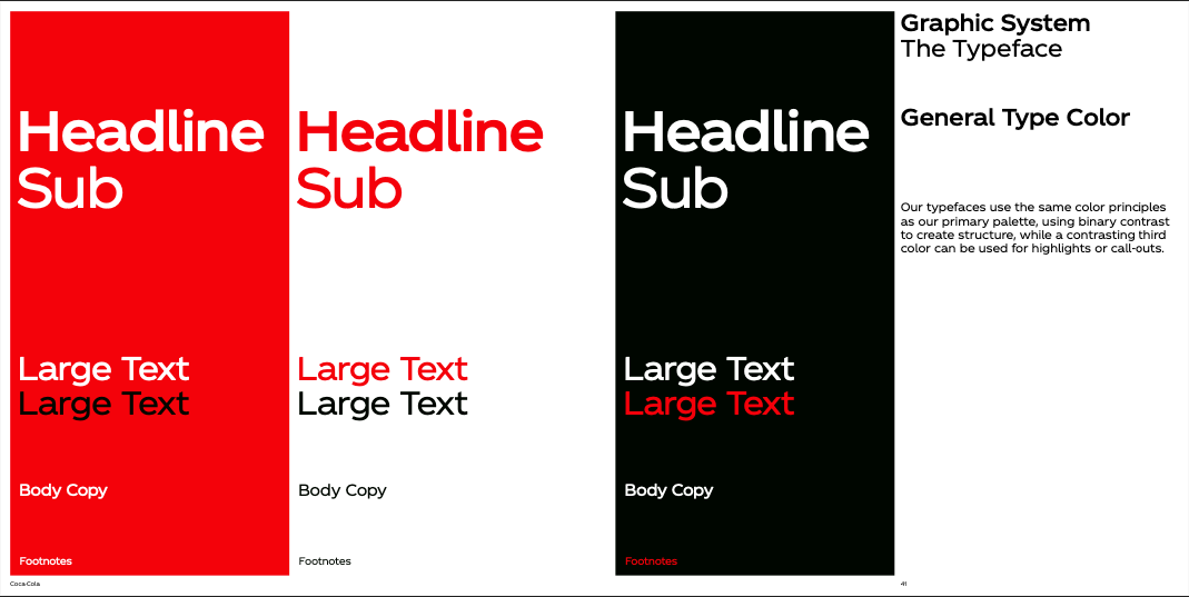
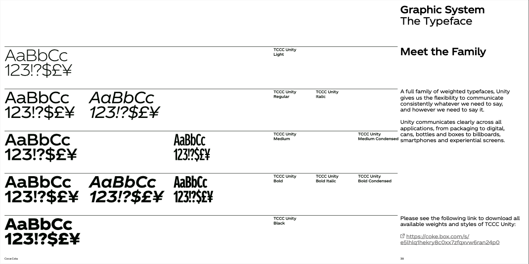
All of the examples above seem to split the area up into a number of columns and then use some for giving examples and the others for explaining more about the decisions they made. I want to follow a similar style, as seeing examples in situ with the correct spacing and colours etc helps to portray what the guidelines want the designer to do.
As you can see, they primarily split up the guidelines into 3 distinct sections, one for colour, one for typography and one for logo spacing and sizing. I decided to split mine up similarly which you can see in the following sections, where I also delve deeper into my specific choices.